

From login screens to checkout flows, forms are ubiquitous in digital products. They are essential for enabling users to input and select information.
Forms can be complex, which is why numerous articles—and even entire books—are dedicated to explaining the fundamentals of good form design (such as this one). Despite this, many forms are still designed and implemented with accessibility and usability issues, frustrating users and diminishing the quality of the information collected.
These design flaws can range from low contrast to the improper use of placeholders. However, there are many other ways to improve your input designs.
In the following sections, I will outline key accessibility and usability considerations that you can immediately apply to your designs.
While forms may include elements such as checkboxes, drop-downs, and date pickers, this article focuses on one of the most fundamental components: text inputs. After reading this, you should be able to apply these principles to other components as well.
Finally, I will explain how to set up a basic Figma component that incorporates these design considerations while remaining easy to maintain and simple to use.
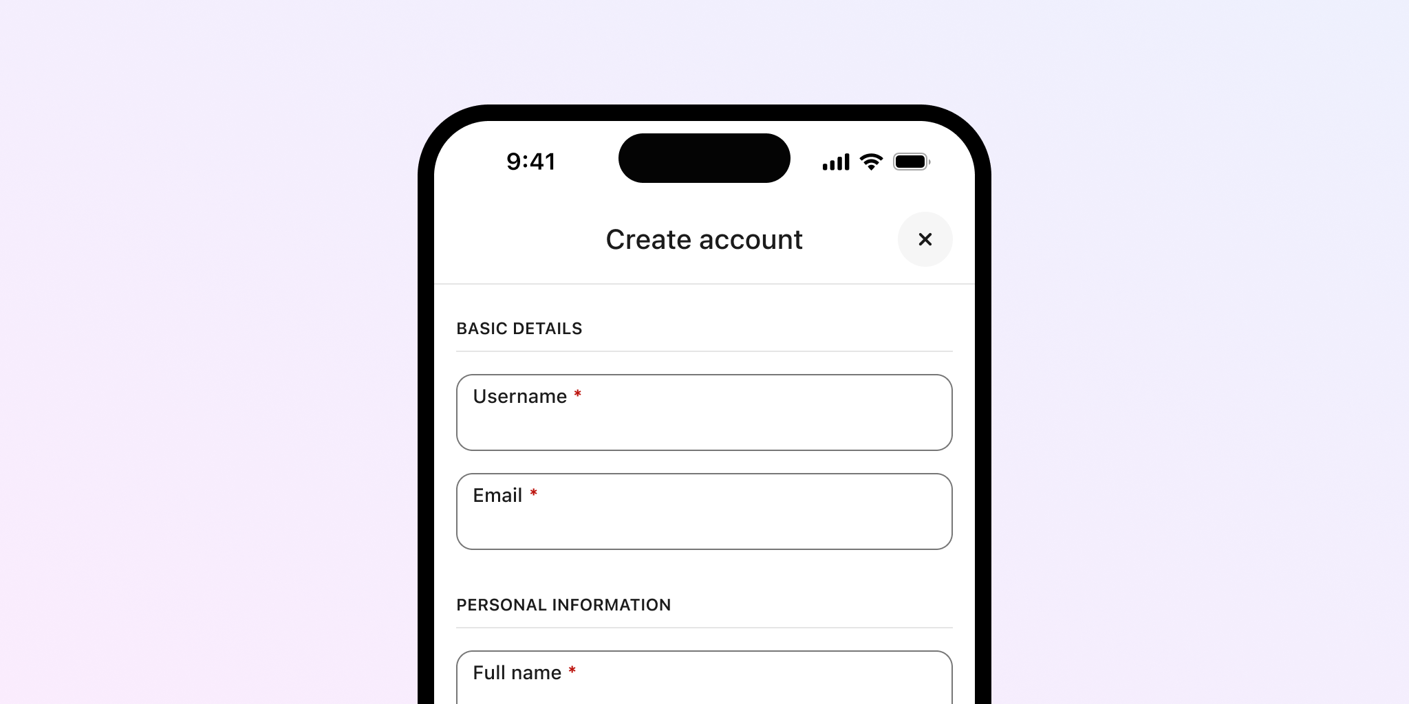
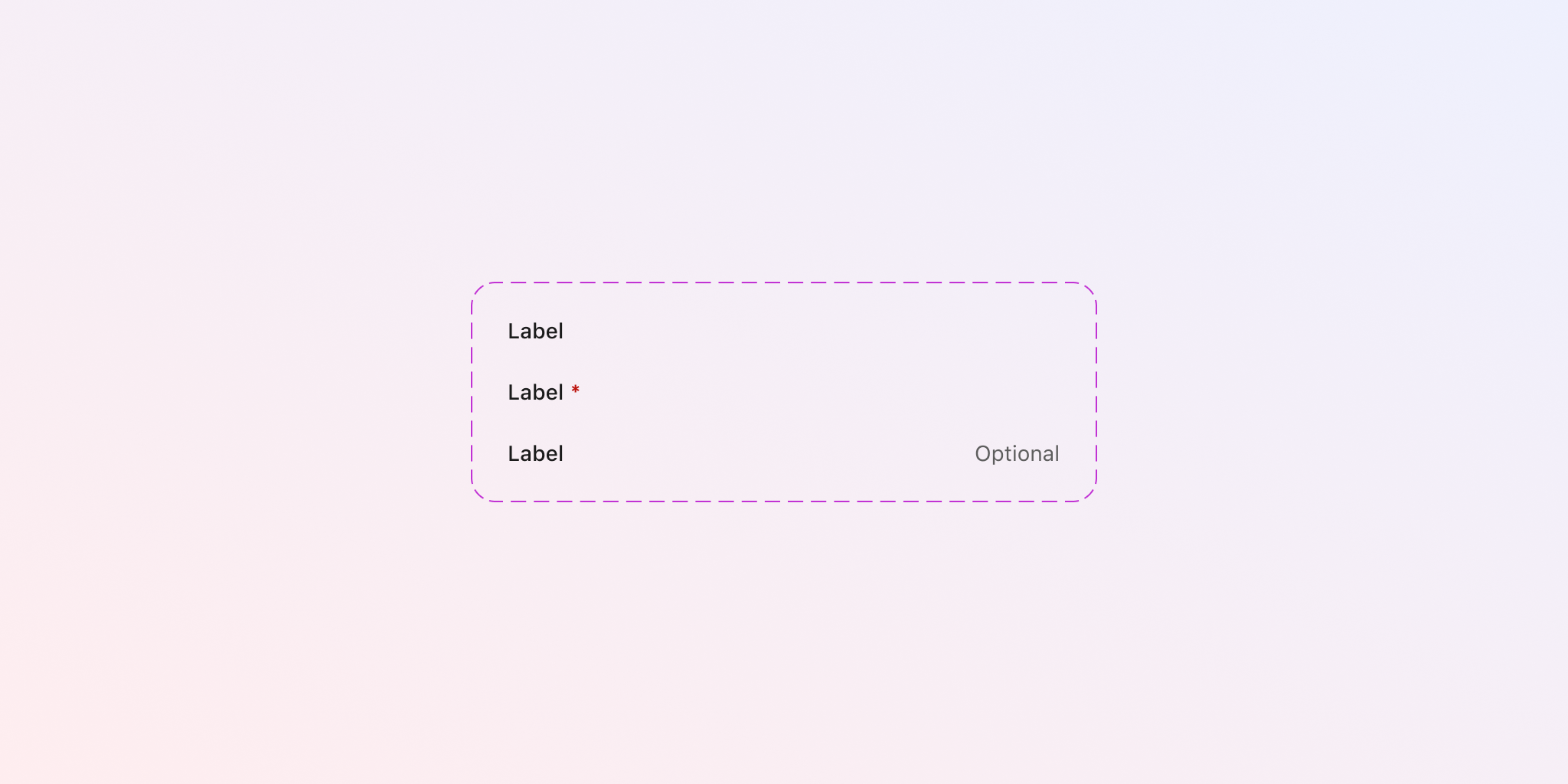
Indicate if required
Especially when filling out lengthy forms, understanding whether a field is mandatory helps users focus and know what is expected of them. When fields lack any indication, it can be frustrating: users may attempt to submit the form only to receive errors indicating that some fields were left blank.
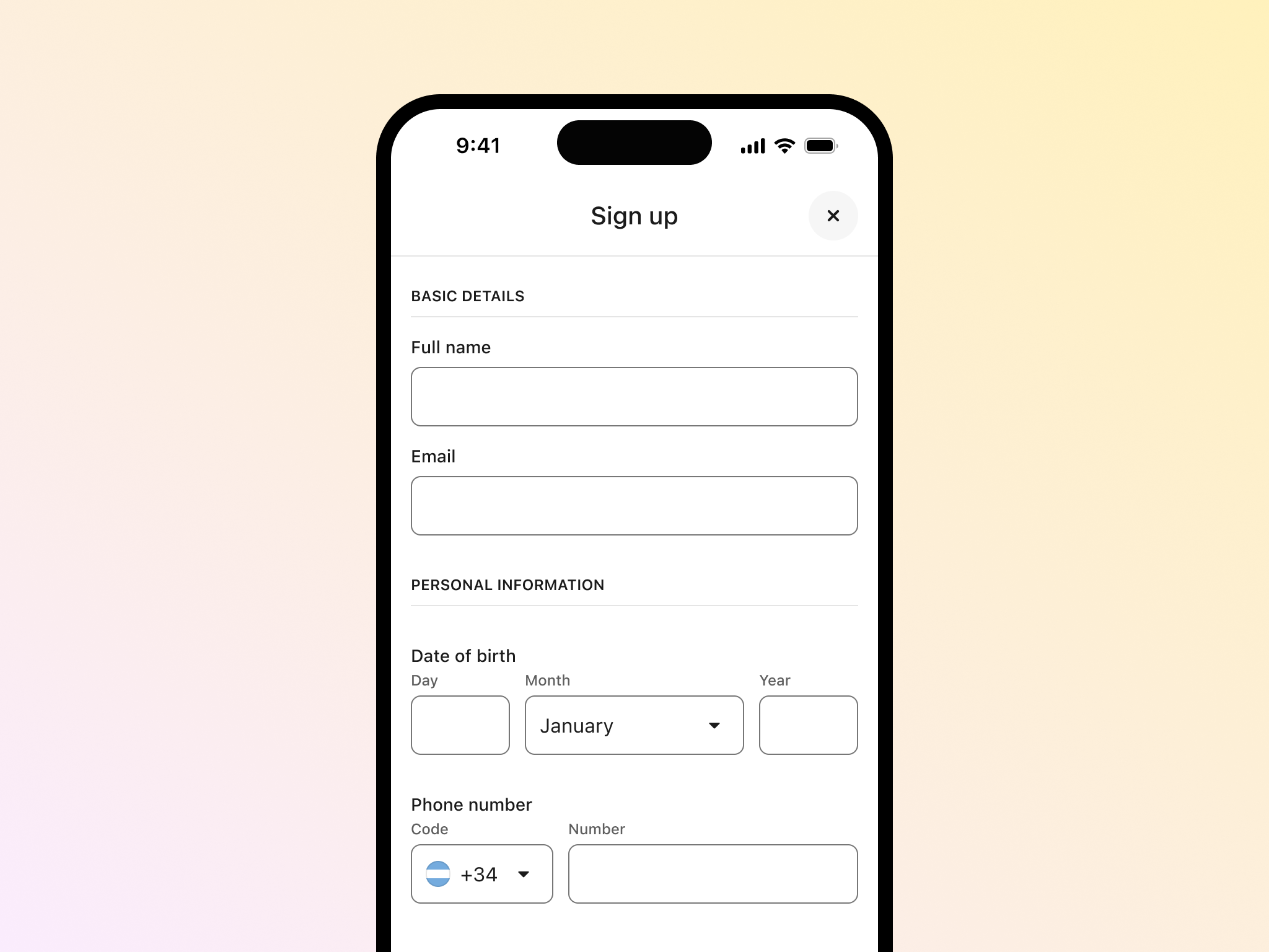
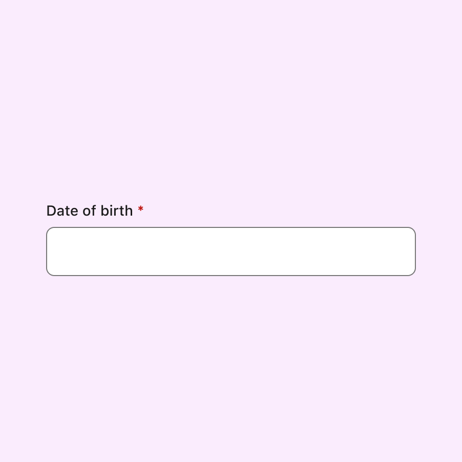
In the following image, there’s a long form with no visual indication of which fields are mandatory or optional, leaving the user to figure that out.
To address this, we can use a clear visual indicator that the field is required. When placed close to the label, these visual cues help users understand what is required (or not) before submitting the form.
The most common method for mandatory fields is to add an asterisk next to the label. To make this even clearer, you could also include the word “required” or a legend explaining what the asterisk means.
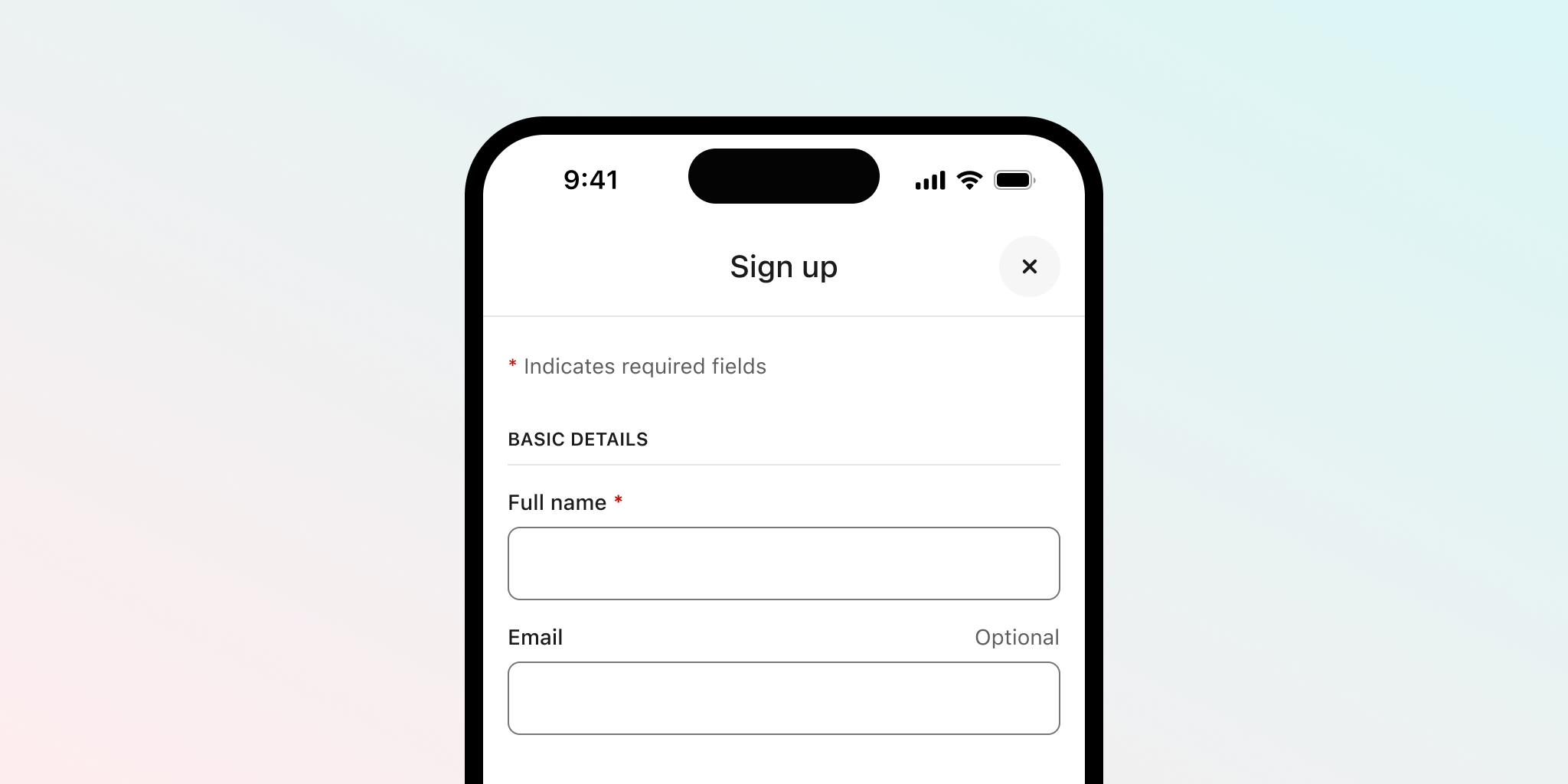
For optional fields, a straightforward approach is to include the word “optional” next to the label. It might be tempting to omit this information and assume users will infer that unmarked fields are optional. However, this assumption could lead to confusion.
Better still, consider whether optional fields can be omitted altogether from your forms.
Related criterion
Use meaningful labels
Labelling inputs appropriately helps manage expectations, as different users may have different ideas of how to enter information. Meaningful labels not only guide users but also help structure the form so that the data entered matches what is expected.
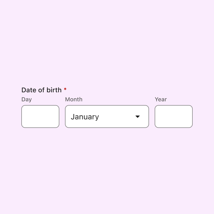
An input field labelled simply “phone number” may be too generic and ambiguous. In contrast, a design that clearly separates the country code from the number, with each field labelled accordingly, leaves no room for confusion.
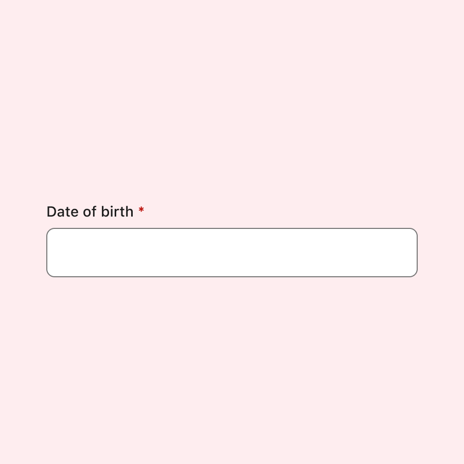
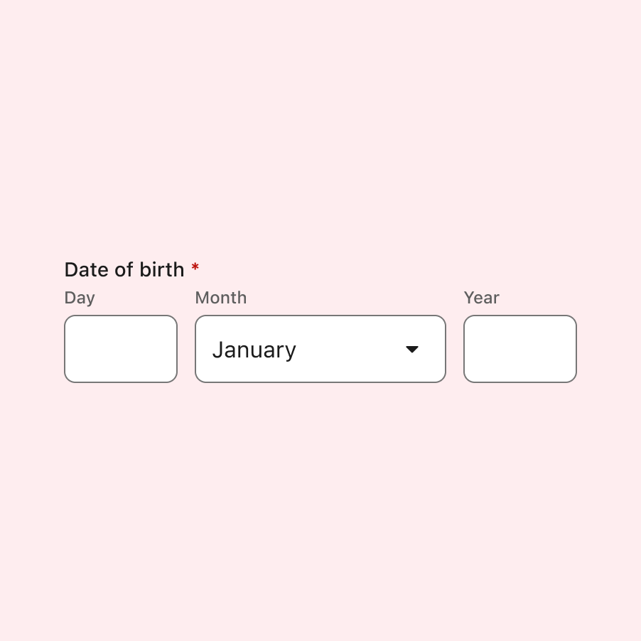
A similar issue arises with date input components, as users from different regions and cultures input dates in different ways. A generic label would lead to unexpected results. However, labels that are meaningful and well-structured guide users on how the data should be entered.
Some might argue that a placeholder could help in the first case, but as we’ll see next, placeholders can often do more harm than good.
Related criterion
Avoid placeholders
Placeholders—text inside an input box providing sample information—are often problematic despite good intentions.
Placeholder text is frequently unhelpful, either because it is too obvious or redundant, adding nothing the user does not already know. In other cases, placeholder text is so faint that it fails to meet accessibility contrast requirements.
At times, users mistake the placeholder for pre-filled information and assume they need not do anything.
Another issue with placeholders is that they typically disappear once the user starts typing, which defeats their original purpose—providing help when users need it most.
Additionally, placeholders are not well-supported by assistive technologies, such as screen readers, and are not displayed in older browsers.
For all these reasons, it is generally recommended not to use placeholders at all, leaving the input box as clean as possible. When guidance is needed, provide the information outside the input field.
There are exceptions, such as search inputs and select inputs, where other icons or visual elements indicate the functionality. However, even these cases should be handled with care and not overused.
Provide contextual help
While placeholders may not be ideal, this doesn’t mean you should eliminate user guidance altogether. Users with cognitive disabilities, in particular, may benefit from additional help when completing forms.
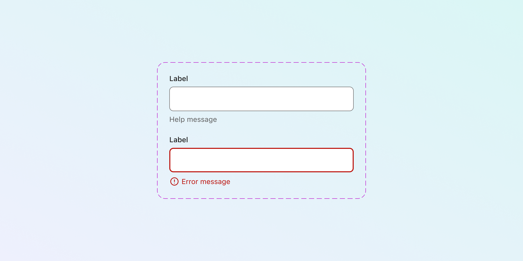
A simple way to provide this help is by including a line of explanatory text above or below the input field, guiding users on what is expected.
Placing help text close to the field ensures it is contextually relevant, increasing the chance of success. This works particularly well when paired with a meaningful label. The image below shows a clear help message placed below the field.

Help text should be used sparingly, as too much information can clutter the UI and overwhelm the user, undermining its purpose.
Related criterion
Communicate errors clearly
Especially in longer forms, it is crucial for users to understand which fields contain errors and need correction. Forms that fail to indicate required fields or provide clear error messages increase user frustration.
A common mistake is using only red to highlight input errors. This is insufficient, as users with colour blindness may not notice the errors. Accessibility standards recommend not relying solely on colour to communicate errors.
Many designs I’ve encountered indicate errors with a subtle colour change that easily gets lost in the interface.

To fix this, use a combination of colour, text, and icons to highlight fields with errors. This multi-layered approach ensures that errors are communicated clearly.
The image below leaves no doubt as to what error is preventing progress and how to fix it. The design uses both colour and an icon.
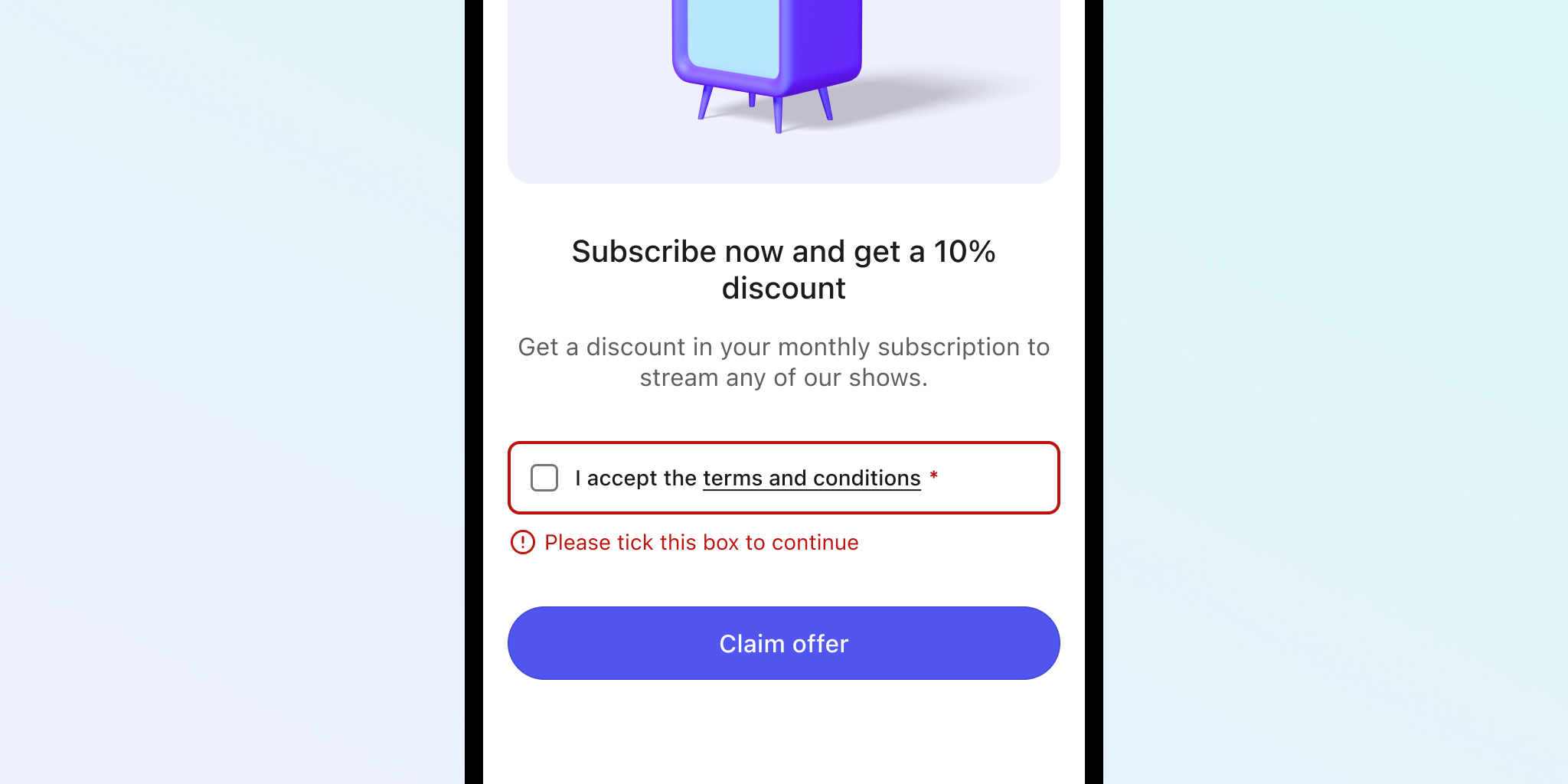
In addition to visual cues, error messages should be concise and informative, explaining the problem and suggesting a solution. Always use straightforward language to enhance clarity and accessibility.
Related criteria
Maximise affordance
If you’ve been designing long enough, you may remember when Material Design used text inputs marked by a thin line, a trend that made inputs harder to identify. Many websites and apps adopted this style, and some still use it today.

At Wise, we replaced similar designs with full-boxed inputs after discovering through user testing how difficult they were to spot—especially when surrounded by non-interactive elements with a similar design. Google also seems to have recognised this, as the current Material Design input fields are much clearer.
Using a box for inputs maximises visual affordance, making it easier for users to identify input fields in a complex layout. While the designs in the image place the label inside the box, you can choose to locate it outside.
Use appropriate colour contrast
According to the A11Y Collective, “poor colour contrast is one of the most common web accessibility problems,” making it harder for all users—not just those with disabilities.
As mentioned earlier, input field placeholders often have inadequate contrast, which can be remedied by removing the placeholder altogether.
Other elements, such as labels, borders, backgrounds, and icons, must also meet specific contrast ratios to ensure accessibility and usability.
- Text: 4.5:1 (AA)
- Icons: 3:1 (AA)
- Borders: 3:1 (AA)
Decorative icons, which are not essential for understanding, are exempt from these requirements. However, borders and backgrounds must meet contrast guidelines.
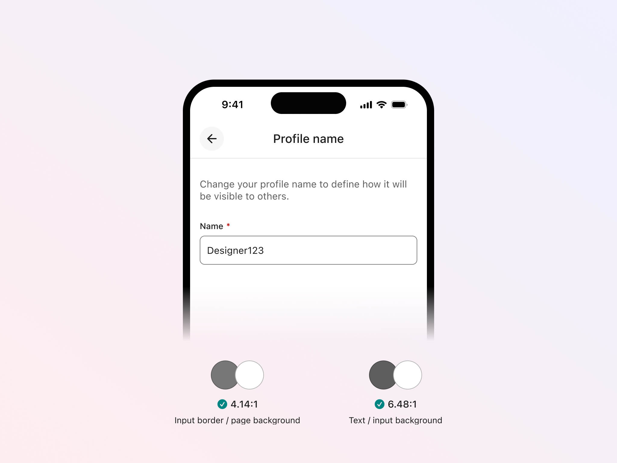
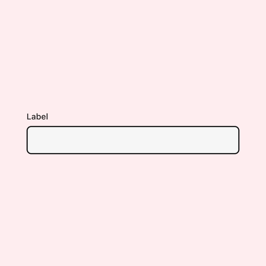
A note on borders
Borders increase visual affordance by helping identify inputs, which is especially beneficial for people with cognitive disabilities. Full borders perform better than single lines, as we’ve seen before.
The border’s contrast is measured against the page background, not the input background. However, you must also ensure that the input text has sufficient contrast with its background.
In the image below, the border of the input has adequate contrast with the white page background. The text also has good contrast with the input background, meeting the required criteria.
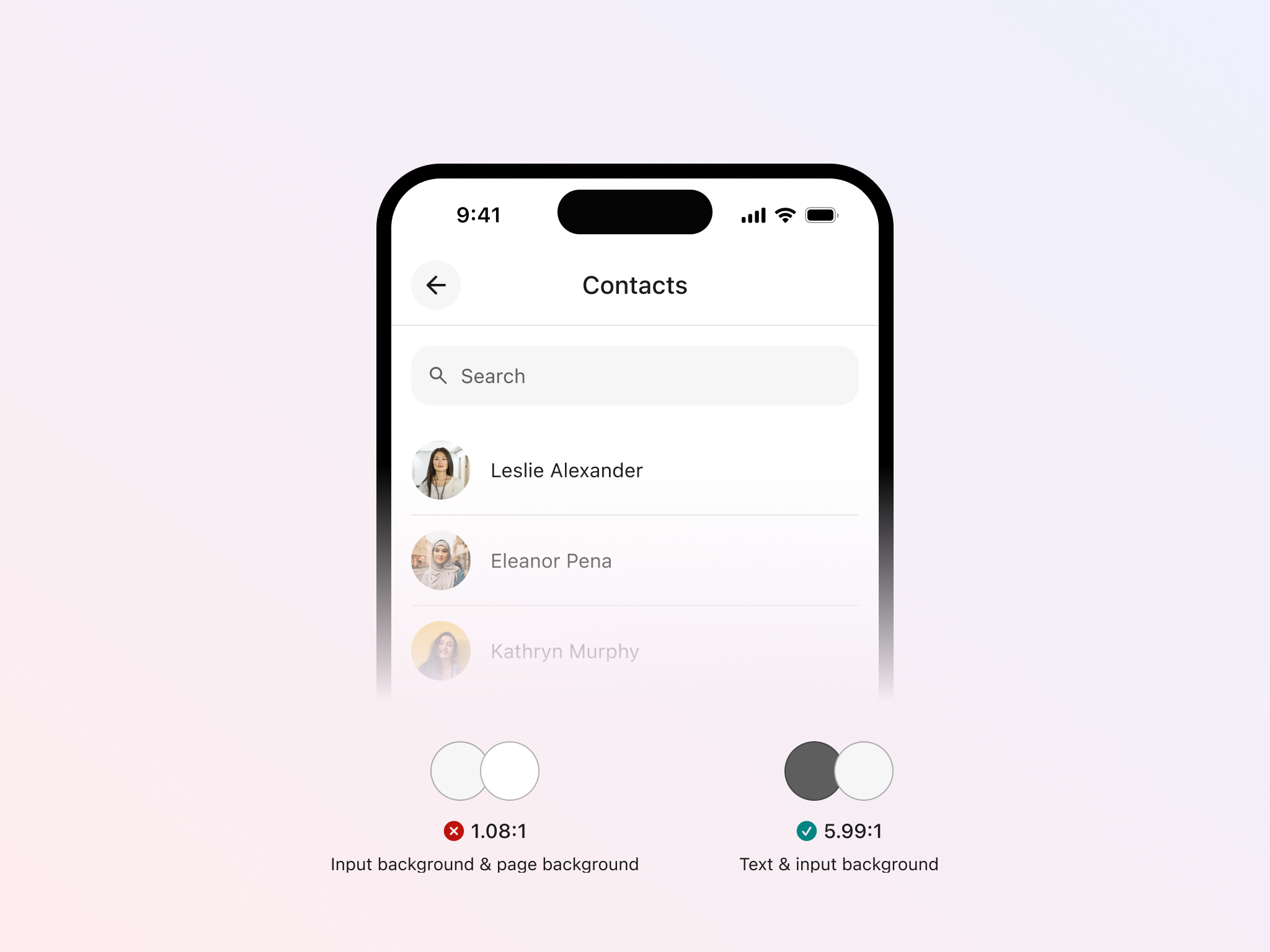
Another scenario involves inputs with no visible borders. In this case, the input’s background must have sufficient contrast with both the page background (3:1) and the input text (4.5:1).
In the image below, the search field is very faint and lacks contrast with the background, failing to meet requirements.
Finally, when an input has a border visible over light backgrounds (image on the left), but it blends into the background due to similar luminance (image on the right).
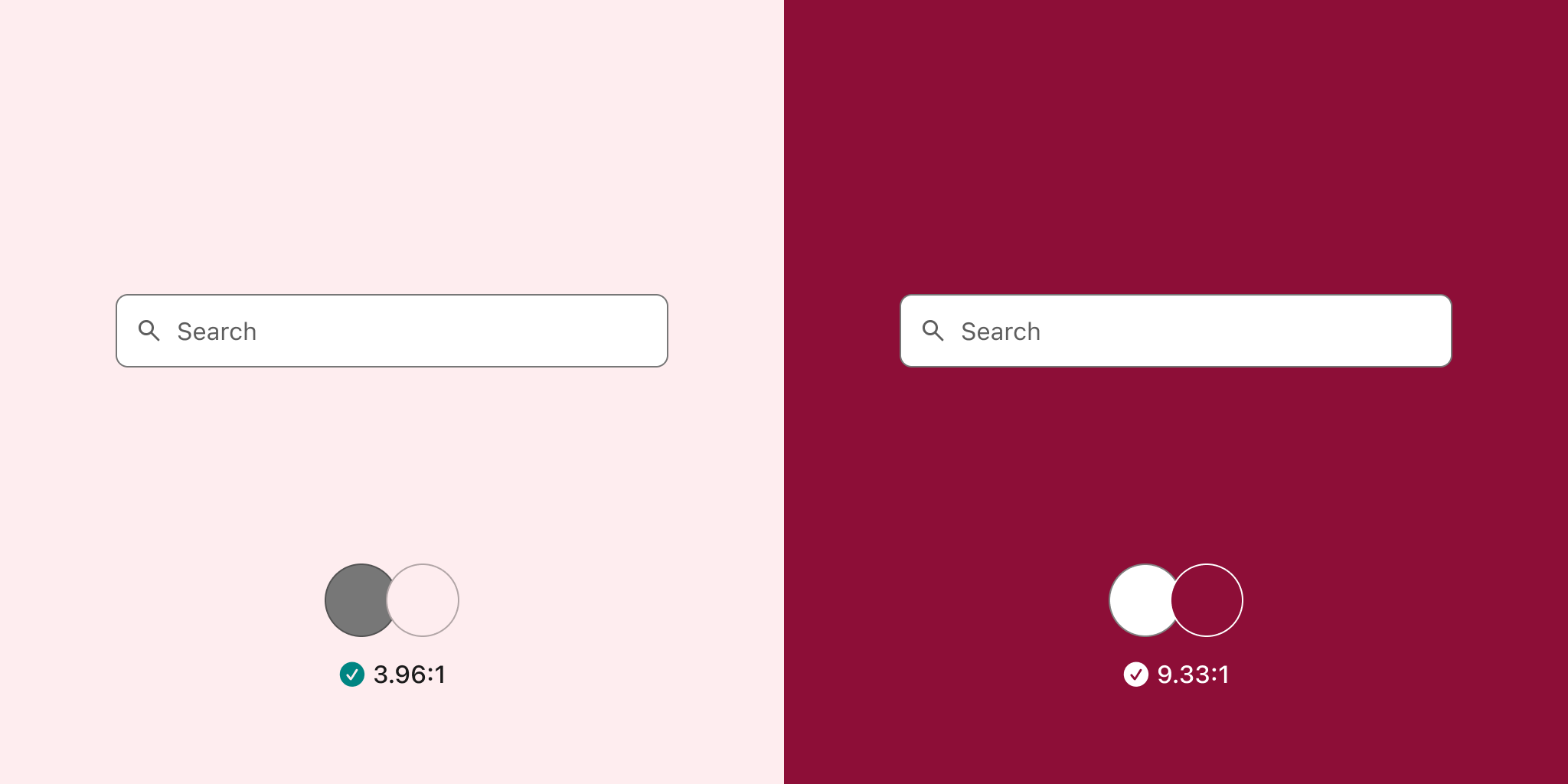
For cases like this, WCAG accessibility guidelines recommend ignoring the contrast between the input border and the page background, focusing instead on maintaining a minimum 3:1 contrast between the input background (white in this case) and the page background.
Related criterion
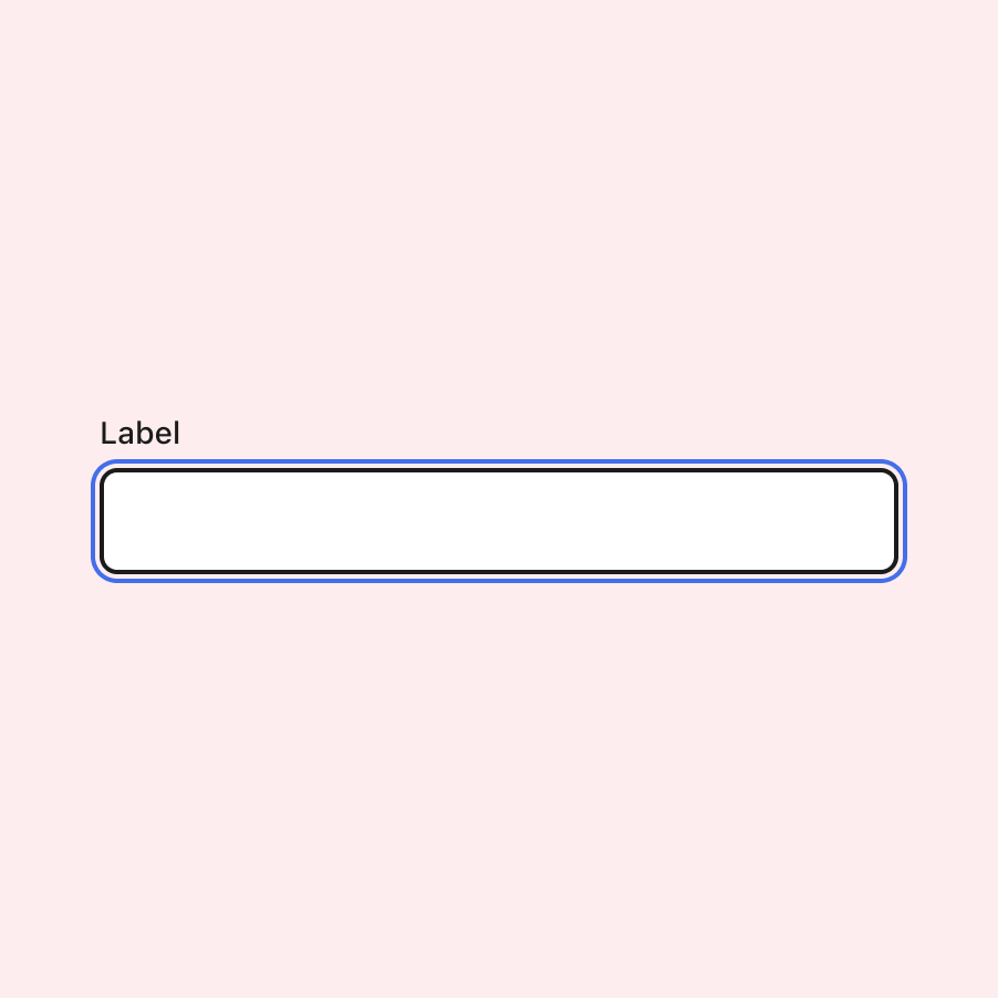
Clear and visible focus
A focus state indicates when a component is ready to be interacted with. A well-designed focus state is crucial for users who rely on assistive technologies or keyboard navigation.
For inputs, designers often include this state because it shows when the user is typing in the field. However, it’s not always necessary to create your own version, as browsers generally handle this.
If you choose to create a custom focus design, there are a couple of approaches to consider. WCAG guidelines state that a visible caret (or cursor) on focus is sufficient, but we can go beyond that.
Below, you’ll see two inputs in focus state, each using different approaches. The one on the left uses a thicker line and slightly alters the background colour while maintaining good contrast with the text and icons inside. The design on the right adds a focus ring surrounding the field. Both approaches meet accessibility requirements while offering different visual styles.
It’s essential that the focus state remains visible regardless of whether the background is light or dark. One technique you can use is a double border.
In addition to the focus ring shown earlier, an extra white outline can contrast against dark backgrounds. This acts as a “backup” for instances where one of the focus rings doesn’t meet contrast requirements.
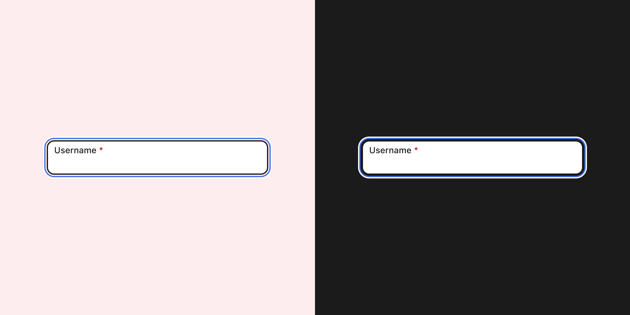
When designing focus states, ensure consistency across all components to maintain a systematic design approach. This will also ensure that other components with focus states behave consistently. Most importantly, the focus should always remain visible in all scenarios.
Related criteria
- 2.4.7: Focus Visible (Level AA)
- 2.4.11: Focus Not Obscured (Minimum) (Level AA)
- 2.4.12: Focus Not Obscured (Enhanced) (Level AAA)
- 2.4.13: Focus Appearance (Level AAA)
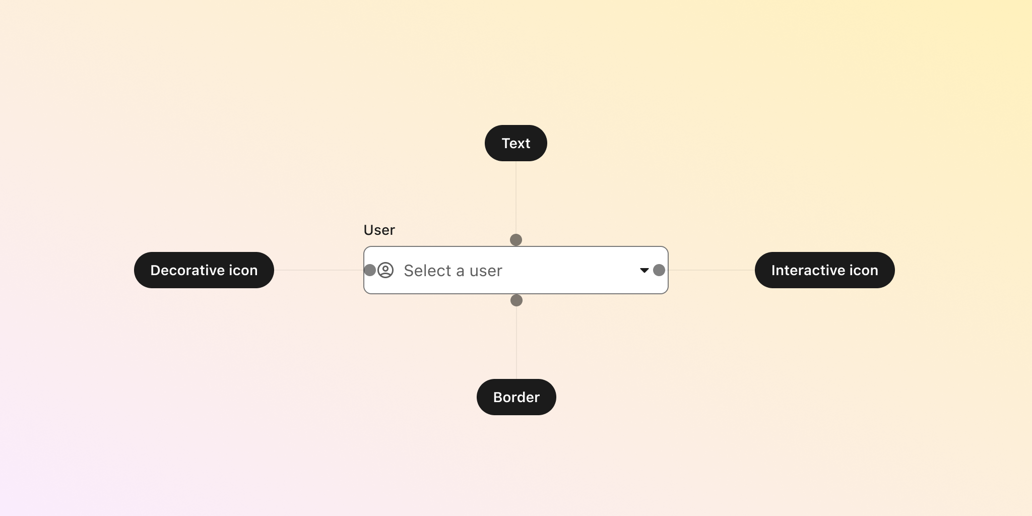
Designing an input in Figma
Many of the considerations mentioned can be applied when designing your components in Figma. Below, I’ll outline some suggestions for designing and structuring a text input component that adheres to these recommendations.
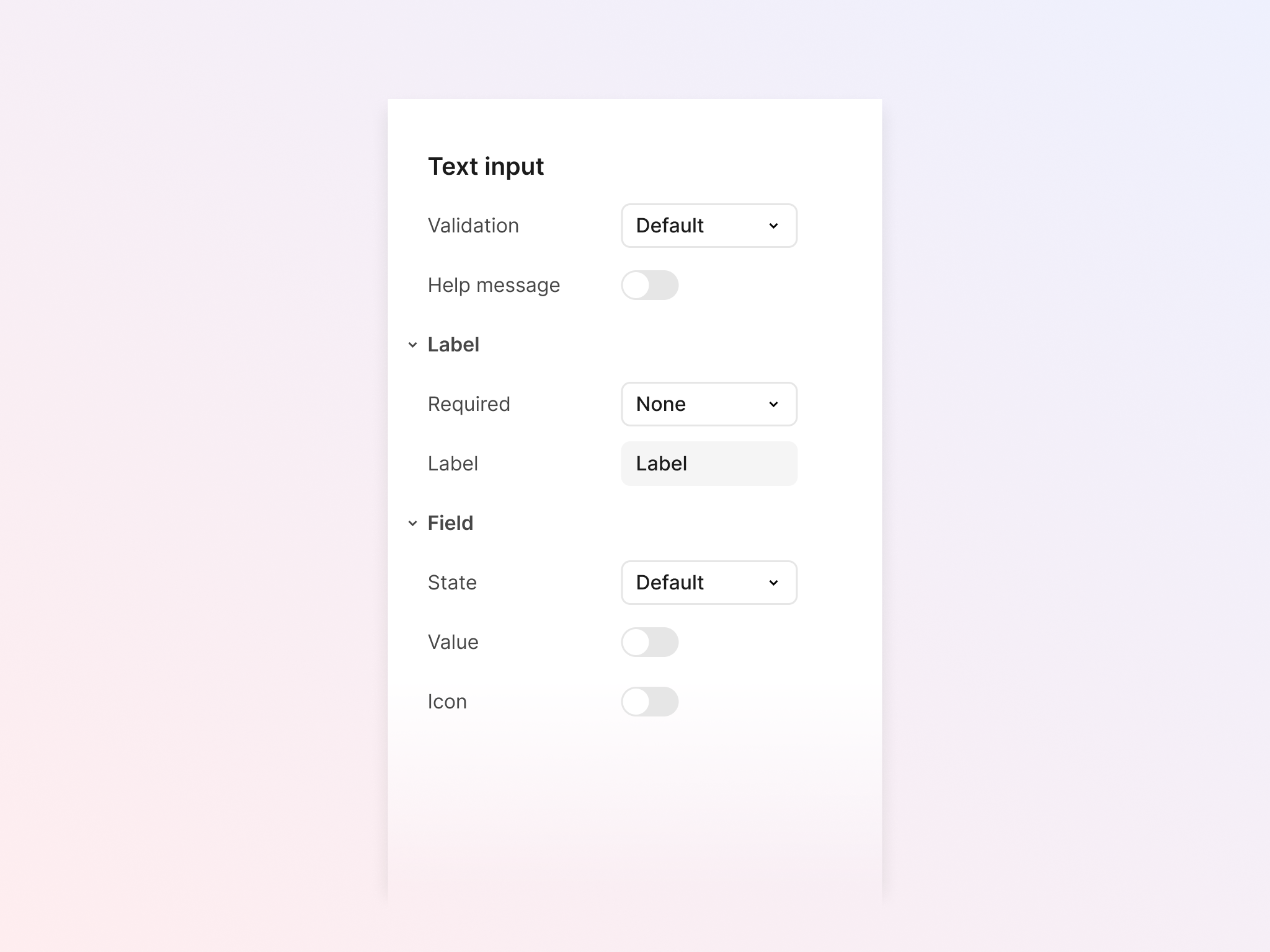
To achieve both flexibility and simplicity, the final text input component will include two nested components: a label and a field.
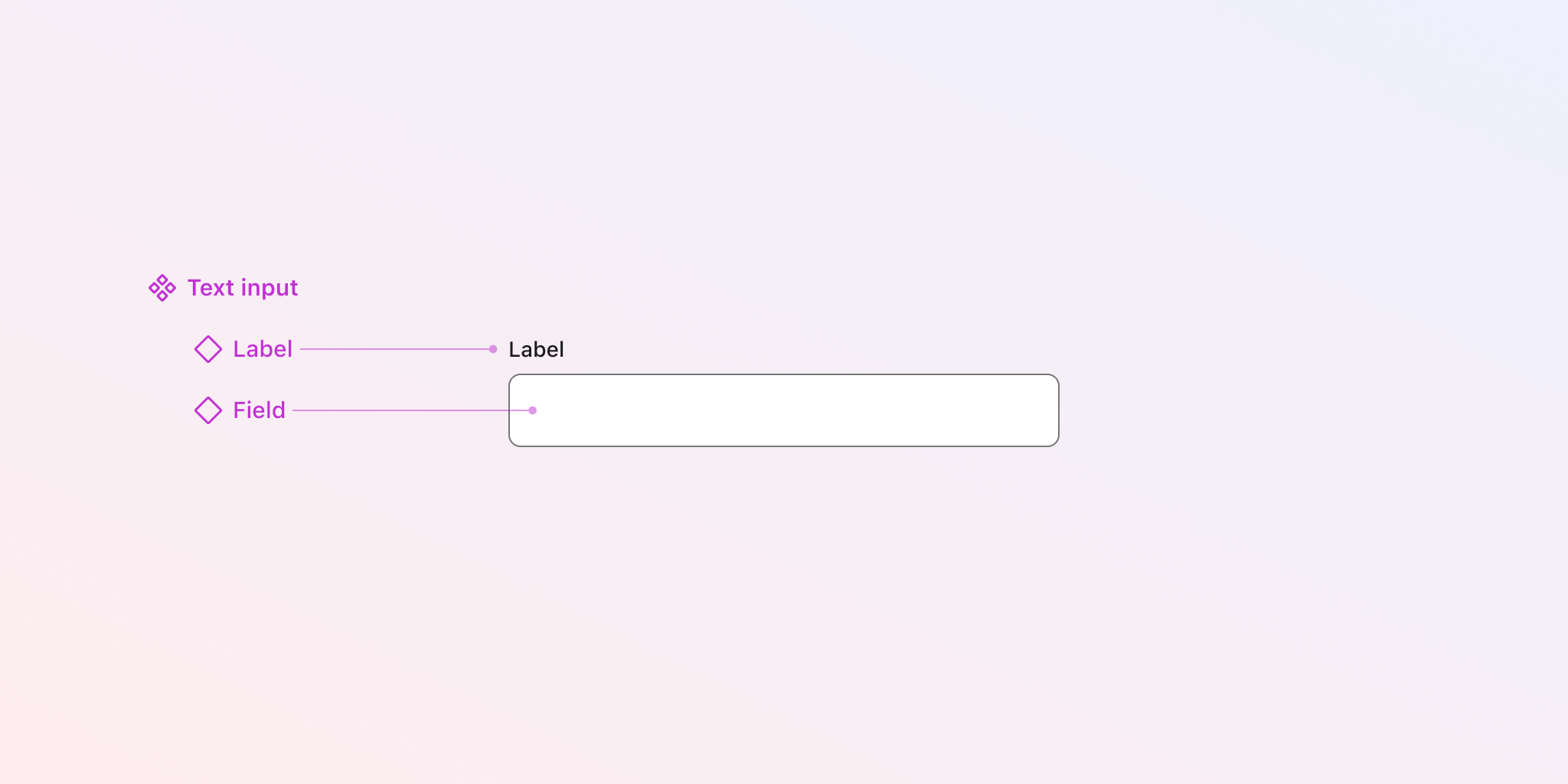
Allowing the main component to manage nested variants will enable you to create various outcomes while keeping the main component simple.
Label
The label must indicate whether the input is required. The design is relatively straightforward: it will include variants for mandatory fields (with an asterisk), optional fields (with the word "optional"), and specific cases where no indication is necessary (e.g. single-field use cases).
Base field
Next, design the base input box. This will become more complex as you consider various use cases.
The main variants will account for its different states: Default, Focus, and Disabled. You can, of course, expand this to include hover and other states as needed. Note that there’s no design for error here, as this will be part of the main component instead.
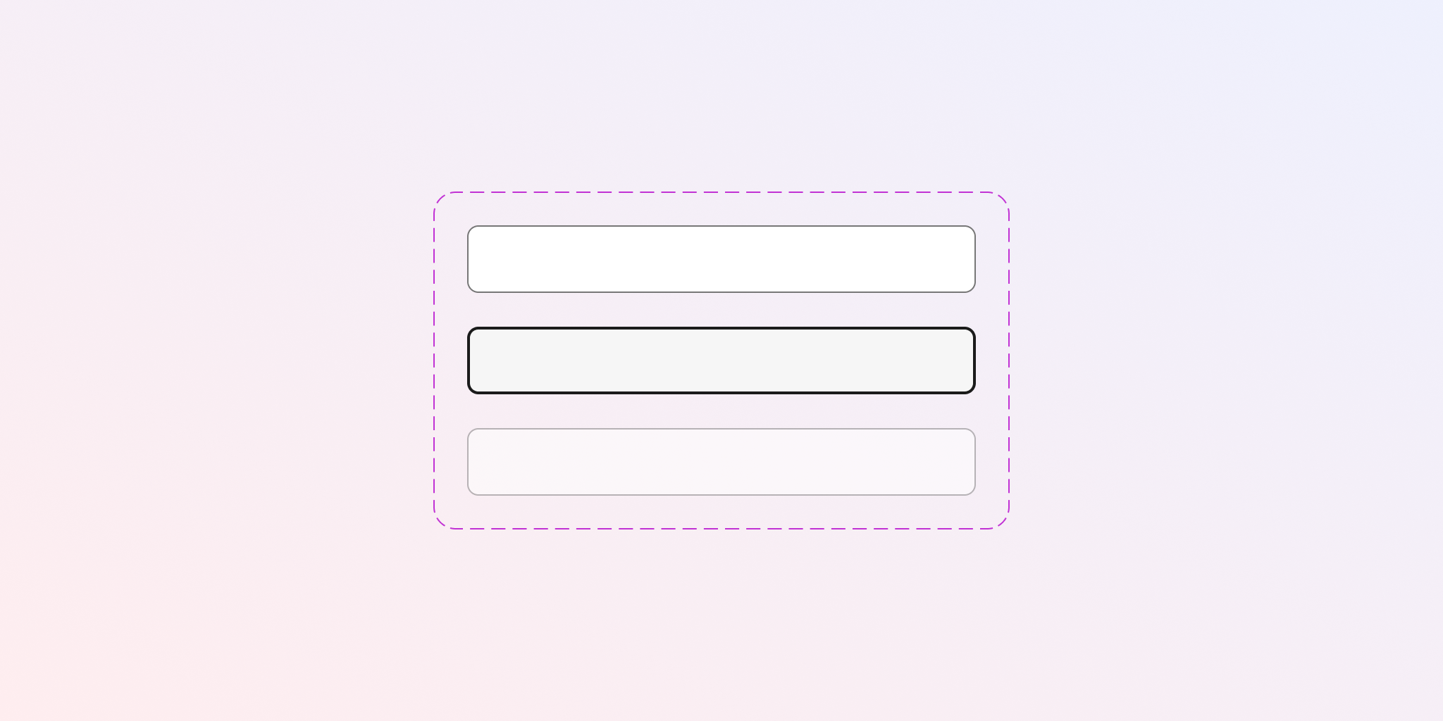
However, that’s not everything. Boolean layers will be used to hide and show layers — such as filled values and icons — without needing to create another variant. This method is useful for maximising the potential outcomes and accounting for different scenarios while maintaining component simplicity.
Remember, we are trying to avoid the use of placeholders as much as possible, as they are not a best practice for accessibility and usability.
If you need boxes of different sizes, you’ll have to create additional variants, though this will increase the complexity of the component.
Main component
To create the main component (the one that will ultimately be inserted into designs), combine the label and input box into a new component. The main variants for this component will refer to validation, including the default and error states.
While the information message below the field may or may not be visible by default, using a Boolean layer here will allow it to be hidden when not necessary, without needing to create another variant.
Before wrapping up, review all components to ensure that:
- Text properties are used in text layers to make text content easier to replace.
- Instant swap properties are used to replace icons.
- Boolean layers are applied to optional elements, allowing them to be hidden or shown.
- The main component has “nested properties” enabled, for easy access to customise the label and field components from the main instance.
You can also refer to Figma components checklists, which contain numerous recommendations for designing your components.
Here’s what the final instance should look like in the properties sidebar when selected. You can see a clear separation of the different parts of the component (such as label and field), with the option to change their properties directly from the main text input.
There are, of course, many different ways to achieve the same result. What I’ve suggested here aims to strike a balance between simplicity and ease of use, keeping the participating components simple to maintain. This is made possible by leveraging Figma’s features and following a methodical and organised way of working.
Inputs are one of the more complex components due to the various scenarios we need to design for.
Structuring variables in Figma
One final optimisation for our components is the thoughtful use of variables. An approach could involve creating base or generic variables in one collection. Then, a second collection with semantic variables would reuse those “raw” values as variable aliases (variables linked to others).
The semantic layer gives purpose to the variables, indicating specific contexts or use cases.
Finally, a collection of component variables allows for more component-specific variables, which can reuse either base or semantic variables for cases related to a particular component or group of components.
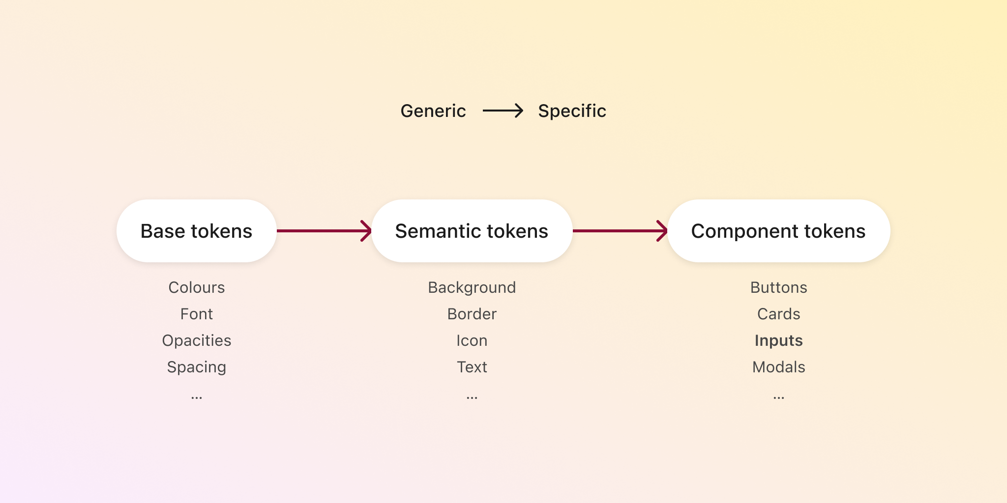
By creating a collection for input components, we can create shared values to be reused by all similar input components, such as selects, text inputs, search inputs, and so on.
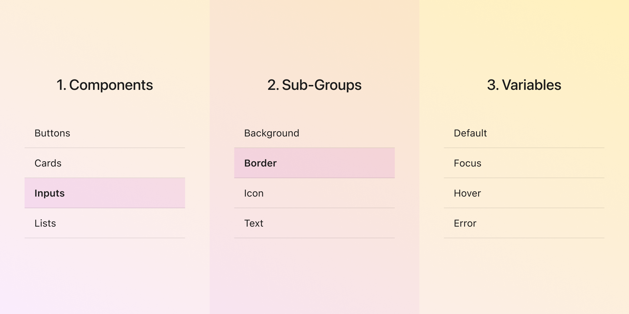
Within this component tokens collection, we can create groups for each component and subgroups within inputs for different categories. We can then create a family of values that apply to different scenarios for a single part of the input.
In the image below, you can see variables created for different states of the input border, making it easy to select the correct value when creating input components.
If you’re not yet familiar with design tokens and how variables work in Figma, please check the links below for more information and tutorials on these topics.
Summary
I hope you found these points useful and can apply them immediately to your component designs. To make things easier, here’s a checklist summarising the key considerations:
- Indicate whether fields are required or optional.
- Use meaningful labels.
- Avoid using placeholders.
- Provide contextual help.
- Communicate errors clearly, and avoid relying solely on colour.
- Use appropriate colour contrast.
- Indicate focus clearly.
- Maximise perceived visual affordance.
Keep learning
Some links that may help you expand your knowledge in areas related to topics mentioned in the article.