

Design tokens have become increasingly popular along with the rise of design systems. Still, they are not entirely new, and we may trace their origins to the Salesforce design system back in 2014. During this time, they have become more powerful and widespread. Nowadays, they are a fundamental part of many design systems.
What are design tokens
In the strictest sense, we can say that tokens consist of a name and a value — but as we will see shortly, they are much more than that. Tokens represent many of the visual design decisions that we make to design components, patterns, and screens.
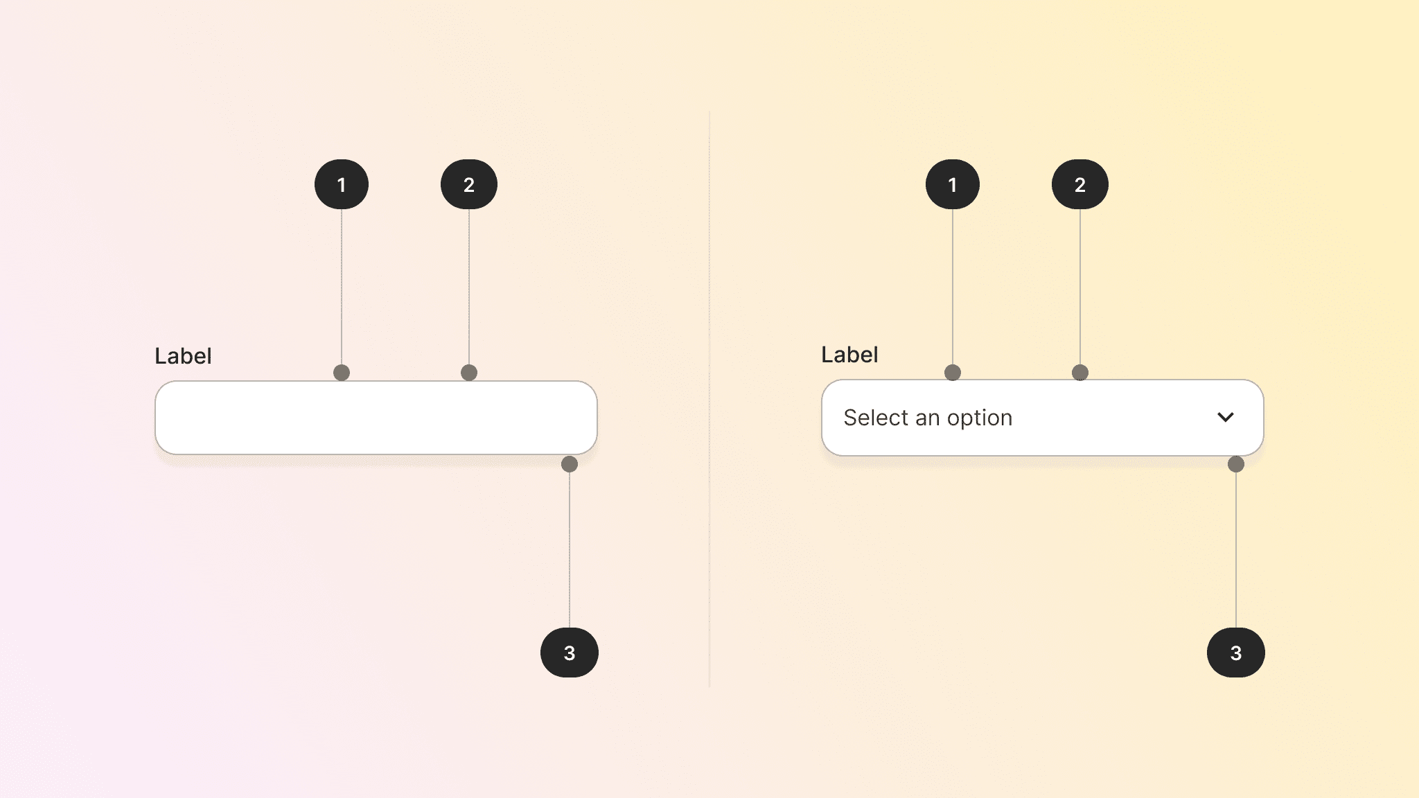
Take a look a the image below. A component quite simple as this one, already has several design tokens applied to it — and just for colour.
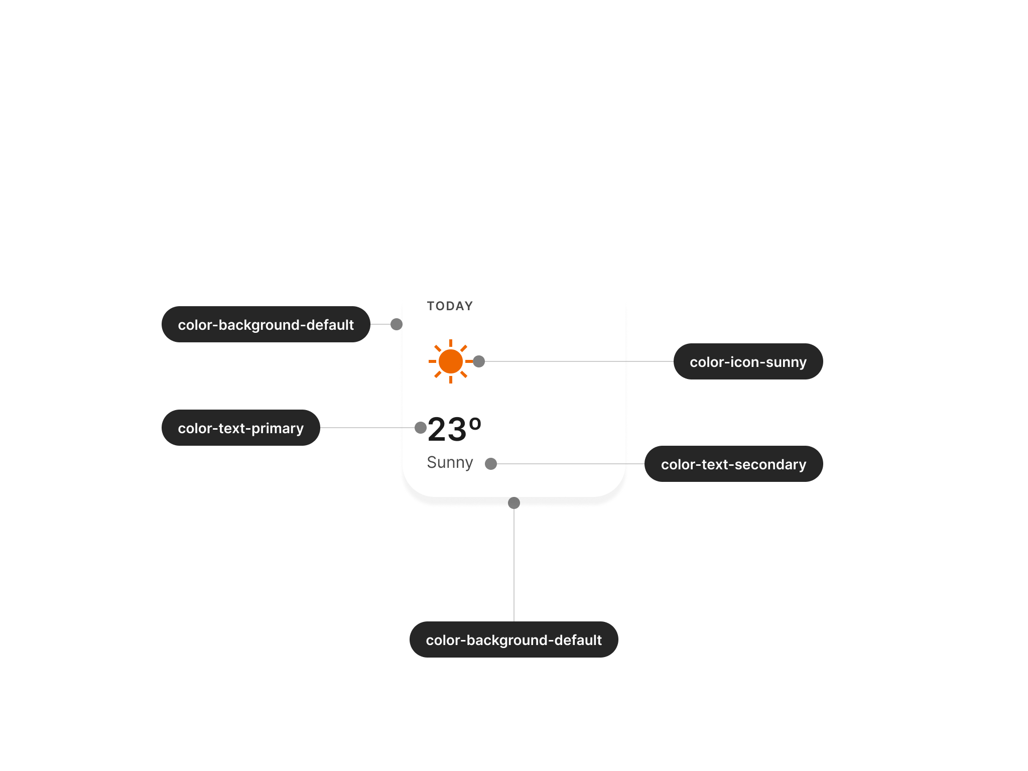
Colour is the most straightforward example, but many other visual design choices can also be implemented as tokens. Most of the common use cases involve the following:
- Spacing (paddings, margins, separation)
- Corner radius
- Font properties (weight, size, leading, tracking, etc.)
- Motion (duration)
- Product copy
- Other visual properties (gradients, shadows, opacity, etc.).
Besides a specific value as seen in the colour example, a token may also contain a type, description, and other metadata linked to it. This will give the token more context or references on how to use it.
A broader definition
If you are thinking that design tokens are just like variables, we can refer to the words from Jina Anne, who was part of the group of people who participated in their original conception as we know them today.
She said that “design Tokens are a methodology” and that limiting them to variables is “like saying responsive design is just media queries”.
With this in mind, we can already understand that tokens are more than just properties or outcomes. Let’s take a look at the W3C’s definition to have a better idea of what they involve:
Design tokens are a methodology for expressing design decisions in a platform-agnostic way so that they can be shared across different disciplines, tools, and technologies. They help establish a common vocabulary across organizations.
Let’s unwrap this definition into its main parts to make sure that the meaning of tokens is a bit clearer.
Tokens are a methodology
We should see tokens not just as an outcome but more as a way of working and scaling visual decisions that affect both design and code across products and systems.
They are platform agnostic
This is an important consideration since we need to ensure that tokens can work on the web, Android, iOS, or any other platform. While they can be later exported in proprietary formats, their origin should remain independent from platform-specific implementations.
Shared across disciplines
Despite the “design” part of the name, tokens are not only for designers. Engineers can also make use of and implement tokens, considering how they are going to be adopted by different platforms and how they will remain in sync with designs.
Benefits of tokens
Why should we use tokens after all? Before we go any further, let’s pause to consider the benefits of using tokens.
They are a single source of truth
This makes it easier to update any visual changes to different products since designers can propagate from their source to anywhere they are being used. With a proper token structure, changing a value once may impact lots of different parts of the experience.
Tokens foster design and code alignment
Tokens foster collaboration and alignment between designers, engineers, and other disciplines. As already mentioned in the W3C definition above, they also help establish a shared language so people can refer to the same thing in similar terms, reducing confusion and ambiguity.
Allow breaking designs into fundamental decisions
Design tokens are the smallest parts we can find in a design system, making the start of big projects easier to approach without yet considering more complex decisions in layout, interaction, and behaviour — that may come a bit later in the design process.
Most fundamentally, tokens align very well with the whole design systems philosophy, something that you may have already noticed from the points above.
Tokens together
While so far, we have seen tokens as just a pair of name and value, we may extend this approach to make their structure a bit more semantic — and specific. That means providing tokens of a clearer intent depending on where and how they will be used.
Alias tokens
We said that tokens essentially contain a name and a value. This is the moment to expand on that idea and mention that the token’s value may be another token. Consider the following example:
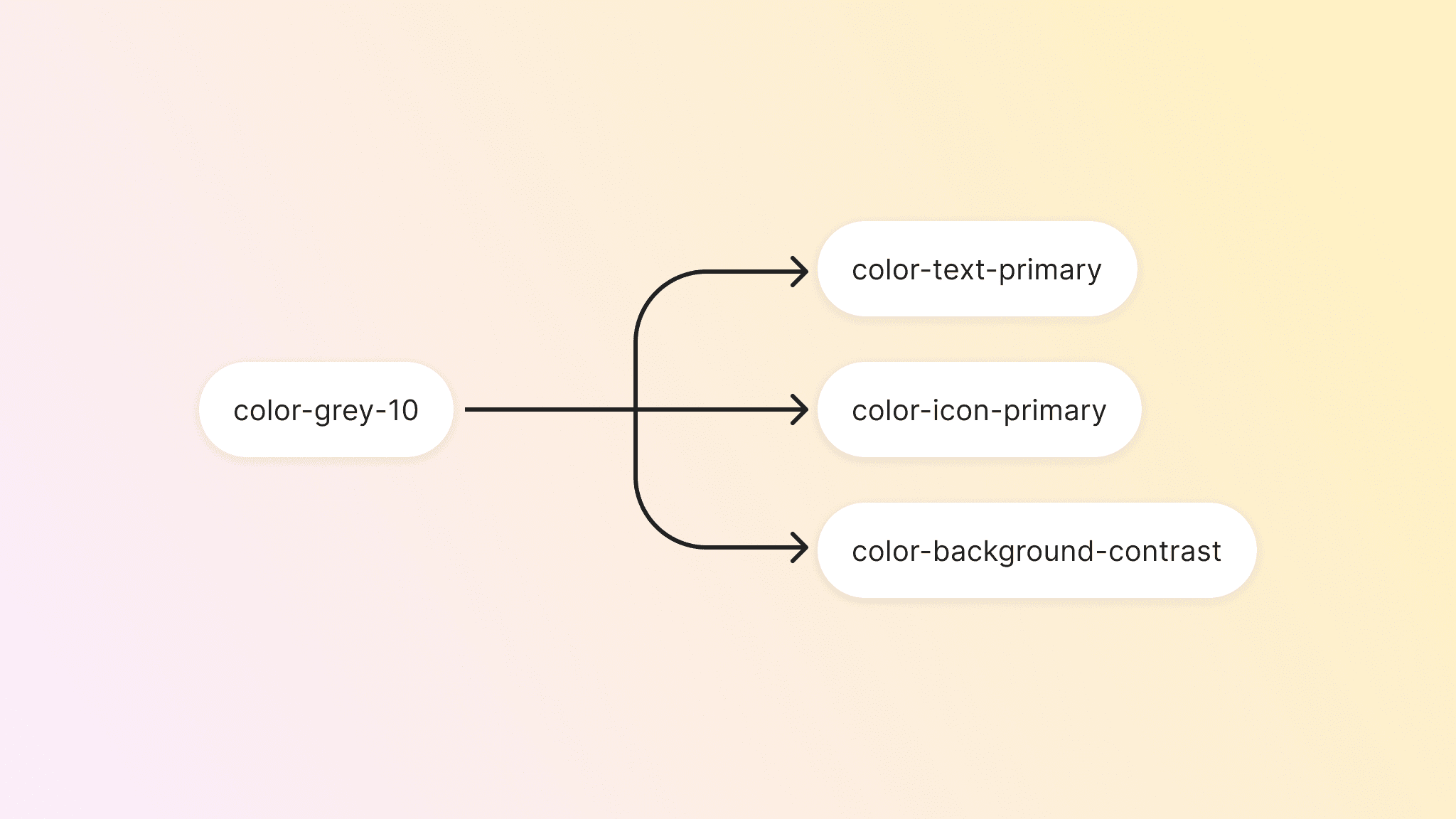
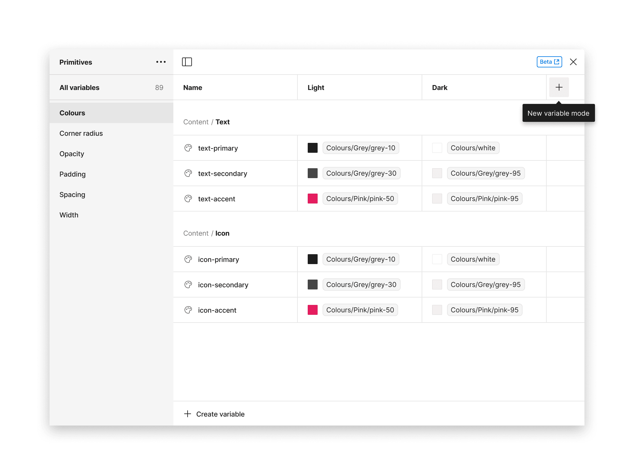
$color-grey-10: #1b1b1bThis gives you the HEX value of the token, but just by taking a look at it, it’s difficult to imagine where and how to make use of this token. If instead, we “embed” this token into another with a more semantic name, its intention starts to become clearer.
$color-text-primary: $color-grey-10When you use this approach, the base or original token is often called a “primitive” (also “global” or "base" token), whereas the token that includes that primitive —color-text-primary— is usually referred to as an “alias”.
Of course, you can replicate this approach to continue using the same primitive inside other aliases. For example:
$color-text-primary: $color-grey-10
$color-icon-primary: $color-grey-10
$color-background-contrast: $color-grey-10
On the image below you can see that all these semantic tokens are using the same primitive. That also means that if you would like at some point to change the value of the primitive, the change will impact the alias tokens using this value.
And since, at the same time, those semantic tokens should be used in components and screens, the update will quickly propagate to all screens using these tokens.
Composite tokens
Alias tokens provide a semantic layer to primitives, making them easier to understand and use. We can take this to another level of complexity —and specificity— by grouping several related tokens together, under the same token.
Tokens that include multiple other tokens are called “composite tokens”. A perhaps clear example of that is a type token. When you need to think about how a text element like a heading will look like, that usually involves several small decisions — or tokens.
Let’s take a look at the example below:
heading-1
  value:
    font-family: $font-family-main
    font-weight: $font-weight-medium
    font-size: $font-size-1
    font-leading: $font-leading-2
    font-spacing: $font-spacing-1
Since everything inside the value is also other tokens, it means that we can have many composite tokens that are very modular in the way outcomes may be produced.
Use cases
So far we have discusses what are tokens, their benefits and how they are structured in primitives, semantic and composite tokens. Next, we will discuss some practical applications of tokens in product design, for you to start visualising all these concepts in a perhaps more familiar way.
Since we said that tokens are "visual design decisions", that means that we can use them practically everywhere in our interfaces. Here are some of the most common use cases.
Components
Components are one the best vehicles to distribute tokens. In there, we can apply semantic tokens to the different parts. And usually, we have more of these decisions that we can think of. A simple component may already have tokens for corner radius, padding, background and more, as seen in the example below.
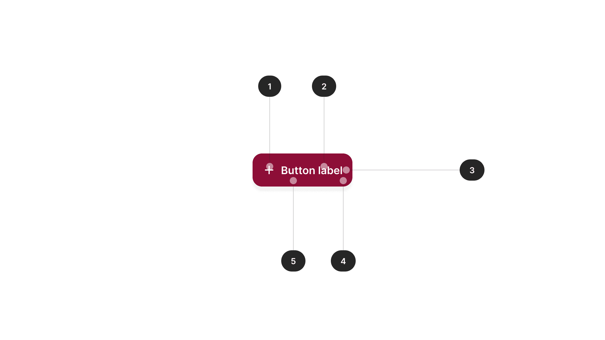
| # | Element | Token |
|---|---|---|
| 1 | Icon | $color-icon-contrast |
| 2 | Label | $color-text-contrast |
| 3 | Padding | $padding-16 |
| 4 | Corner radius | $corner-radius-16 |
| 5 | Background | $color-background-primary |
Component-specific
Creating token-specific components can also be an option. For example, for a button component you may have the following set of individual tokens that apply to each one of main aspects of the component.
button-primary-color-border
button-primary-color-background
button-primary-color-label
button-primary-text-label
However, doing this with every component may soon clutter your tokens libraries — undermining the initial proposition of making tokens easier to discover and use. Nate Baldwin mentions in his article the cons of over-creating tokens and bloating the system. So, by following this component-specific approach, it seems to be best to do it with moderation to keep its benefits.
Component groups
Another possibility is define specific components for groups of components that share the same characteristics. For example, if we know that all form elements (such as inputs, drop-downs, radio buttons, etc.) will share the same visual characteristics, creating semantic tokens specific for a family or group of components may help keep a consistent implementation.
| # | Element | Token |
|---|---|---|
| 1 | Border | $input-border-default |
| 2 | Background | $input-background-default |
| 3 | Corner radius | $input-corner-radius |
Between UI elements
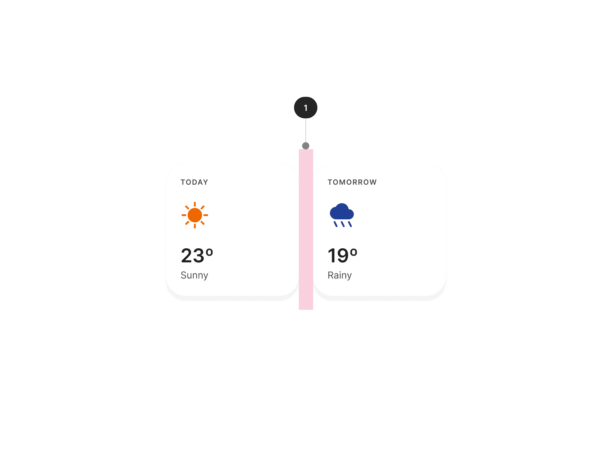
Another application for tokens beyond component is using them to separate UI elements that should otherwise follow guidance. This is the case when we have a series of components that are next to each other, for example. This is what Wise's design system proposes for the case of chips, following use cases similar to the one in the image below.
| # | Element | Token |
|---|---|---|
| 1 | Spacing | $spacing-horizontal-between-widgets |
Any other UI element
Finally, you can of course apply tokens to any other UI element that is not a component. In these cases, as in creating custom components, it's always best to follow examples of applications and components found in the design system, to keep a consistent approach. This way, end-users of our products shouldn't feel the difference of what behind the scenes are o are not components from the system.
Naming conventions
One interesting aspect of using tokens is how they are named. This is what really unlocks the potential of primitives, alias, and composite tokens. If we have tokens that are not properly named, they may be difficult to understand, use, and scale — undermining their main benefits as we have mentioned before.
While this is a topic more complex than it might initially seem, we’ll touch a few basic examples in this post to help you get started — without getting too much into the weeds of naming conventions.
Before we go further, please consider that there’s no single way of naming tokens. Different teams use different approaches. So there’s no single right answer.
Base names
Primitive tokens are perhaps simpler to name because they are abstract tokens that are meant to be reused as part of more semantic names. This being so, their names often offer a pair of what kind of property it is, and a second name part that positions that value in a larger scale — of sizes, shades, and so on.
It may be a good idea to start here when naming your tokens, before deciding how this is going to scale to cover different use cases:
color-blue-50
spacing-24
While these two examples are quite simple, they already start to offer a glimpse of how a structure may unfold. You may expand and adapt this as needed to cover different use cases. Note that the name is closer to the actual value of the token, than where or how this should be used — as opposed to semantic naming.
Semantic names
The goal of semantic tokens is to add a layer of intent to primitives. This starts making a semantic structure become more complex, since it also needs to become more informative and contextual — or, in other words, specific.
An example like the one in the image below already gives us more information than a primitive on how to use the token:
color-text-primaryHowever, in real-life scenarios, we usually have more complex considerations that may make this name become longer — but at the same time, more specific and purposeful. Consider the following example:
color-text-feedback-error-enabled-on_lightIf you read this, you can probably guess that this token is a color, used for texts that are part of error messages. The name also implies that it is used for enabled states on a light mode.
By deconstructing this example, we can come up with a structure similar to the one mentioned in the image below.

That is only an example of a possible structure. Structures can be different depending on the token type, and you don’t always need to include all possible levels.
Naming summary
There's a lot to talk about names — so much that this seems one of the favourite topics of any design system designer, perhaps including myself. What's we need to remember is that whatever approach you follow, it’s important that your team agrees on it, that everyone understands it, and it's followed and implemented by everyone in the same way.
Please make sure to check the additional resources below for links with more complete information on how to name tokens.
Tokens in Figma
If you are a Figma user, you have probably already connected much of this with the native variables feature they offer. Make sure to check the Variables in Figma tutorial to understand more about how they work.
Here’s a summary of how to start using a tokens approach in Figma:
- Variables allow you to create reusable values that can be then published as part of a shared library, to be used by different teams across different products.
- Figma also allows you to create alias tokens, which allows you to replicate what we have mentioned above — nesting one token inside another.
- Composite tokens can be achieved using styles. For example, a text style allows you to use variables to its main definitions such as name, size, weight, and more.
Variables in Figma also allow groups, collections, and modes. This allows for a more specific organisation that will help you separate primitives from semantic or component tokens. You should also be able to replicate naming structures as the conventions examples mentioned before.
Managing tokens
We are going to pick up again on some concepts that we mentioned at the beginning of this article. We said that according to that, tokens should be platform-agnostic so that they can be shared across different disciplines.
The other thing we need to keep in mind is that tokens should be easier to update, so we should keep them in one central place where all the rest of platforms and tools can pull them from — including Figma.
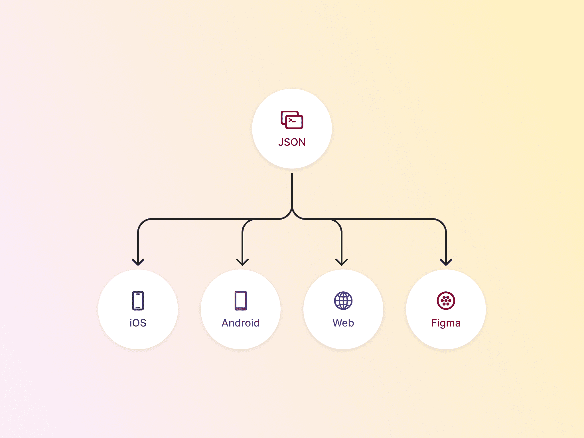
A JSON as the source of truth
One possibility to manage tokens is to store them in a JSON file, from where they can be distributed in other more specific formats. JSON is a popular open format to interchange data.
This is how a token could look like defined in a JSON file:
{
  "color": {
    "background": {
      primary": { "value": "#fff" },
      "secondary": { "value": "#ccc" }
    }
  }
}
Style Dictionary is one of the alternatives to keep tokens in a JSON format stored in a central place. Using it, tokens can be defined once and then exported to the specific formats that Android, iOS, and the web can use to consume them.
Figma could also pull tokens from this JSON via a plugin — although currently, that seems to be harder to achieve than what it seems. That would make the JSON file the source of truth where tokens need to be updated, so Figma would just consume them as any other platform.
Figma as the source of truth
Another possible workflow is using Figma as the source of truth. However, this can ago against the philosophy of tokens of being agnostic and set up in a way that foster collaboration between team members.
Following this setup, variables can be updated on Figma and then exported to a JSON file. This would change what we did before: here Figma goes from being a consumer to a creator of tokens.
Using this workflow, you can still use Style Dictionary to take the output from Figma, and then export the tokens for other platforms such as iOS, Android, and the web.
There are many plugins that will allow you to do this, and a simple search on Figma plugins can present different alternatives to choose from.
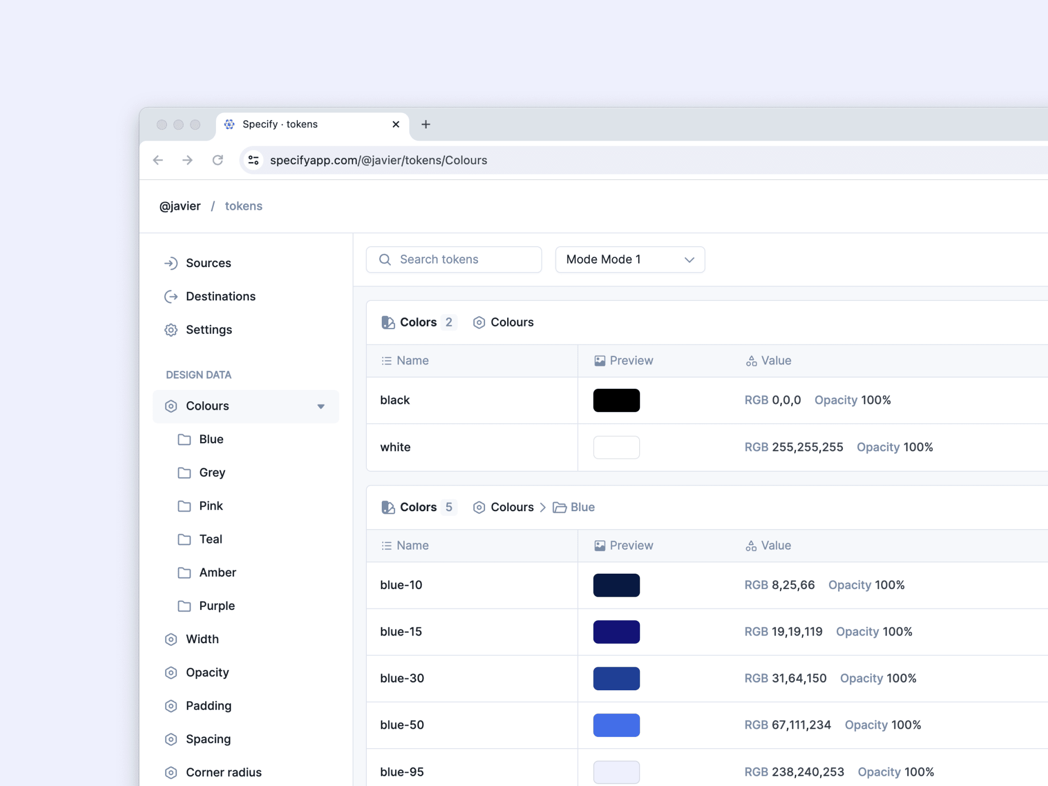
Besides plugins, there are other tools that offer a more complete workflow, settings, and features. Just to name a few, there’s Specify and Supernova.
These tools will use your Figma file as a source where to sync your tokens from. They will be included in the platform, where usually you would export them to Style Dictionary or parse them in more specific outputs.
Documentation
Some of the tools we mentioned above already include built-in documentation to take a look at the tokens representation, their values, and more information. Being this in sync with a source, it will ensure that the documentation is easy to be up to date.
You can complement the more technical aspect of tokens documentation with ad-hoc guidance of how to actually use them in practice. This will help designers and engineers alike to follow good practices when bringing tokens into product.
The future of tokens
We mentioned before that tokens have been around for a while now. Still, we can assume that them being more popular will just push the development of new tools, processes, practices, and standards.
The Design Tokens Community Group (DTCG) is a working group of people aiming to provide these standards, in order to make tokens easier to share and scale.
The group involves many professionals from different companies such as Figma, Google, Microsoft, Shopify, and many more. We can only expect they will continue working on bringing more alignment to create standard that will benefit the whole industry.
Summary
I hope that after reading this article you have a better idea of what tokens are — and what to expect from them in both design and code.
Tokens are not just variables but a methodology aligned with the principles of design systems, that foster collaboration and communication between team members.
By using them, we can set the foundations of a scalable and reusable design, that can also be easy to update and maintain over time.
If you enjoyed this read, please share it on your social networks so other people may benefit from it.