

Figma variables allow you to store design values (such as colour, spacing, and more) in your local document or as part of a shared library. You can then use these variables and apply them to elements for properties such as fills, auto layout, widths, and so on. Having variables enables you to maintain a single source of truth for all these values that would otherwise be scattered across individual layers and components.
This aligns with the concept of "design tokens" in design systems and their philosophy of reusability, scalability, and facilitating easier maintenance and updates of design decisions.
If you are familiar with variables in programming, you'll find they work similarly here. In Figma, they are already quite powerful. We can guess this relatively new feature will continue growing in capabilities over time, becoming even more useful to designers.
In a nutshell, the main benefits of using variables are:
- A source of truth. This makes design decisions easier to update and maintain.
- Tokens for implementation. Variables enalbe a better hand-off to developers to implement tokens.
- Fewer libraries. With variables and modes, you can consolidate libraries into a single file, instead of having separate per brand.
Next, we will see everything you need to know to start using variables right away.
Variable types
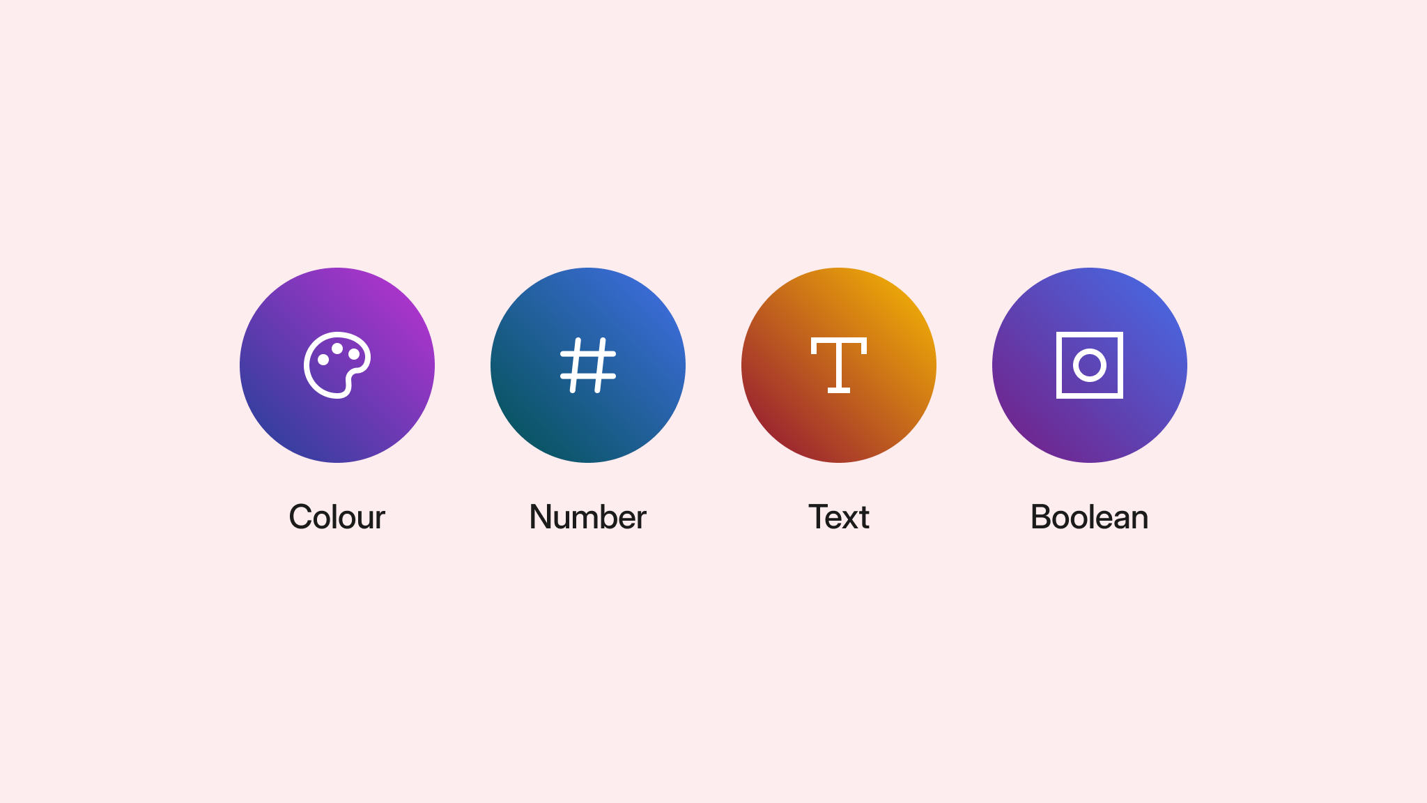
At the moment, Figma allows you to create Color, Number, String, and Boolean variable types. Here’s a summary of the main use cases for each variable type:
Color
You can use colour variables to change fills in frames, shapes, and text — including gradients. You can also apply these types of variables to stroke colour and effects such as shadows.
Number
Number variables are also quite versatile since you can use them for corner radius, width and height, plus all settings in auto layout such as paddings and spacing. You can also use numbers to define the thickness of a stroke, the opacity of a layer, or in effects.
You can also apply number variables to text layer settings such as size, line-height, letter spacing and paragraph indent and spacing.
Finally, you can also use them as text content in a layer. This can be useful if you want to update that number depending on interactions triggered in a prototype, such as a counter. Right now, you cannot use number variables for sizes in text.
String
String variables are only for text content. This can be useful to maintain a source of truth of common text placeholders or, as in numbers, to update the text from actions in a prototype.
In text layers, these kind of variables can also be used for font family and font weight.
String variables are also used in prototyping to swap a component’s instance.
Boolean
Finally, we have Boolean variables that let you store true or false values—for example, to toggle layers' visibility on and off. These are more useful in prototyping, so we will discuss how they work in a later tutorial on prototyping with variables.
Variables and styles
You may have already wondered what the difference is between variables and styles, and many designers have had the same question since their introduction. Perhaps the key difference is that variables can just store a single value like the ones we discussed above. For example, a single number, colour, and so on.
Styles, on the other hand, can combine different visual values together. Think of a Fill style that can have 2 fills at the same time. Another example could be gradients, where a layer style uses different colour variables for the gradient’s start and end point.
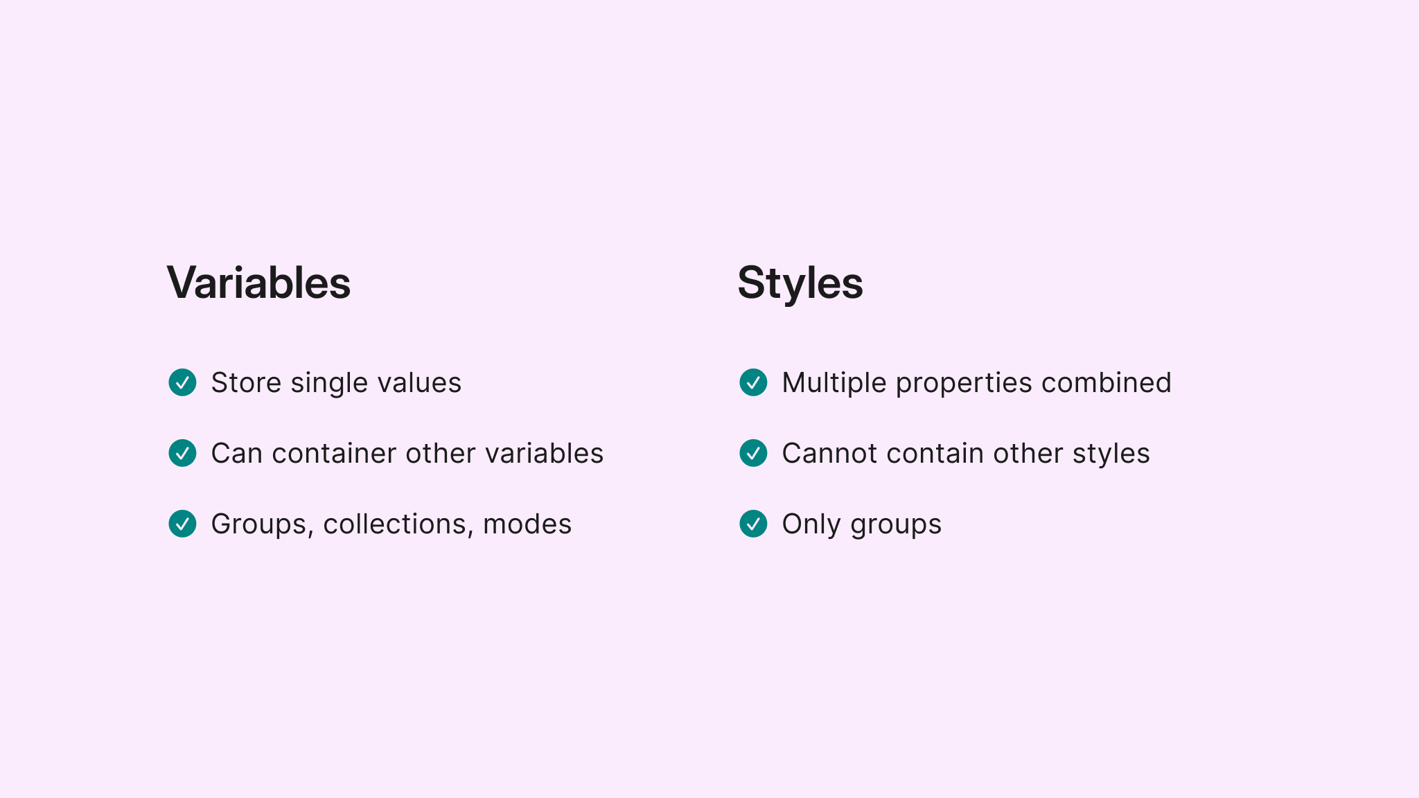
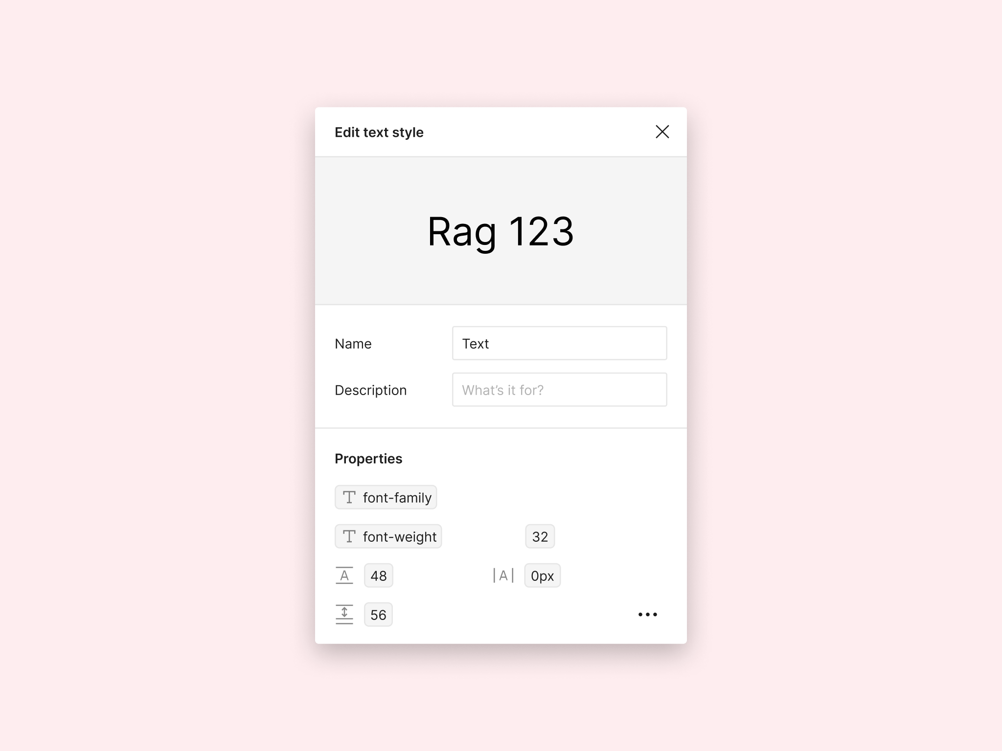
A case where it’s very useful to have styles bundling variables is text. Here you can create a single text style that uses variables for its settings, such as size, weigh, family and so on.
An important point to make the distinction between variables and styles is to keep in mind that variables can also benefit from different features such as collections and modes that don’t exist in styles, something that we will discuss a bit later on.
In any case, styles can also use values coming from variables, so it doesn’t mean that you necessarily need to pick between one and the other.
Creation and use
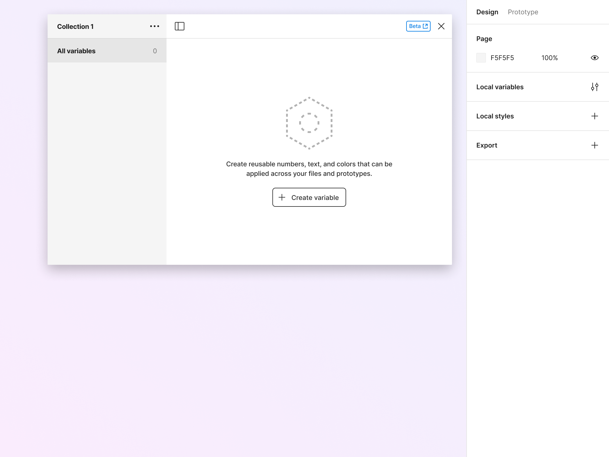
Variables can be created in different forms. They can be created directly from the modal in properties when you are using a layer. If you do this, be careful not to create a variable as a style, something that has happened to me admittedly more than once.
In order to get an easier way to manage them, you can create variables from the Local Variables menu, which will open a large modal. From here, it will be easy to rename, organise, and delete variables.
Applying variables
Once you have variables applied, you can start using them where they are supported. To be honest, this is not always as straightforward as it may seem, since variables have different ways of being accessed depending on where they are being applied.
Here are some examples:
- Width and height: There’s a variable icon directly accessible
- Auto layout: From a drop-down menu
- Colour: Click on colours and then in libraries, where variables will appear next to styles
- Stroke and layer opacity: Right-click to see a drop-down menu
When using colour variables, note how they are different from styles—variables appear as circles, while layer styles are in rectangles. To be honest, it can be hard to tell apart variables from styles once your list of both grows.
Detaching
When variables are applied, they usually show up in a box, where you can see the value on a different background. This will be the main indication that you have a variable applied to it. From that same place, you will be able to detach a value from the variable, which will break the connection between the two.
Scoping
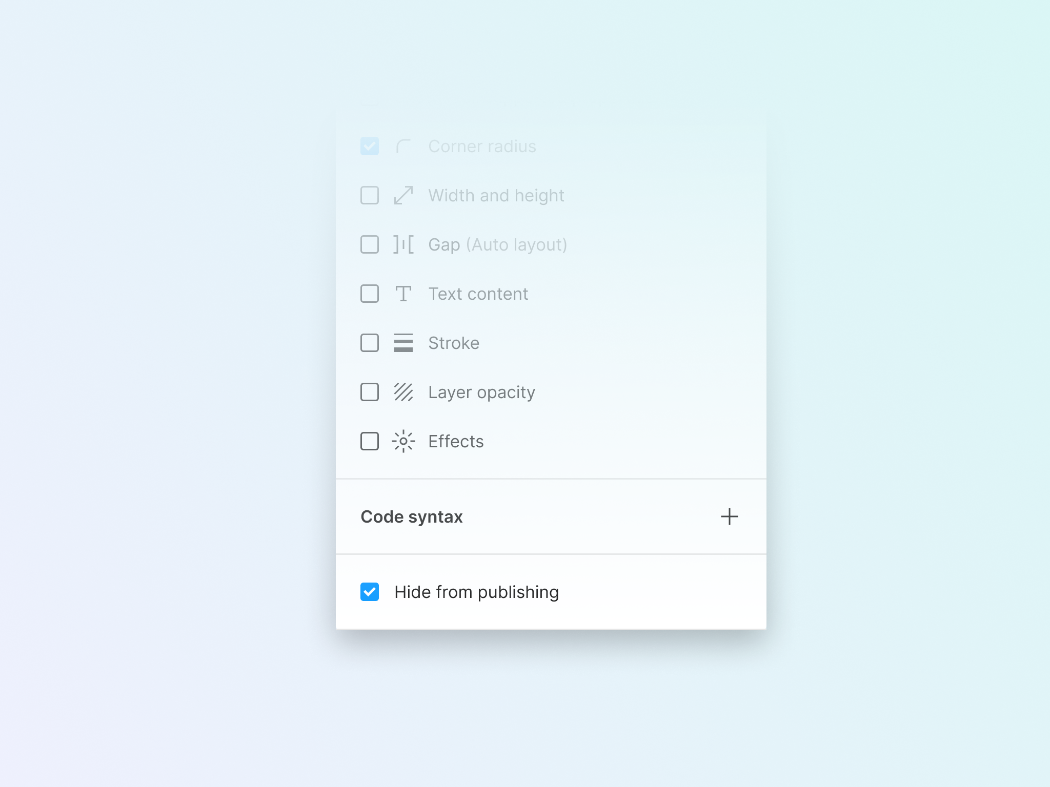
A variable’s scope is accessed from the variable settings icons (see image below). A scope is the properties where this particular variable can be applied. If you don’t define anything, the variable will be available everywhere where it’s supported. The scope of the variable will change depending on the variable type.
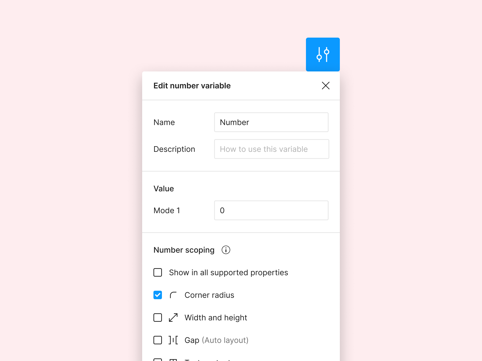
By default, you have all the possibilities in the scope ticked on. This may sometimes clutter your view if you have created variables for specific use cases, such as width and height. When there’s no scope for a Number variable, you will see all of them available to select.
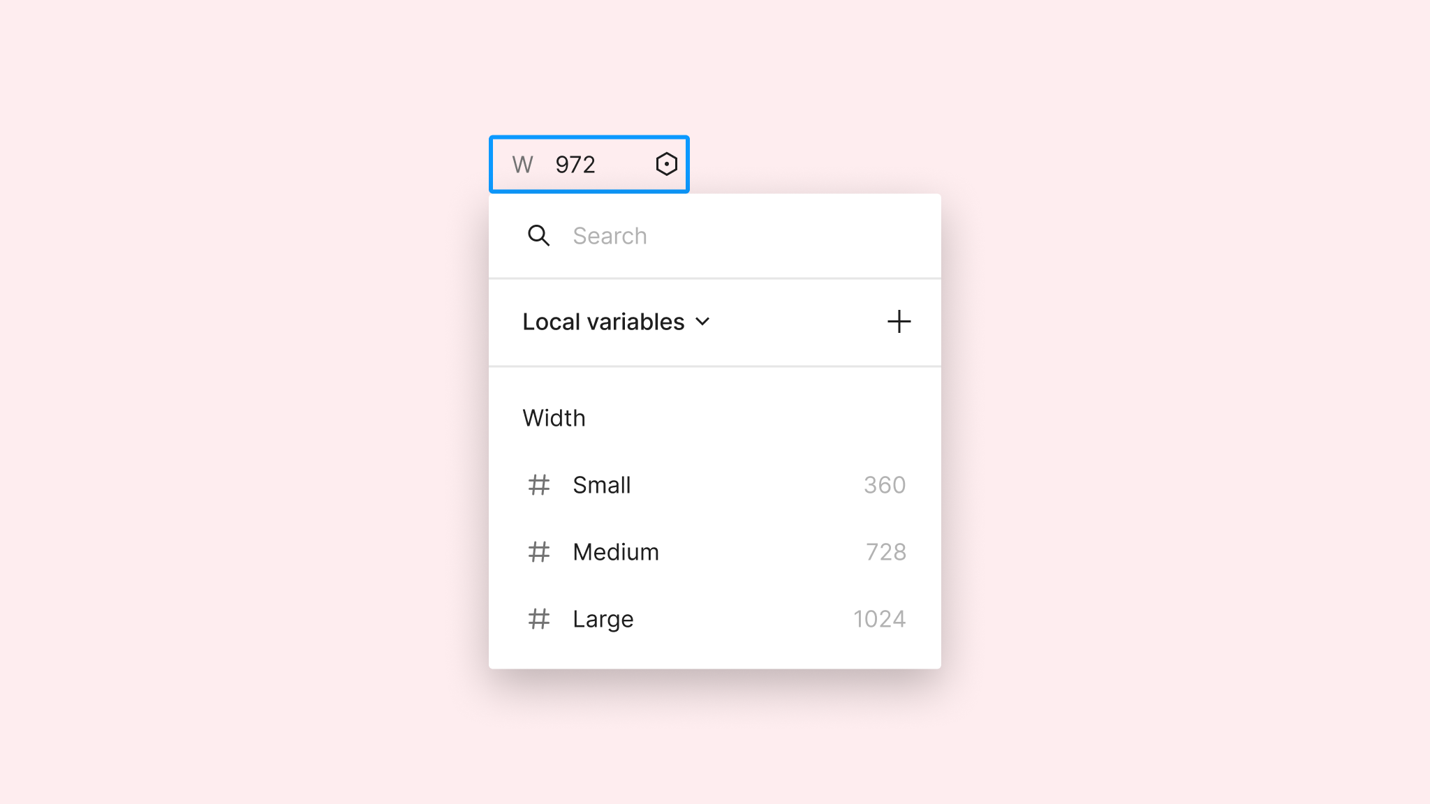
However, if you manually adjust the scope of a variable to be available only where it should be, you can have a nicer view with just the values that you want to select from. In the example below, applying a variable for width will just show the ones that in scope have only “width and height” selected.
Organising variables
Having just a handful of variables is not a problem, but once your set of variables starts to grow, you may want to organise them in groups and collections. This will allow you not only to easily identify them but also to communicate what the relationship is between them.
Groups
Groups are the most basic way of organising variables in sets. You can select several of them at once and create a group from the contextual menu. Once you do this, you will see that the group will show up on the sidebar on the left-hand side; where you can also rename and rearrange groups.
Groups are quite useful when you want to start grouping variables by type or any other meaning. Here’s an example of how organised groups may look like in a more complex project.
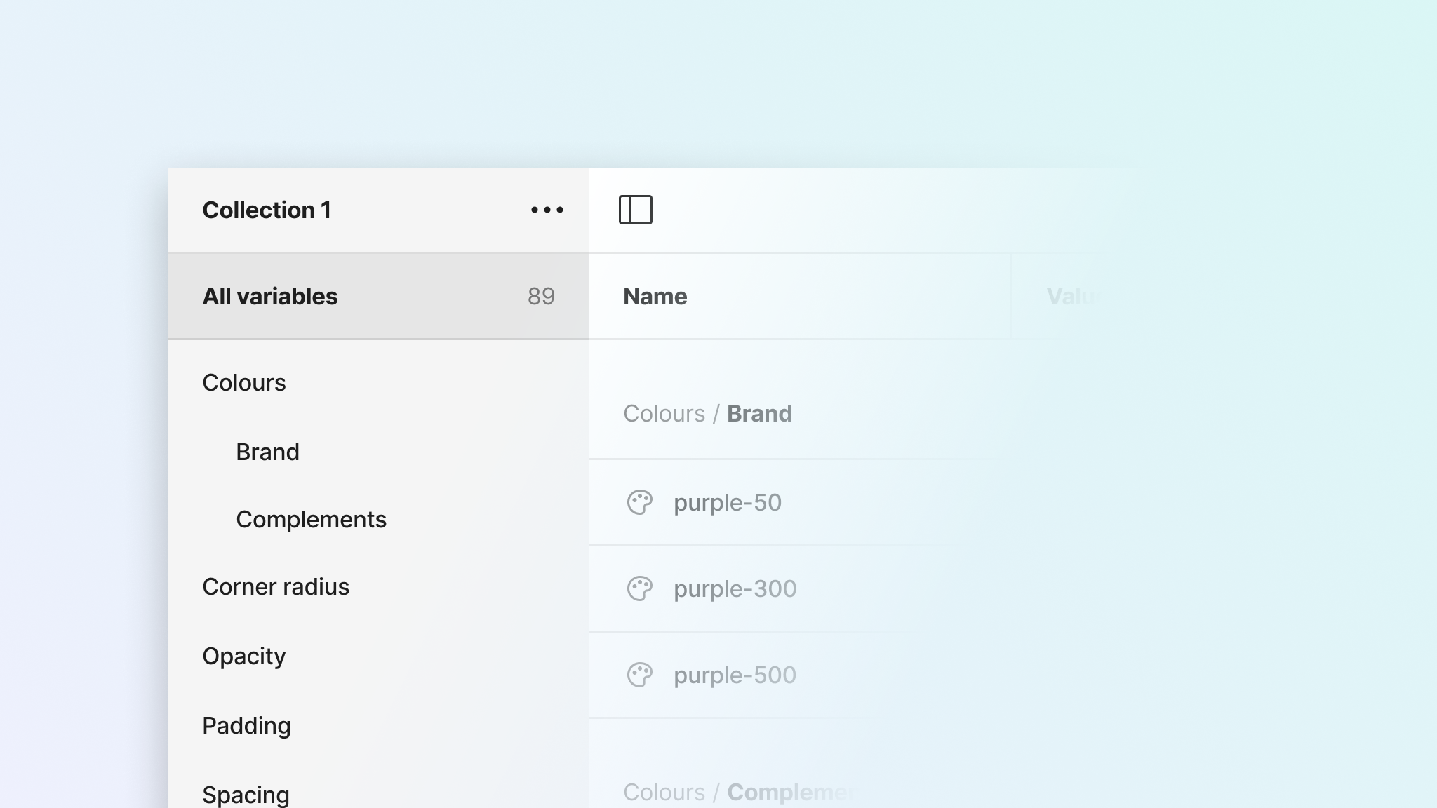
Collections
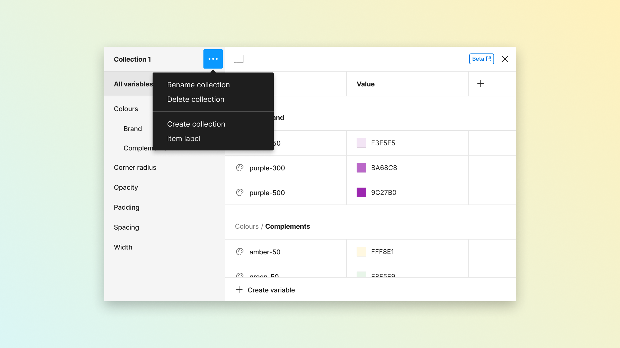
You may have noticed that variables are added to a default collection in Figma, but you can create more. You can use collections to add another layer of organisation to your variables, and have separate and independent groups in each one.
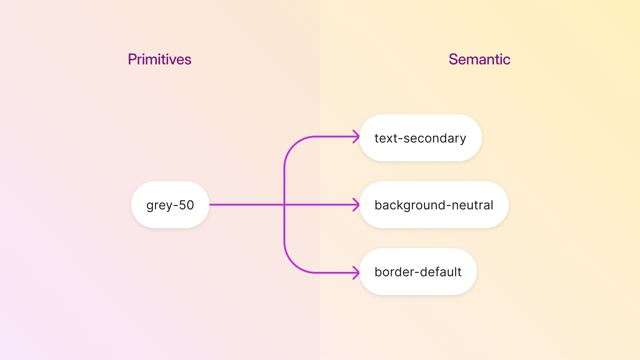
One common use case for having different collections, is to differentiate between primitive variables and semantic variables.
- Primitives: Raw values that don’t have a purpose assigned to them (e.g., red-50)
- Semantic: Variables that have some meaning or intent assigned to them (e.g., color-primary)
Alias
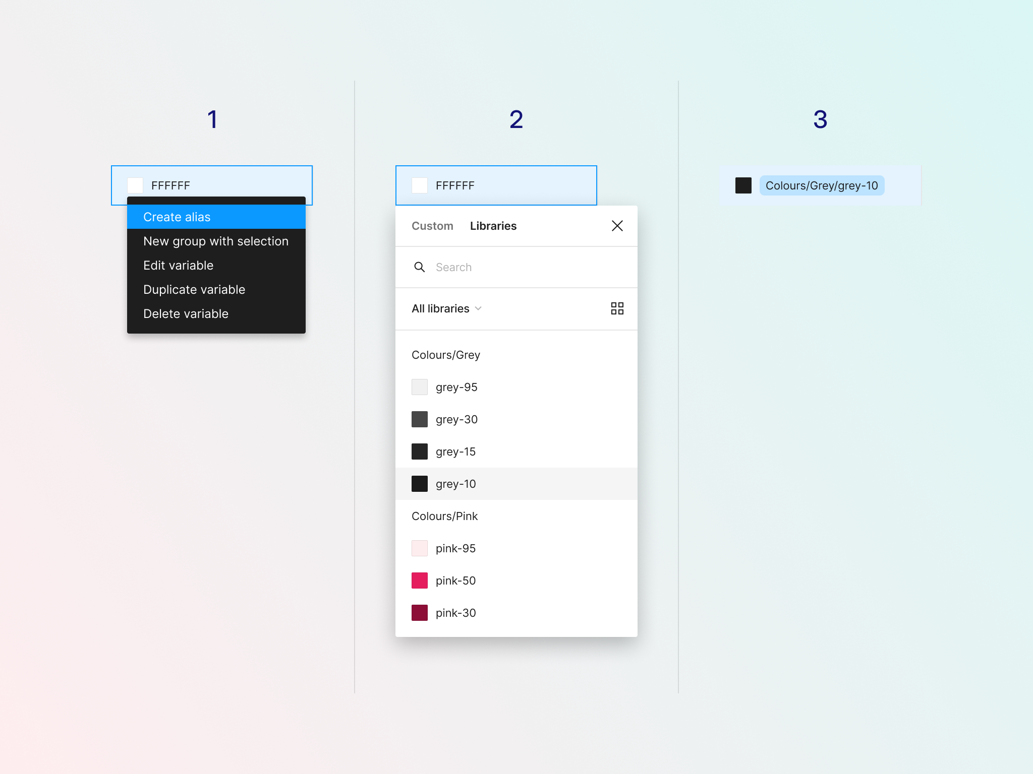
Variables in each collection are not linked to each other, but this can be done if you have "nested" variables, meaning one variable that contains another variable inside. In Figma, this is called "alias" — or variables referencing other variables. When you change the value of the source variable, this will also be reflected in the alias.
Creating alias for a variable can be done in just 3 steps, from the contextual menu of any variable. When you are done doing this, you will notice that the value of the variables changes and it's shown in container with coloured background.
Following up with what we discussed above about having separate collections for Primitive and Semantic variables, then you could have variables connected between collections. Since a source variable can have several alias, you can reuse a value across several places. In the example below you can see how a variable stored in the Primitives collection have several use cases in different Semantic variables, a common scenario that we face in product design.
Modes
Modes allow you to add another dimension to your variables. Once you create a Mode, Figma will add another column duplicating the previous values. However, a variable can have different values in different modes.
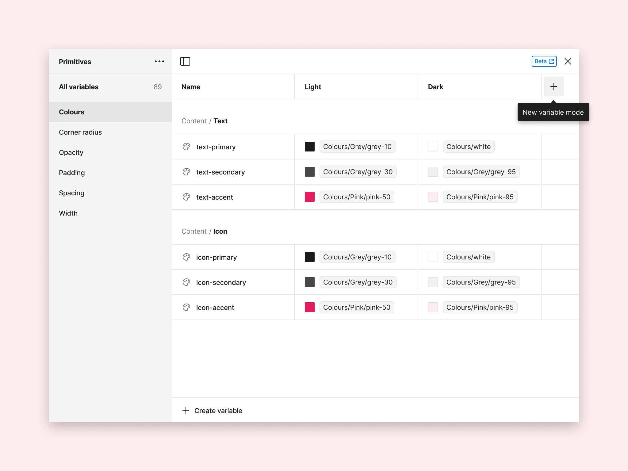
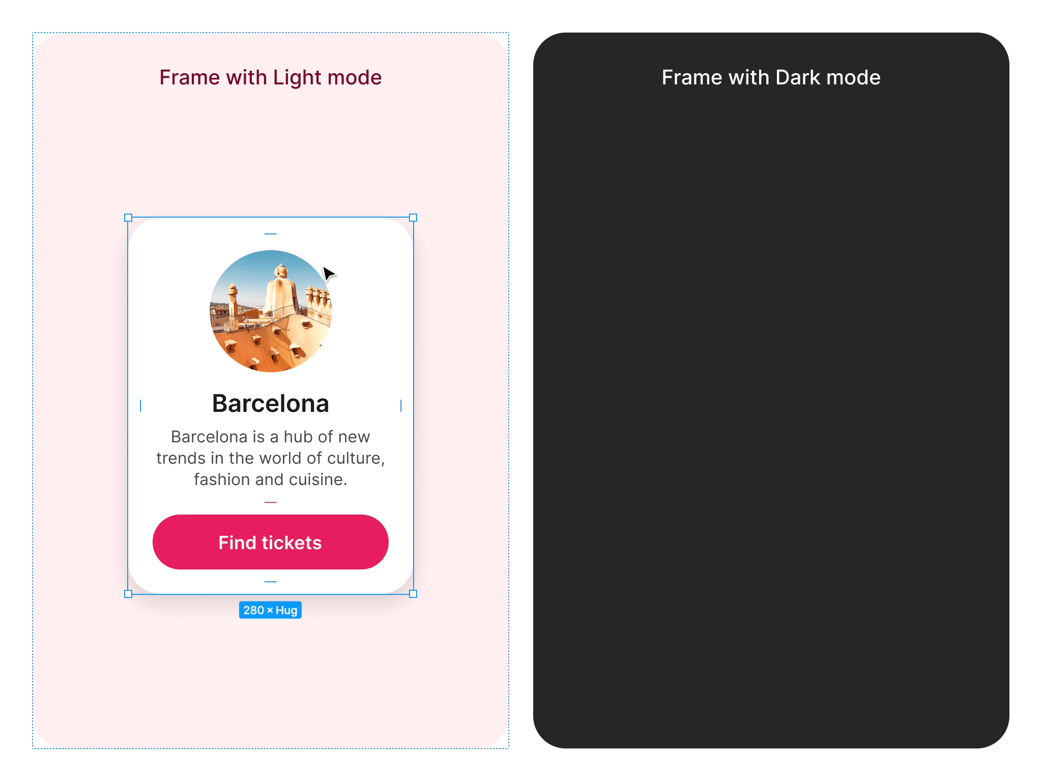
A classic example of this is creating modes for light and dark interfaces. By doing this, the same variable can have different representations depending on its mode. In the example above, we have created 2 variables for Light and Dark mode: a screen background and a text colour.
Modes are a paid feature, therefore not available on the free Starter Figma plan.
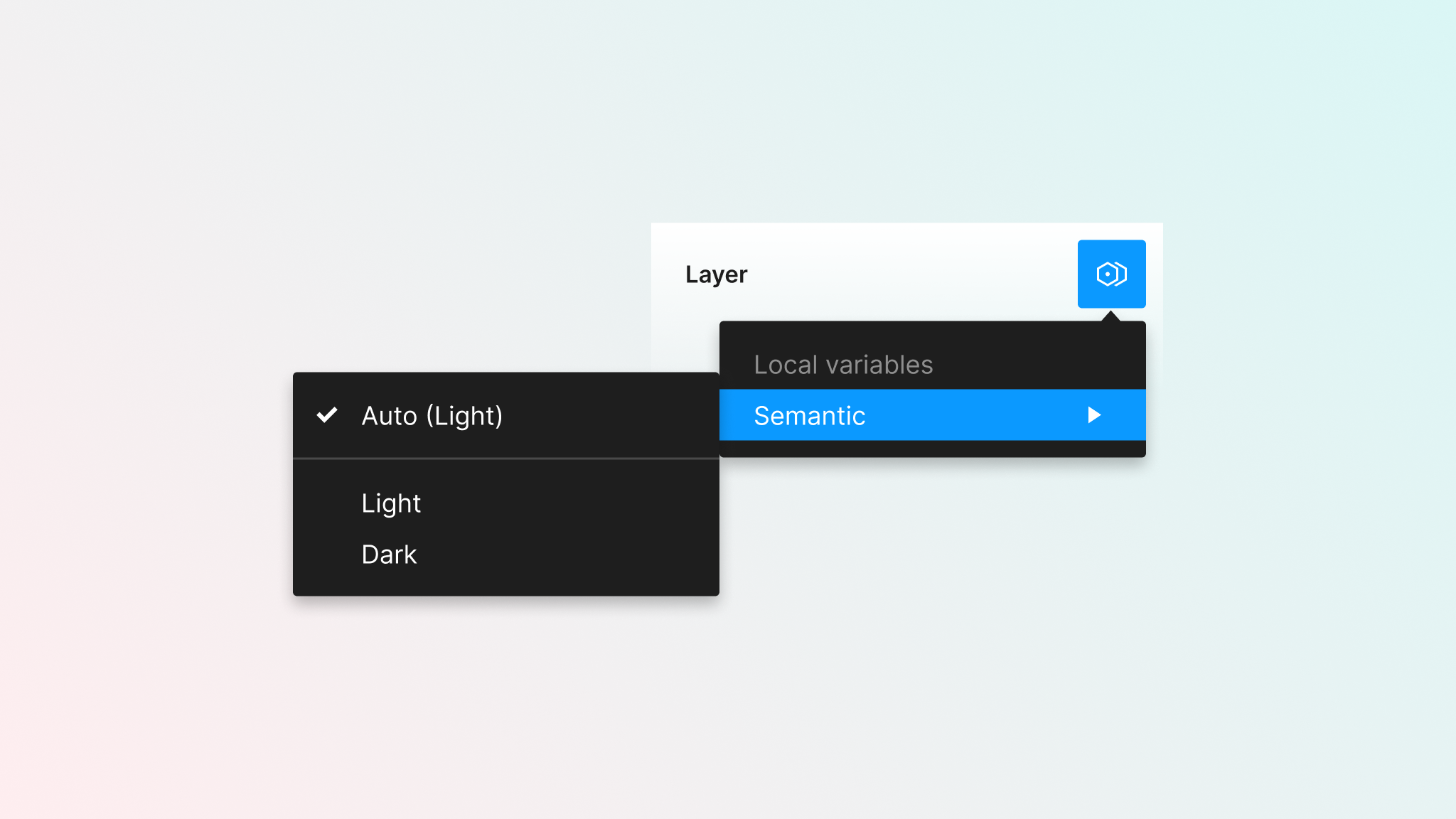
Selecting modes from layers
When you have a mode created, you will see an icon next to the layer section in the properties sidebar. If you don’t do anything, variables will have an “Auto” mode applied to them.
The Auto mode is:
- The mode that was already created by default
- The mode that the layer’s parent container has applied to it
In the following image, you can see the available modes in the Semantic collection, which are Light and Dark.
When layers have a mode applied to them other than the default one, this will also be shown on the layer list.
Keep in mind that there should be at least one layer with a variable applied to it in order to see this icon.
Modes and Collections
You can combine modes and collections to make the most out of both. In the example below, we have created a Light and Dark mode. The left frame has the default (or Auto) Light mode, whereas the container on the right has the Dark mode applied to it.
When dropping the design on the frame with Dark mode, the value of the variables will be replaced for the ones defined in that mode’s column.
You could replicate the same approach to change variables to other modes, for example:
- Use text variables to translate the content from one language to another.
- Use number variables in auto layout to adjust paddings and separations to make them tighter or more spacious in different modes.
- Use boolean variables to show layers in one mode, and hide in another.
Since you can have several collections with different modes in them, layers can also have more than one mode applied at the same time (for example, for colours and text content).
Variables in prototypes
This is just the start. There are some other ways of getting more juice out of variables when you are prototyping. For example, you could use Boolean variables to change the visibility of a layer based on some interaction. Or change a text content that is stored in a String variable.
In the example below, we are using variables to update a counter when items are selected. At the same time, we are using boolean variables to show or hide elements (such as the text next to the title) depending on some conditions. A similar logic using text variables is used to change the button from one variant to another.
Since this can get more complicated once we introduce conditionals, we will leave this topic for later on. For now, you can just know that this is possible with the current Figma features without too much hassle. Stay tuned to explore this and more topics in upcoming tutorials.
Variables in prototypes and conditional logic are a paid feature, therefore not available on the free Starter Figma plan.
Publishing variables
Variables are created in the local document that you are working on. If that document is also a shared library, you can publish these variables so they will be accessible from other documents. This makes sense since, in many cases, you would like to have a “tokens” library with variables and styles, and then reuse them in other files for components and screen design.
Still, you can decide to hide a variable from publishing. Similarly to what happens with components, if you do this, the variable will still remain available in your file, but won’t be accessible to other people beyond that.
You could potentially use this for the variables in your primitives collections, so designers in your team just use semantic variables in their components.
Keep learning
If you want to continue learning about variables, my recommendation is that you take the concepts from this file and start using them as much as you can, even if that is just in a test file that you have set up for these purposes.
There are also some other links that may be useful to you:
I hope you found this useful! If you would like to show your support or appreciation, please share this tutorial online so other people can also benefit from it.