

Design systems are built from interconnected parts: tokens, components, patterns and documentation and guidelines, among others. All of this makes sense when it’s supported by workflows and processes that foster adoption and encourage contribution.
Components by themselves, although a key part of any system, wouldn’t go too far without those supporting mechanisms.
When incorporating accessibility, we add another dimension on top of our current design practices. Here as well, the design, implementation and use of components to build accessible products works better when there’s an internal culture —and people— that supports it.
From all this broad spectrum, in this article we will focus on how to incorporate accessibility practices in the design of components. While this may work for any design software, there'll be some hints for Figma users. We will base this approach on WCAG current guidelines, but in a way that —hopefully— will be easier for you to understand.
Keep in mind that this is by no means an exhaustive list. I still recommend blocking some time in your calendar to take a deeper look at the documentation by yourself.
Principles
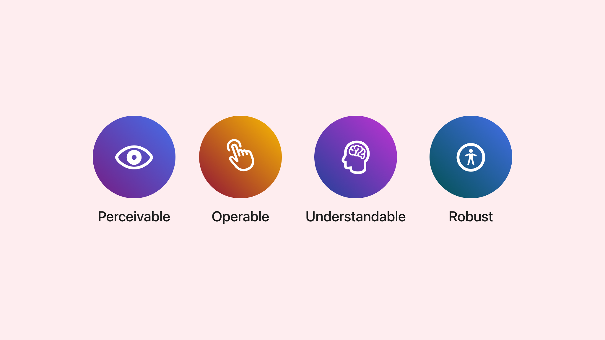
Accessibility guidelines and criteria are based on four main principles. Each criterion in this post and in the documentation belongs to one of them. Just to give you a better idea of what they mean, here’s a brief explanation of each.
Perceivable
This refers mostly to users being able to correctly see the information and content presented. When designing components, what will help to achieve this is keeping enough colour contrast and designing for different text sizes, for example.
Operable
This principle means that users should not only be able to see components, but also to use them as intended. What will help achieve this goal is making components easier to navigate and interact with — for example, by having size targets big enough and using meaningful links.
Understandable
It is based on providing content and information in components in a way that is possible to understand. In our components this will mean providing contextual help, correctly labelled fields, or error messages that help users understand what has just happened or what to do next.
Robust
This last principle ensures that your components are reliable and work well across a variety of devices and assistive technologies. As a product designer, this means creating components that adapt to new technologies and updates, ensuring long-term usability and accessibility.
In the following points, we will see how to take these principles into account in practical design decisions that meet accessibility criteria. You might recognise some of these practices as something that you already do, but now you will understand how they impact accessibility and users.
Colour
Use of colour
Colour alone shouldn’t be the only visual way of communicating information and actions. Colour-blind users will miss out and won’t perceive the same amount of information as other people. Adding other elements can reinforce the use of colour, so people who cannot perceive it can still understand the content.
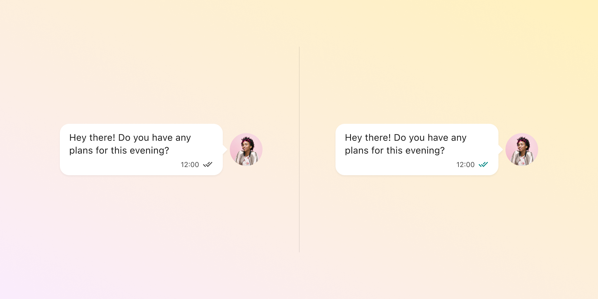
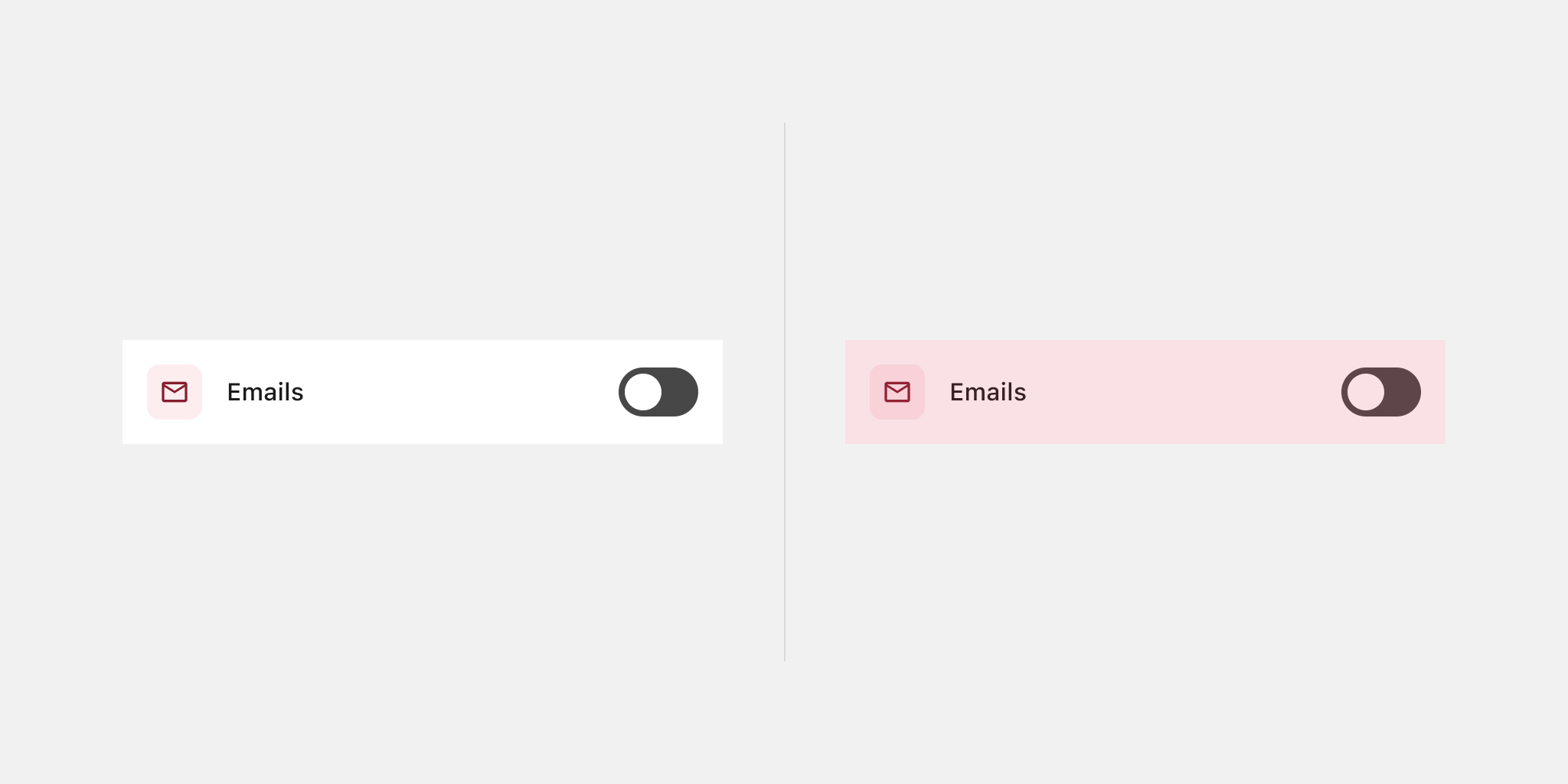
Don't do ✘
This chat message component uses just a colour change between read and unread statuses. That's the check mark you can find at the bottom. Users who cannot see colour will miss out on the information and won’t be able to perceive the differences. It may be even hard to tell for normal-sighted people, too.
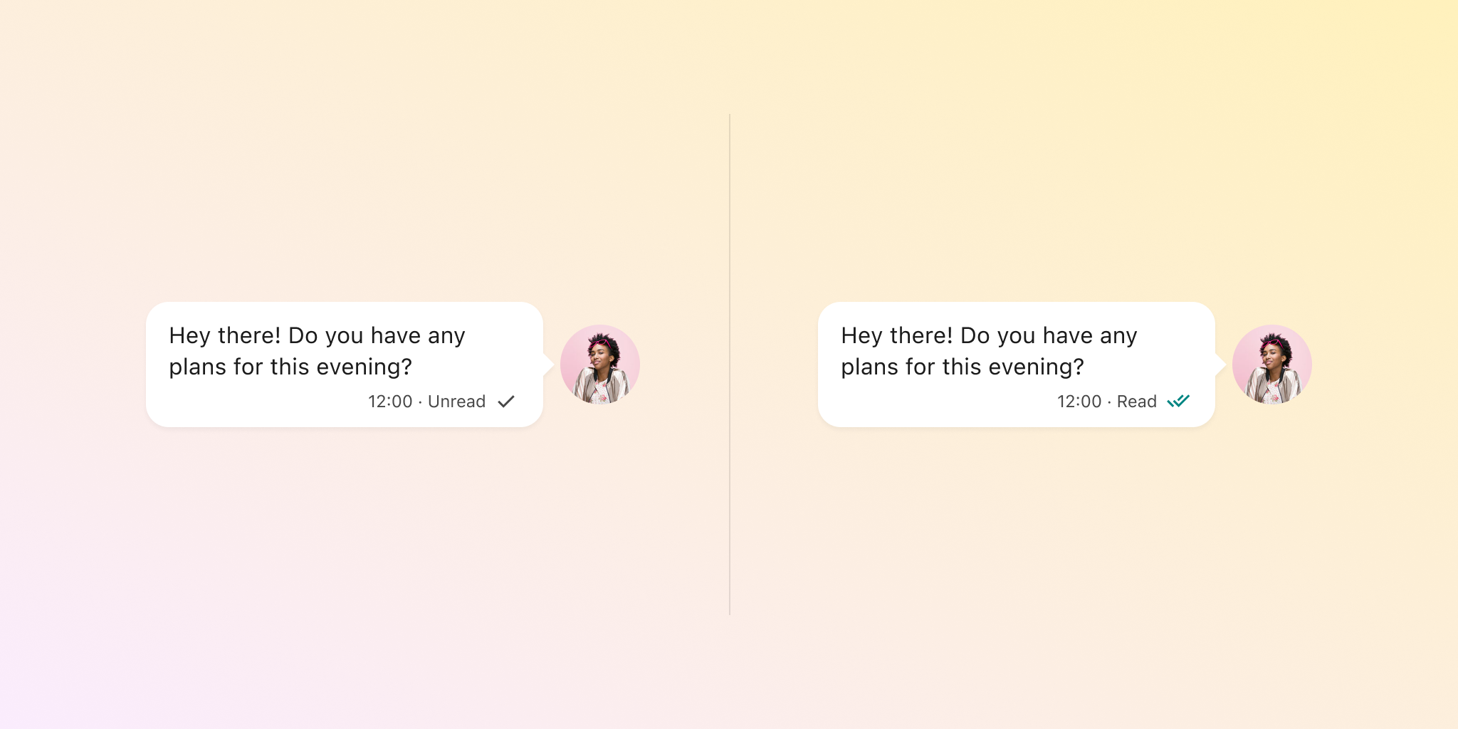
Do ✔
By using a text to mark the difference between read and unread, you no longer rely solely on colour to tell them apart. There's also a different icon for each status, which may be also hard to understand without the text. This design will work even for people who cannot differentiate colours: The visual cues take care of the job.
Related criterion
Colour contrast
Poor colour contrast is one of the main causes of accessibility issues. Keeping a good contrast in text, graphics and controls makes it easier for people with low vision to identify and read content. It also makes it easier for everyone else, even when you don’t have any apparent sight issues.
Different contrast ratios apply to text and other elements, depending on factors such as size and function. This topic is so complex in general, that we also wrote another article specifically for this.
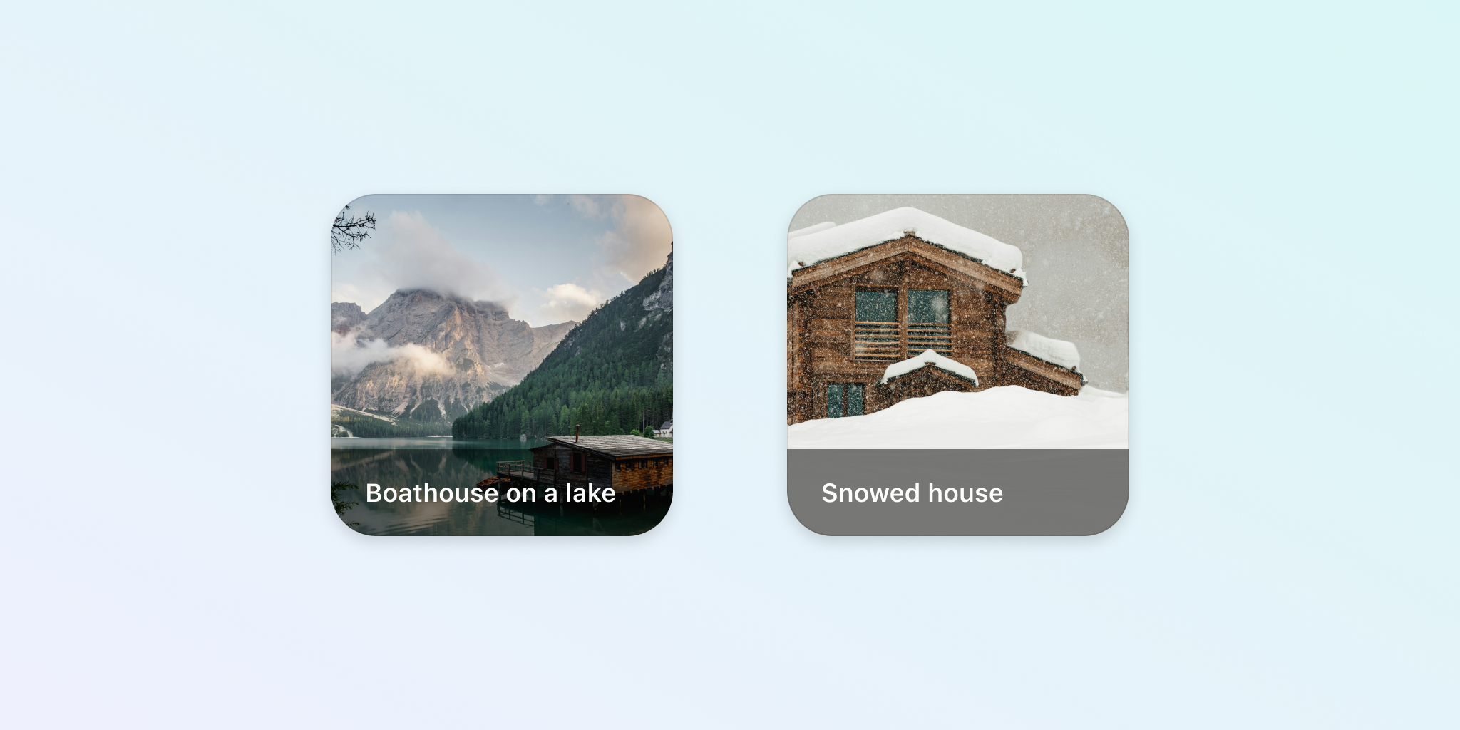
Don't do ✘
Texts that are below the required contrast ratio can be difficult to perceive for people with low vision, but also for everyone else depending, for example, on lighting conditions. The card component below presents contrast problems from overlaying text to an image, that are even worse when the background image presents larger areas of bright colours, such as white.

Do ✔
Meet minimum contrast ratios to make sure texts and other elements are easier to identify for everyone. Adding a protective layer between background image and text will create enough contrast. This is specially important in components like this one, where it's not possible to control how the image will look like every time.
Related criterion
1.4.3: Contrast (Minimum) (Level AA)
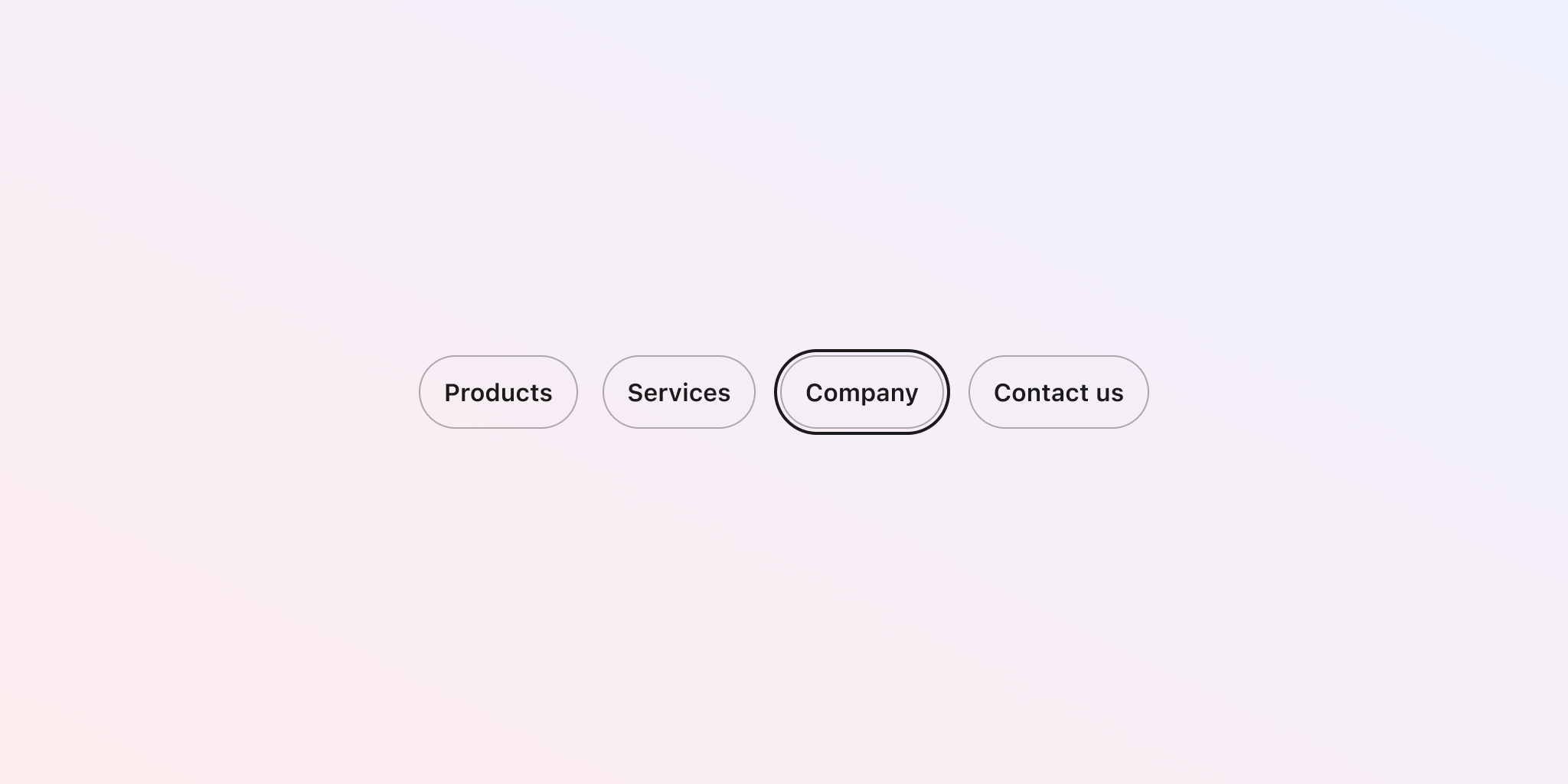
Focus visible
Ensuring that interactive elements like buttons and links have a visible focus state is crucial for accessibility. A focus state provides a clear visual indicator of which element is currently selected and ready to be interacted with, helping users navigate your design using a keyboard. This is especially important for users with motor disabilities who rely on keyboard navigation and for individuals with cognitive disabilities who benefit from clear, visual cues.
Accessibility guidelines exempt the default focus states provided by browsers. However, this does not mean that the default designs are inherently accessible. While you are not required to design custom focus states, if you choose to do so, consider the recommendations below.
Don't do ✘
Interactive elements without a clearly visible focus state can make it difficult for keyboard users to navigate, causing frustration and accessibility barriers. This significantly impacts users with motor disabilities, vision impairments, or cognitive challenges, making it hard for them to understand where they are on the page and what actions they can take.
In the component below, not only the default focus has been removed, but an appropriate focus state was also omitted. This makes it very hard to understand which button is currently in focus.
Do ✔
Always define a visible focus state for interactive elements, such as adding an outline, to provide clear guidance for users navigating with a keyboard. By doing so, you enhance the usability and accessibility of your design for all users, particularly those with disabilities. The component below includes a custom focus ring that meets the guidelines, and help people clearly identified where they are located within the main navigation menu when swapping from one item to another.
Related criteria
- 2.4.7: Focus Visible (Level AA)
- 2.4.11: Focus Not Obscured (Minimum) (Level AA)
- 2.4.12: Focus Not Obscured (Enhanced) (Level AAA)
- 2.4.13: Focus Appearance (Level AAA)
A bit more on colour
Here are a few extra points that may help round out your understanding of this topic, even though they are not necessarily included in WCAG official success criteria.
Be mindful of pure black and white for texts
Colours that are too contrasting such as pure black on top of pure white can cause eye strain for some users, especially when used in larger and bolder headings. This is particularly problematic for individuals with visual impairments, migraines, or light sensitivity.
Keep opacity in mind
Opacity will affect the contrast between a text or graphic and its background, so make sure of checking the resulting contrast as opposed to values in isolation. Proper contrast is crucial for people with low vision or colour blindness, who may struggle to read text or distinguish elements if the contrast is not adequate.
Text
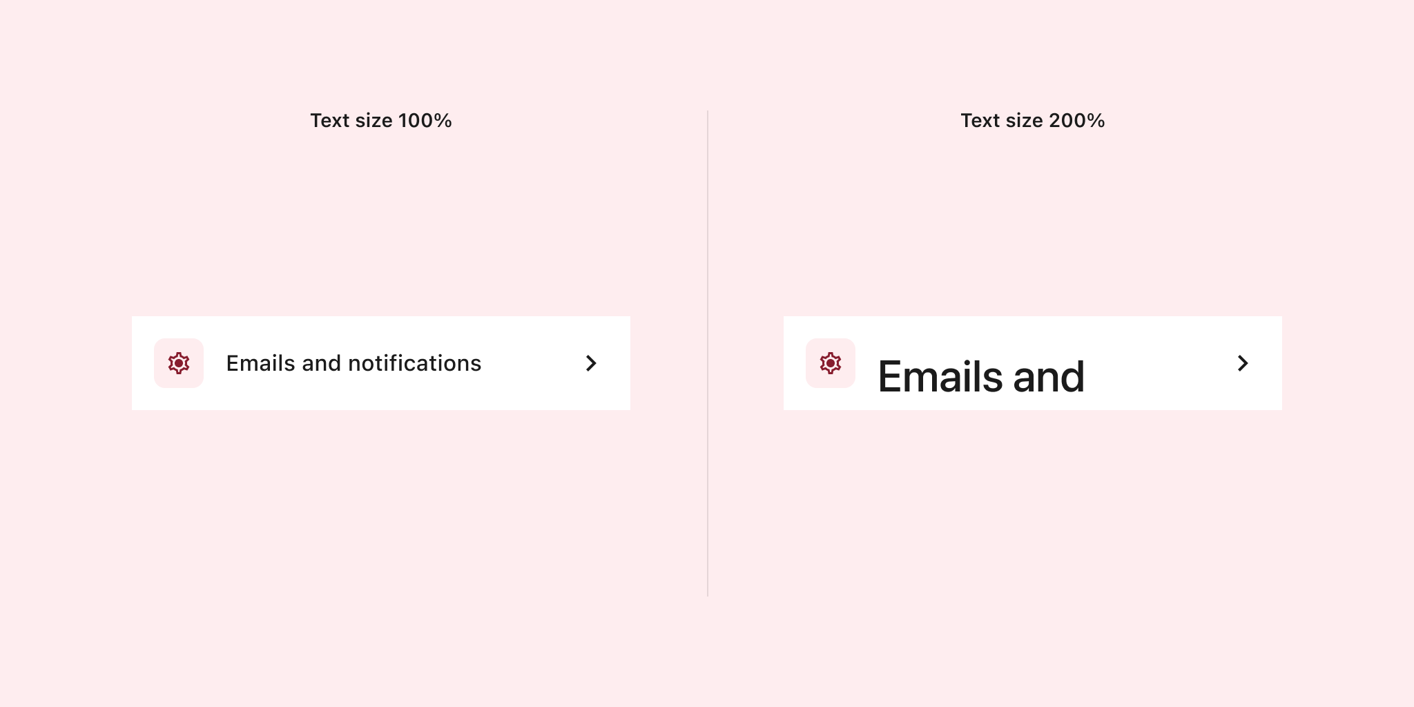
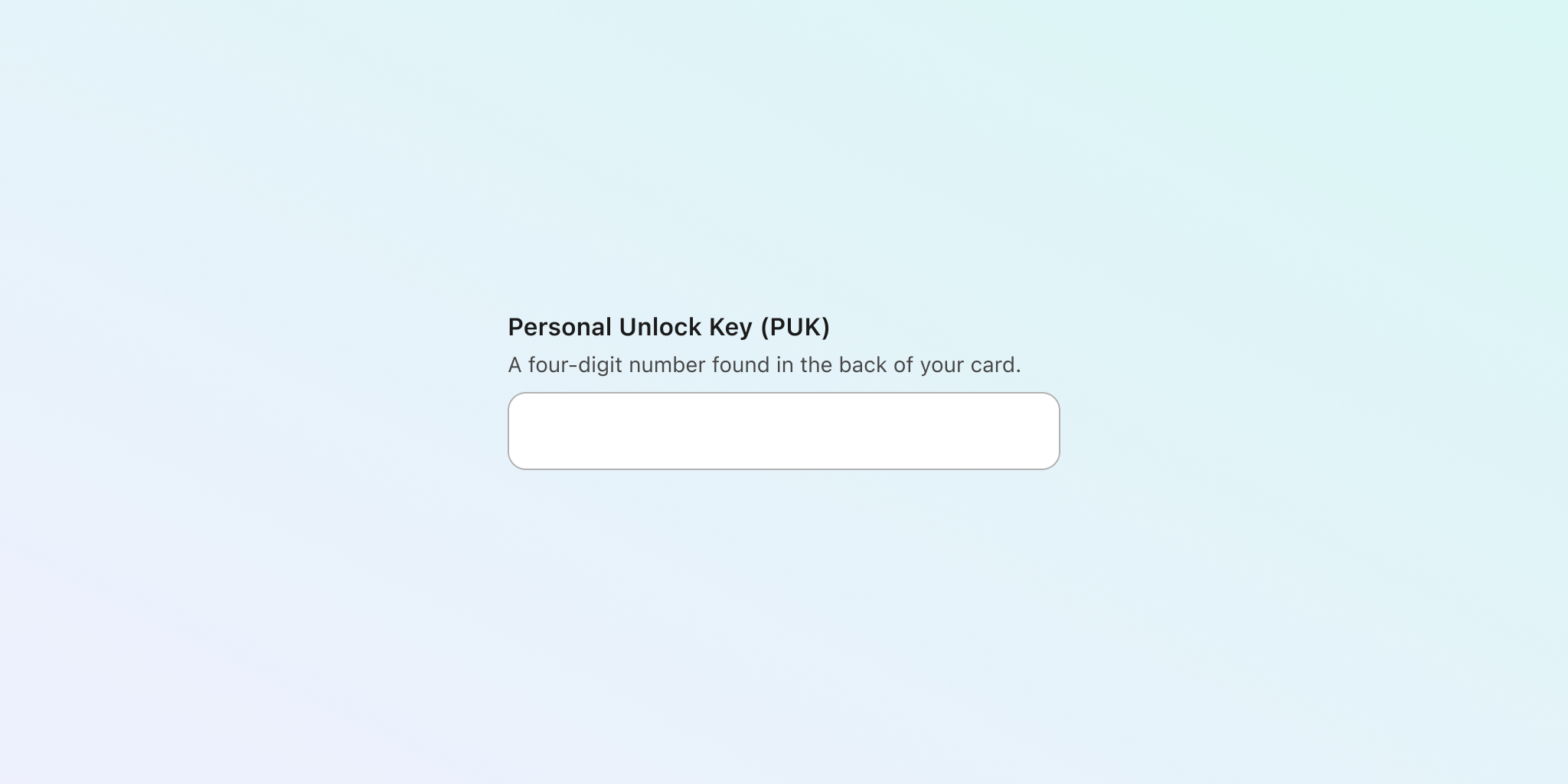
Text resizing
Accessibility guidelines indicate that text should be possible to resize to 200% of its size without losing content or functionality.
Text may look bigger when content is zoomed in browsers, or when users have bigger text sizes configured in their mobile phone settings, and your designs should keep these scenarios into considerations to make sure of providing the corresponding layouts for implementation.
Don’t do ✘
Using fixed-height containers will cut your texts when they are scaled, so users would miss a portion of the content. In this component there's a portion of the text that got cut off because its container with fixed height didn't automatically adjust to give room.
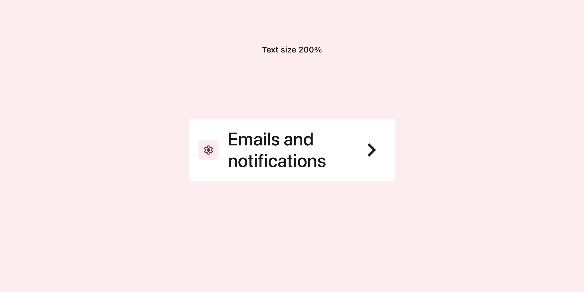
In Figma, ensure that layers containing text have their height set to "hug." This way, they will resize and adapt automatically when the text size changes.
Do ✔
Prepare designs that account for text resizing. For example, you can create a version of your designs that resizes important text and icons while leaving decorative elements at their original size. In this component, the text scaled to 200% with a flexible height that adapts to the content, ensuring all text is visible. Note how the decorative icon remained at its original size, while the more important and functional icon (the right chevron) scaled alongside the text.
Related criterion
Column width
Text columns that are too wide can be difficult to follow for some people, making them get lost when changing to the next line of text. Limiting their width to a more compact size will make texts easier to read.
Accessibility guidelines mention 80 characters as the maximum. However, some other research suggests that the ideal is between 45 and 65 instead.
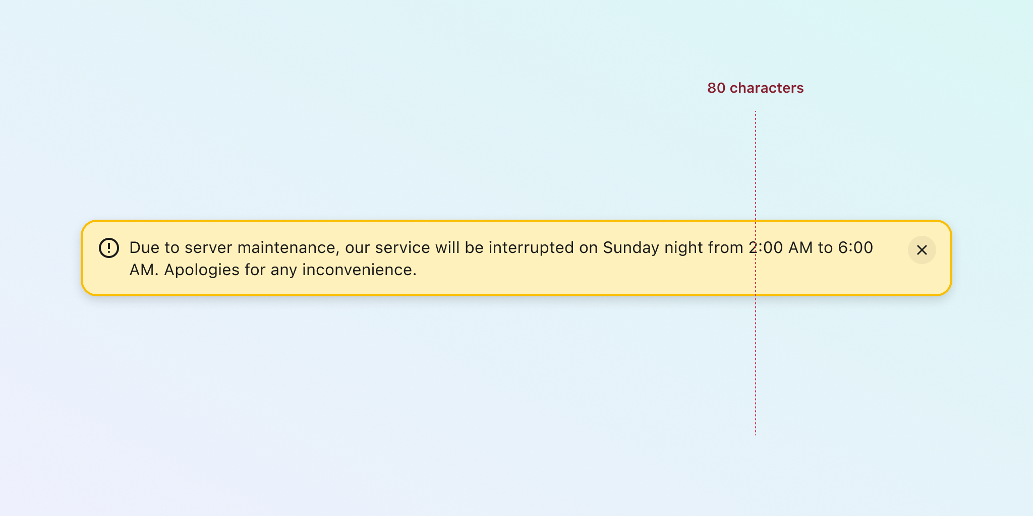
Don't do ✘
Without defining any constraints, text can flow freely using all available width. Depending on the size of the container, columns may become too wide and text difficult to read.
Do ✔
When columns have a maximum width, they won’t be wider than a predefined number of characters. This ensures the accessible limit is maintained, regardless of the container size. In this component—an alert that can host longer texts—the column width is capped at a maximum. Once this limit is reached, the text will wrap onto another line, even if the main component uses more width.
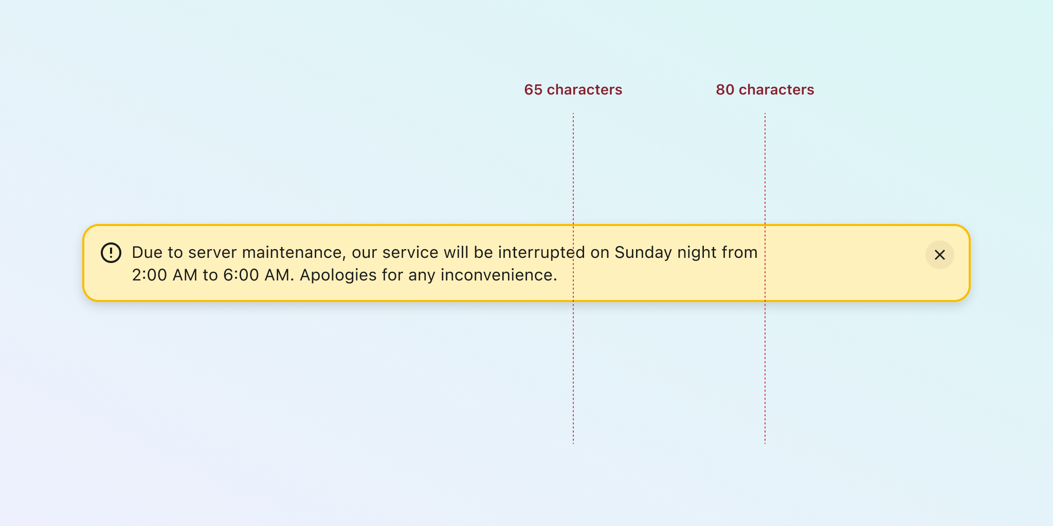
In Figma, you can use the max-width feature on any layer inside auto layout containers. By matching this pixel value to your calculation of characters, you can achieve the desired layout more effectively.
Related criterion
1.4.8: Visual Presentation (Level AAA)
Text truncation
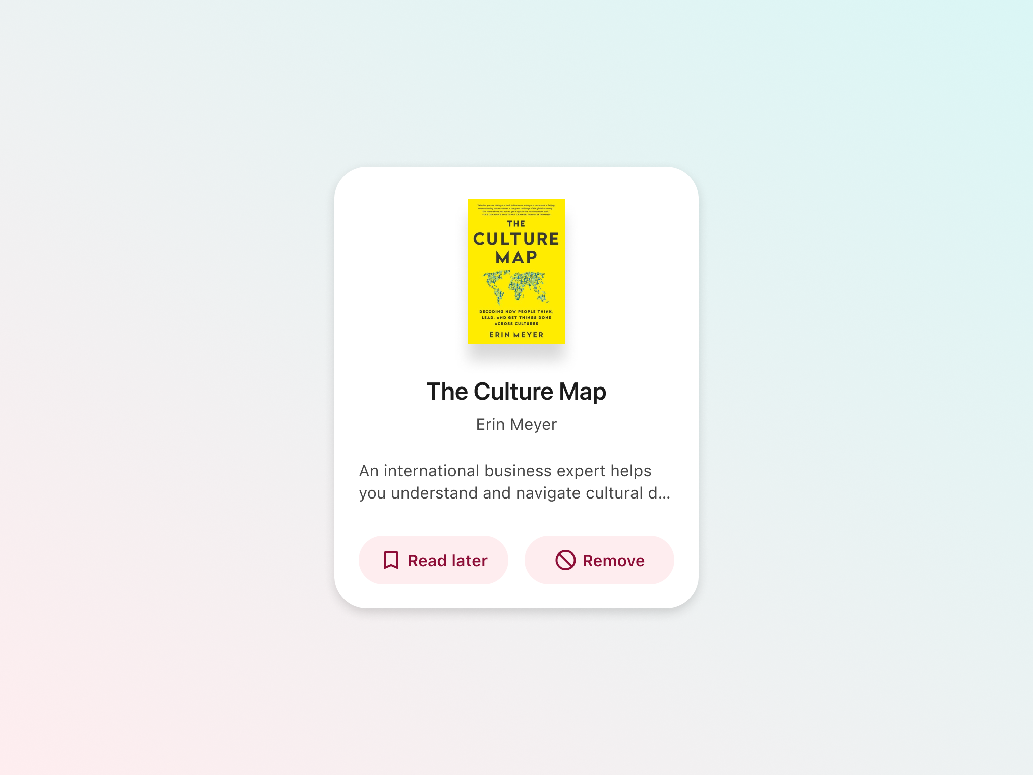
Truncated text is used when content doesn’t fit its container. Ellipsis (…) is then shown to represent that there’s more text not visible. However, the remainder of the text is not typically available for anyone, let alone screen readers.
Accessibility guidelines allow truncation only if certain conditions are met. One of them is that the full text should be available after hover or interaction. Another condition is that there should be some indication, other than the truncation itself, to show that there's missing text.
Don’t do ✘
When you have a text overflow situation, avoid using truncation if there’s no other way to access the hidden portion of the text. In this example, the description of the book gets cut to save on vertical space. However, since there's no way to access the full text, it doesn't meet the accessibility criteria.
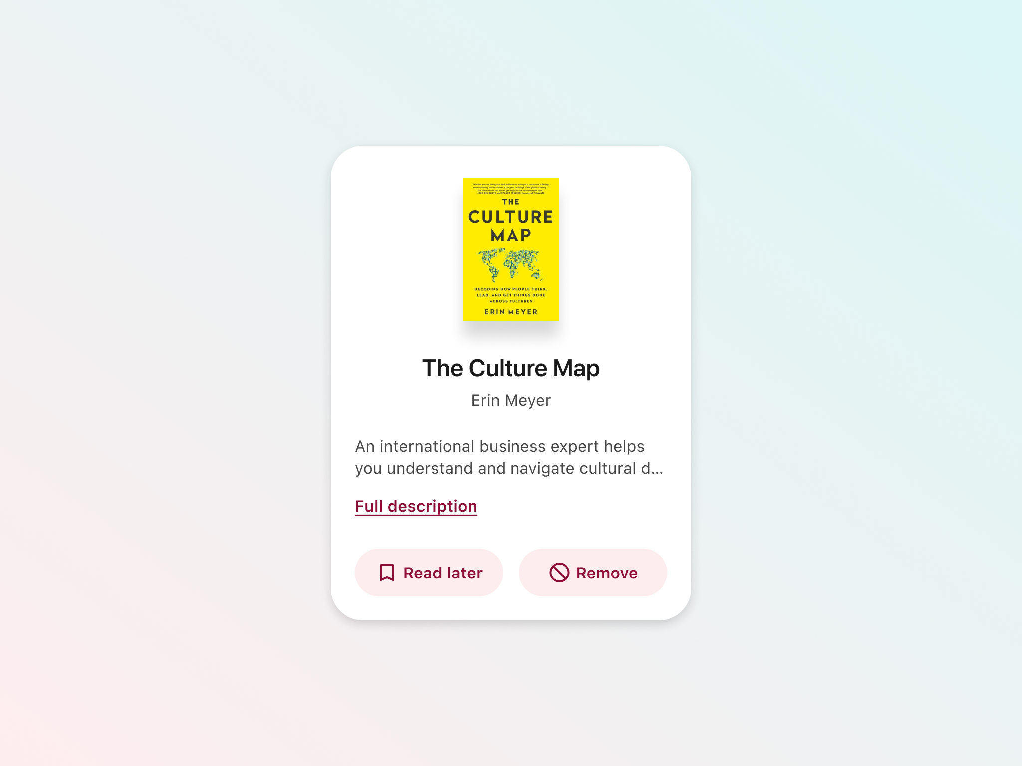
Do ✔
The ellipsis indicates that the text is truncated. Including a link to the full version of the text ensures the card meets accessibility guidelines. The remaining text can be displayed in various ways, such as by expanding the card or opening a modal, among other options.
Related criterion
A bit more on text
Here are a few extra points that may help round out your understanding of this topic, even though they are not necessarily included in WCAG official success criteria.
Be aware of minimum sizes
Although there’s no criterion on minimum sizes, it is generally accepted that 16px is the base size for body text. You can still use smaller sizes sparingly in less important information.
Keep reasonable weights
A combination of thin or light font weights and small sizes may make texts harder to read, so be mindful of readability issues even when the passing contrast is correct.
Left alignment is better for readability
Guidelines briefly recommend not using justified text. On the same note, left-aligned text (for left-to-right scripts) makes the better choice, while centre-aligned text should be reserved for short paragraphs.
Interaction
Links purpose
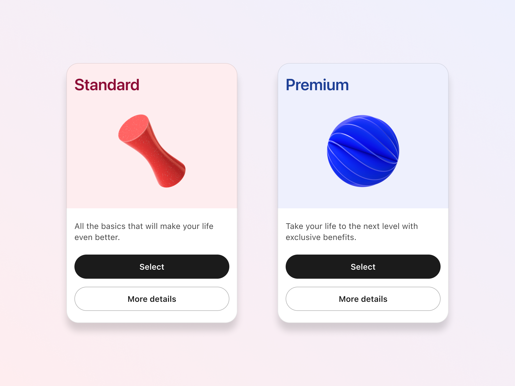
Screen readers can list all links available on a screen. When several links are named the same, it may be confusing for users to understand what each one does. Providing more meaningful text to links can help better understand their purpose.
In some cases when the link text is still generic, there should be a surrounding context that helps identify where this link will take you.
Don’t do ✘
Using generic links in isolation won't meet accessibility guidelines and may confuse users. For example, a component that includes a link labeled "more details" is too generic and lacks clear context. This can be difficult to understand, especially for screen reader users, as they might only hear "more details" for each card, which doesn't clearly convey what the link refers to.
Do ✔
Look for ways to make link text more meaningful so it can be understood on its own. In the example below, rephrasing the link text provides more value. Additionally, the link now follows a preceding text with more context. Notice how the main button also has a more meaningful label; replacing the generic "plan" with a more specific and contextual term helps users understand what the button will do.
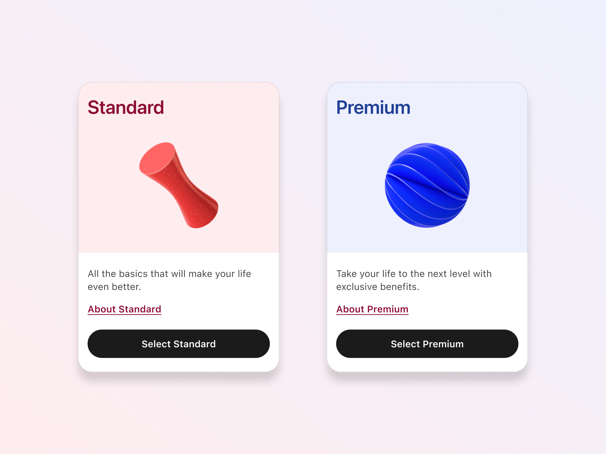
Related criterion
2.4.4: Link Purpose (In Context) (Level A)
Target areas
A target area is the part of a component that can be interacted with using various pointing devices. This includes traditional devices like a mouse or fingers, but also specialised devices used by people with disabilities (such as the ones controlled by ultrasound, infrared beams, eye movements, nerve signals, or brain waves; and others).
WCAG guidelines mention a minimum of 24px, with some considerations. Still, larger target areas are beneficial for everyone, as they make it easier to interact with components regardless of the device being used (Android and iOS guidelines recommend sizes around 44-48px instead).
Keep in mind that this should be the size of the target area, which doesn’t need to be totally visible. You can have an interactive icon where the area to interact with is larger than the visible shape.
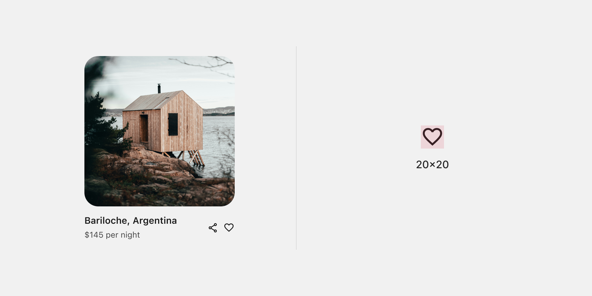
Don't do ✘
When target areas are too small or too close to each other, users may tap the wrong part of the component, leading to unexpected results and frustration. For example, this component has icons to share the item and mark it as a favorite. However, their small size and close proximity may cause users to mistap the option they don't intend to select.
Do ✔
Aim to meet 44px as the minimum target area if possible. In the component below, the target area for each action has been increased to 48px. The background shape provides more affordance than just the icon alone. This background, although it could be invisible if the target area is maintained at that size, helps provide contrast. Finally, the layout has been reworked to place the icons a bit farther apart, making their tapping more intentional and reducing the likelihood of mistaps.
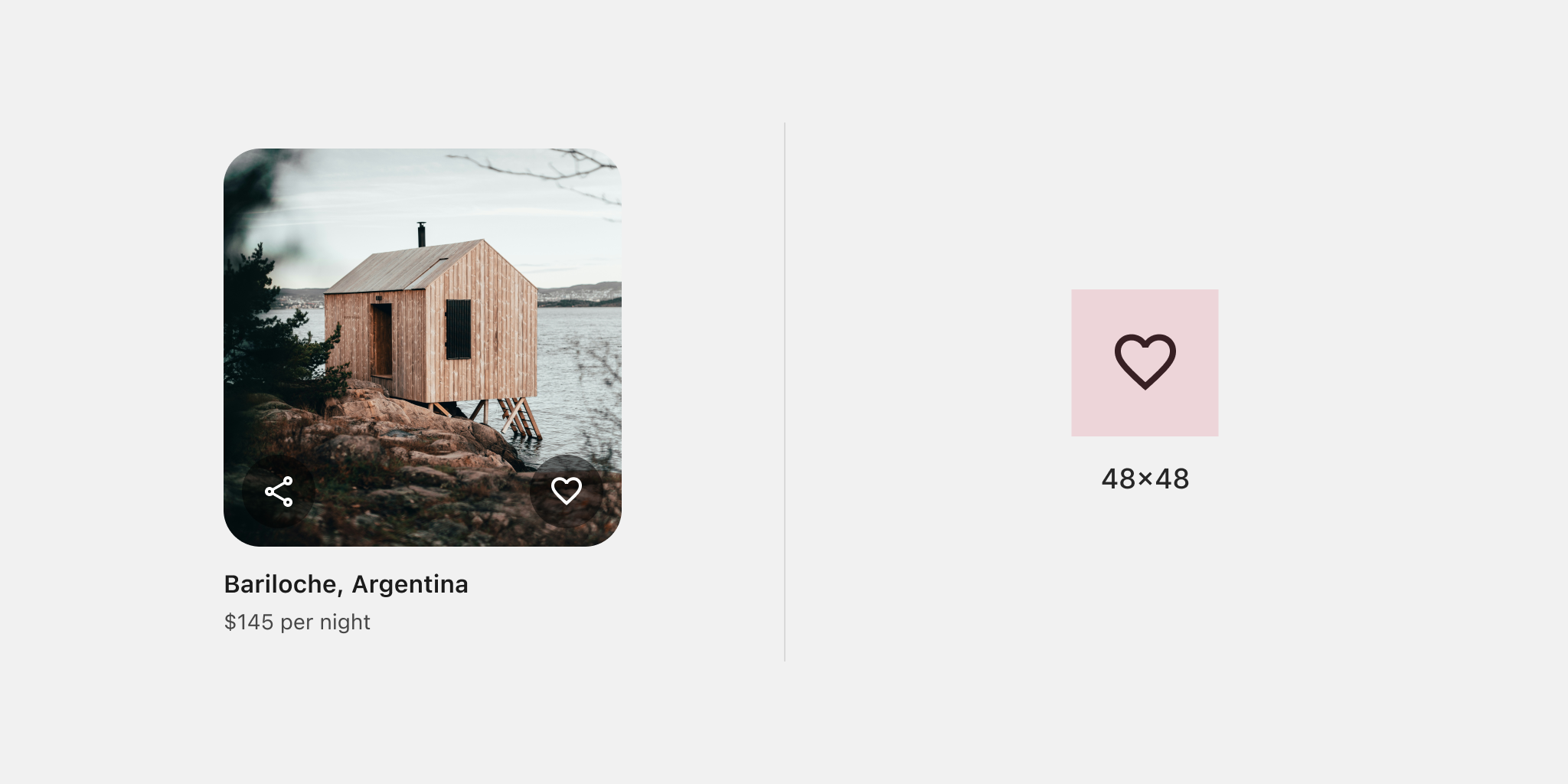
It's even better if you can be generous with the area you provide for interaction, offering as much target space as possible. For instance, when you have a single element that can be interacted with, such as in the component below, making the entire surface tappable will activate the icon. This approach makes it easier for everyone to use, as users won't need to aim for a specific part of the component.
Related criteria
A bit more on interaction
Here are a few extra points that may help round out your understanding of this topic, even though they are not necessarily included in WCAG official success criteria.
Underline links but mind descendants
Underlining links in texts is still the safest way of meeting accessibility criteria. Still, keeping the underline at a certain distance from descendants so they don’t overlap will be beneficial for some users, for example, those with dyslexia.
Strive for affordance
Buttons are not required to have a contrasting background according to guidelines. However, controls with evident affordance, where their function is easy to recognise, will benefit all users. This helps make your UI more intuitive and easier to use.
Consider a focus state for disabled elements
Disabled elements are not required to meet any contrast requirement. When implemented, making them focusable will help users with screen readers identify them. As a designer, you can keep the disabled plus focus state in mind in your Figma variants, if you choose to override the system defaults.
Help and errors
Labels
When designing components that are part of a form, it’s important to provide enough information so users understand what is expected from them. This can be as easy as properly labelling fields.
Don’t do ✘
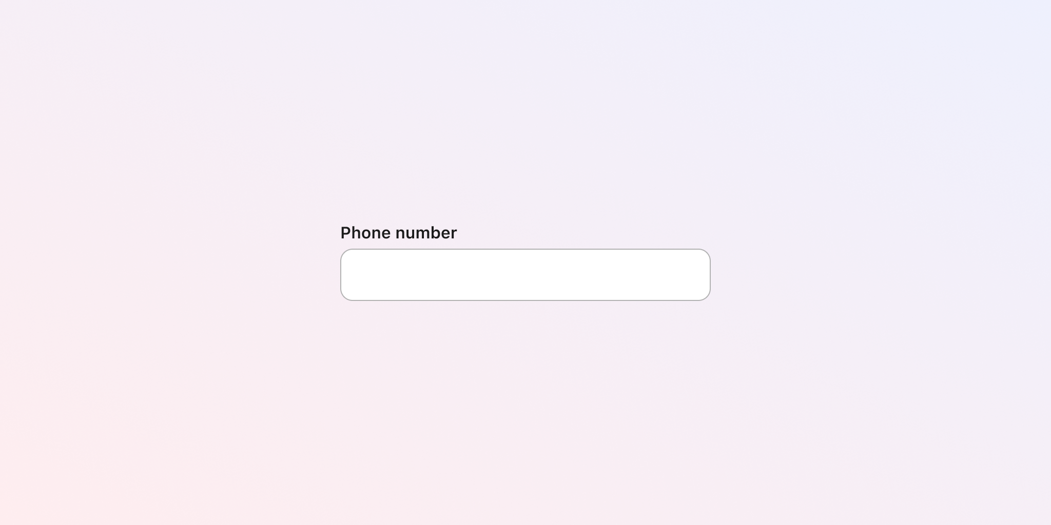
Using inputs that are ambiguous or with insufficient information can confuse users on how to enter information. Inputs that don’t have any label on them don’t help users understand their purpose. The component below is a generic text input used to enter a phone number. However, since phone numbers can have different formats and include country codes, it's not very clear how is expected from the user to enter information.
Do ✔
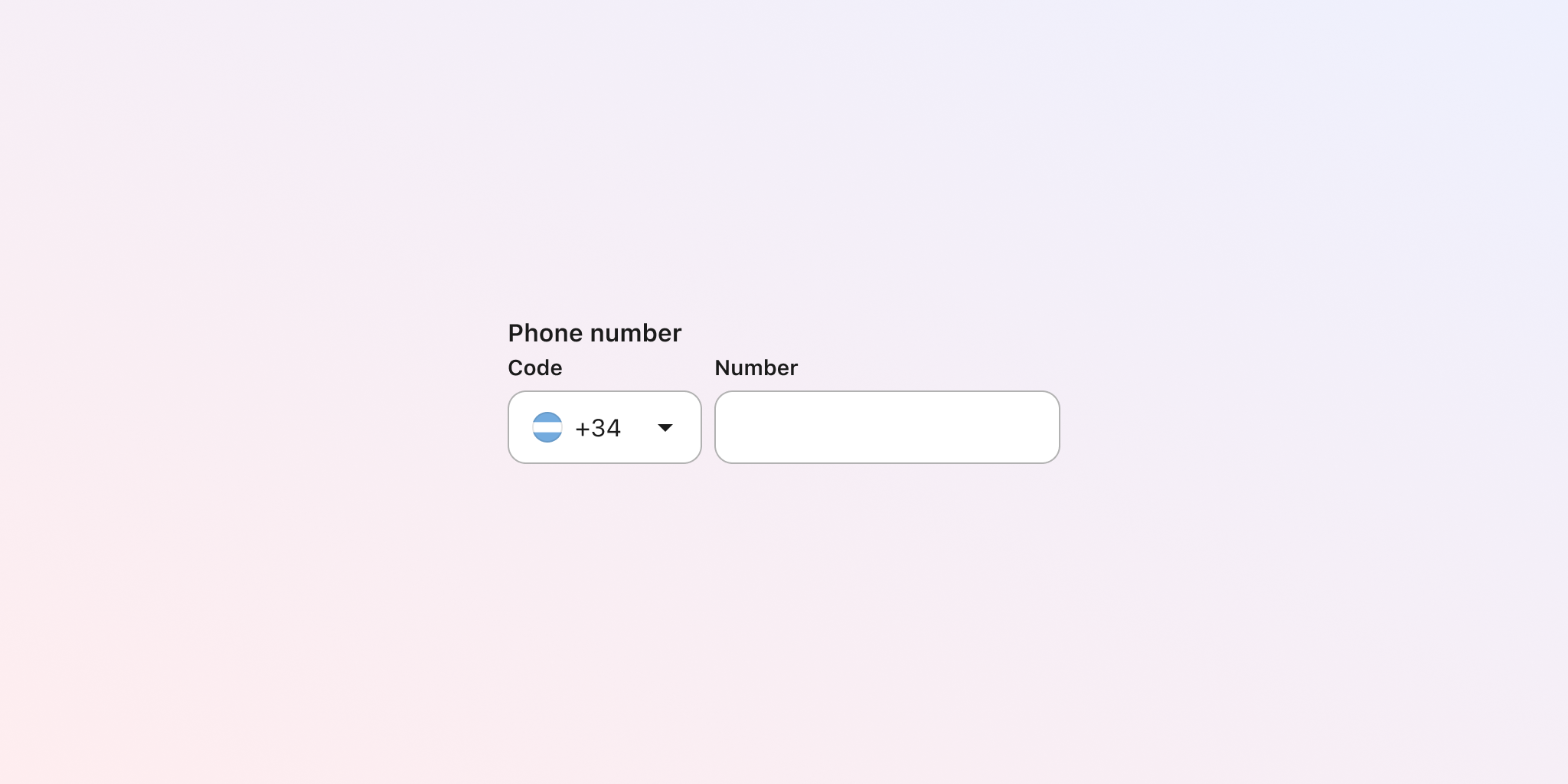
Labelling inputs appropriately helps manage expectations, especially in cases (such as names) when different people may have different ideas of how to enter information. The component now has a separate field for country code, which not only helps people, but will also benefit the quality of information that you get from them.
Related criterion
3.3.2: Labels or Instructions (Level A)
Help
Some users with disabilities are more likely to make mistakes when completing forms or doing some actions. Help that is in context and close to where they are performing their tasks may help maximise their chance of success.
This is especially important when labels are not enough to provide the necessary information.
Keep in mind that this should be done when it’s actually helpful, since providing too much help can also clutter the UI and overload the screen, undermining the initial goal of this requirement.
Don’t do ✘
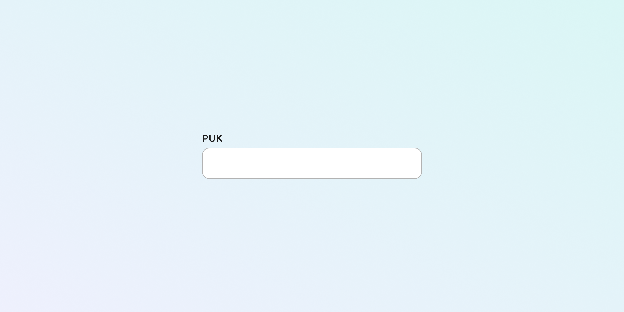
When inputs or components present labels in a way that is not enough to understand how users should proceed, this may confuse people and lead them to make mistakes. This text field component uses an acronym that could be hard to understand. Even if people do know what it means, they may have problems locating this value.
Do ✔
To align with WCAG 3.3.5, provide supplementary guidance to assist users in error prevention. Simply add a brief line of text before each field to clarify its purpose and format, ensuring it's contextually relevant. Consider augmenting this with links to further information on completing the form.
Additionally, rephrase labels to enhance clarity and user-friendliness across all demographics. This proactive approach fosters accessibility and improves overall user experience.
Related criteria
Error communication
Components that can trigger errors (for example, upon submission) should consider errors into account. A typical example is an input component, although not limited to them.
In these cases, you need to think about how to display cases of error in a way that text is indicating the error. Furthermore, you also need to clearly communicate to users how to fix the error so they can continue with their task at hand.
Don’t do ✘
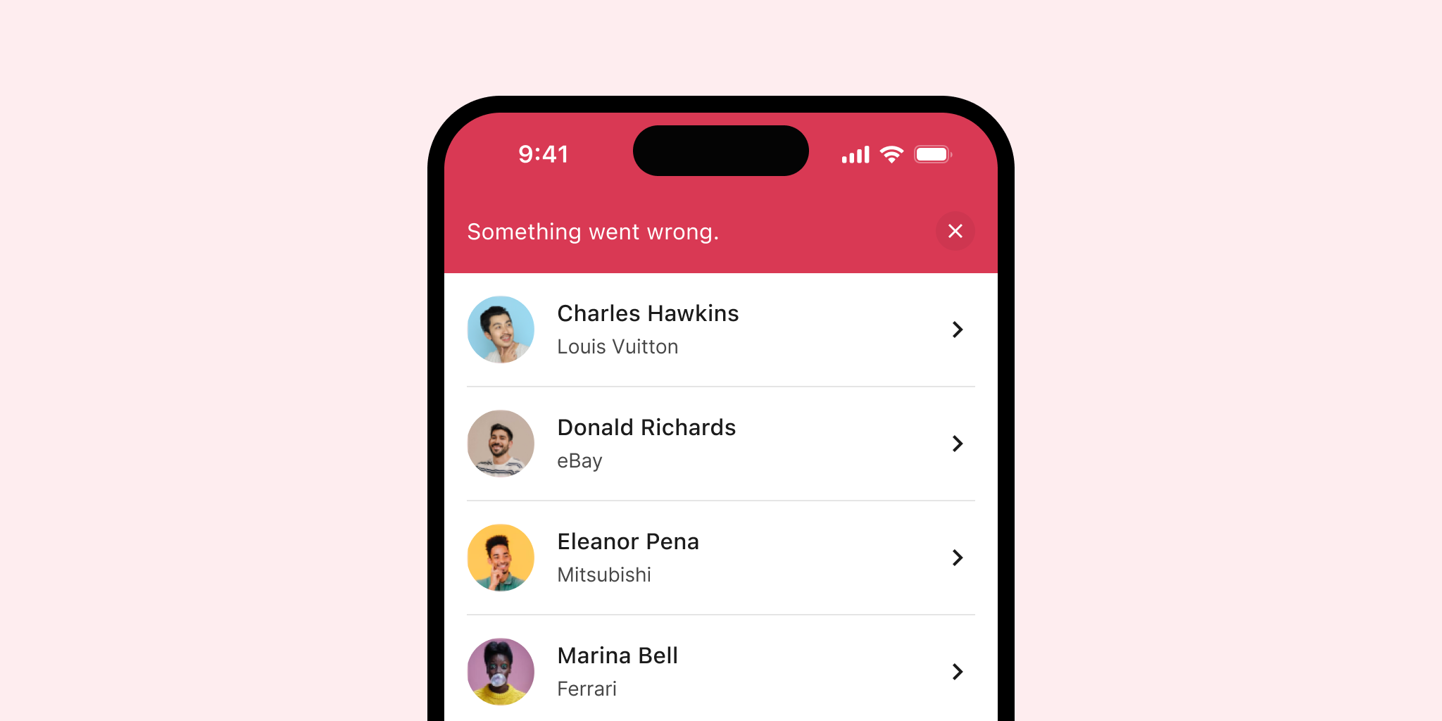
Using a design that relies solely on color to indicate errors is inadequate. This method can make it hard for users to recognize errors and understand how to address them effectively. The following error banner component not only uses red to indicate the problem but also fails to offer a helpful message.
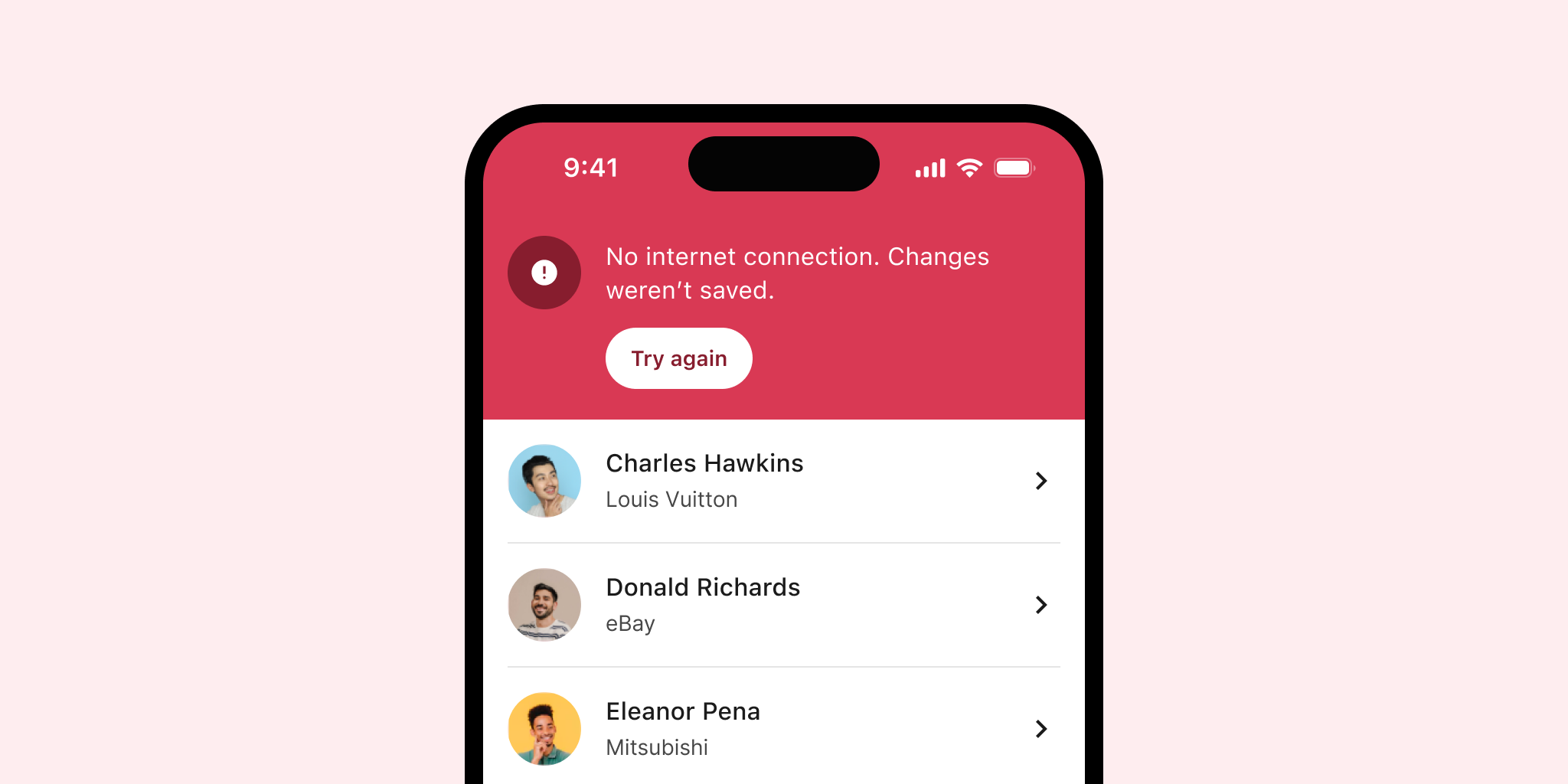
Do ✔
Communicate errors using a blend of text, icons, and colours. This multifaceted approach ensures users can identify and comprehend errors, accommodating varying visual and cognitive abilities. The updated banner now features both colour and an icon.
Additionally, the error message is clear and precise, detailing the issue and providing an action for resolution. Always use straightforward language to enhance message clarity and accessibility.
Related criteria
Documentation
Designing components with accessibility practices is just part of what you can do in your designer's role. While many criteria depend on engineers, you can prepare your designs to bridge the gap between your proposal and the final implementation.
A practical approach is to create accessibility-focused components specifications and documentation that assist engineers in the implementation process. These additional documents complement your existing design considerations. While this topic deserves a deeper exploration, here are some initial ideas to inspire what you could document.
Focus order
Document the logical order in which elements of your components should receive focus. Focused elements should follow a predictable and consistent sequence, which you can test using the tab key. Tools like the A11y - Focus Order plugin by Microsoft for Figma can help with this task.
Keyboard navigation
In addition to focus order, specify how users can navigate components using other keys. For instance, up and down arrows can facilitate vertical movement within a list, while the spacebar or Enter key can trigger interactions. Include these details in your component specifications.
Headings annotation
Annotate your components and screens to indicate the hierarchy of headings (such as h1, h2, h3). Ensure that headings follow a logical, descending order without skipping levels, which enhances readability and accessibility.
ARIA Attributes
ARIA attributes enhance the accessibility of custom components for technologies like screen readers. While helpful, these attributes must be used correctly, as improper implementation can cause more harm than good.
These suggestions aim to enhance your current component documentation with a focus on accessibility. We will explore this topic in further detail in upcoming articles.
Conclusion
Following these recommendations won’t magically make your components accessible. How these components are implemented by engineers will also play a key role. Additionally, how other designers and engineers use the final result will impact our accessibility outcomes.
Achieving this is easier when there are internal practices, culture, tools, and people that support accessibility. If your team or organisation is just getting started on accessibility, consider getting an Accessibility Specialist involved in the design process. They can also train and support your team members to maintain and improve accessibility standards over time.
Whatever your current situation is, adding accessibility practices is always a good idea, especially if you want to start getting more familiar with how accessibility works in practice and do your part, as a designer, to build more accessible products for everyone.