

Colour contrast is one of the areas where we designers can have a significant impact on accessibility. While accessibility is much more than that, a series of measurable variables make colour contrast one of the perhaps easier aspects to address.
The WCAG guidelines, while comprehensive, may make approaching colour contrast seem daunting. That’s why in this article, I will provide several examples and visual content to help you better understand how accessible colour contrast works in UI design.
I assume that if you are here, it’s because you are already interested in accessibility. So instead of making a case for it, I will focus on practical tips that you can start using right away after reading this post.
Basics of colour contrast
Colour is one of the most intricate areas of design if you want to get it right. A deep knowledge of how it works may involve understanding human perception, colour models, and even mathematics and history.
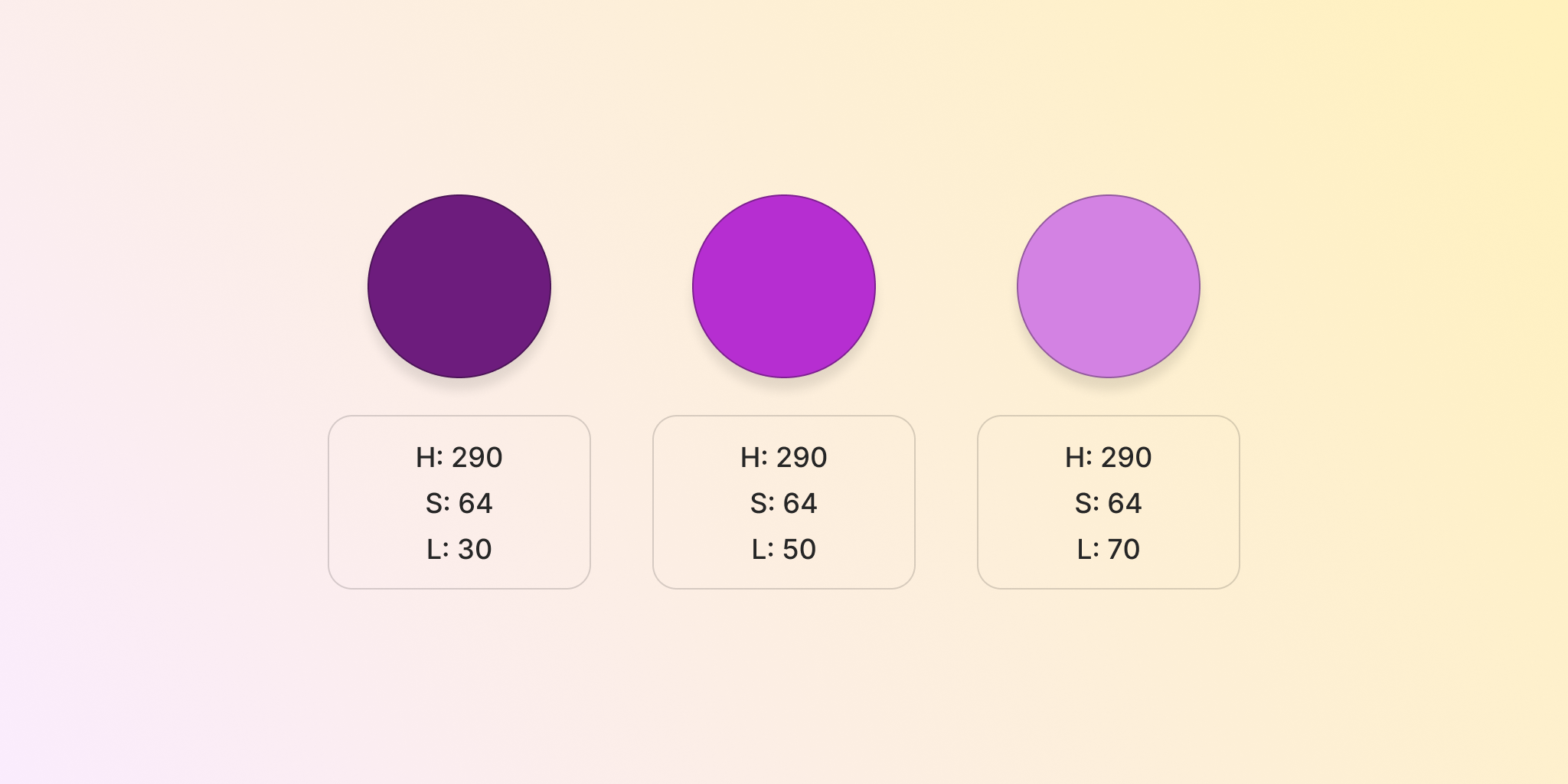
For our purposes, we just need to understand that every colour has a luminance component. This is what makes colours look darker or lighter compared to each other. Scales are usually created with several “steps” of luminosity for each colour.
This is easier to understand when you see a colour value decomposed into its HSL values, which stand for hue, saturation, and lightness. In the image below, you can see how a colour with the same values for hue and saturation can look darker or lighter depending on its lightness (represented with the L values).
Contrast ratios
The accessibility guidelines propose their approach by comparing the perceived luminance of two colours. The result is measured in what is called contrast ratios, which can range from 21:1 to 1:1 and everything in between.
Black to white (and vice versa) has the highest contrast ratio. Two colours that have the same perceived luminance will have a ratio of 1:1, like the ones on the following image.
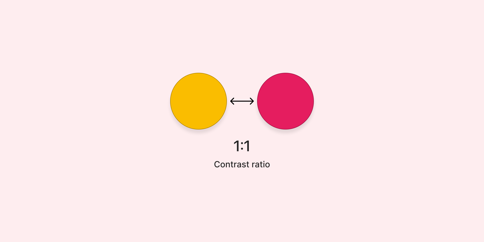
It’s important to note that the order of the colours in this equation doesn’t matter since the contrast is measured against each other.
In design, we usually measure a foreground element against a background element. The guidelines follow this approach mostly for text elements. They also often mention "adjacent" colours — that is, when one colour is next to another. This is especially true for colours that are applied to elements other than text, like controls.
We will dig into some examples later on how to tackle real-life scenarios scenarios where, even for a single component, there are simultaneous contrasts that you need to take into account.
While contrast ratios are expressed in the format 3.5:1, we will often shorten it to 3.5 for the purposes of this article (the :1 part is always the same).
Conformance levels
Web Content Accessibility Guidelines (WCAG) 2.2 define three conformance levels to meet the needs of users. They are our success benchmarks to understand if the contrast between colours is passing the test.
While the whole range consists of A, AA, and AAA, for colour contrast it only applies to AA and AAA, which mean an “intermediate” level of accessibility and a more advanced one. When designing, you need to decide if you want to aim for AA or AAA and prepare your designs accordingly.
In practice
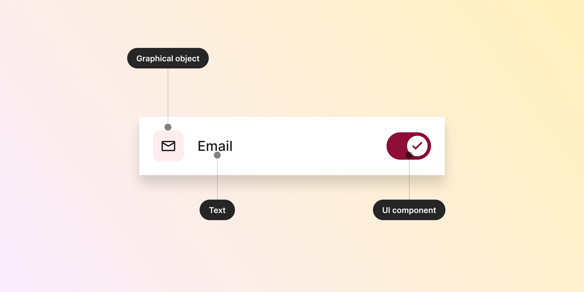
The guidelines divide everything into text and non-text elements. Text elements are straightforward in terms of what they represent. Non-text elements are further split into "User Interface components" (buttons and other controls) and "Graphical objects" (icons and other graphics).
Each type will have different contrast ratios that need to be met to achieve an AA or AAA rating.
In the examples below, we will go through the main use cases in UI design to understand the contrast ratios required for each success criterion.
Text
For texts elements we need to make a distinction depending on their size and if they are bold or not. WCAG guidelines communicate size values in points. However, to make things easier for us I have included their rough equivalent in pixels.
Normal text is 24px or below, unless it’s bold. In that case, normal text is 19px or below.
Large text is 24px or above, unless it’s bold. In that case, large text is 19px or above.
Each kind of text will need to meet different contrast ratios to get their AA or AAA rating.
Normal text 4.5:1 (AA) and 7:1 (AAA)
Large text 3:1 (AA) and 4.5:1 (AAA)
This is relatively simple to measure for cases when you have text on top of a plain solid background. There are, however, a couple of scenarios where you need to be a bit more careful to make sure that your texts are still accessible.
Text on images
When the text is placed on top of images, you still need to meet the criteria mentioned above. The challenge here is that sometimes we don’t know exactly what that image will look like, or what colours will it contain, since it may be user-generated.
One possibility is to add a layer in between the text and the background to protect readability against different kinds of backgrounds. This layer will have a certain, so to allow the image in the background to be visible.
In this case, the contrast between text and background will always pass the test, even when the text sits on top of a white background.

Another option would be to add a shadow around the letters to create a so-called “halo” effect. This shadow around the text can create a sort of “buffer” area to protect the contrast of the text against any kind of image, not matter what that is.
Text on gradients
While there are no specific guidelines on how to handle text that goes on top of gradients, my recommendation would be to test the contrast with all colours that compose the gradient to check that the required contrasts are met.
White and purple work well and pass the contrast. However, blue doesn’t meet the requirements for text at that size, even when being bold — and just for little. So the options would be to change the blue to something slightly darker, or increase the font-weight to turn the label into a large text, that needs a lower contrast.
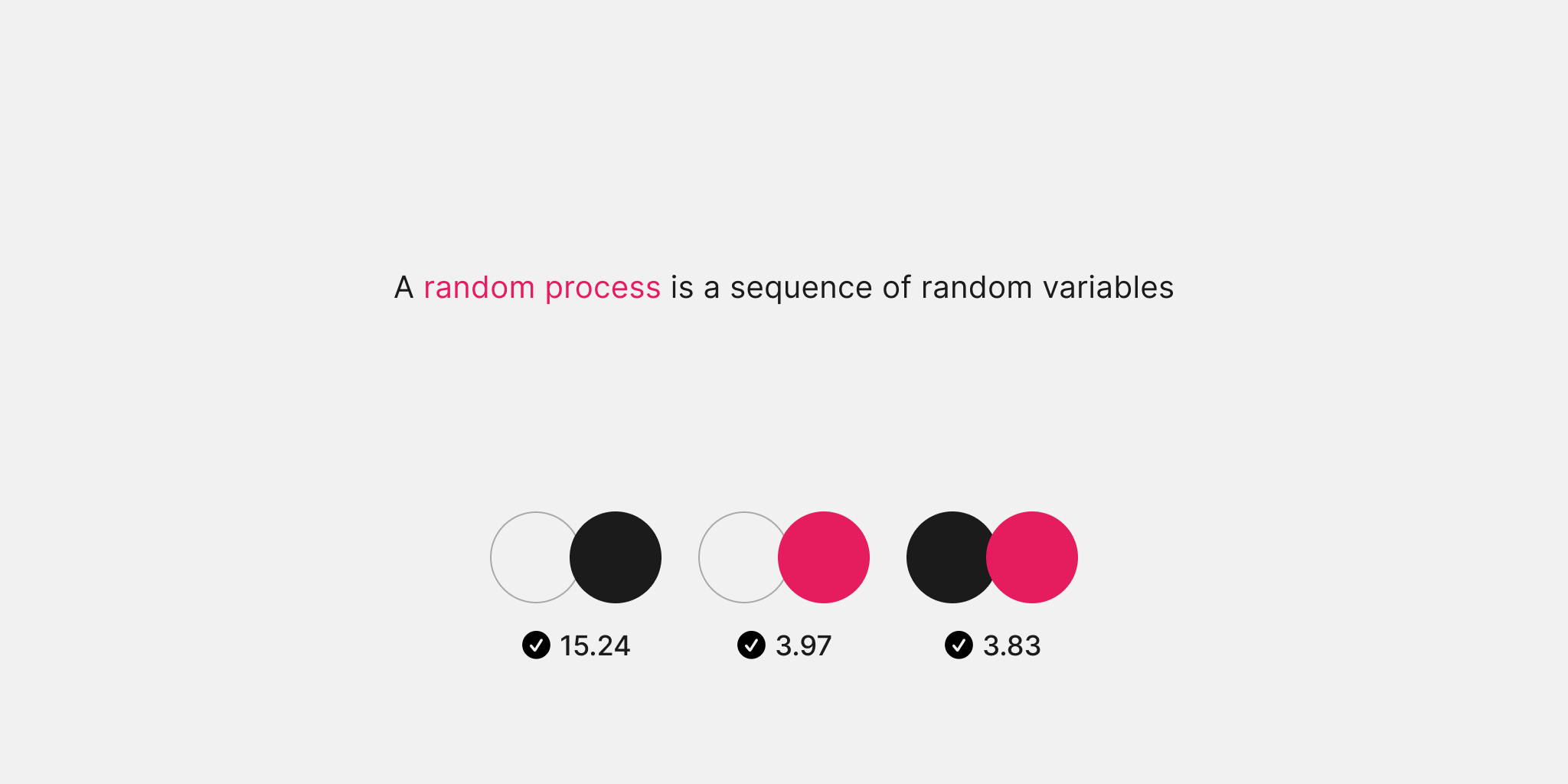
Text as links
In this case we talk about links as parts of the body text, for example inside a paragraph. In this case, if we use colour alone as the only means to identify a link, they need to meet a somewhat hard to meet criteria.
Links that are part of the body text should maintain a contrast with the text that is not a link. At the same time, they should also have enough contrast with the page surface. You can see in the image below all the ratios that we need to keep into account. In this case, this is a large text.
If you follow this approach, you must at least underline links on hover states.
Since doing all of this may be tricky — and less user-friendly, I often recommend adding an underline to links in all states to ensure they are clearly identified as such and don’t rely on colour contrast alone. At the same time, this makes the requirement of contrast between normal text and link not necessary to meet anymore.
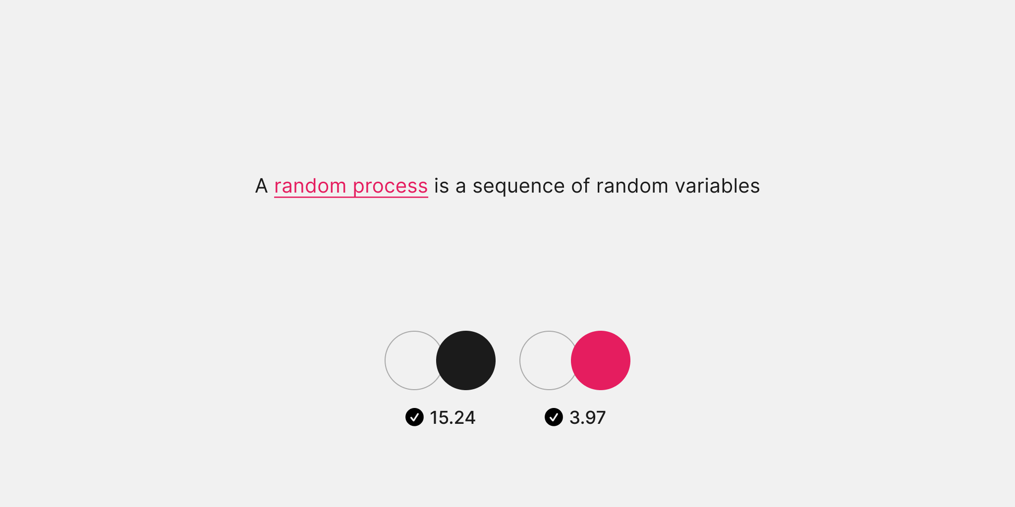
In the example above, you could potentially even use the link in the same colour of the body text, as long as is underlined. We will discuss a bit more on how is not a good practices only relying in colour in certain situations.
Decorative
An exception to all these cases is text that is purely decorative and doesn’t have any essential function. One perhaps controversial scenario is texts that are disabled, which don’t need to meet any specific criteria.
UI components
Having already explained how contrast works on text elements, we will now focus on the non-text elements of various common UI components.
In any interface, we typically have a mix of components: some are interactive, while others serve an informative purpose without requiring interaction.
For interactive elements, we need to ensure they are easily recognisable and operable. Thus, borders on inputs, chevrons in drop-downs, and any other elements that provide visual affordance to interactive components must have a minimum contrast ratio of 3:1 (AA).
This doesn’t mean every interactive element must have visual boundaries, but we need to maintain them when they are the primary indicator of interactivity. As we will see with the case of buttons below, there are some surprising exceptions.
On the other hand, components that use borders decoratively do not need to meet any special contrast requirements.
Let’s explore some common design considerations for UI components.
Buttons
Guidelines do not require that buttons and other components have boundaries (or visible borders) delimiting their interactive area, unless that is the only way to identify the component as such.
In the case of buttons, neither the outline nor the background must meet any requirement with the surface they are placed on. The context, location, and text label of buttons may be enough to convey meaning and interaction. However, do keep in mind contrasts for text as mentioned before.

In the image, both buttons are meeting the requirements, since the border doesn’t need to meet any specific contrast. However, the one on the right has a darker border with good contrast, which makes it easier to identify. At the same time, this increases its visual affordance, which could benefit everyone, especially people with cognitive disabilities.
Inputs and form controls
In the case of controls such as inputs, radio buttons, and checkboxes, the boundaries of the element play a fundamental role in making the component easier to perceive as such.
In the example below of an input that has a white background and is over a light screen, the border is the main way of identifying the input, so that needs to meet a minimum 3:1 contrast ratio with the background.
Removing the border would leave just the background as the main element to create affordance. And input with a white background and a clear screen wouldn’t meet the criteria, since there’s very little contrast between both.
Beyond inputs, there are more complex components like toggles that include several parts. For example, an active toggle presents the icon, the knob, the background of the components, and the surface of the page.

Here there are multiple adjacent colours, and all of them need to keep this 3:1 contrast between others. That would be the contrast between:
- Check mark and the knob
- Knob and component background
- Component background and page surface
The same principle could be applied to other components such as radio buttons or checkboxes.
States
Components need to keep the same criteria that is necessary for their default or enable state across all others. What is perhaps important to mention is that states between them don’t need to keep any specific contrast, since they are not visible at the same time.

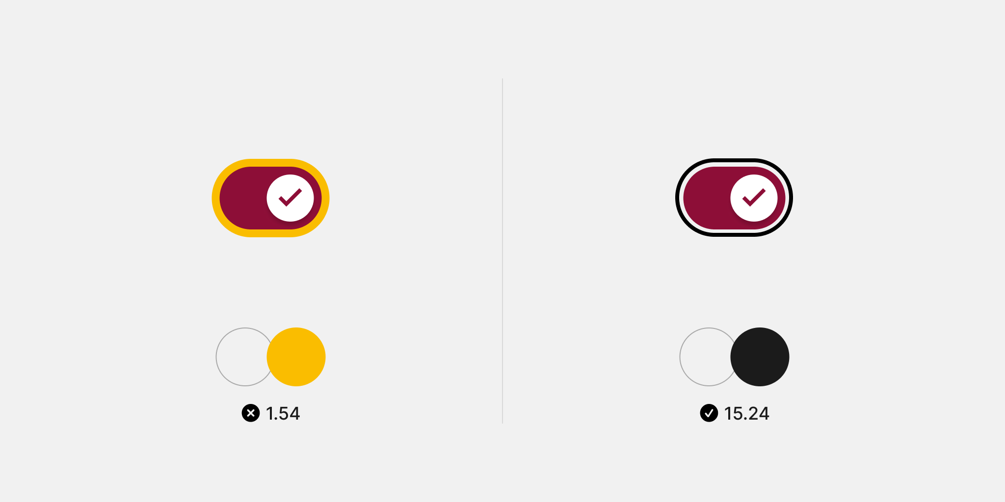
Focus
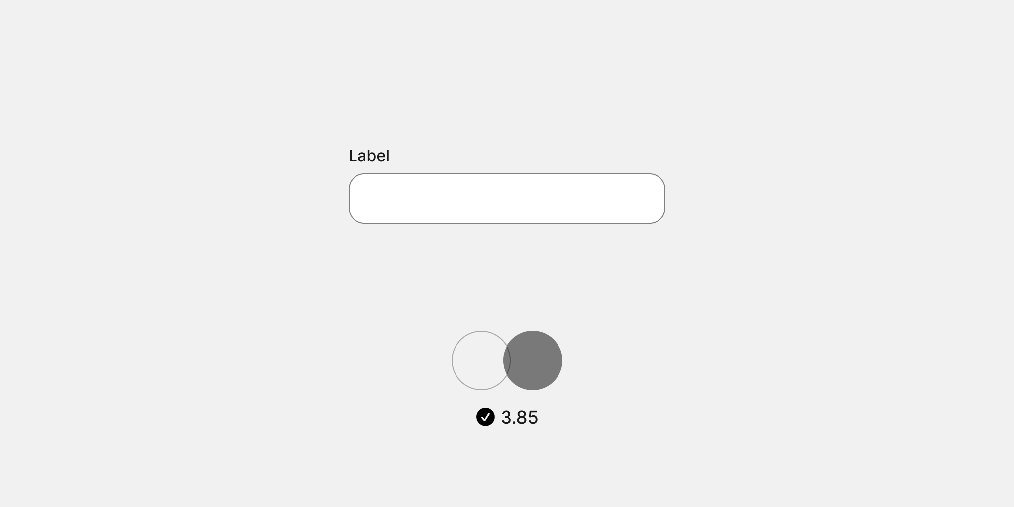
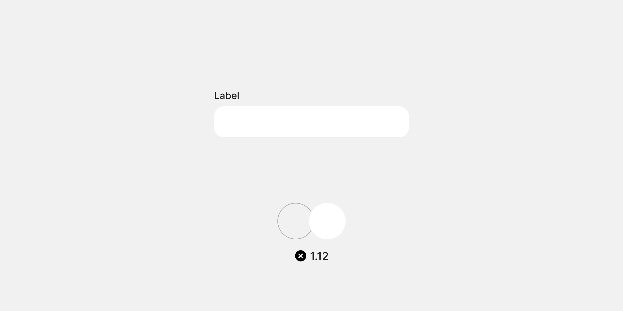
If you payed close attention to the image above, you perhaps realised that a note apart is the focus state. This state is a critical piece of information for many users to understand when a component is “selected” in the sense of being ready to be interacted with.
Most browsers already provide a focus state by default. So in that case, you don’t even need to design this state or do anything else.
If you wish to design your own proposal, you need to make sure that colour contrasts with both the background of the component, and the background of the page. On the image below the yellow ring does not have a sufficient contrast with the background of the screen. The image on the right have a ring outside the component, that greatly contrasts with the page.
There are multiple ways of designing focus states, also with considerations beyond colour contrast. I do recommend you to take a look at the guidelines that state that multiple criteria need to be passed, signifying the importance of this state.
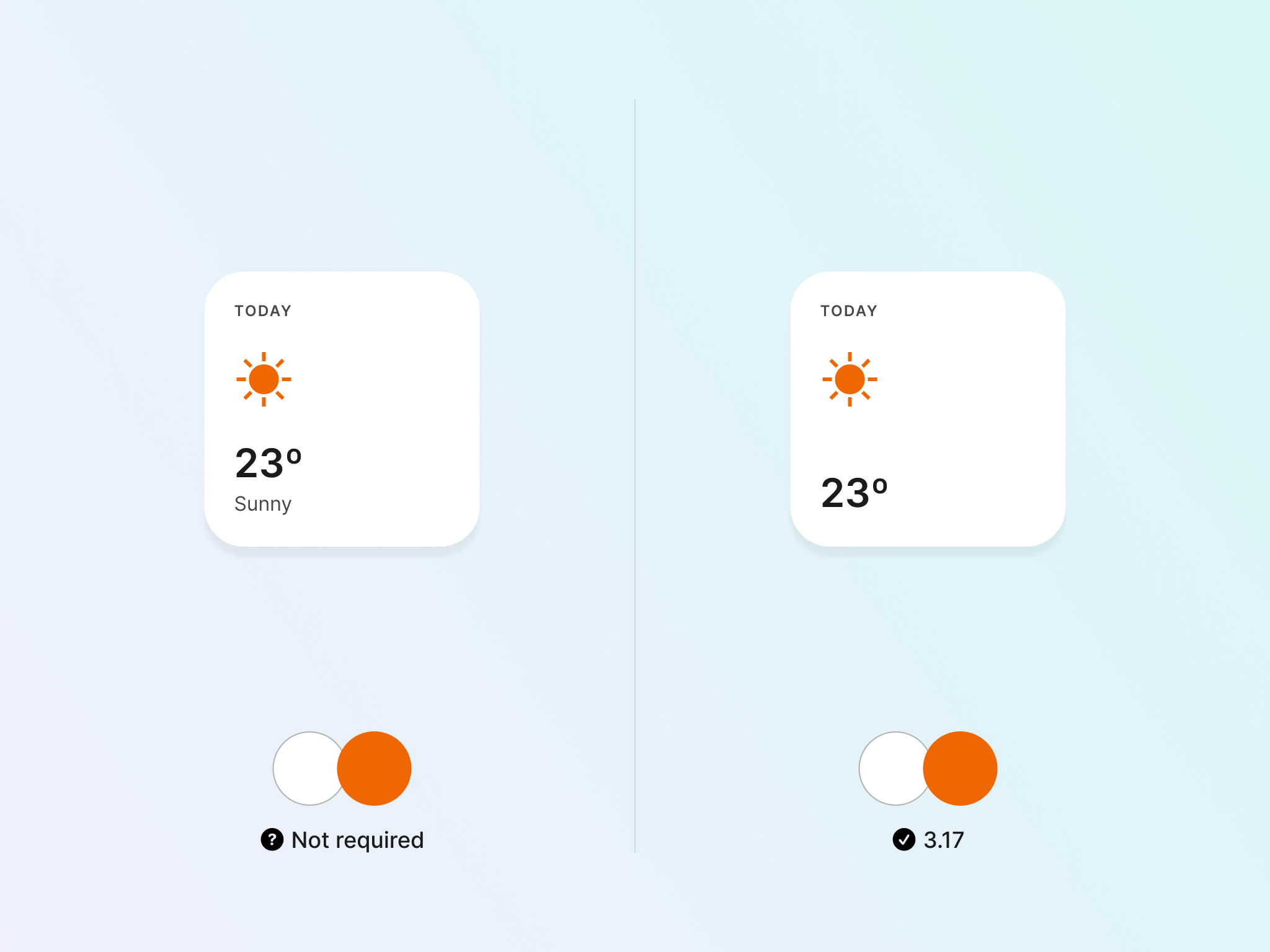
Disabled
Lastly, you need to consider disabled states that cannot be interacted with by users. This state is exempt from the rules that apply to other states since creating a universal solution has proven challenging.

That being said, in the image below, both designs are passing the criteria in terms of colour contrast.
Other graphics elements
There are different kinds of visual elements and graphics that we can find in a user interface: Icons, pie charts, illustrations, infographics, and so on. For the sake of brevity, we will just focus on icons, which are a very common element present in interfaces.
Before going further, it’s important to note that not every icon needs to meet a contrast requirement. This should be so when the icon is needed to understand what it means, or when it’s not accompanied by any text.
In this example, since there’s already a text that is mentioning what the icon means, that gives the icon to a decorative function; its contrast is not essential anymore to understand the information presented to the user. If that label weren’t present, then the icon would need to pass the 3:1 minimum contrast.
Other icons can have a more important role in a component. One of these cases is the chevrons you can find in drop-downs, and that provide a clear indication of how the component works. In that case, it’s necessary to keep the same 3:1 ratio mentioned before.
Tools to measure
There are standalone tools that you can use to measure colour contrast, such as the WebAIM contrast tool. For Figma, there are also numerous plugins such as Contrast Checker that integrate into your workflow.
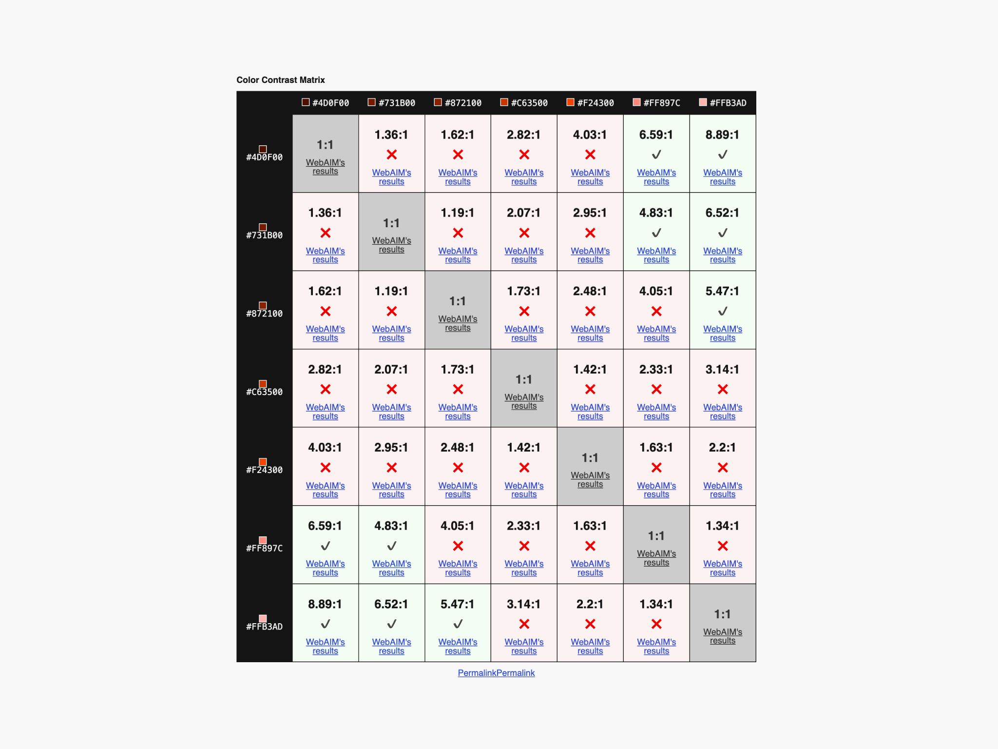
Other tools such as color contrast matrix can help you visualise the relationship between colours and make better decisions when you are building your colour palette.
However, the rise in popularity of design tokens with semantic naming means that it shouldn’t be so frequent to measure contrast in your day-to-day design job.
When accessible colours are baked into the design systems, and appropriate colour naming is defined, then accessible colour pairing is easier to achieve.
For example, we can already define that $color-text-primary and $color-background-default will meet the criteria we are looking for, no matter in which component or screen they are being used. This will save a lot of time in the long run, once it is understood how colour tokens can be combined.
Beyond contrast
While we have put an emphasis on colour contrast for this article, there’s more to this that you should know. In order to make our products easier to use for everyone, we shouldn’t rely on colour alone in certain scenarios.
Status
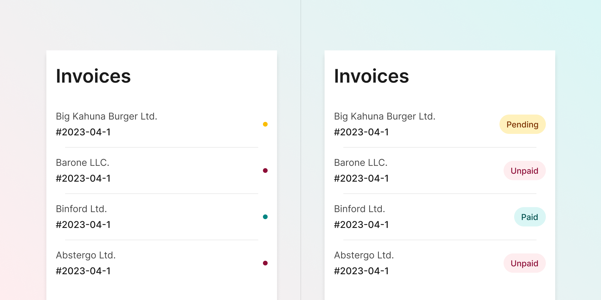
Consider the image below. In this calendar, colour is the only way to understand when a price is high or low. Users who cannot distinguish between green and red would be unable to spot the difference, missing an important piece of information in the decision-making process.
A similar situation could happen in this example where the status is just indicated by colour. Adding a label badge also does the trick since it doesn’t rely solely on colour.
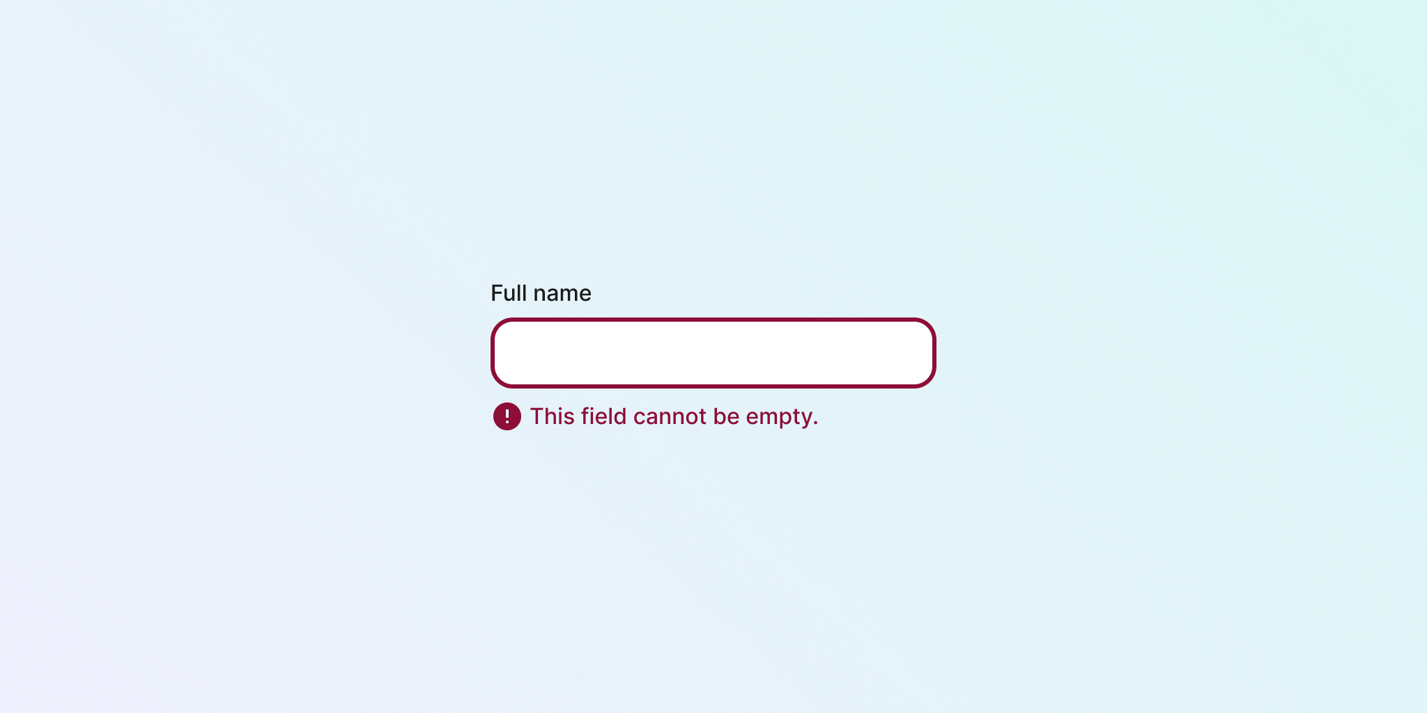
There are some other examples that you could take into consideration, being one of them the indication of error status in components such as inputs. Just using red is problematic, so a better alternative also includes an icon.
Charts
Charts are a category of their own. Even when the contrast of each colour in the chart with the background is “accessible,” it’s difficult to guarantee that other colours that are in touch with each other will also have an accessible contrast ratio between them.
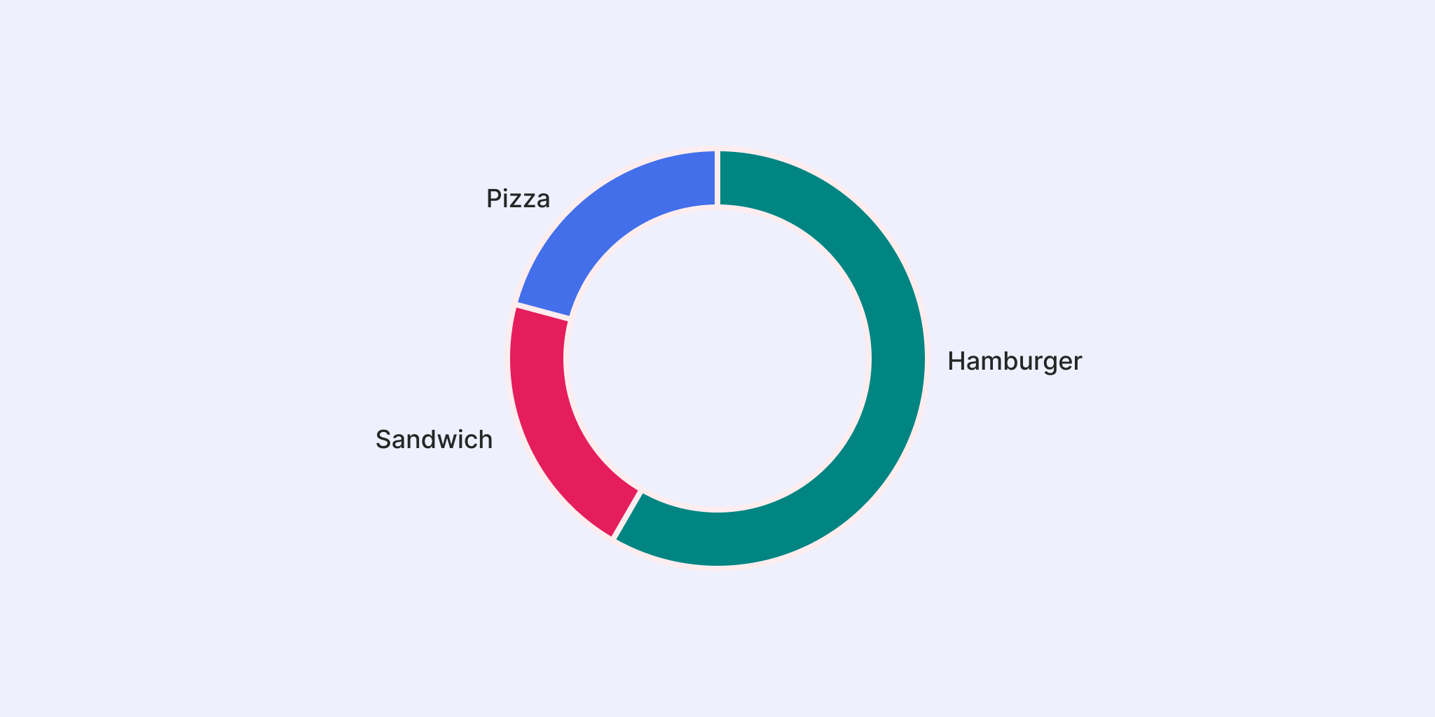
There are a number of additional techniques that can be used to overcome this shortcoming, including additional white space to separate the information, as in the image above. Other options include adding textures, or presenting contextual data that allows the identification of each segment, leaving the use of colour in a secondary role.
Links
As mentioned before, it’s recommended to add an underline to links in all states, to make sure they are clearly identified as such and don’t rely on colour contrast. And when doing so, take care of placing the underline in a way that doesn’t interfere with descendants — to keep users with dyslexia in mind.
The future
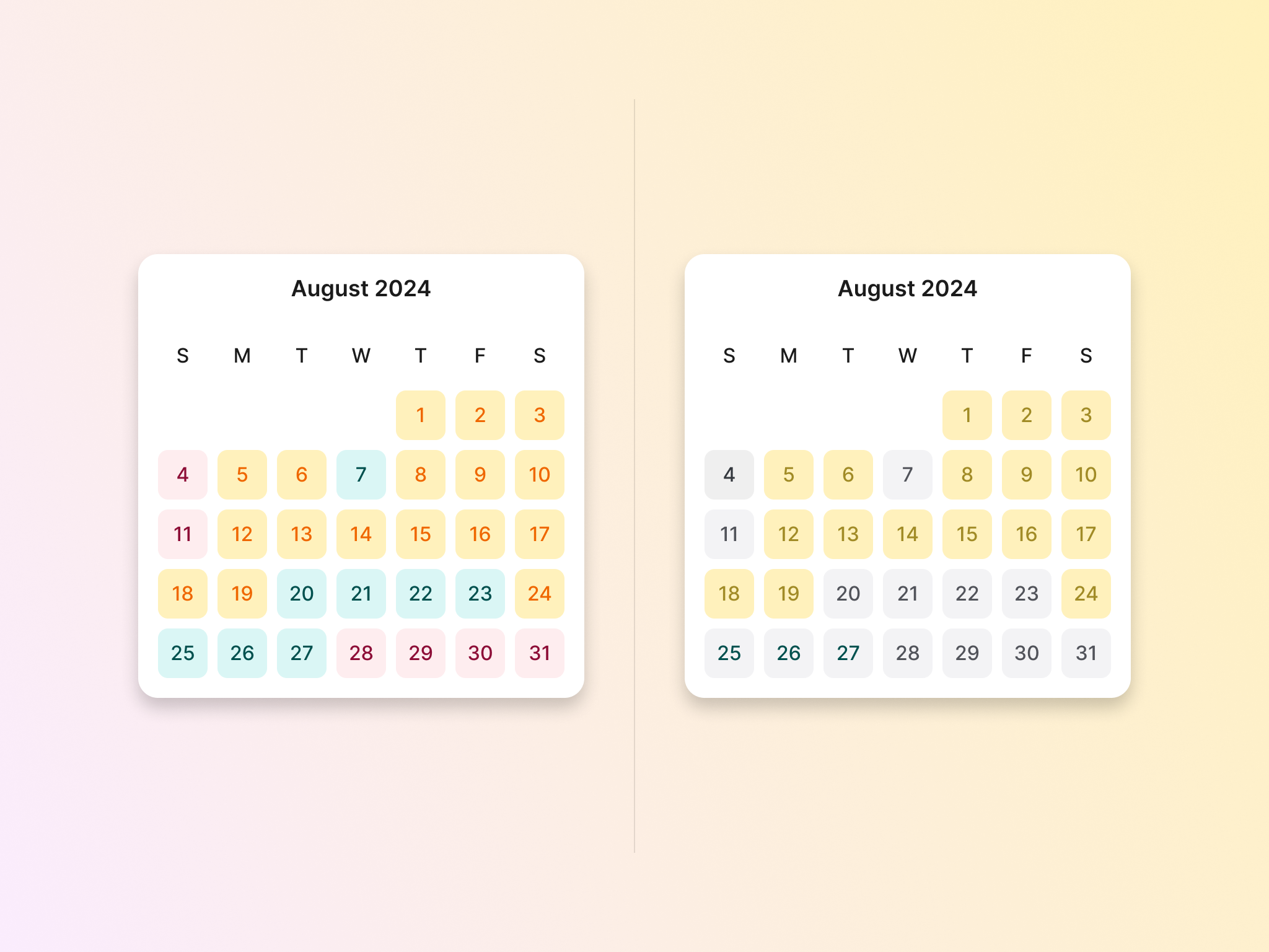
WCAG guidelines are a very good place to start to make sure that you are making your designs more accessible. For colour contrast, once you get more familiar with how everything works you will probably start noticing some weird results in contrast ratios, maybe more than in some colours than with another.
The current contrast calculation system is far from being flawless. In the image below, you will notice how some combinations that, at first sight, don’t look accesible at all get ratios that passed the mark, while others who are perhaps easier to read don’t meet the criteria.

A new contrast calculation model has been suggested as possible to be the one used by the next generation of the guidelines (3.0, currently in draft). That model is APCA, that stands for Accessible Perceptual Contrast Algorithm.
APCA is a more adapted and ready for modern technologies, and uses a different approach and rating system than the current one. This may make colour contrast closer to how we actually perceive colours on screen.
Alternative colour models
The new draft while take still a while to be released (the First Public Working Draft was published in 2021, with a handful of updates over the subsequent years). While waiting for APAC to be official, there may be some other strategies to use more predictable colour pairings that will help us meet accessible contrast.
One option is to use HSLuv colour model, “a human-friendly alternative to HSL”. While HSL lightness make sense for individual colours, they don’t when you compare colours between each other.
As you can see with the blue and yellow below, colours with similar lightness (and even saturation, in this case) can have a very different representation in HSL, which would make achieving contrast ratios more difficult.

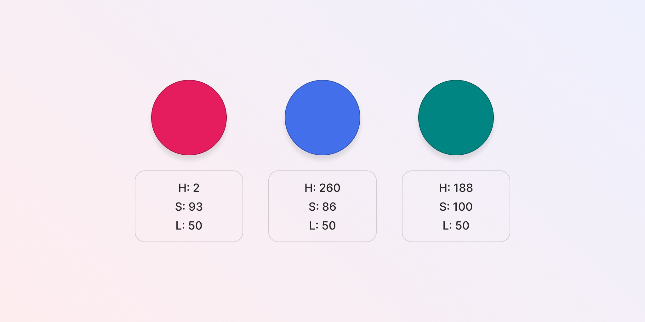
HSLuv in some way “normalises” lightness, so colours with the same “L” in their values will look close to each other in terms of how bright they are. All of the colours below have a similar lightness in HSLuv and look more harmonious next to each other, as opposed to the blue and yellow example above.
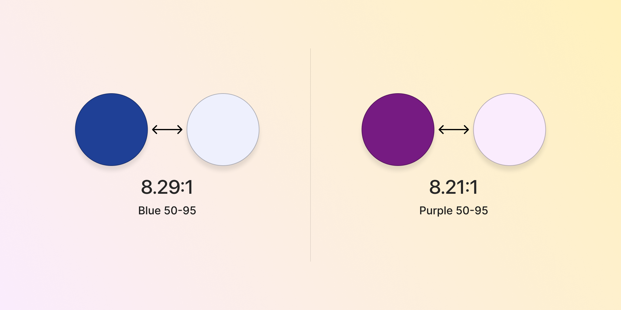
With this in mind, we can then create a colour scale that is more predictable. For example, we can know that all colours with “50” in lightness will get a contrast ratio around 8.2 when paired with colours with “95” in lightness. No matter the hue or saturation, colours will result in more predictable contrasts ratios.
While it’s not as simple as it sounds and there are many different ways of approaching colour, this could be one alternative to keep in mind. In Figma, the HSLuve plugin will help you convert colours.
Summary
Colour contrast is one of the main tools designers have to make more accessible designs, although certainly not the only one. There are guidelines that help us understand how to use proper contrast ratios, but they may be sometimes difficult to understand.
The ratio between text and background or between adjacent colours can be measured in a way that helps us understand what criteria we are meeting.
There’s not a single solution for all cases, and not even the sole use of colour will guarantee an accessible experience. But even when all of this means a bit of care and effort, it’s a fundamental way that we are designing experiences that can be used and understood by everyone.