
Anatomy
The anatomy of components comprises common elements you may encounter. In this context, they represent a standardised structure.

Visual design
These guidelines provide insight into designing your component. Consider them as inspiration and tailor them to suit your product's requirements.
Accessories
When using avatars, make sure of also including empty states. This way the component is prepared to handle gracefully information, and also the lack of it when it's missing.
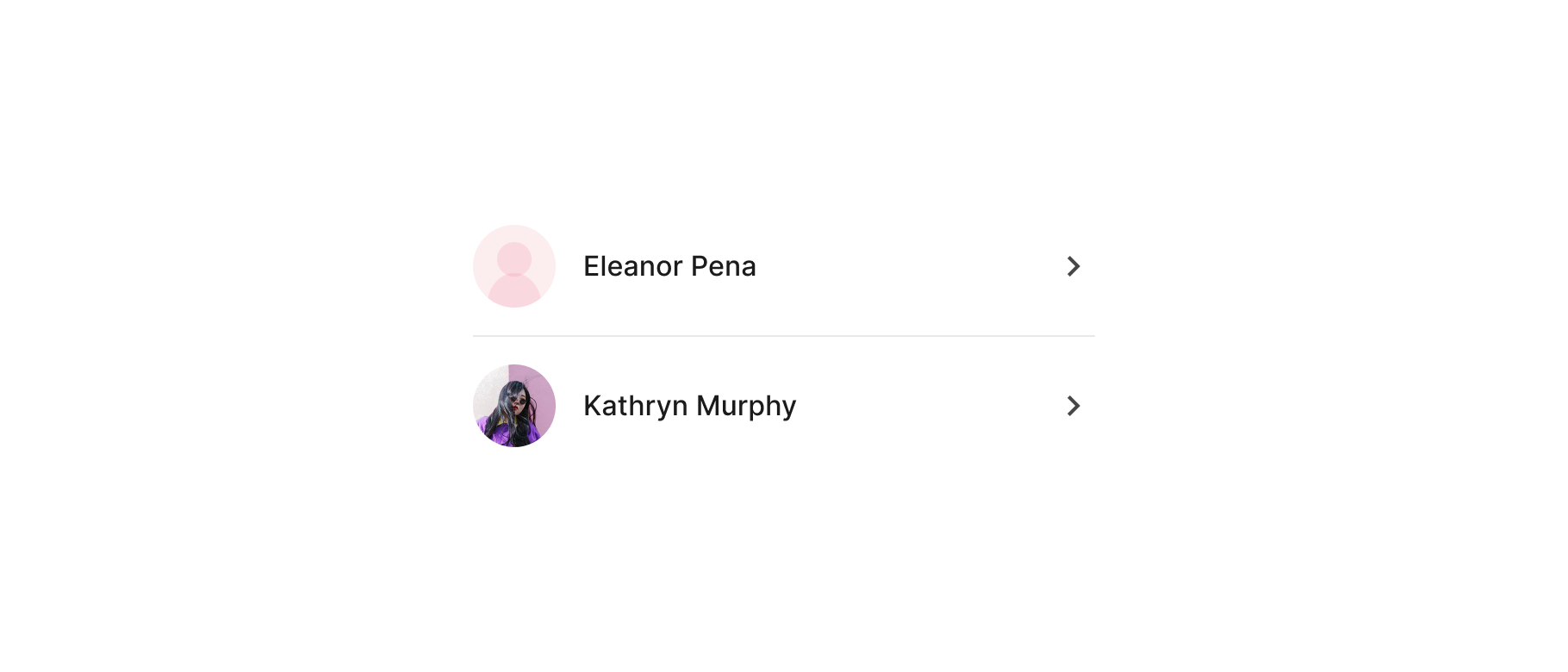
Icons can also be an option when they help differentiate items on a list, and their size is kept small to prevent taking so much space from the item.

Actions
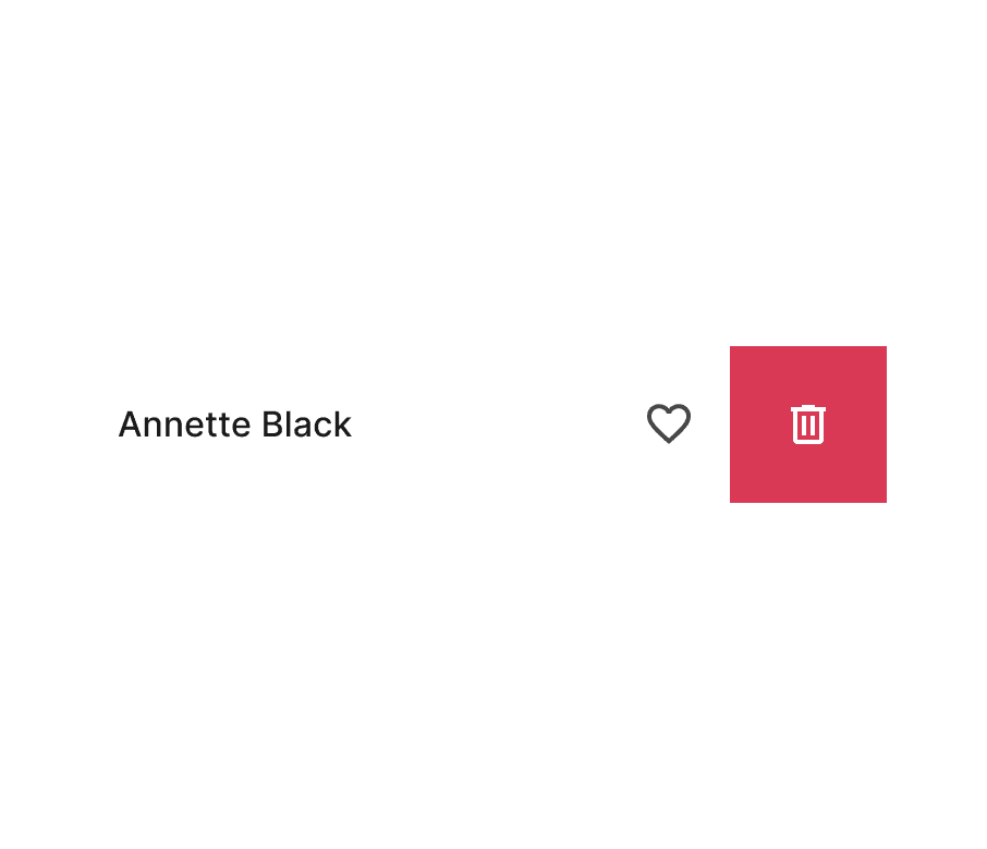
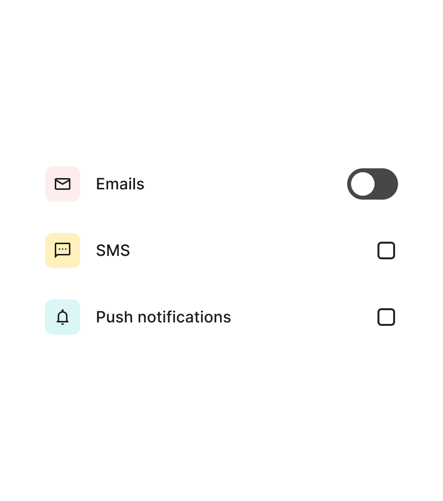
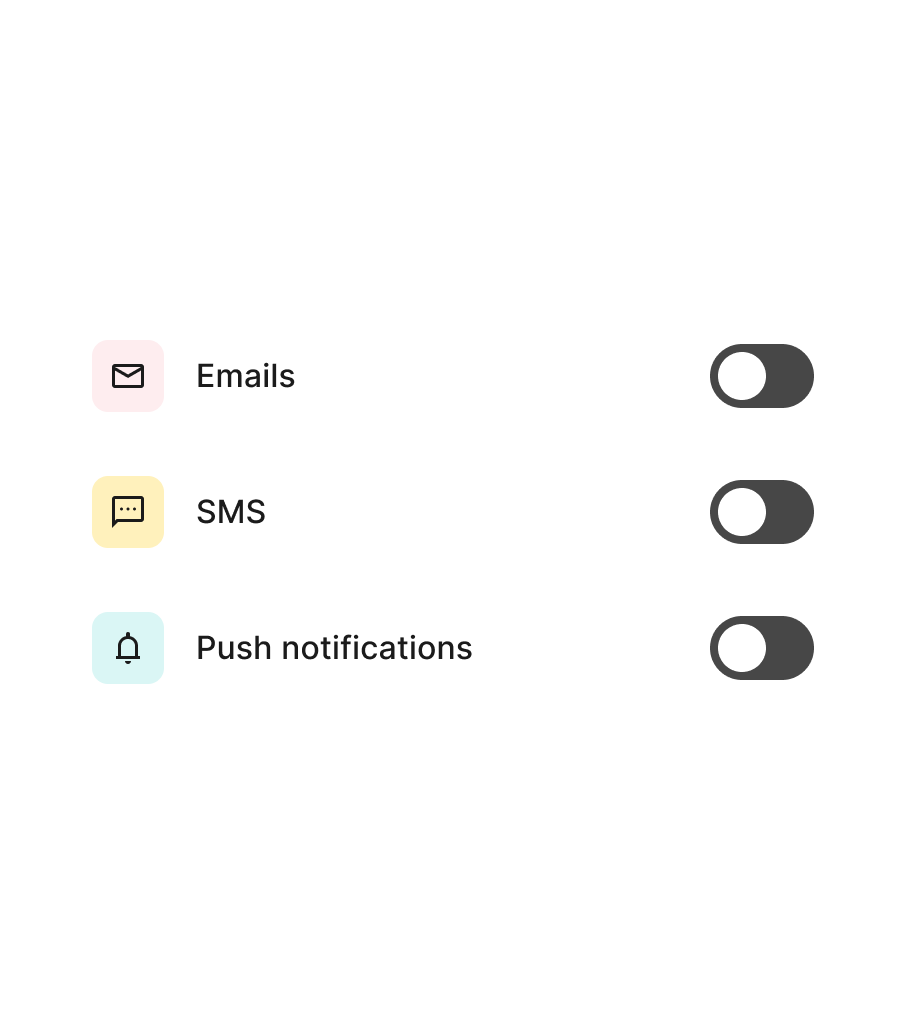
Lists can also can contain icons to perform quick interactions without needing to go to a separate screen. While some of them are common and have a stronger affordance (such as a switch, radio button or checkbox) — be more careful if you are allowing other actions that might not be perceived as such.
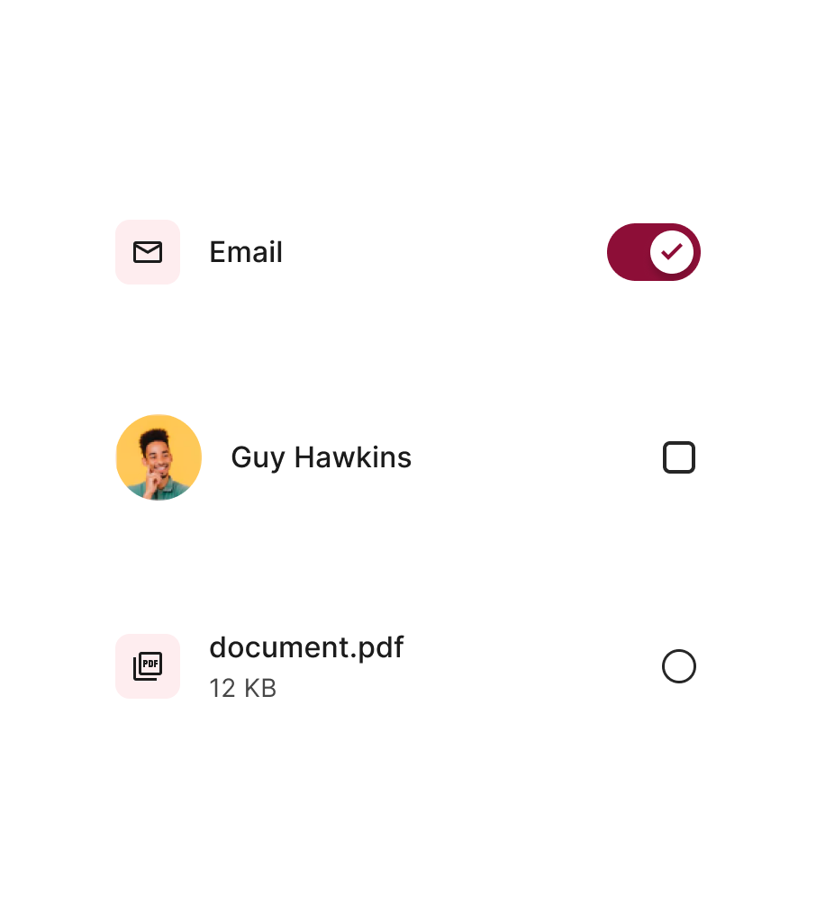

Actions in list items should be limited to just one per item to avoid misstaping and confusions. Aim to have just the main action always visible, and if you would like to include more, consider a swipe that will reveal additional actions for that item.

Text content
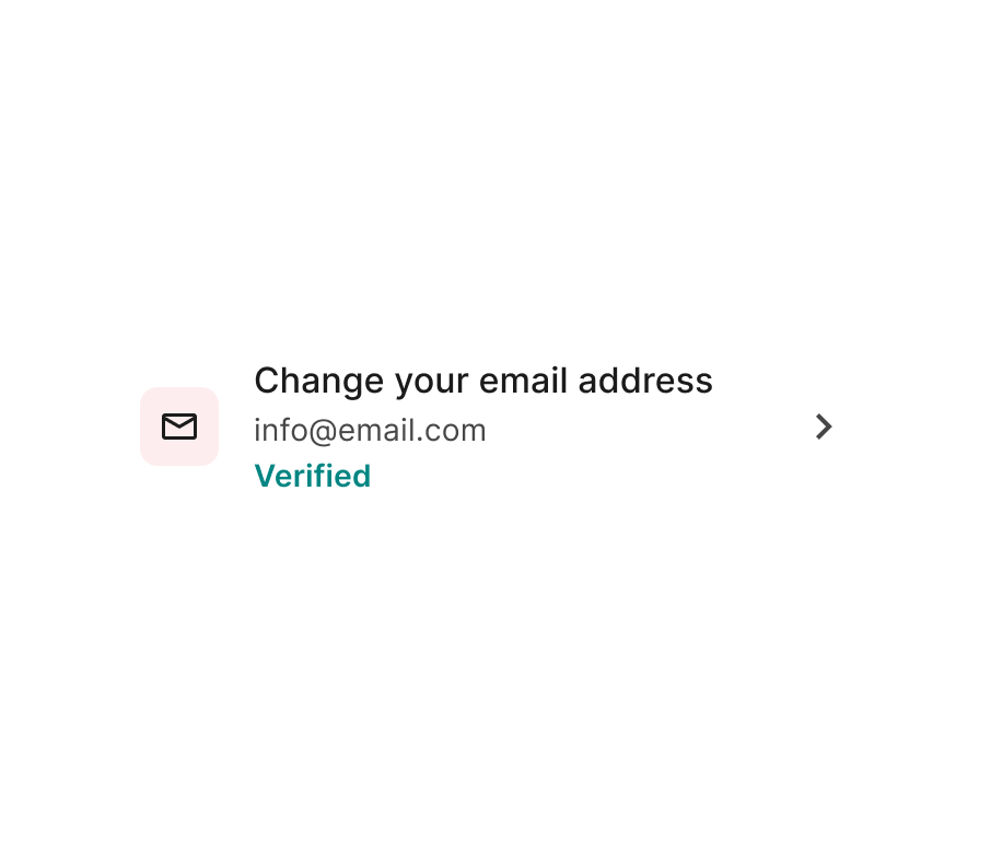
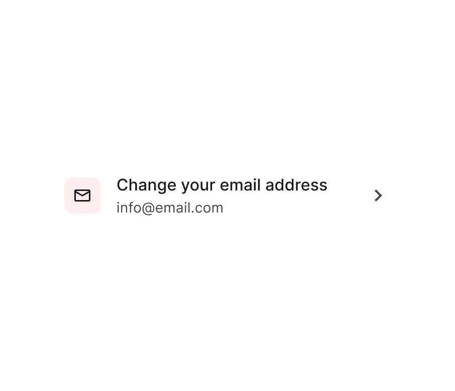
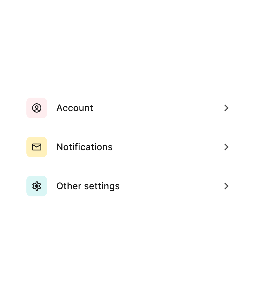
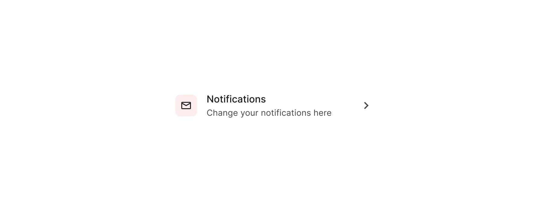
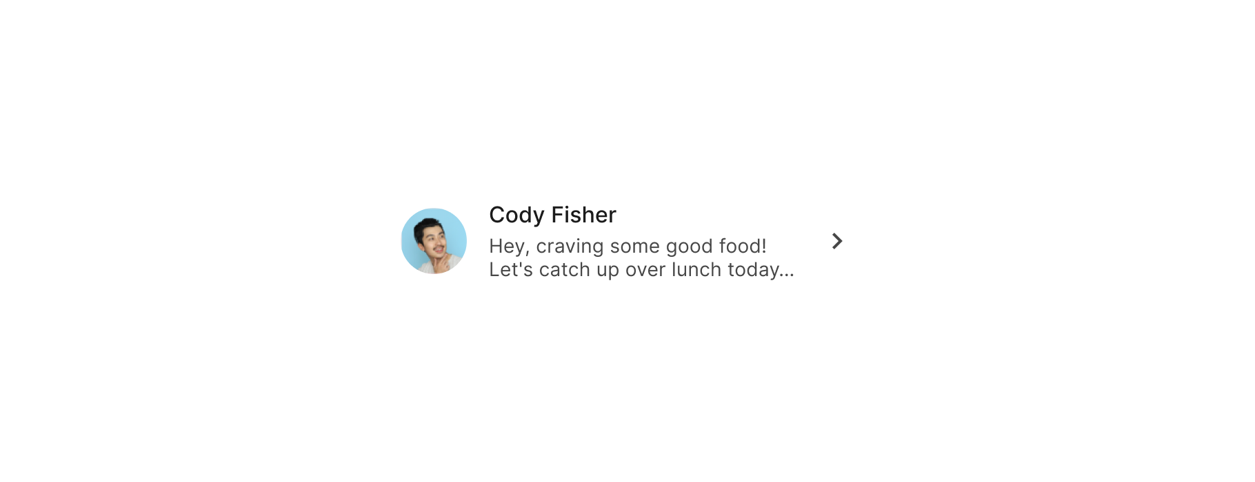
List items can contain a second line of text as description, or to bring forward text values from the item detail. However, avoid adding more lines since this will overcrowd the limited space with information, and will make it difficult to scan — specially when there are several items on top of each other.
States
This is an interactive component, necessitating all relevant states for various interaction moments. Generally, the following states should be included in this component.
Make sure of checking the notes further below for additional clarifications.

Selected items
When items can be selected or active, make sure of adding an additional state to represent that.

Accessibility
Here are basic guidelines on color contrast requirements according to WCAG 2.1 guidelines. However, accessibility is much more than colour contrast. We will continue expanding these examples.
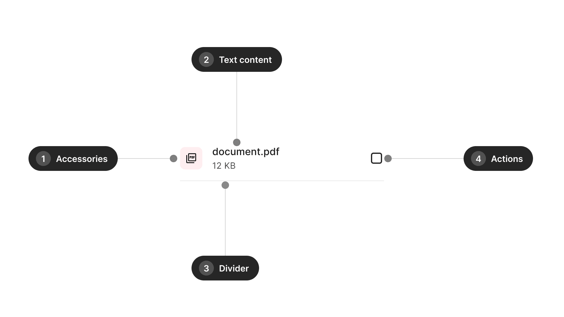
| Ref. | Name | AA score | Notes |
|---|---|---|---|
| 1 | Accessories | N/A | Not required |
| 2 | Text content | 4.5:1 | - |
| 3 | Divider | N/A | Not required |
| 4 | Actions | 3:1 | - |
Design takeaways
- Include empty states for avatars.
- Decorative icons can be smaller in size.
- Exercise caution when adding actions that may not be easily recognisable.
- Consider placing secondary actions under a swipe gesture.
- Limit text content to a maximum of two different texts.
- Add another state if the list item can be selected.
Best practices
Guidelines for incorporating this component into your screen designs.
Grouping
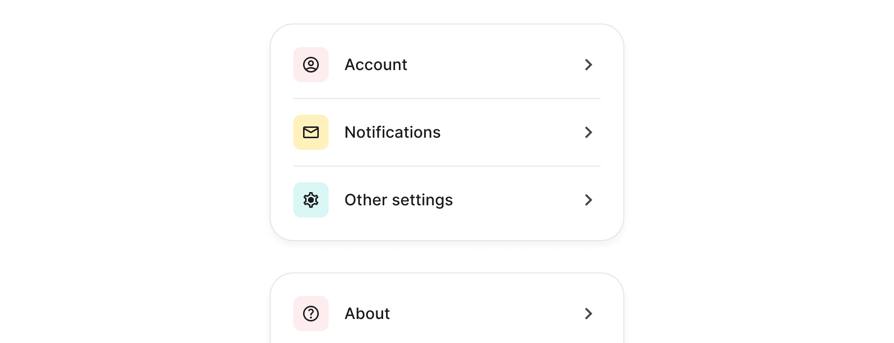
You could split a list into segments when you have a list long enough. This way, it can help users scan items in separate groups.


If you create some other groups or containers (for example with a background) don't overdo it, since this may add more clutter and make the general content difficult to follow.
Actions
While you may mix different actions of the same type (for example selection) be careful of not mixing different mental models in the same list, since this may confuse the users' expectations.
Divider
Consider not using a divider line when list items are just one line of text. Instead, you could reserve this line for situations where the amount of content or actions require a more clear demarcation between items.

Content
Consider these guidelines when incorporating text content into this component.
Copy
List items have the possibility of adding a second line of text. They are more valuable when they bring the content forward, so users can have an idea of what they will find. Instead of using this space for information that may be redundant, or not really useful, make the most of it by providing useful content that may even save users of going to the item's detail.

Scalability
Descriptions in list items can take a lot of space if you show long paragraphs. Imagine if every item did something similar. Since users may see more details on a separate screen, limit what you show to just a couple of lines.

Usage takeaways
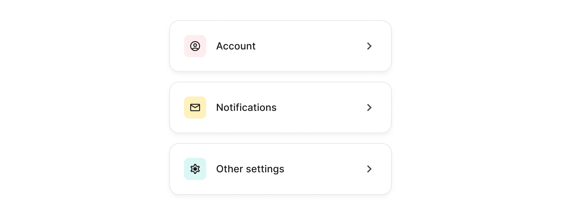
- Split lists into semantic groups when they get too long.
- Avoid adding groups with few items inside excessively.
- Do not mix incompatible actions within the same list.
- Consider using dividers for complex list items.
- Utilise a second line of text to highlight content.
- Limit the amount of content to just a couple of lines.