
Anatomy
The anatomy of components comprises common elements you may encounter. In this context, they represent a standardised structure.

Visual design
These guidelines provide insight into designing your component. Consider them as inspiration and tailor them to suit your product's requirements.
Icons
Limit icon support to a strictly functional role, such as indicating that the filter chip is selected or includes a dropdown. Using other icons for decoration may clutter the limited space and increase cognitive load.
States
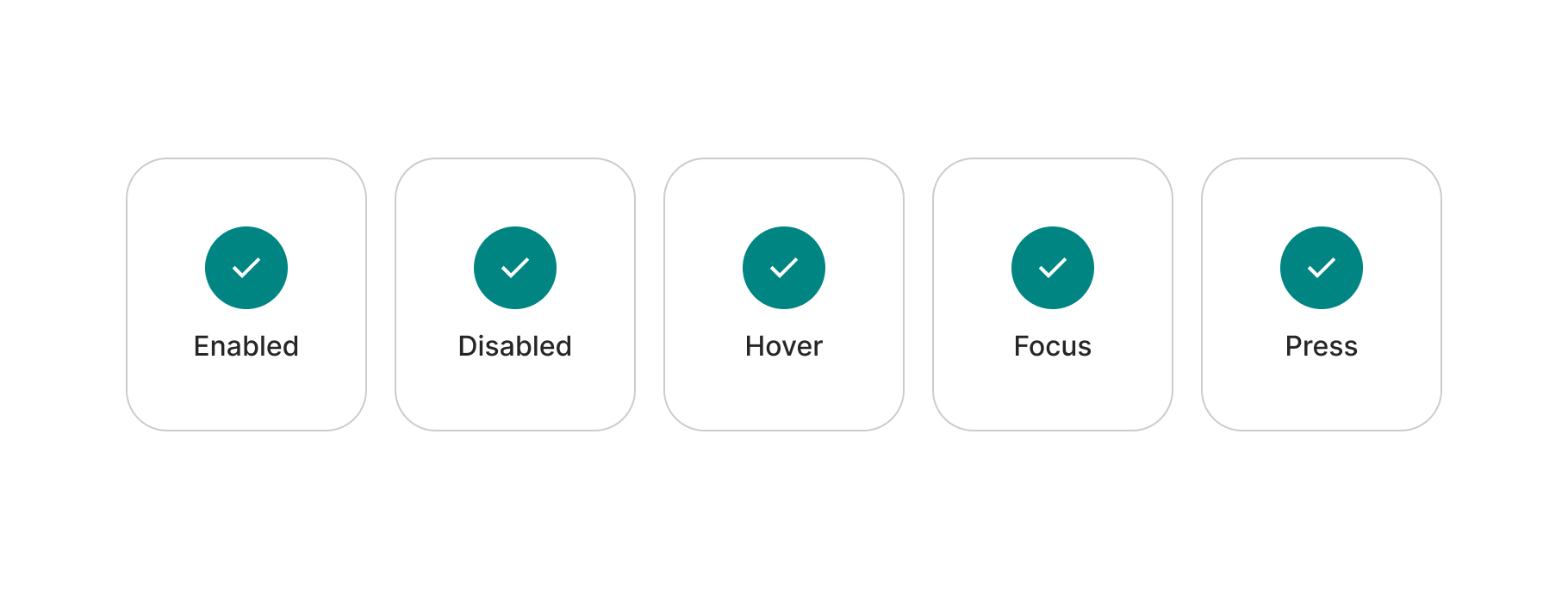
This is an interactive component, necessitating all relevant states for various interaction moments. Generally, the following states should be included in this component.
Make sure of checking the notes further below for additional clarifications.
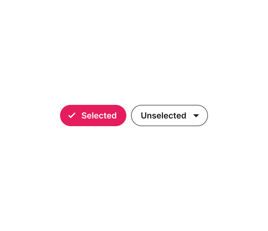
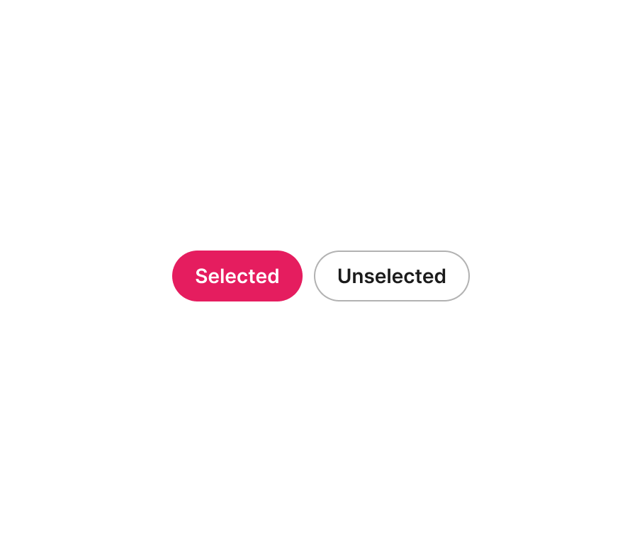
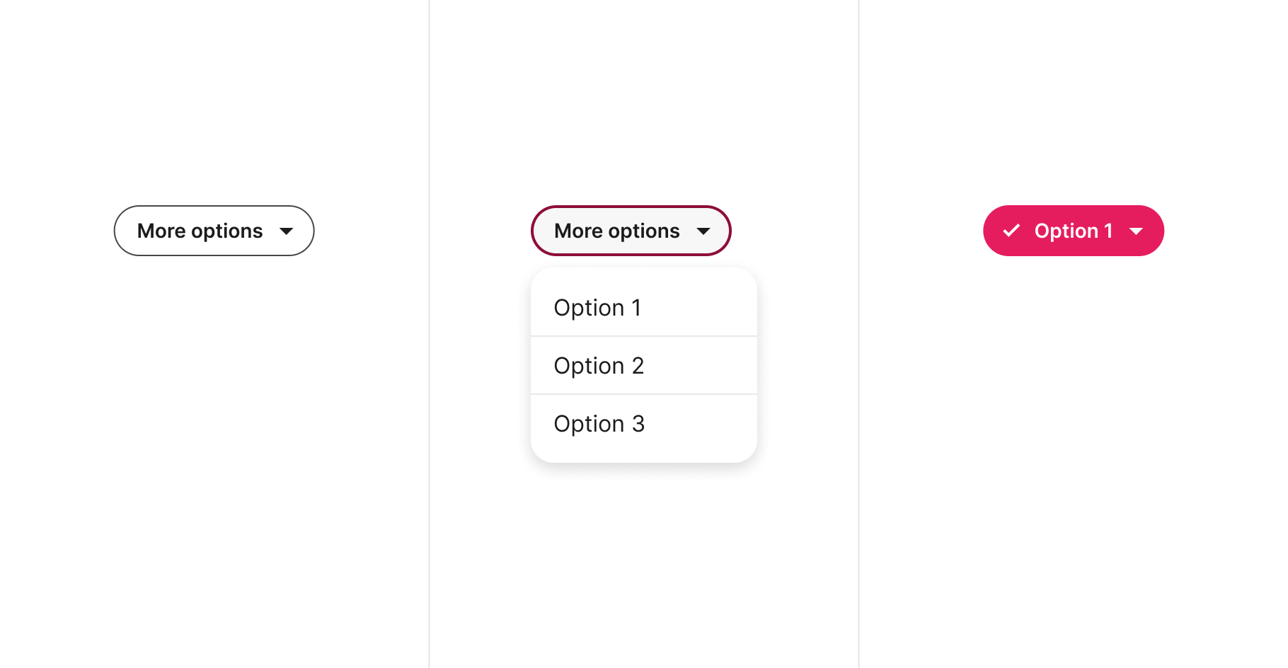
Selected
The design of selected filter chips must avoid any confusion. Therefore, ensure a clear distinction between the two states.

Accessibility
Here are basic guidelines on color contrast requirements according to WCAG 2.1 guidelines. However, accessibility is much more than colour contrast. We will continue expanding these examples.

| Ref. | Name | AA score | Notes |
|---|---|---|---|
| 1 | Icon | 4.5:1 | - |
| 2 | Label | 4.5:1 | - |
| 3 | Background | N/A | 3:1 recommended |
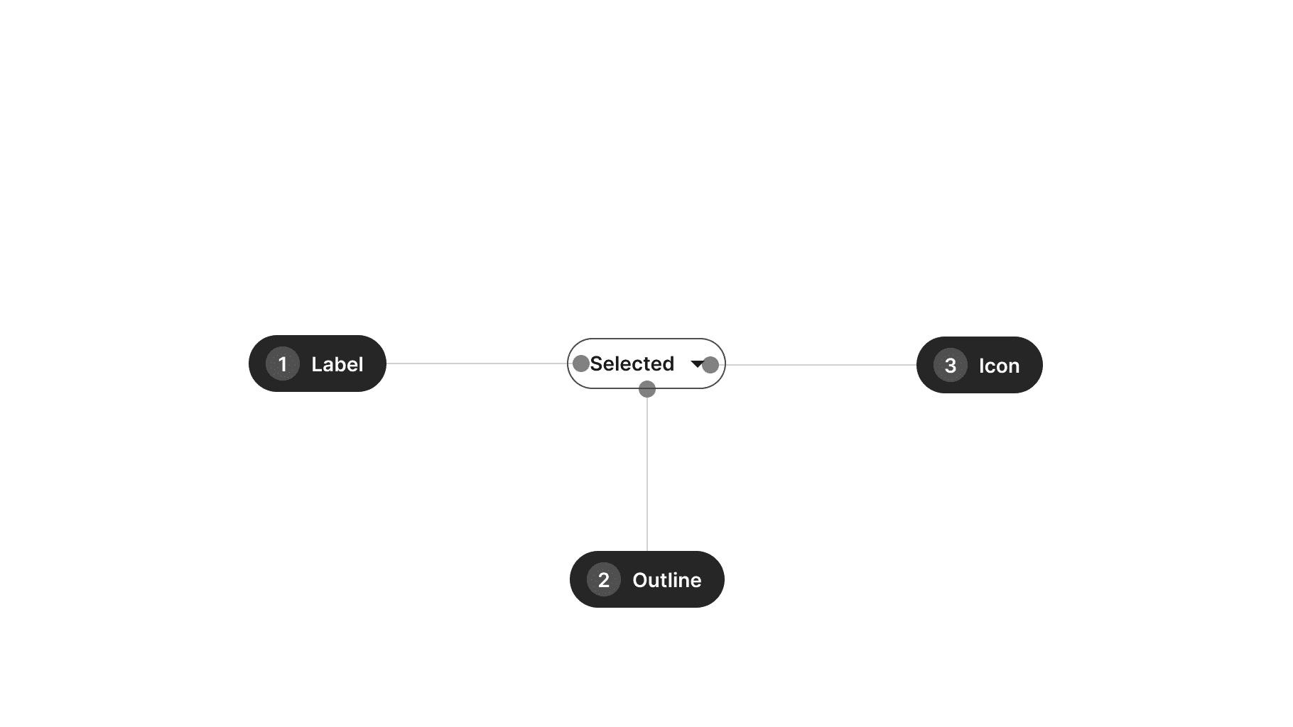
| Ref. | Name | AA score | Notes |
|---|---|---|---|
| 1 | Label | 4.5:1 | - |
| 2 | Outline | N/A | 3:1 recommended |
| 3 | Icon | 4.5:1 | - |
Design takeaways
- Avoid adding decorative icons.
- Ensure states are clearly distinguishable.
- Strengthen the select state with an icon.
Best practices
Guidelines for incorporating this component into your screen designs.
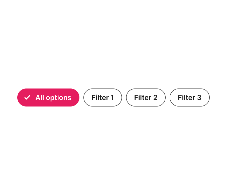
All options
When dealing with a simpler set of filter chips (without a dropdown), consider adding an "All" option as the initial state. This option can also serve as a way to clear all applied filters.

Dropdown
Consider using a dropdown filter chip when you would like to group a subset of filters under the same category. However, limit the set of options to just a few.
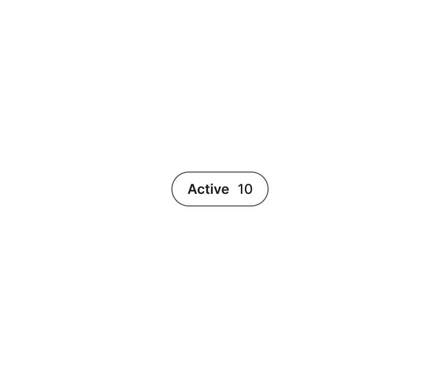
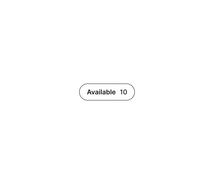
Numbers
Numbers along the main text label may be helpful for users to preview how many items they may encounter when the filter chip is selected. However, if this number is too big, it may not fit the layout properly or may reduce its value to users. For this reason, we suggest keeping numbers for cases where the total amount won't exceed 100.

Content
Consider these guidelines when incorporating text content into this component.
Copy
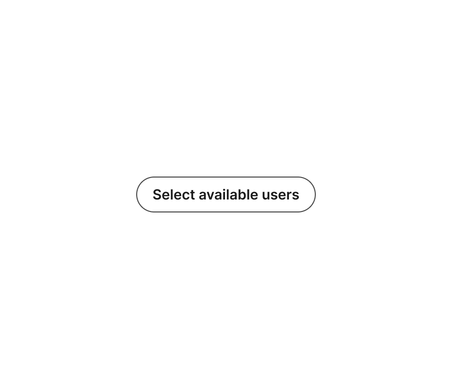
Text should be succinct (ideally just 1 word) rather than lengthy sentences. Avoid adding verbs such as "select" or "filter" inside the filter chips

Numbers
The variant with numbers is reserved for numeric content that represents the amount of available options under that filter. Avoid using this space for other kinds of text content.

Usage takeaways
- Consider adding a simple filter chip to view all options.
- Utilize a dropdown filter chip to group related options together.
- When using numbers, limit them to 1-3 digits.
- Strive to keep text at one-word length.
- Avoid using filter chips with secondary text.