
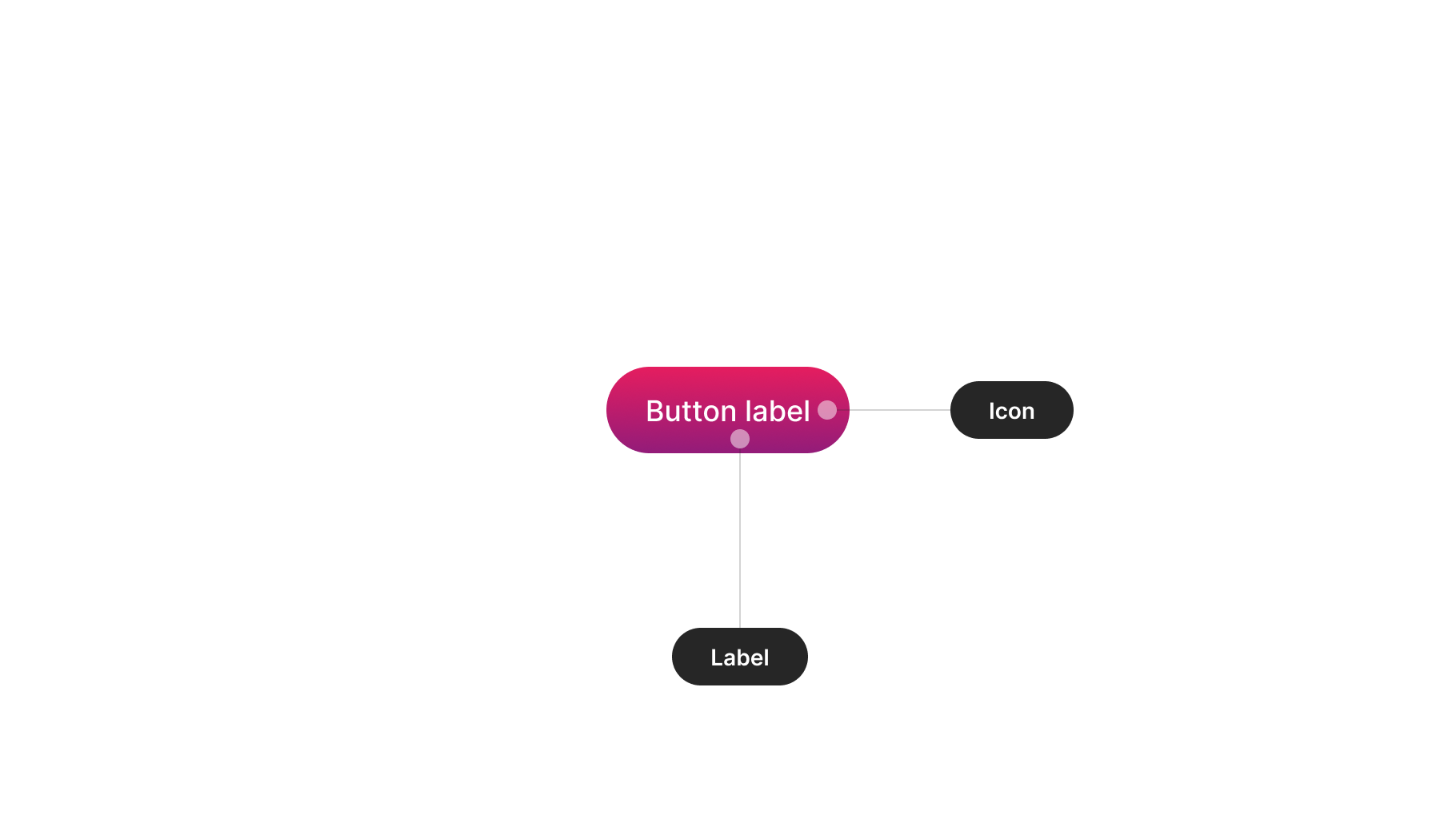
Anatomy
The anatomy of components comprises common elements you may encounter. In this context, they represent a standardised structure.
Visual design
These guidelines provide insight into designing your component. Consider them as inspiration and tailor them to suit your product's requirements.
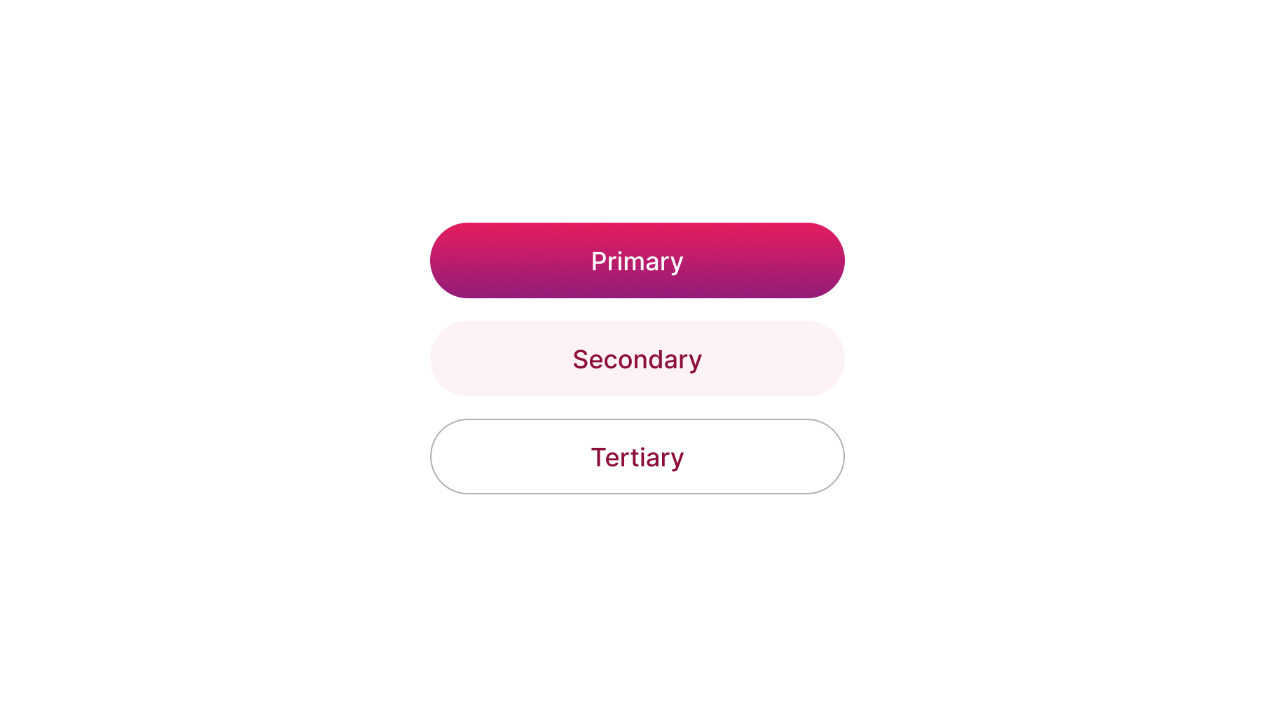
Hierarchies
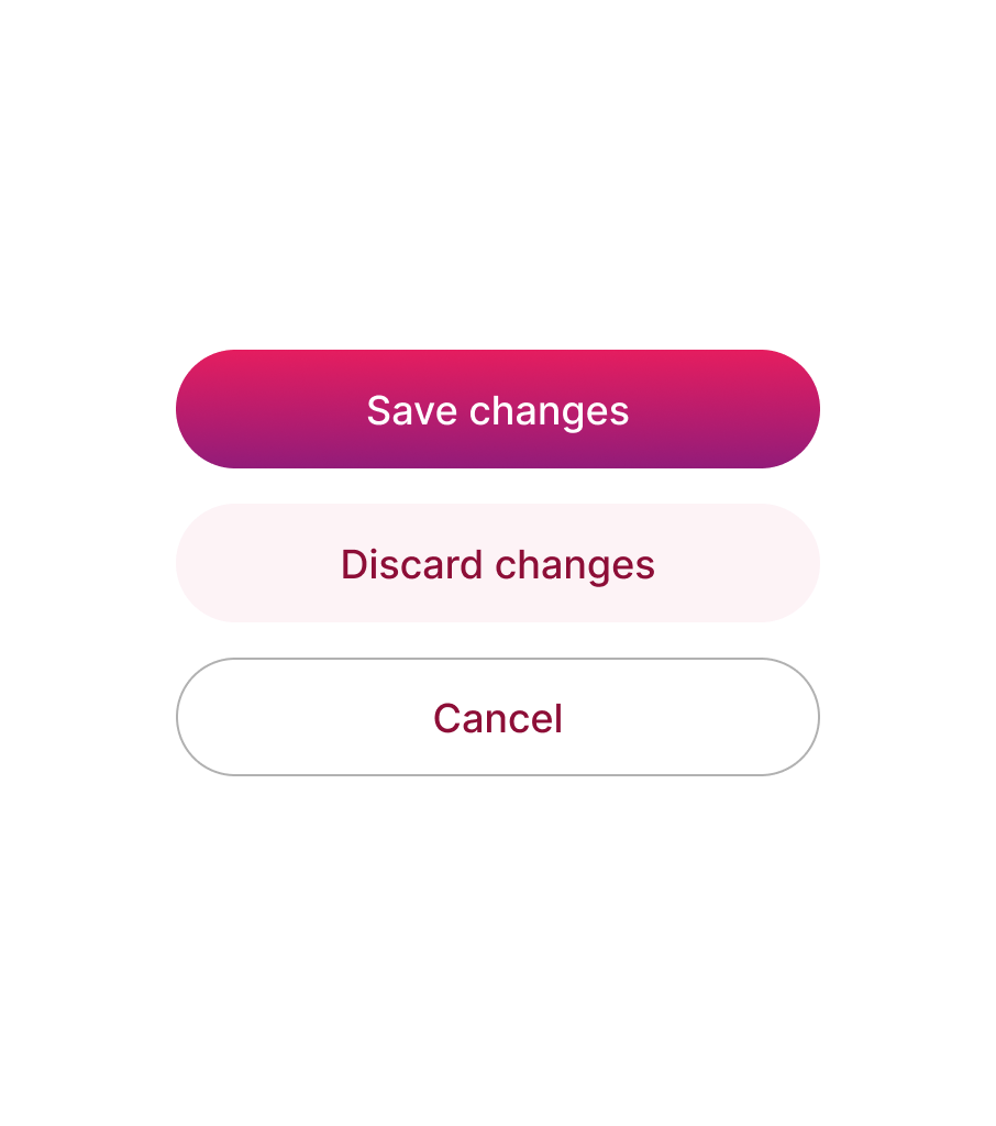
Buttons of different hierarchies should be distinctly discernible from each other, especially when placed together. The visual design should aid users in assessing the contextual importance of each action.
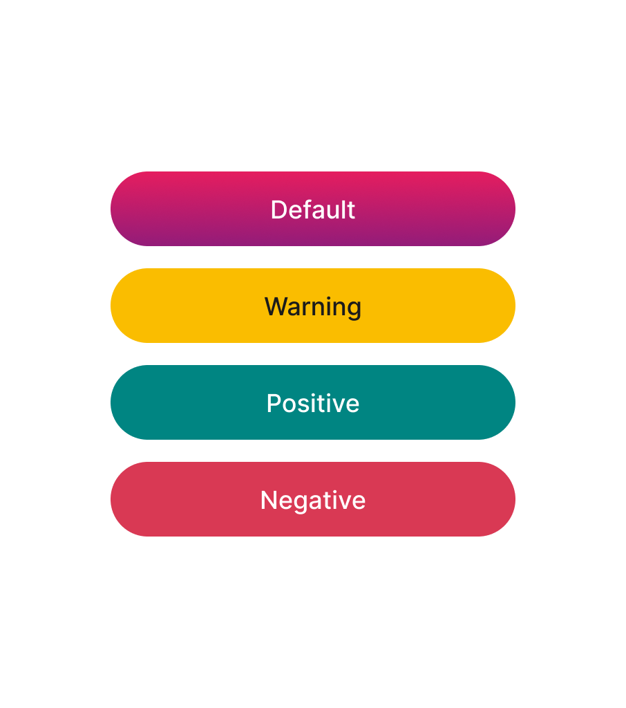
Roles
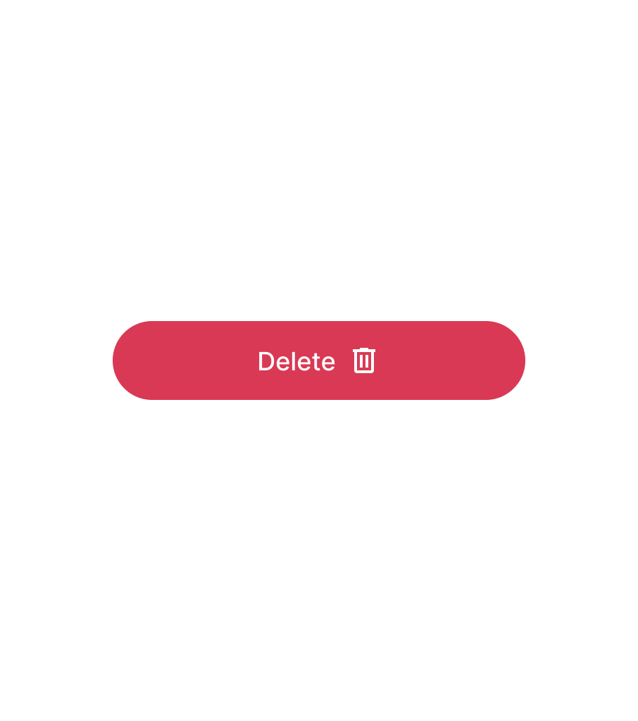
Overloading design variants with numerous specific use cases may complicate button maintenance over time. Instead, focus on fundamental buttons required for your product, such as default and danger buttons.

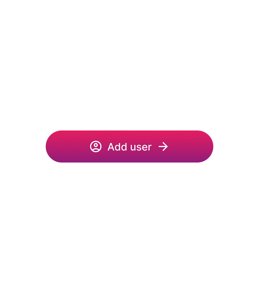
Icons
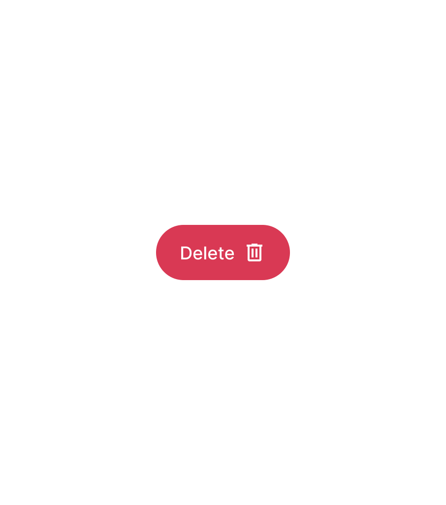
Icons, when paired with labels, can clarify button actions. However, support for multiple icons can have the opposite effect. Exercise caution when adding support for more than one icon in buttons, reserving them for specific impactful use cases.
States
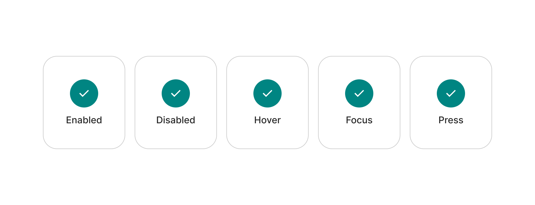
This is an interactive component, necessitating all relevant states for various interaction moments. Generally, the following states should be included in this component.
Make sure of checking the notes further below for additional clarifications.
Disabled buttons
Disabled buttons can cause confusion when users don't understand why they are disabled. Instead, use enabled buttons that provide feedback, such as an error message, if action requirements are not met. Additionally, disabled button designs typically have low contrast, which, although not a WCAG 2.1 requirement, can exacerbate the aforementioned issue.

Loading
A loading state can provide feedback while an action is being processed without altering the context.

Accessibility
Here are basic guidelines on color contrast requirements according to WCAG 2.1 guidelines. However, accessibility is much more than colour contrast. We will continue expanding these examples.
| Ref. | Name | AA score | Notes |
|---|---|---|---|
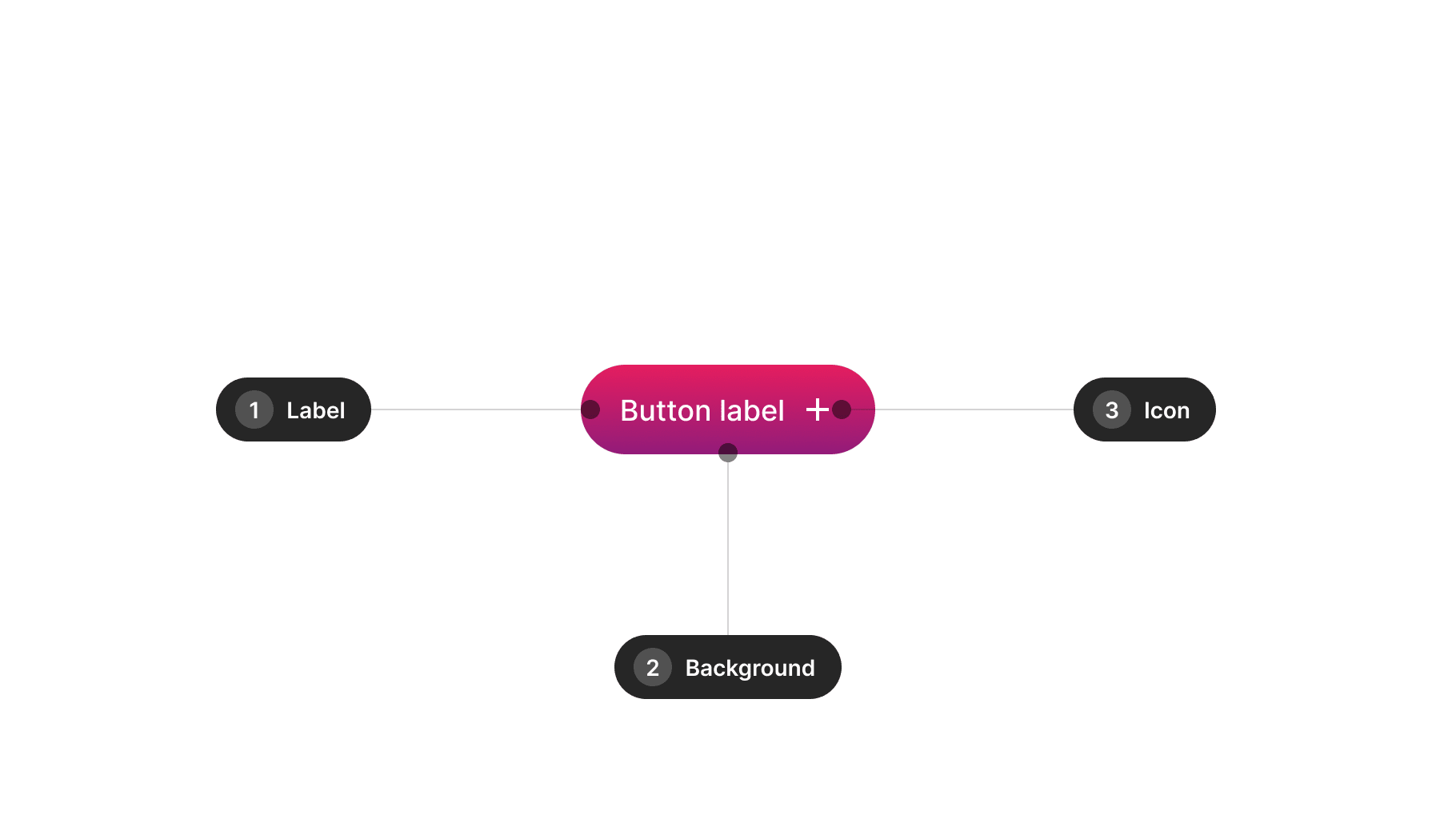
| 1 | Label | 4.5:1 | - |
| 2 | Background | N/A | 3:1 recommended |
| 3 | Icon | 3:1 | - |

| Ref. | Name | AA score | Notes |
|---|---|---|---|
| 1 | Label | 4.5:1 | - |
| 2 | Outiline | N/A | 3:1 recommended |
| 3 | Icon | 3:1 | - |
Design takeaways
- Hierarchies ought to be distinctly delineated from one another.
- Concentrate on including only the crucial roles.
- Restrict icon assistance to merely one side.
- Incorporate disabled states, yet explore alternative options.
- A loading state proves beneficial beyond the default states.
Resources
Best practices
Guidelines for incorporating this component into your screen designs.
Hierarchies
Avoid overusing variants reserved for primary actions when using buttons. Users should distinguish hierarchy and intent of actions when buttons are placed adjacent to each other. Buttons should offer clear alternatives without competing.
Icons
Icons in this component are intended to complement labels, aiding in conveying button functionality. Reserve buttons with single icons for cases where they can have a significant impact, always alongside a label.

Content
Consider these guidelines when incorporating text content into this component.
Copy
Button text should be actionable, including a verb, and succinct (1-2 words) rather than lengthy sentences.


Scalability
When dealing with long words and limited space, prioritize full text visibility over truncation with ellipses. Regardless, strive to keep text short and actionable.


Usage takeaways
- Avoid excessive reliance on the primary hierarchy.
- Leverage hierarchies to communicate the action's purpose.
- Relying solely on icons might pose comprehension challenges.
- Icons can enhance primary actions as needed.
- Use concise and clear text to denote actions.
- Test internationalising content.
- Ensure content scalability instead of resorting to ellipsis.