
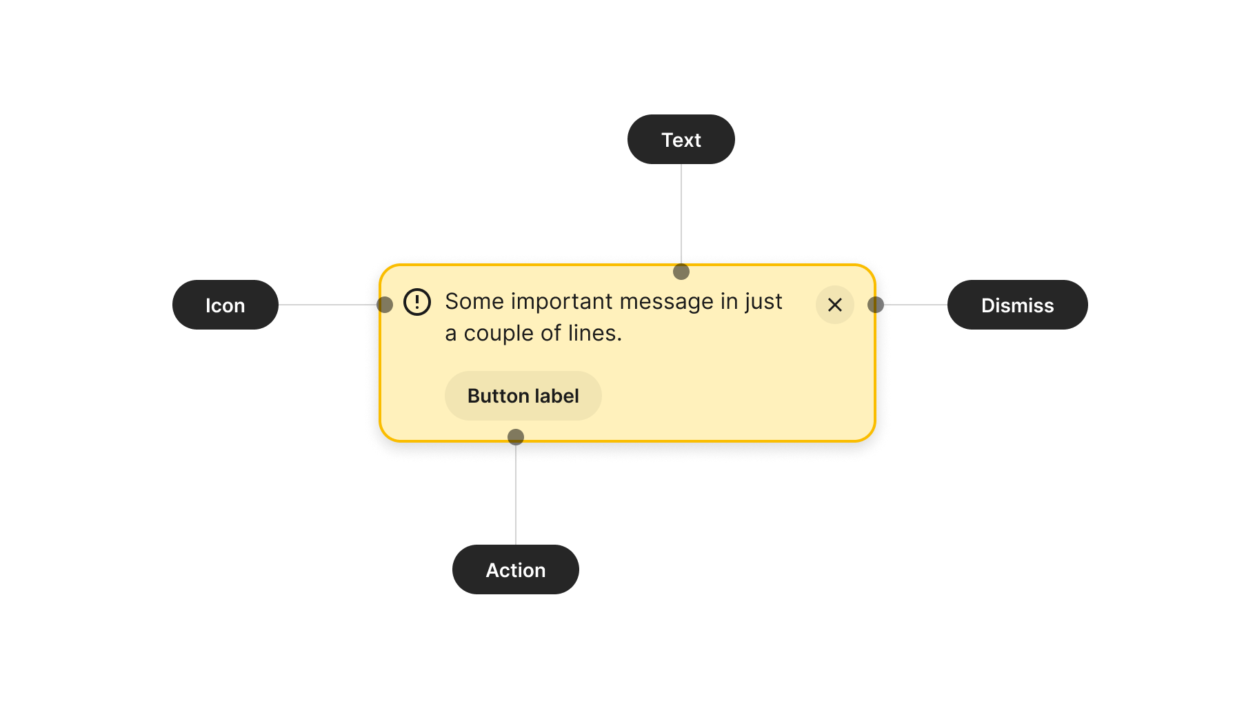
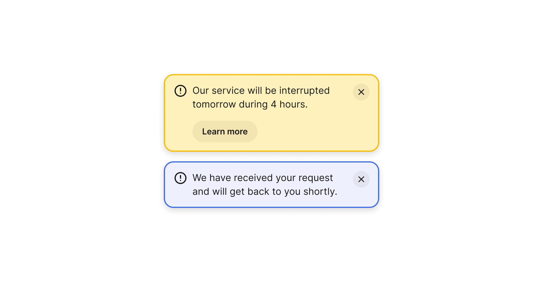
Anatomy
The anatomy of components comprises common elements you may encounter. In this context, they represent a standardised structure.
Visual design
These guidelines provide insight into designing your component. Consider them as inspiration and tailor them to suit your product's requirements.
Title
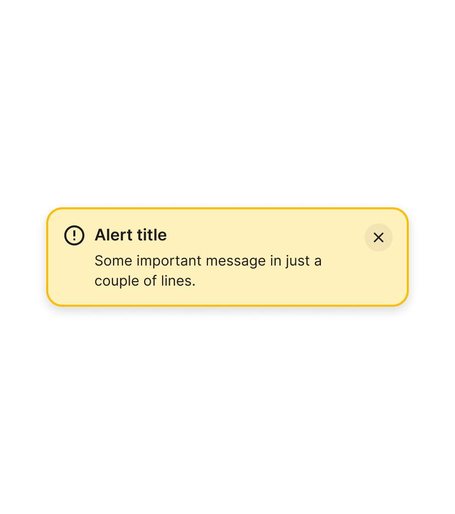
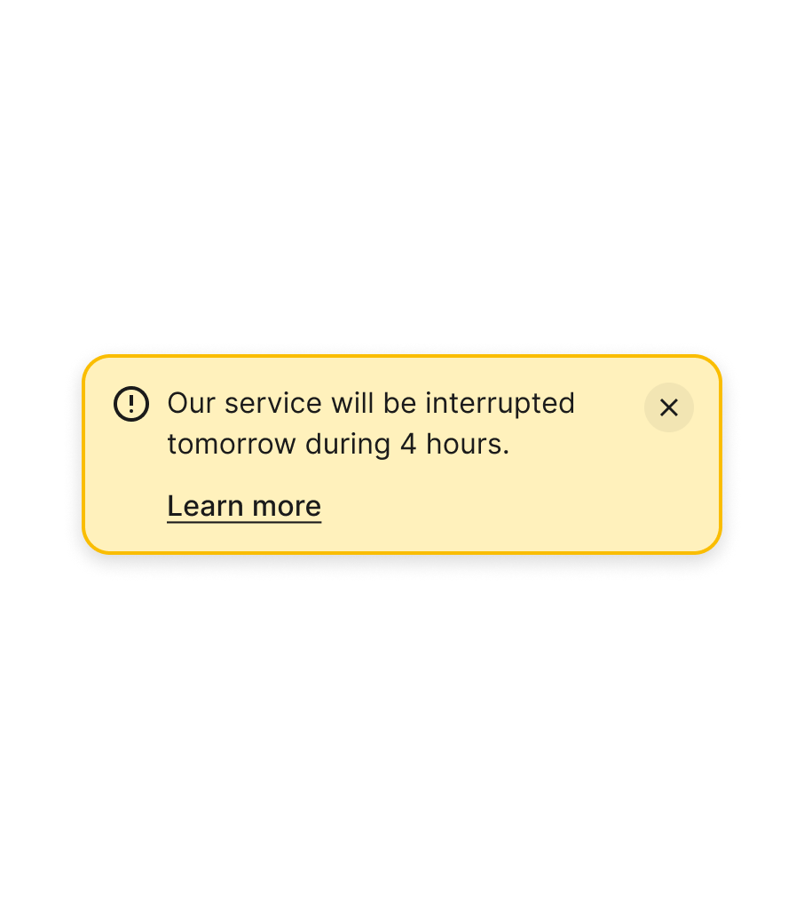
While it's not unusual to find titles in alert components, be mindful of adding them. The extra piece of information may add clutter and make the general message less impactful. If possible, include only the main text in the design to focus your content efforts on that single piece of message.
Icon
Since the purpose of the alert component is to draw attention to the main message — which may require actions from the user — be careful when including decorative elements such as images or other graphics instead of icons. These may divert attention or lead users to mistake this important piece of information for a marketing message.
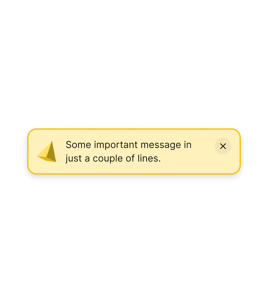
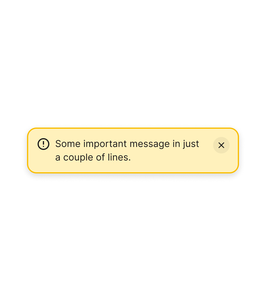
Icons also help communicate the importance of a message. Removing them and relying purely on colour can make these components less accessible for some people.


Close
Actions to close messages like this should have a generous tapping or clicking area. Removing backgrounds can also reduce the visual affordance of the interactive area. If you do remove it, ensure to still include a target area that is larger than the actual closing icon.


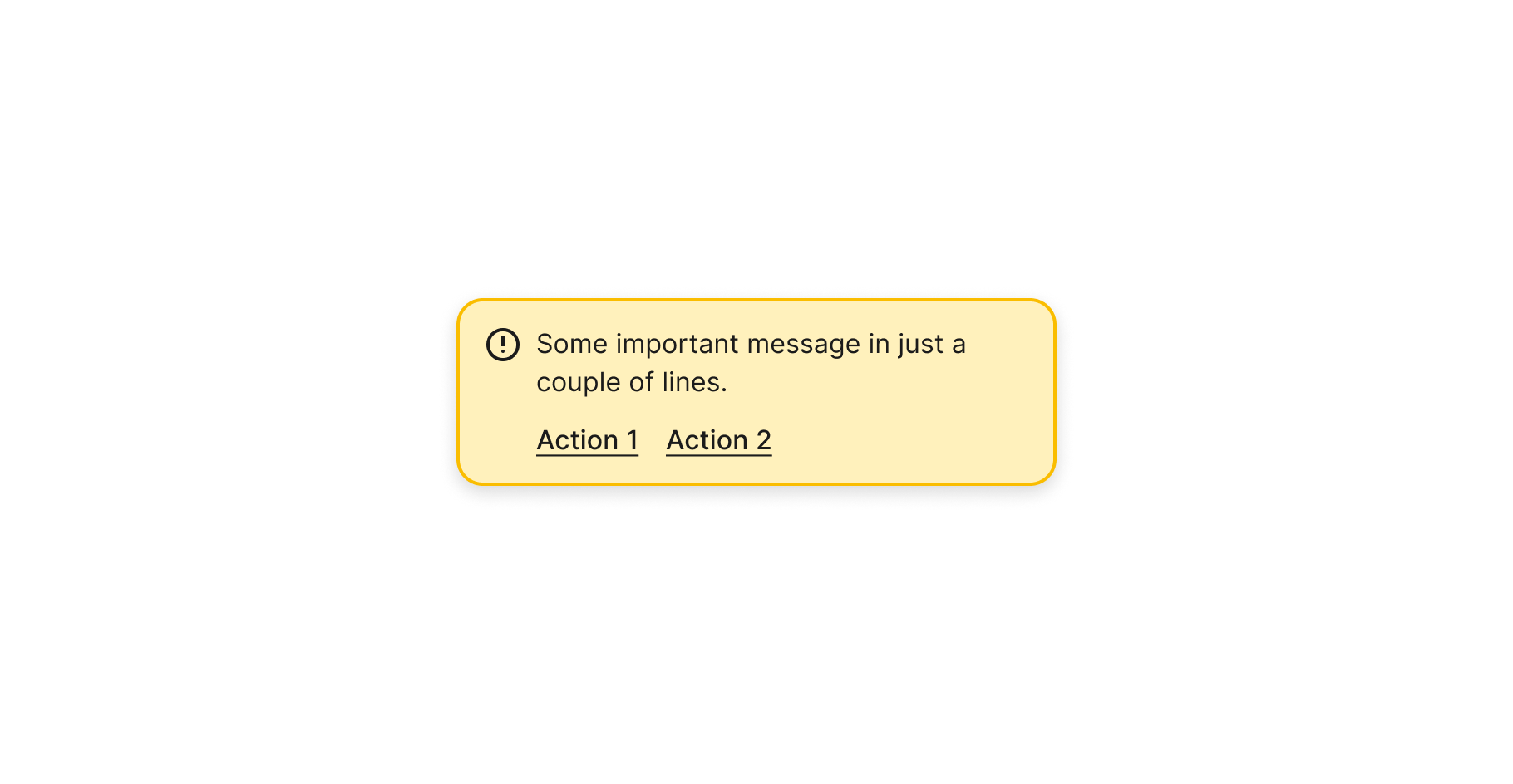
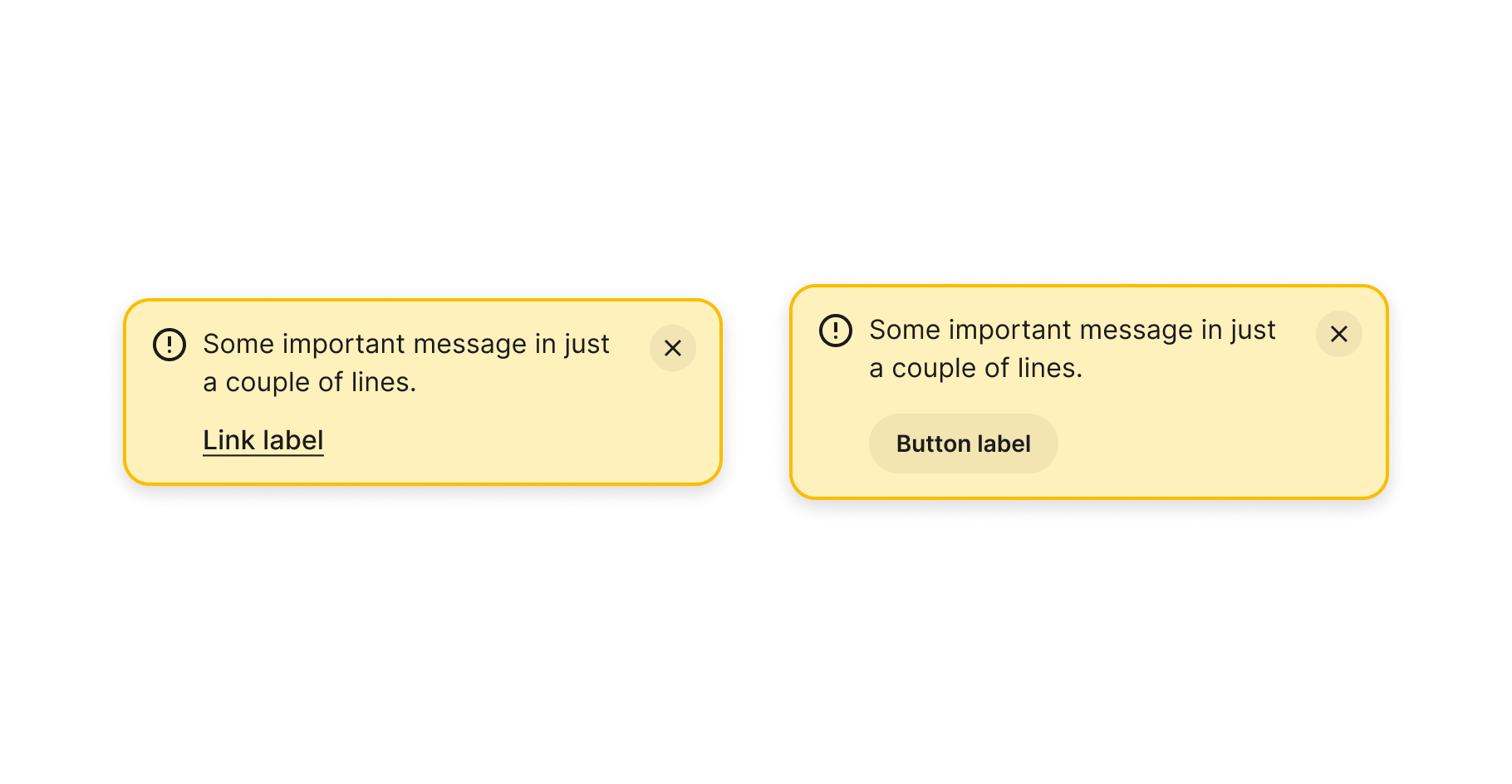
Actions
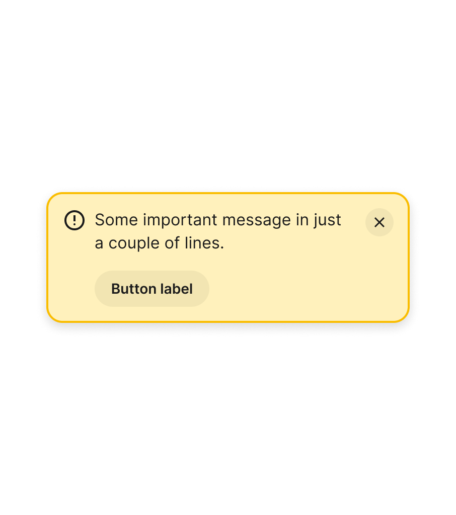
The goal of the alert component is to inform users of an important message. Sometimes, this means they need to take action. However, the limited space and intent of the message make it more effective to include just one action — either a button or a link. If you need to present users with the possibility of choosing between two or more actions, consider using a modal instead.
Severity
Alert components can inform users of messages with varying degrees of importance or severity, from neutral or informative to something that requires urgent attention. Ensure that your design can respond to all these different scenarios, using all the concepts mentioned above (colour, actions, and icons).

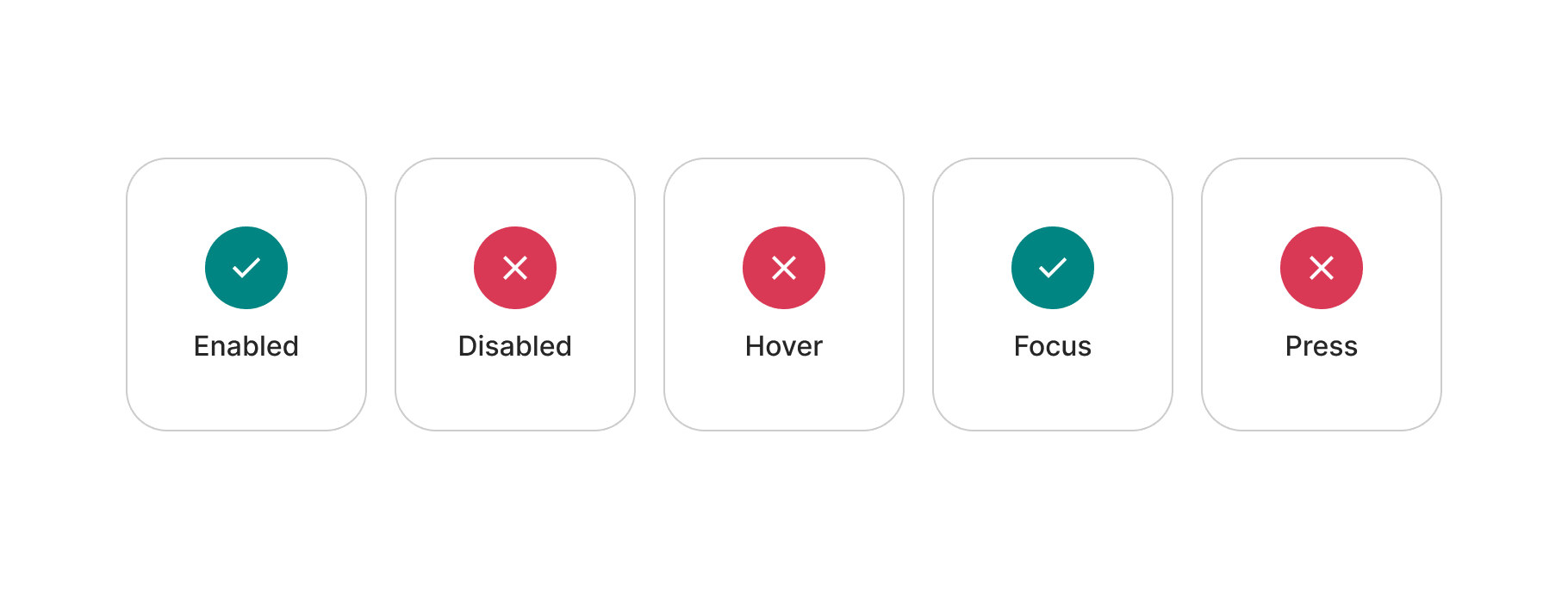
States
The main component is not interactive, so there are some states that should not be included. However, do add them if necessary for sub-components that make part of this one.
Accessibility
Here are basic guidelines on color contrast requirements according to WCAG 2.1 guidelines. However, accessibility is much more than colour contrast. We will continue expanding these examples.
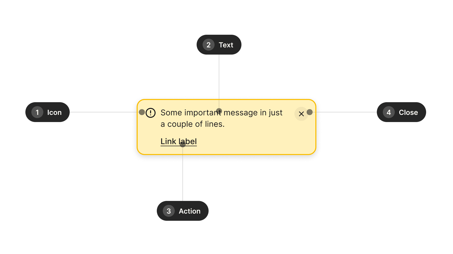
| Ref. | Name | AA score | Notes |
|---|---|---|---|
| 1 | Icon | N/A | 3:1 recommended |
| 2 | Text | 4.5:1 | - |
| 3 | Action | 4.5:1 | - |
| 4 | Close | 4.5:1 | - |
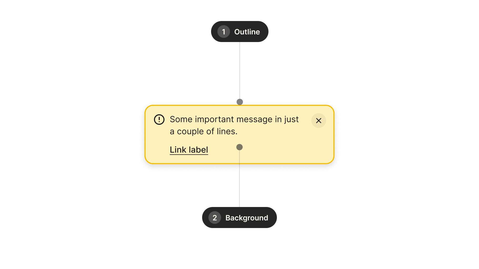
| Ref. | Name | AA score | Notes |
|---|---|---|---|
| 1 | Outline | N/A | 3:1 recommended |
| 2 | Background | N/A | 3:1 recommended |
Design takeaways
- Consider adding a title, though it's best to keep it simple.
- Icons should be simple and not detract from the main message.
- Avoid relying solely on color for communication — complement with icons.
- Ensure the close button has a generous tapping area.
- Support just one main action at a time.
- Consider adding options for different severity levels.
Best practices
Guidelines for incorporating this component into your screen designs.
Close button
Avoid using the close button for alerts that inform of critical messages in your product. Instead, reserve the close action for messages that won't have any dramatic consequences if they are dismissed from the screen.

Actions
Don't use buttons in alerts for navigation to informative pages. For those cases, use links instead — and reserve buttons to perform actions or start flows from the alert component.

Combination
Avoid using more than one alert at a time or combining alerts of different severity. Consider using other elements such as text on the screen or snackbar components instead.
Content
Consider these guidelines when incorporating text content into this component.
Copy
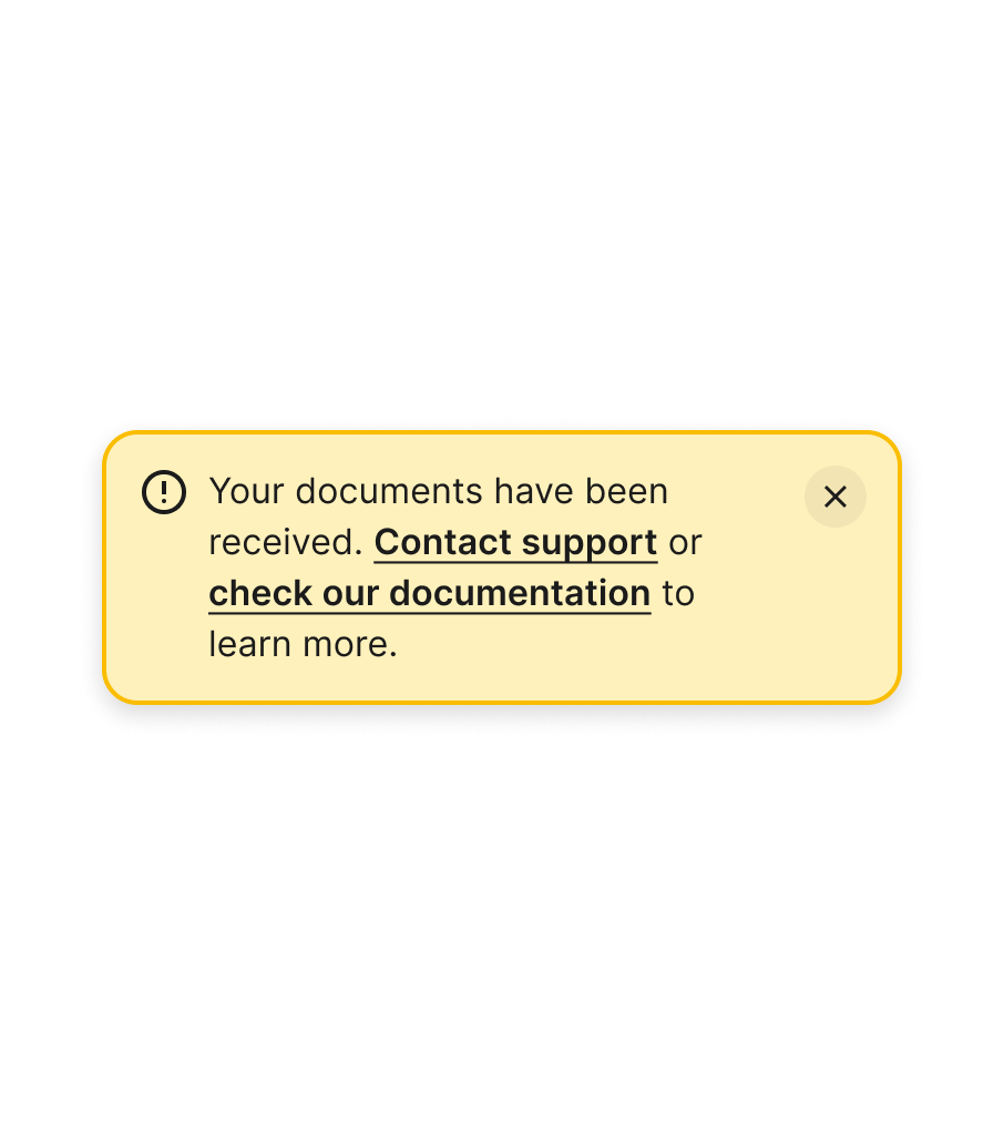
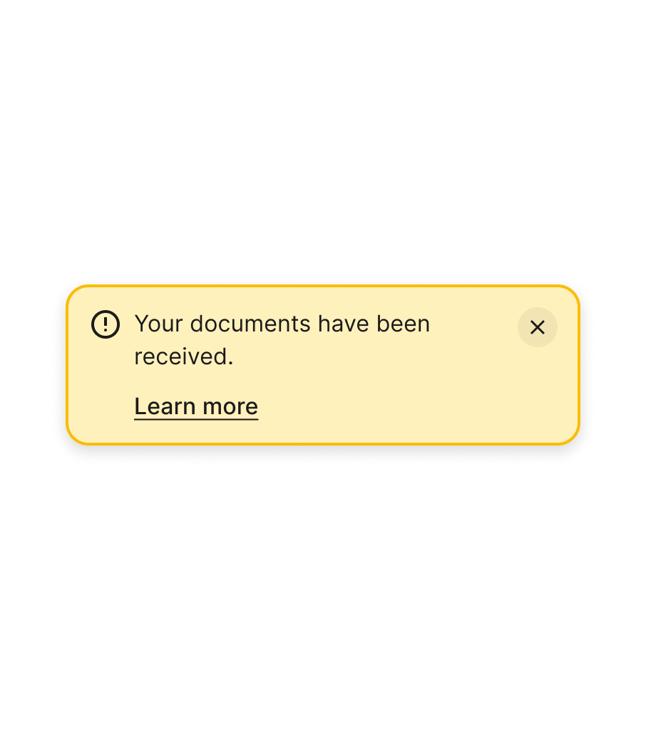
Keep messages short and to the point, using just 1 or 2 sentences, so alerts can remain effective. If you need to add more information to a message, consider adding a link to another screen.

Links
Avoid using the main text body to add links. Users might not know where to click or may miss some of the information they need to know. Instead, make use of links or buttons that are the main call-to-actions after the main piece of information.
Actions
Action text should be actionable, including a verb, and succinct (1-2 words) rather than lengthy sentences


Usage takeaways
- Ensure critical messages cannot be dismissed.
- Retain the close action for less urgent information.
- Incorporate buttons in alerts to initiate actions.
- Utilise links instead of buttons for navigating to other pages.
- Avoid combining alerts of different types simultaneously.
- Keep messages brief and incorporate a link if necessary.
- Refrain from including links in the main text.
- Keep text in actions and links succinct.