
Separating documents
The way that documents in a design system are split an organised is the first indication of how things are going to be inside them. In any case, it's always convenient to aim for an intuitive and modular organisation, so just by taking a quick look at it we can already know what each document is about, and their relationship.
In the design system
A design systems is modular by nature. Its documents should have certain independence, and take advantage of that flexibility of possible combinations.

- Style Guide or Foundations: Contains everything that we could call tokens: colour styles, shadows, spacing, sizes, type scale, among other things.
- UI Kit: Contains components such as input fields, dialog windows, buttons, etc. Components here use the styles from the "Style Guide" document, with no other isolated styles.
- Patterns: Patterns are representations of screens or processes to accomplish a task, that can be repeated along a project. A pattern can be something individual, like a screen with a form (then you can see the fields separation, the location of the submit button); or something longer like a search process involving several steps. Patterns are mostly referential, and not necessarily should also be components or symbols in Figma or Sketch.
In projects or features
Every project or feature can require one or more documents, depending on its complexity and whether it's using their own components or the ones from the design system (or a combination of both.) Different screen sizes that you are targeting can also impact on the arrangement and separation of the documents.
Thinking of a relative simple case, where the project is being designed for both mobile and desktop, and components are coming from a separated library, the structure could look like this:
Project
↳ Project (Desktop)
↳ Project (Mobile)
↳ Library
Splitting screen sizes in separated documents give you a bit more of freedom and space to organise those documents internally, as we will see later on. In the other hand, if the project is using its own components, not being part of the design system, those will be included in the "Library" document, inside the same project's folder.
Pages
Pages are used to separate different sections of the same product, following a structure that in some way mirrors the main navigation or levels. Let's pretend that we have an app with a navigation bar below.

Pages in the document will match the same structure:
Home
Search
Profile
Account
Settings
In libraries and UI Kits
When the documents have components, such as libraries or UI Kits, there will also be a single page where all the editable components and symbols will be placed. The idea is to have them separated, and not scattered around different screens and pages of the interface. Let's see the following example, representing a UI Kit document in a design system:
Elements
Components
Patterns
Editable components
Frames and artboards
Frames and artboards arrangement inside a page can give an idea of the relationship between screens, if it's used in a consistent manner between pages and pages. The placement of the screens (in row and columns) and the separation (vertically and horizontally) can help establish an organisation system.
Vertically
Vertically are placed the different states of a screen. By states we mean temporary moments that a screen goes through, and are generally the same.

- Final state: all the information is complete. This is the ideal scenario, where the amount and complexity of information is the one that we were expecting most part of the time.
- Partial state: there's information missing to complete. This could happen because the user hasn't uploaded all the necessary information, or because there's information that cannot be displayed at the moment.
- Empty state: there's no information to show. This could be when the screen is a list of favourite items, but the user hasn't marked any yet.
- Loading state: the design of the information that will be shown while there's an ongoing loading process. An habitual practice is to use a "skeleton" with a base structure that can be displayed in advance.
- Error state: there's something going wrong, therefore the information cannot be shown. Think, for example, what would happen when the user doesn't have internet connection.
Not all screens will have all states; this can be adjusted from case to case. Even so, separating screens vertically we can start by the final state, and then include the others below, keeping the same separation between them.
Horizontally
Horizontally the screens are arranged in a way that represent a flow from left to right. For example, the first one of them could be the main screen (or the first level one), and then following next, a secondary screen (or second level). It could also be a temporary element, like a modal window.

The separation between frames or artboards will also indicate the relationship between screens: if they are close, then the conceptual connection between them will also be bigger.
Layers
The arrangement of layers follow an organisation that allows matching the order of the elements in the interface. The upper layer will be for the element that is also on top of the others. The next, just below it, for the element that goes just below in the design as well. And so on with the rest, following vertically and order that matches a top to bottom sense.
When the elements in the design are horizontally next to each other, the uppermost layer will correspond to the leftmost element, following a reading order from left to right.

Exceptions
The way that layers are ordered will also determine that an element displays on top of another in the canvas. For example, if you have a dialog or modal window, it will necessary have to be first in the layers list, so it will cover the rest of the interface. This is also something to take into account, and that of course will be an exemption when following the ordering system mentioned before.
Components
Ideally, components have to follow the same configuration and layer ordering that is used outside of them. This also applies when they contain nested instances of other components.
Flexibility
In order to the maintenance of components be easier to manage, we have to minimise the total amount of components we have. That's why components are conceived in a flexible way, so you can, for example, get different outcomes by hiding or showing a layer.
Let's see a practical example. The "item" component has an avatar image on the left. This avatar also includes a layer with a transparent image over the icon, so this icon can be seen when there's no image. This has a double purpose: to simulate a real behaviour, and also to make the component more versatile.

Base components
A strategy to try minimising the amount of components, is to think the base structure that several of them will share, meaning what all of them will have in common. From there, a "base" component is created that will function as common foundation. Other components with slight differences or variations, can then use this component as base, having its nested instance and then add the additional layers they may need.
Let's see an example with this "Item" component we have seen before. If we want a variant without padding to its sides, and another with padding, the most logical thing to do would be to first create the option without padding.
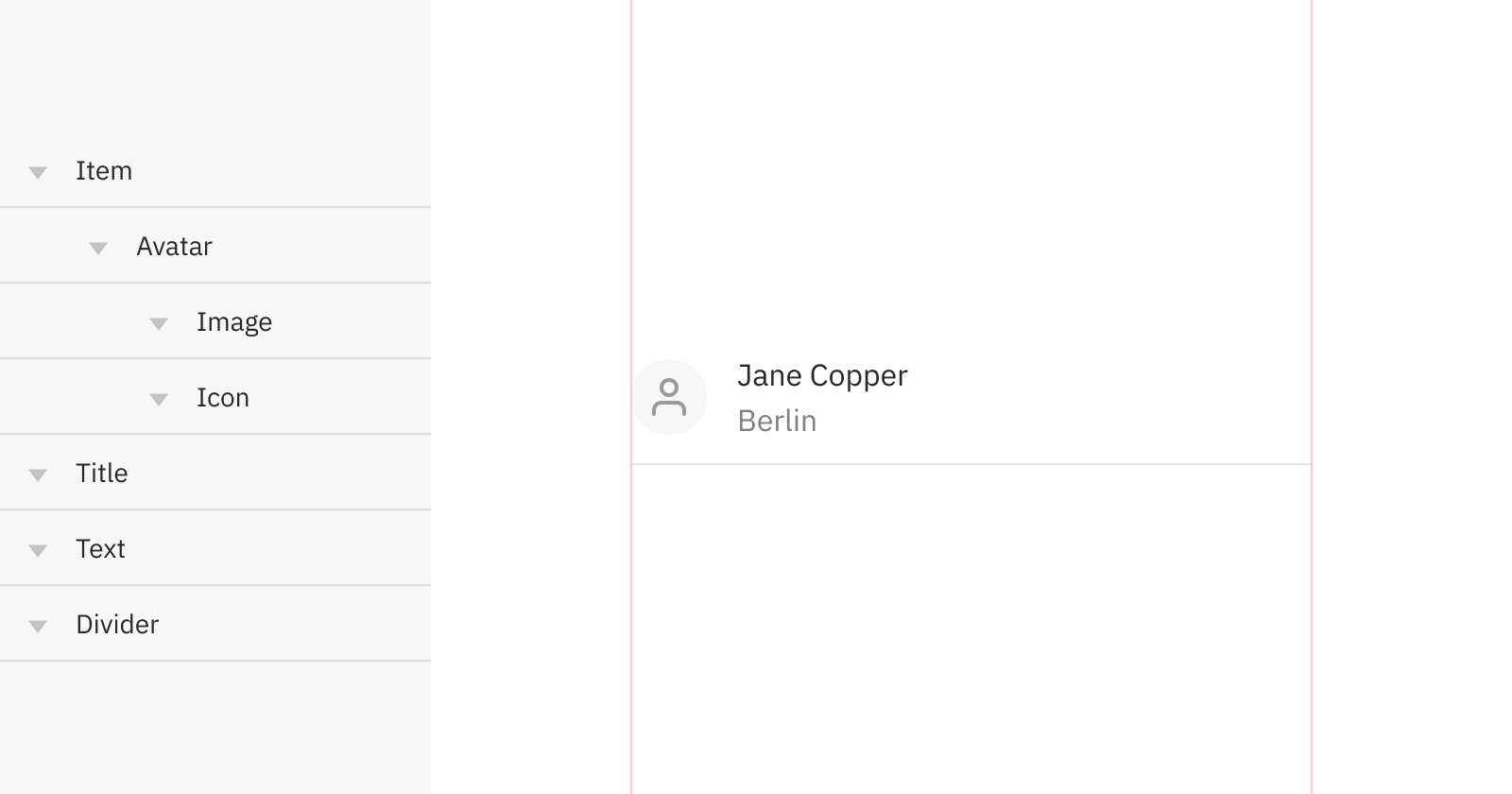
Then, you can include this as an instance inside the component that will have the padding. This new component with padding will hide the divider line in the instance, and then will add a layer with it, so this way it can go from side to side.
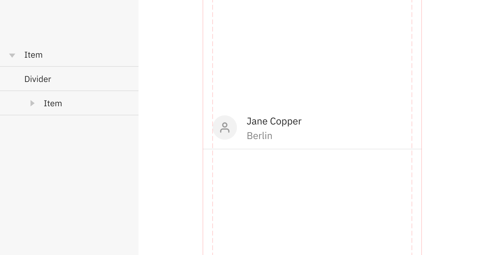
Working like this is key to optimise maintenance. Just by updating the base component, changes will propagate to other variants where this base is being used.
What should be a component?
As far as design regards, the idea is always to have the least amount of different components in a design file. This will help reduce the amount of maintenance time that we dedicate to them; that's why good practices such as using nested symbols whenever it's possible (and makes sense) will also benefit us.
In any case, reducing maintenance doesn't have to compromise the ease of use and discoverability of the components we need in our day-to-day workflow. Then, we need to ask ourselves: Should this be a (Sketch or Figma) component, or can we get away with just a group? To be able of answering this, we need to ask two more fundamental questions:
- How often will the component be used? If it will be used only in some isolated cases, maybe it won't be necessary to create a component from it. The biggest benefit from creating components is the instant changes and updates propagation, therefore, the more the component will be use, the more will be justified to have it as a Sketch symbol or Figma component.
- Is this just for documentation? A component may have different cases and states. These should be documented somewhere, but not always they should be a component or symbol in our design document. For those cases that are only referential (meaning, for documentation purposes) a group will be enough. This could be, for the "down" state a button, a case that most of the times you won't need to reuse as part of your designs.
Anatomy and properties
When components go from design to code, they often have optional properties and some others that are required. The front-end person will then use this to render the component in the interface. These properties can decide if the component will have (or not) an icon, an avatar, the width and height, and all those options that were decided to be provided as configurable at code level.
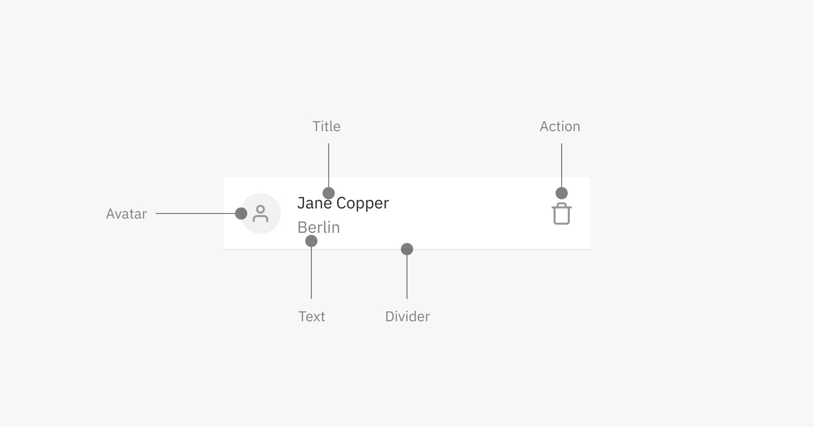
If we want to use the "Item" component with an avatar, but intentionally using the variant with padding and hiding the divider line, the code would look something like this:
<item padding no-divider>
    <avatar type="icon" icon-name="user"></avatar>
    <content title="Jane Copper"></content>
    <content text="Berlin"></content>
    <action icon-name="trash"></action>
</item>
These properties or attributes that the component will offer should be decided at the design stage, involving programmers and agreeing as a team. These definitions are also a commitment for the designer to not use variants of a component that will be, later on, not possible to obtain with what the component is offering out of the box.