
A short intro
The main reason to document design is to keep everyone in the team aligned, and I mean not only designers. By having a main reference site where all design specifications, practices and workflows are laid out, you can use this as a central piece of consult, avoiding repeating concepts or having them scattered around different places.
Documentation goes beyond the interface itself. There are so many things around the process of designing that are also necessary to communicate: From the rationale behind decisions to behaviours, and from everyday practices to general workflows. For now, the scope of this publication will cover everything related to the visual aspect of the product.
Documenting in your design file
Nowadays is more common than before to find tools that help connect your design software with other websites where the documentation can live. Most of them work through plugins that will allow you keep to your design in a central place, and then sync it through third party software. We'll talk about this later on (or you can jump straight to the Documentation tools section.)
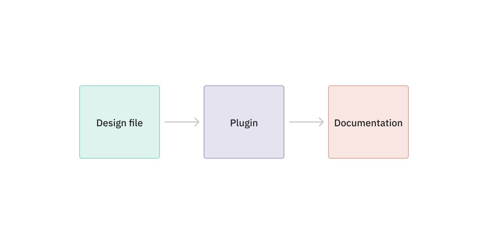
Unfortunately, the maturity of both design tools and documentation tools is a bit behind of what we would like to find nowadays. For that reason, and as we'll see below, I still prefer to use those tools in combination with an in-file documentation. This has the advantage of fine-tuning the communication of your design with the level of granularity you want, but involves some manual work to keep it up to date.
In the next few sections, we'll see what to keep in mind when documenting the main pieces of your design.
Colours
To document colours, we need to follow a series of steps: State their anatomy (meaning the different parts that form a colour asset); define how they are going to be categorised or divided; and lastly, what's the relationship between all of them, keeping in mind that the same colour value can have different applications in the interface.
Anatomy
A colour is pretty simple, so to define it we just need a name and a value, and a visual representation of both. To do this in our documentation file, something that would be useful is to create a symbol or component with a common structure to later on document the palette based on that.

This is a pretty simple example, but this common structure will be replicated to document every colour we have in the interface. There's something else to keep in mind: Colours are normally part of a scale, and they have a position on it.
It would be rare to have just one primary colour. Instead, it's more likely we'll have some variations of it that will be later on applied on different situations, like when hovering over a button. All this will need to be defined and documented, as we'll see next.
Definition
To visually explain how the colours structure or categorisation works, you can arrange them on a specific page inside the style guide, besides creating them as variables or styles.
The primary colour we have just seen could part of the "Main" category, where we will have primary and secondary colours. Besides those, a project will typically include some other divisions inside the palette.
Main
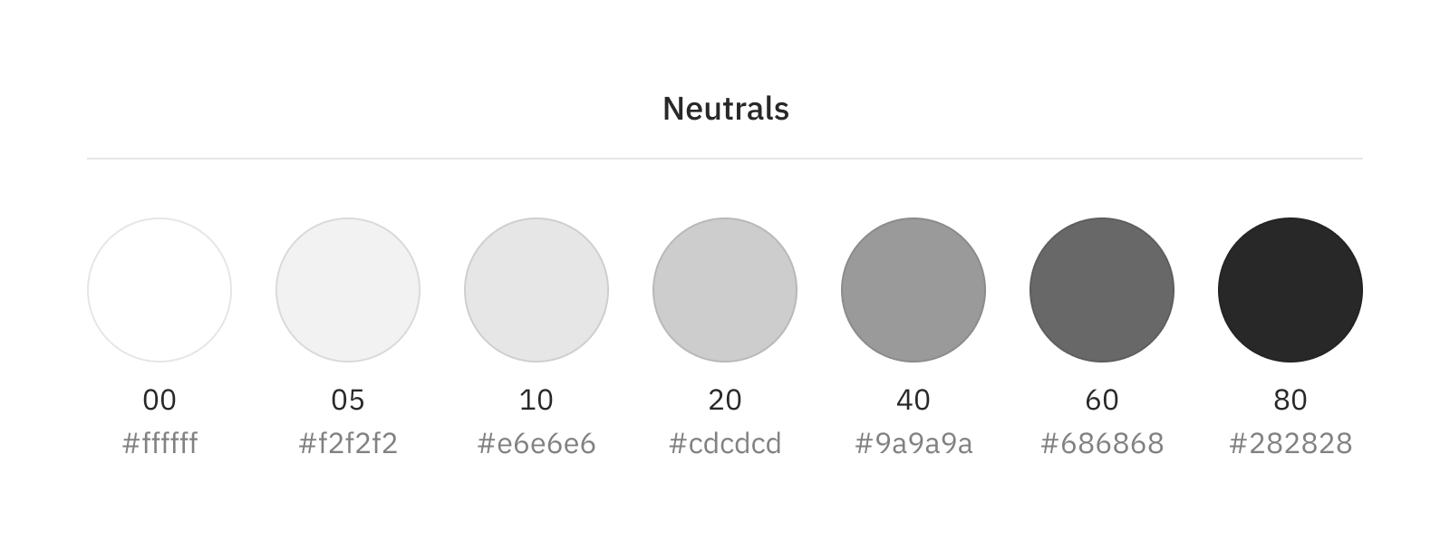
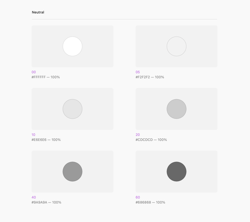
Neutrals
Backgrounds
Opacities
Icons
TextsWe'll take the Neutral category to define an example of the different values it contains.
Applications
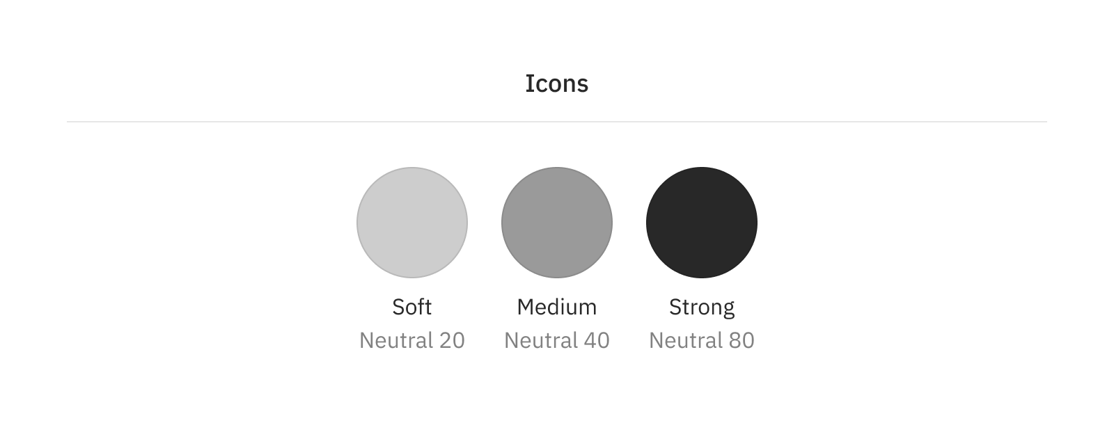
A normal thing would be to reuse some of these colours in other places, such as texts, icons or backgrounds. For the same reason that we commented above, we will create the styles again, even if they reuse the value, to make them easier to find in our styles list.
When designing the documentation we can clarify that some of the values are not distinct, but reuse some of the already defined instead.
Tools like Sketch and Figma allow to store colours in isolated styles and variables (meaning that you save the colour value alone, without other visual attribute.)
Ideally, we should be able, within our design tool, to nest colour definitions so two colours could share the same value, and have it updated when it changes in one central place. This behaviour would be similar to the one we do in code.
$colour-neutral-20: #cdcdcd;
$colour-neutral-60: #686868;
$colour-neutral-80: #282828;

$colour-icon-soft: $colour-neutral-20;
$colour-icon-medium: $colour-neutral-60;
$colour-icon-strong: $colour-neutral-80;
For now, this level of nesting is not possible in our design tools, and we'll have to rely on documentation to clearly communicate how colours are being used across our product.
Text
Defining text styles can be complex because it involves a combination of properties that play together, such as size, colour, family or weight, for example. The challenge here is to document this in a modular way, so you can have in one page a clear map and overview of how these combinations work together.
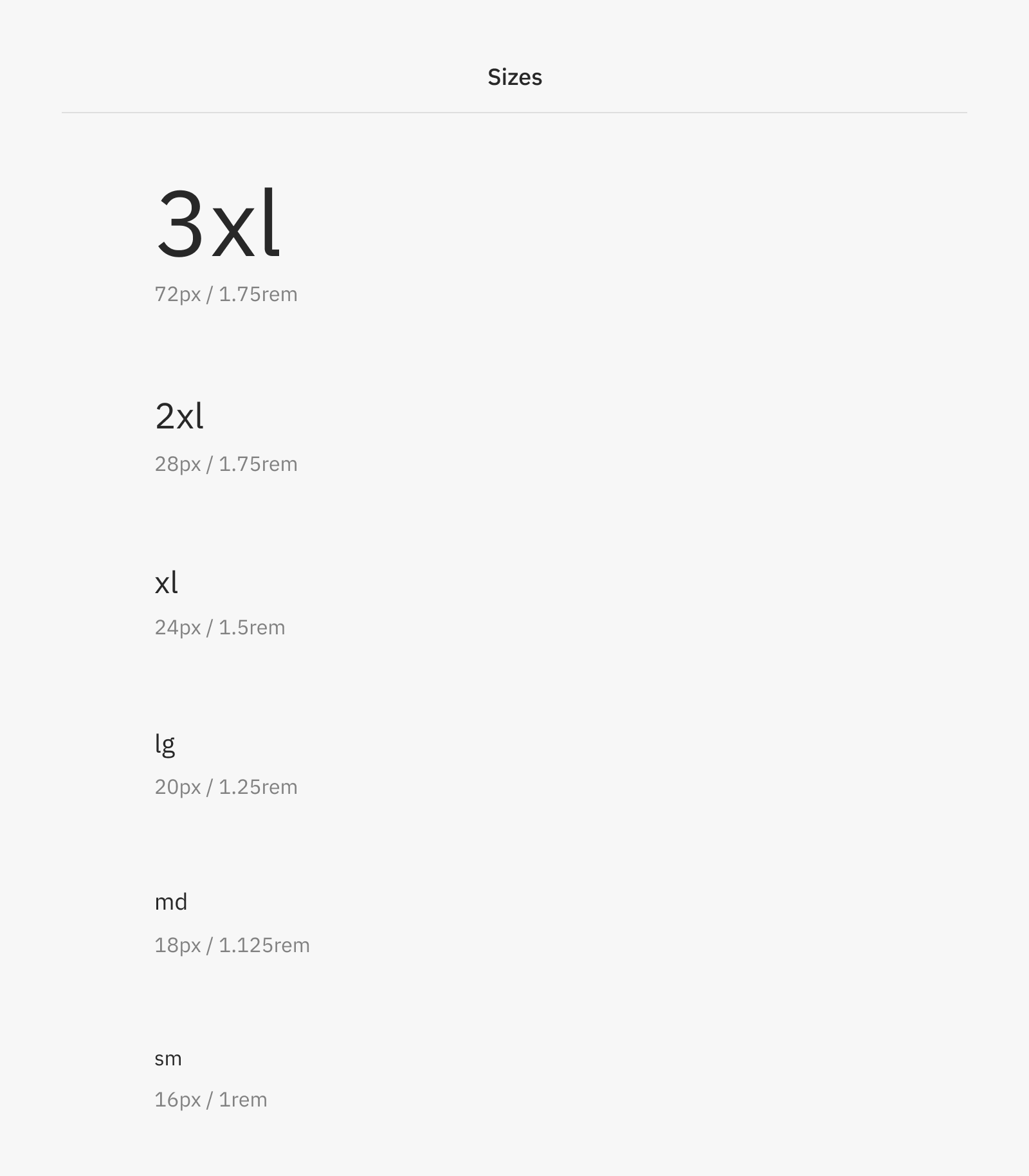
Size
Size will be usually based on a type scale. Having everything in a single place will help us make an idea of the different sizes we have, in order to keep them tidy and reduce the total amount of options. We'll keep in mind the naming conventions that we use for sizes across the project, and we will also include values such as measures in pixels and REMs.
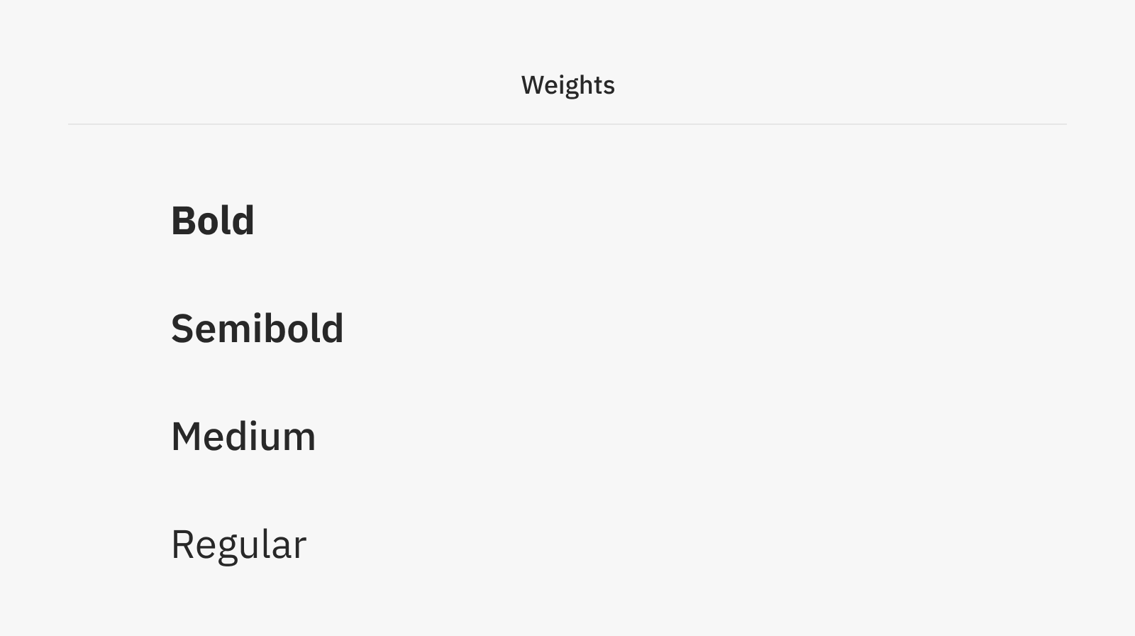
Weight
Depending on the typeface of our choice we'll get access to different weights we can use. Following the same principles of having as little different options as possible, we can lay them out in a page to visualise the ones we'll be using in our designs.
Putting everything together
In the design tool of our choice, we'll need to combine sizes, colour, font family and weight together to create a unique style for each of the main and most common applications we'll have in the interface. (If using Sketch, it's preferred not to create several styles with different alignments, just the most common one -- that is, usually left-aligned.)
For every case, we can add some information below the style to explain a bit more clearly the "token" that is using, regarding size, weight, line-height and so on.
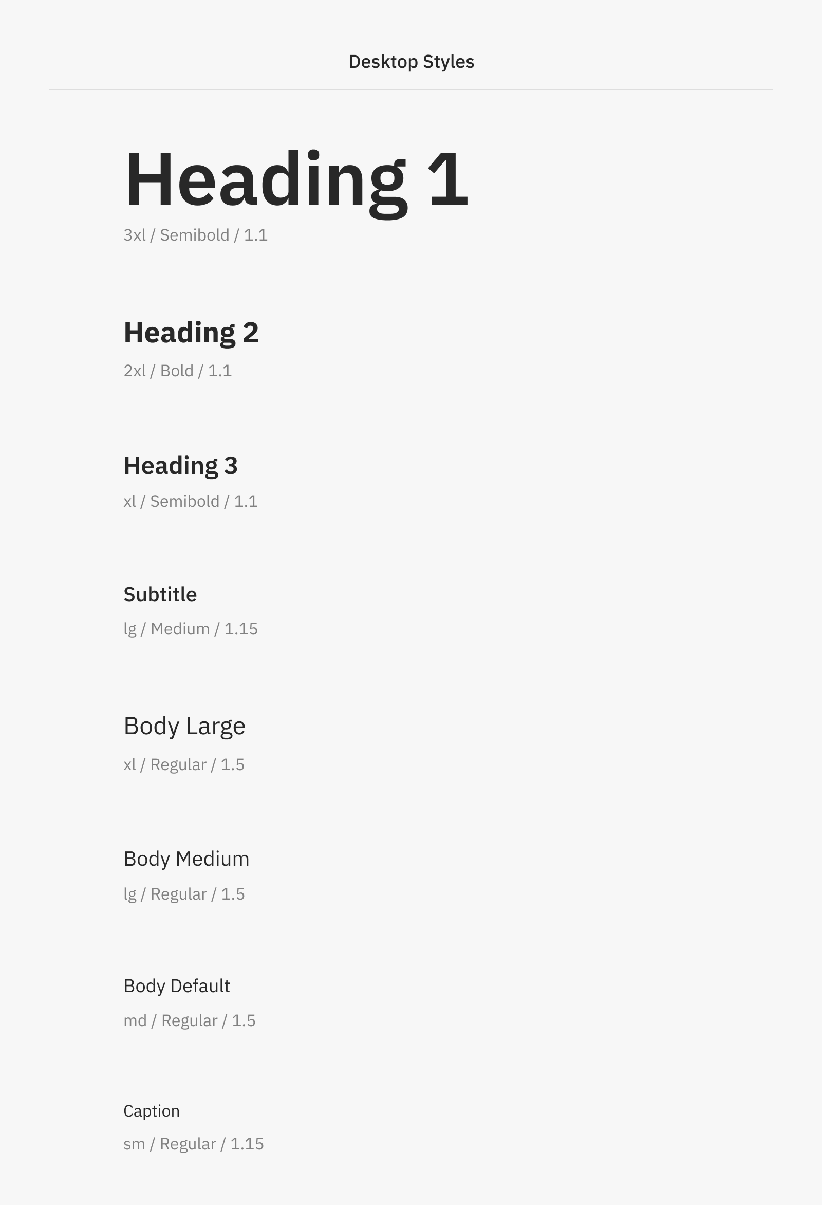
Text styles are also usually split in "Desktop" and "Mobile". Headings tend to look really big on small screens if we keep just one size, therefore they need to be adjusted. Keeping in mind the size scale we have previously defined, we can use one step less in the scale for mobile phones and tablets.
Beyond some point, there's no need of having separate styles so we keep a "Common" section that is shared across platforms. This will help us minimise the amount of different styles and it's not really worth it to have so many of them with little difference.
There's more to this than that. There are also the styles we use for links, too -- and this involves different states, for example when you are hovering the text, or the link is disabled. We'll see some of this in the next sections, but for now, you just have to know that it's always preferable to create just the styles that have any chance of being used often in the interface, and not necessarily all of them.
Components
Even if our Sketch symbols or Figma components are relative simple, it's necessary to document components keeping in mind the different constraints, behaviours and outcomes they may have.
Anatomy
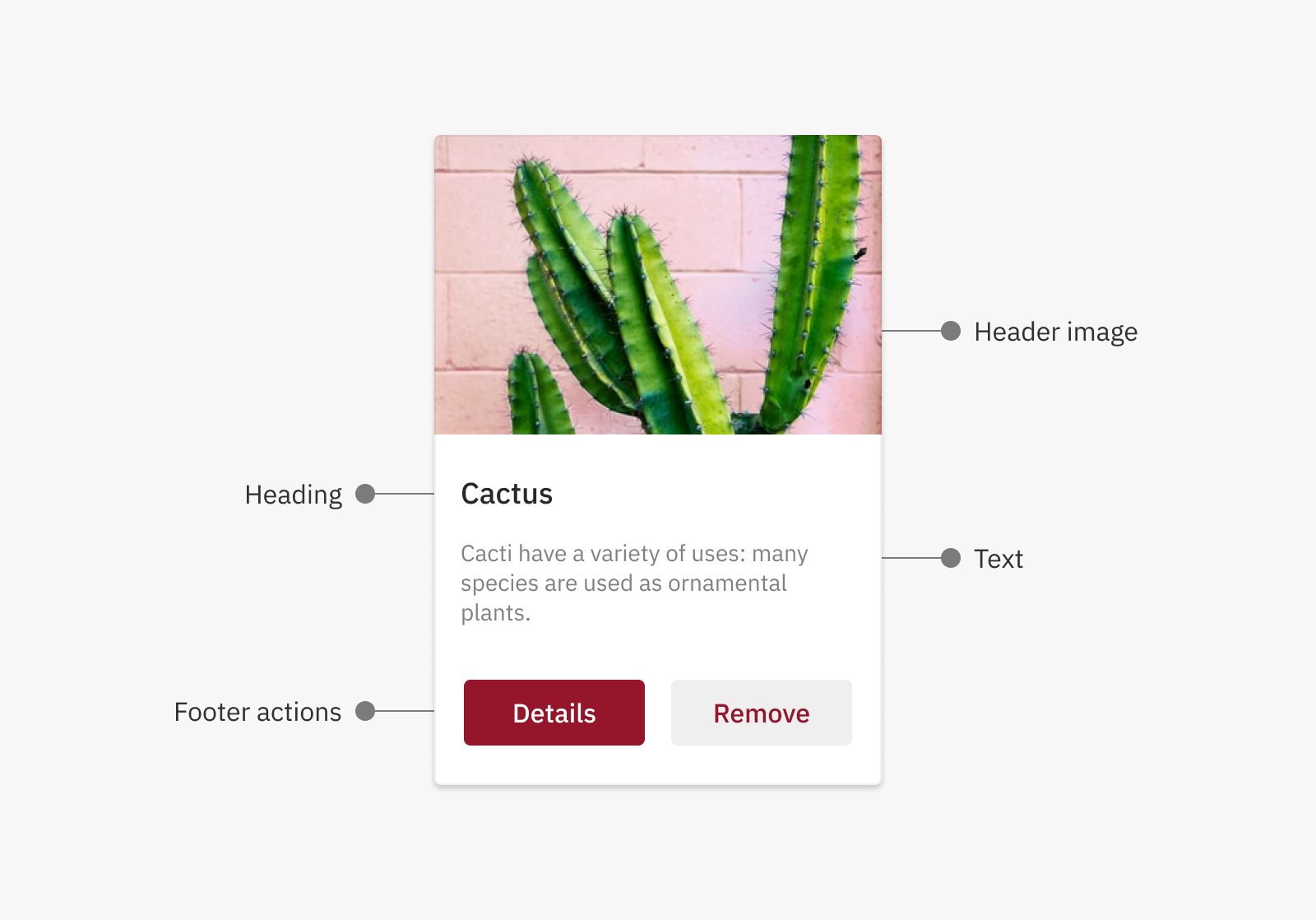
We'll start by documenting the components' anatomy, which identifies its different parts —specially the ones that later on will be possible to customise by making use of their properties.
Let's say we have a pretty common component, a "Card" that, at the same time, contains some other smaller components inside. This first part of a component's documentation is mainly aimed to visualise an overview of its general structure.
A common glossary
A component can have different behaviours, content and layout depending on the context and its purpose. This (you've probably guessed) must also be documented.
Some tools like Figma have features called "variants" that allow to split a component and group it with several others that are visually related. In our case we'll go a bit beyond that and we'll use a higher level of granularity, that will allow us to document a component defining its Types, Variants, Cases and States. We'll see what each one of those mean in a second.
This division is something to be kept for all components, although not all components will have all definitions. For example, maybe an input field will be of only one type, and a dialog won't have variants. So there's no need of forcing this if it's not completely necessary -- it's something that must be decided case by case, and component by component.
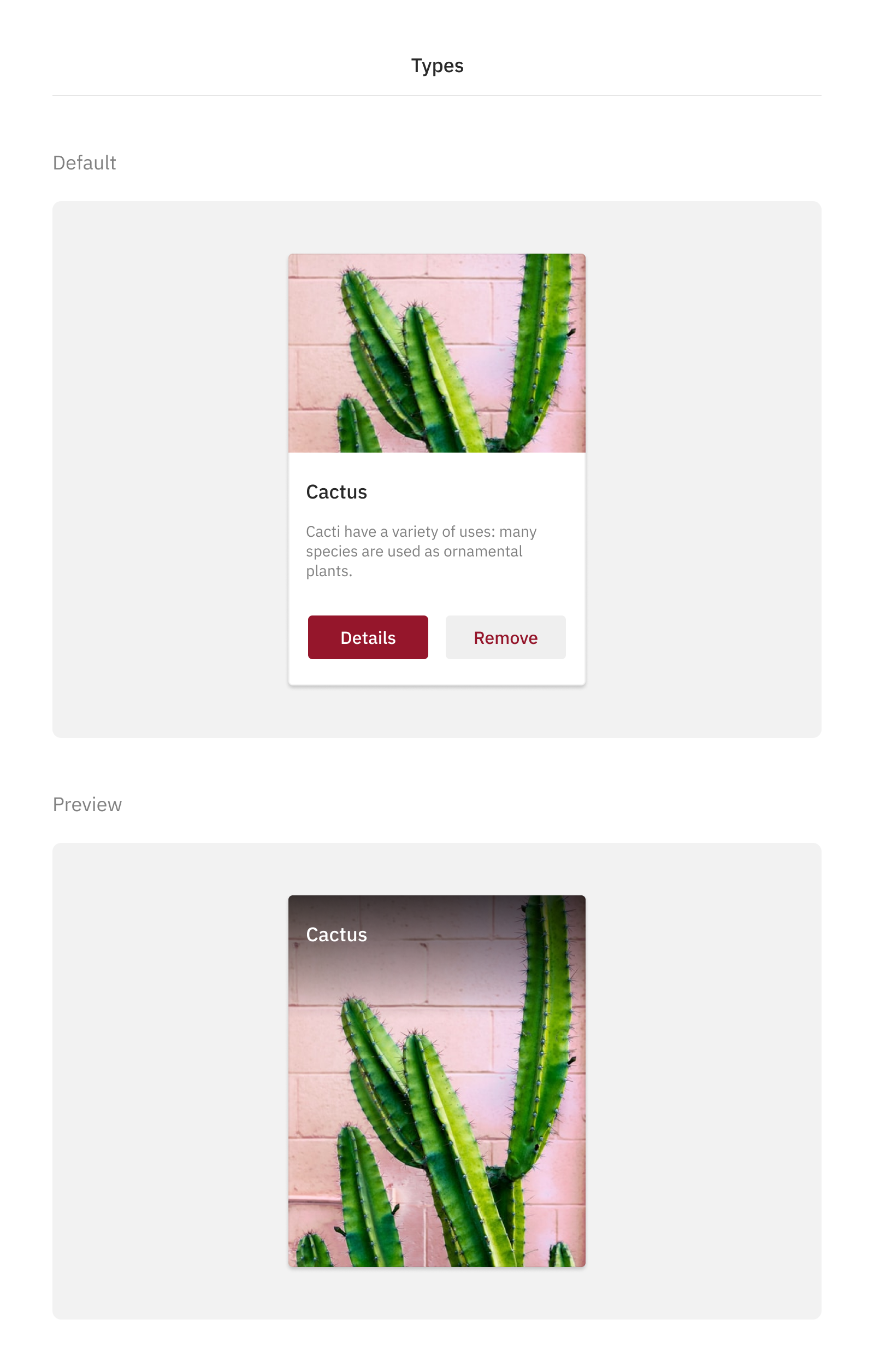
Types
A Type is the highest-level differentiation a component can have. It usually refers to big changes in the layout that render the component in different ways, while still sharing the same core concept and functionality. Keeping the example we used of the card above, we could it say it will have two different types: The default one, that we have already seen, and another version that will look more like a preview image with less information.
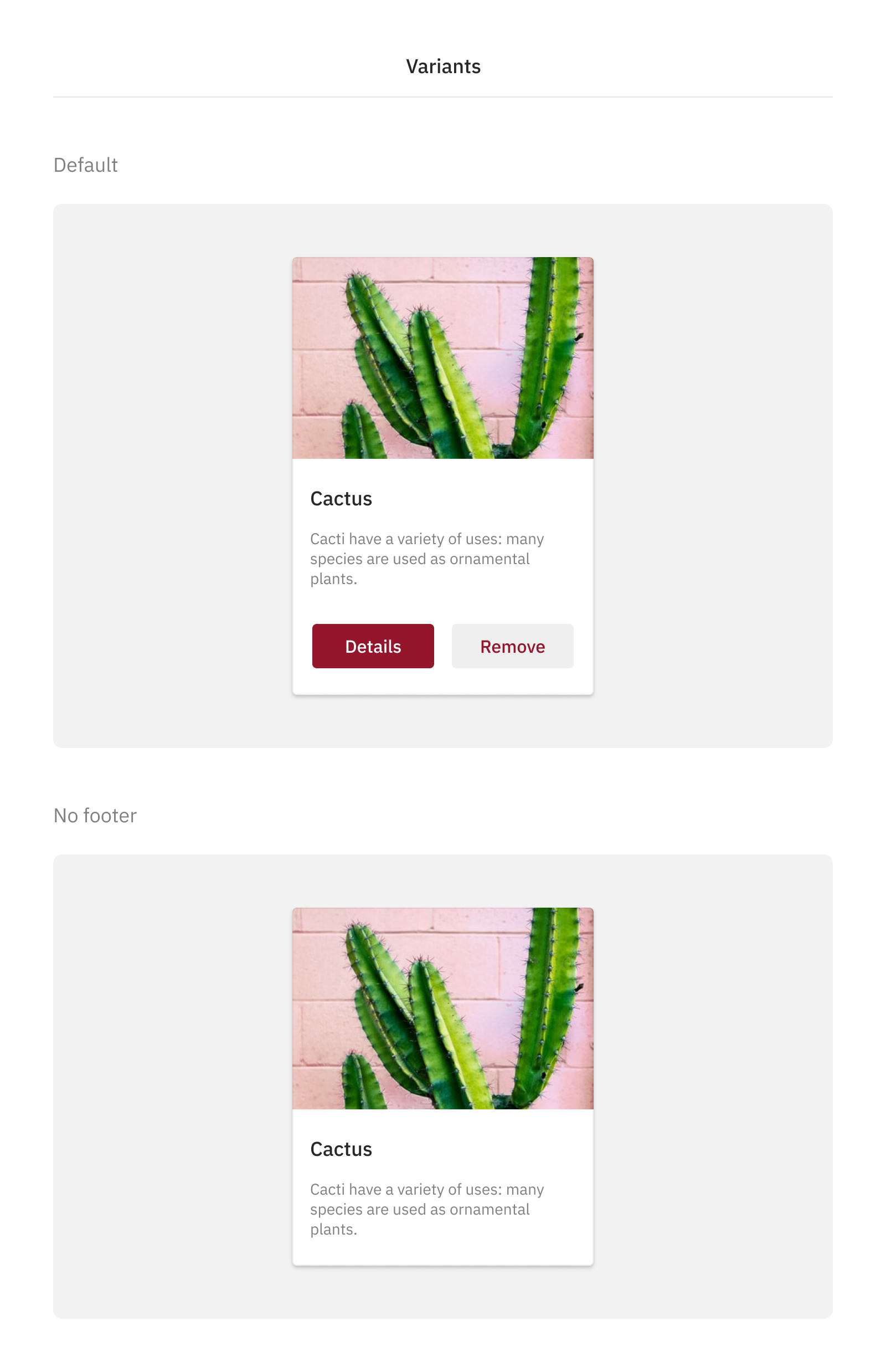
Variants
Next, we'll have variants: A small variation of the component at a visual level, not behavioural. The layout will remain mostly the same, but it will be adjusted to meet the needs of certain scenario. For example, we could have the default Card that we'll use most of the times, but also a Variant that will keep the main structure and remove the footer, like you can see in the image below.
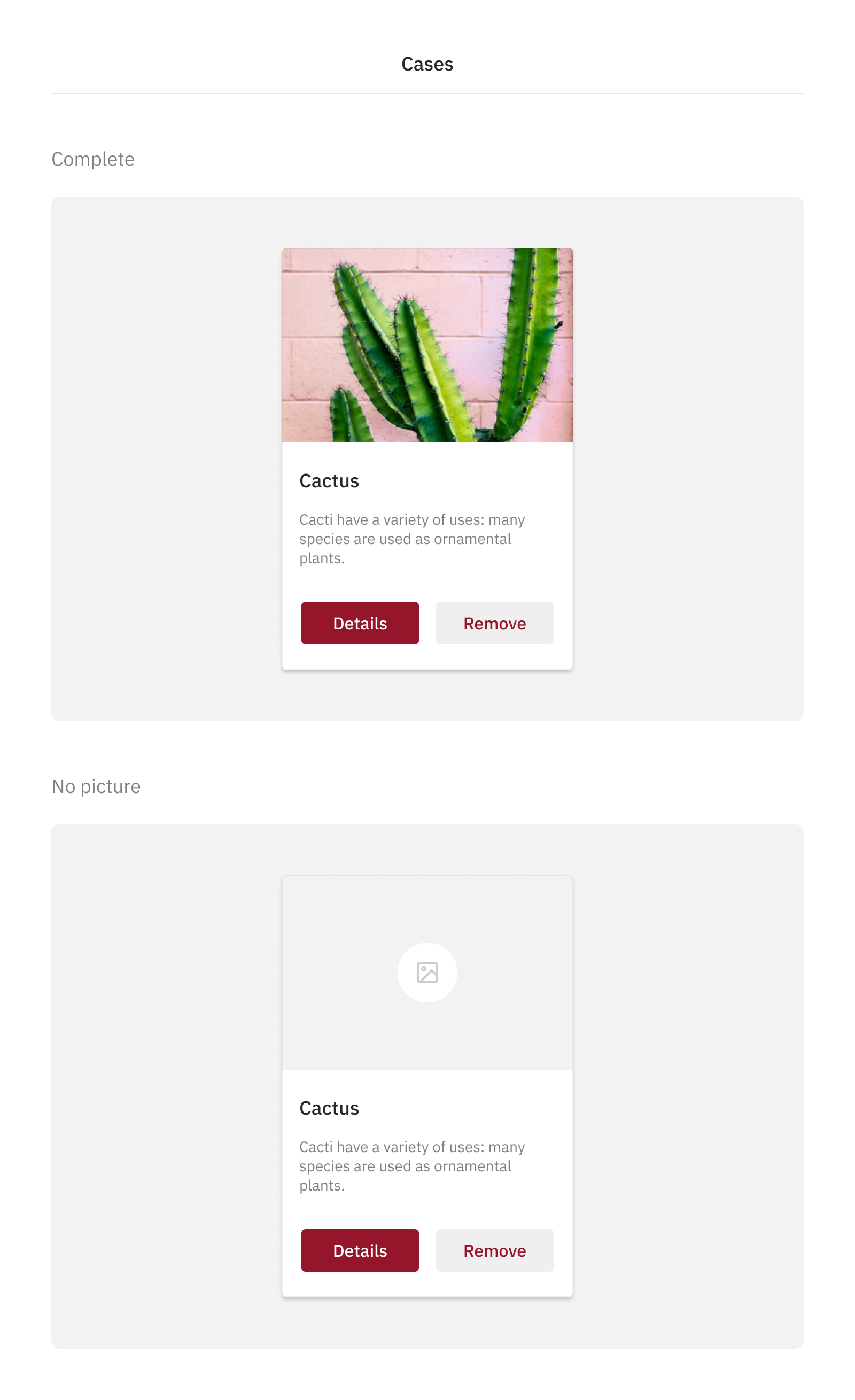
Cases
Cases refer to different scenarios in which a component could be. So far, we have used a Card full of content, but we also need to define how it's going to look in the case that there's no image, for example. So, along the ideal scenario of a piece full of content, we should also design the component with missing pieces, and present it like one of the cases.
States
And finally, States are usually triggered by user's interaction, and they are generally the same: Up, hover, focus and down. It could happen, though, that some of them could be different depending on the component.
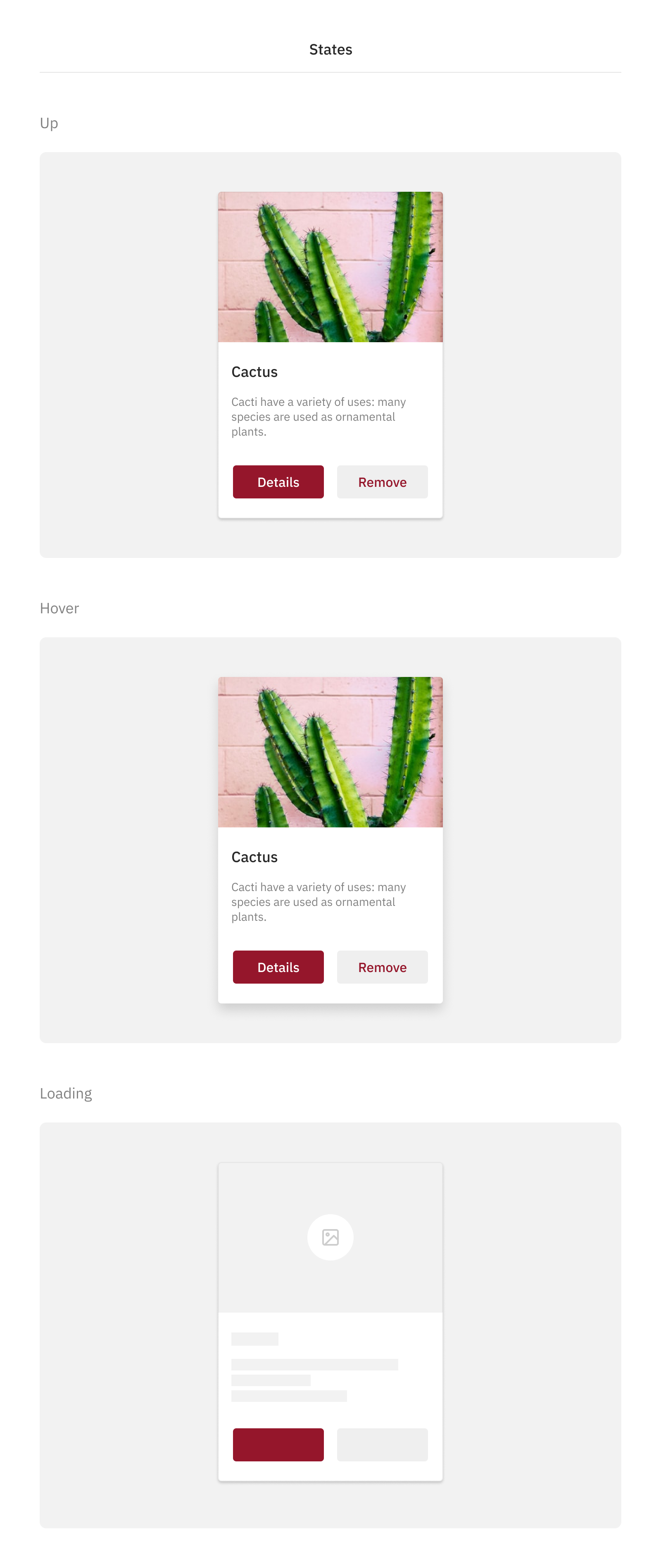
As per the design file is concerned, it's not necessary to create as symbols or components those states that are not going to be used frequently in our day-to-day work, like the hover state. These are truly necessary to have documented somewhere, but they don't need to be part of our file as Sketch symbols or Figma components.
Before finishing this section, you have to be aware that this is not a rigid classification. Sometimes it could be tricky to decide if that design definition should be a case or a variant, for example. Ideally, you have to document this design decision somewhere without caring in excess about in which category it falls.
Documenting properties
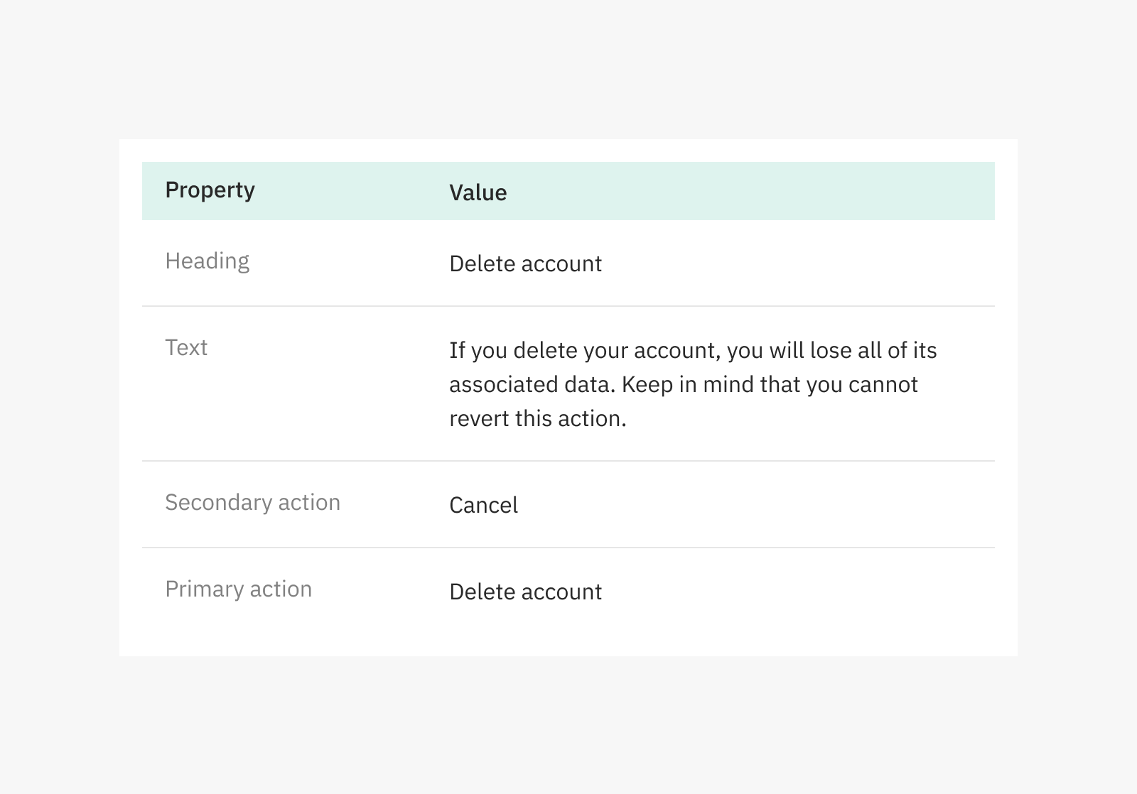
Components are formed by properties that can, and cannot be changed when using them in code. For example, a dialog can have a title, a body text, and an action button with text values that will change depending on the occasion. Everything else (background colour, margins and separations) will invariable remain the same.
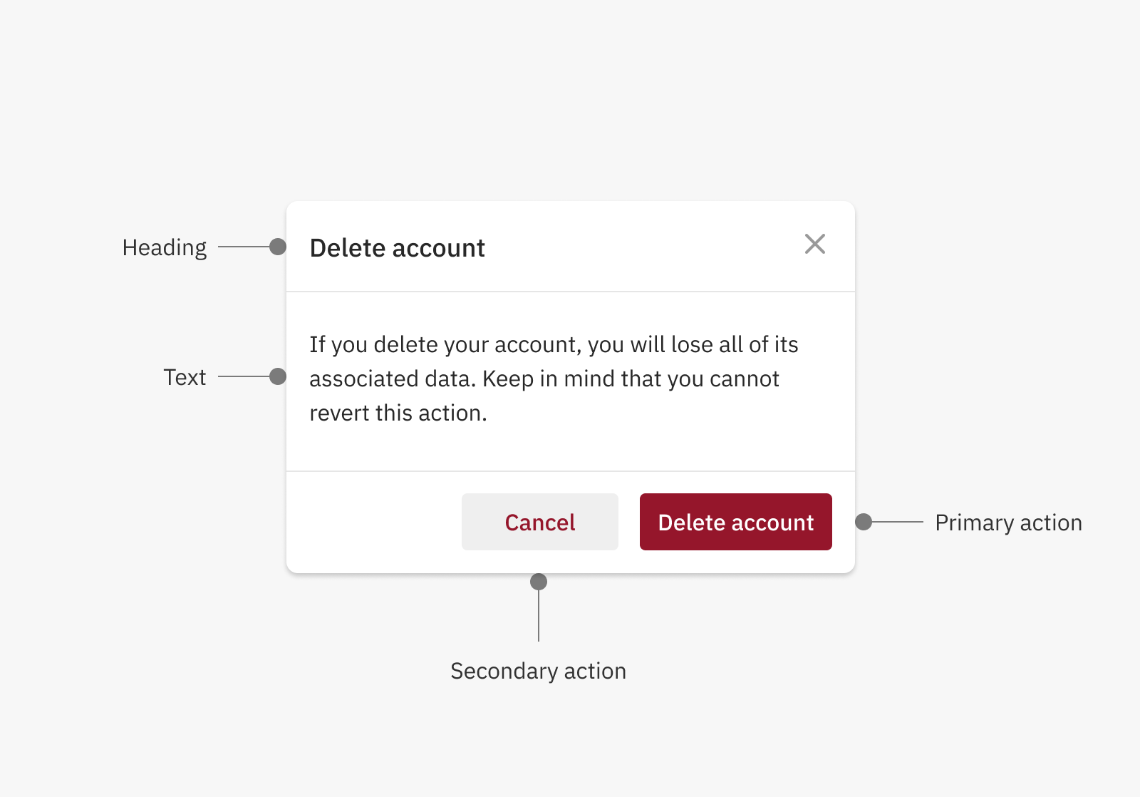
So, does it make sense to design a dialog for implementation every time we have one? I say no, it doesn't. There's a way of avoiding repetitive design for components that have pre-defined properties that can be modified, and it's documenting them.
Using a simple table in our product documentation, we can indicate for each dialog the values of the pre-defined properties it supports. This way, we avoid having to design a dialog each time we need it. Instead, we can use the table, which is easier to maintain and specially suitable for lazy designers like me.
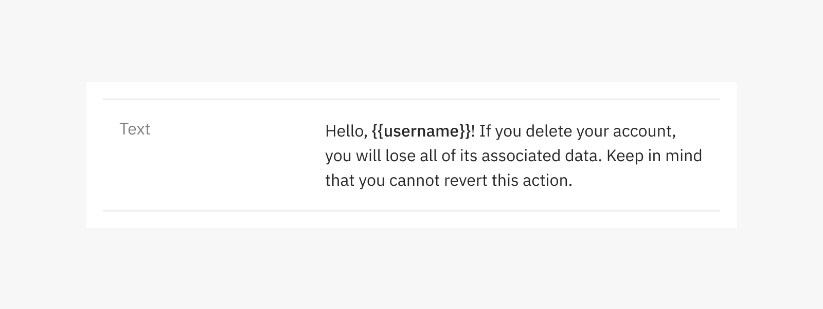
For text content that can vary dynamically, you can agree how to indicate variables, so you can use them in the part of the text that will be different. For example, you can define how to include a user name like in the example below.
Documentation tools
I believe documentation tools for design are still in their early stages. Probably with the rise of designs systems and a consequent improvement in DesignOps and design-development collaboration, we'll find more tools aimed to shorten the gap between those two parts.
ou've probably heard of Zeplin before, a tool specially useful for design hand-off (such as sharing spacing, sizes, colours and assets download.) I have to mention that both Sketch and Figma have inspect and commenting features that overlap this tool, so you can get away with just using your design software by itself.
An interesting option for documentation is Zeroheight. It allows you to sync your designs from Sketch or Figma, and very easily extract styles, so you can use them to document your style guide. It goes beyond that, as you can also upload any artboard or frame, and symbols and components to document them. You can even add static pages to have a more complete wiki. It also has integrations (like the one with Storybook) that allow to have design and code examples in the same place.
Finally, Specify is making interesting progress in its way to become a design API that will help you keep design and code in sync, having a central hub where design assets and tokens will be stored. It's worth keeping an eye on its roadmap.
A final word: There are many tools, and it doesn't matter which one you use. It could even be Notion, Google Docs or whatever you like. The important part here is for the documentation to be accesible, up to date, and friendly to all team members, even non designers.