A good name
For a name to be effective, it must comply with some certain basic characteristics: it has to be recognisable and make possible to identify what it's referring to. Even when it seems to leave that group as "Copy 23", investing a few seconds to set a proper name just after created, will help boost speed and order in the design process. So, beyond where it's being used, how should a name be?
It has a logic structure

It's important to use some logic to build the name, something that will be predictable and will remain always the same -- not changing often depending on the situation. Perhaps this is even more important in components, that usually have a long and complex structure.
It's not related to visual properties
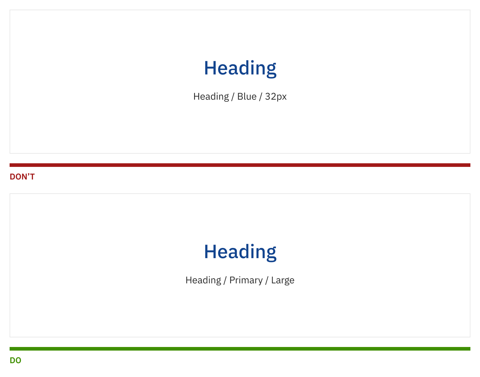
This logic we mentioned before means using context, function or hierarchy to name something. But not the visual properties that may change over time, rendering the name useless. If you name something based on the element color, or its border radius, it won't be useful anymore once one of those properties is modified. But as usual, there are always exceptions, that we'll see later.
It's short, but meaningful

In components, following the structure's logic makes us end with often long names. Once we are using an instance (meaning the component's copy, not the editable one) we can simplify the name to reduce it as much as possible. This will make the layers list easier to scan at simple sight. The important bit here is that, just for the sake of making something shorter, we don't sacrifice the name's purpose of easily identifying what it's referring to.
It's short and known by everyone
Did you know that "Cheers" is the bar where everybody know your name? In a team, naming convention should be known, agreed and used by all team members. It can't be that from project to project, and from designer to designer (or even inside the same product) there are different ways of naming.
As a side note: if you have a distributed team or with international designers, the best is to use names in English. This will make your file easier to understand independently from where the other person is.
Sizes
An interface is full of different sizes, from texts to breakpoints, or spacing between elements. The easiest and most scalable way it's related to the clothing sizing system we use in the real world. It's a pretty universal concept widely understood. From smaller to bigger, it would be work like this:
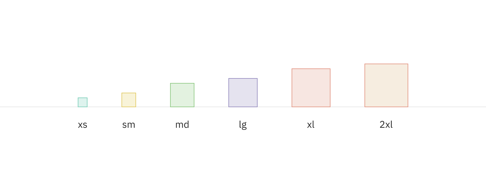
xs = Extra small
sm = Small
md = Medium
lg = Large
xl = Extra large
2xl = Extra, extra large
Alternatively, we could use "xxl" instead of "2xl", but I find that when the sizes start to grow, readability becomes increasingly compromised if we exclude numbers, and go for just "x".
There are other ways of naming sizes. Some of them refer to animals or other kinds of analogies. I find this funny, but in some cases is not so clear what thing is bigger than the other, therefore the usefulness of such systems is limited (not to mention, they are also harder to scale.) Just as an example, this is what I meant (again, from smaller to bigger):
mouse
rabbit
dog
horse
elephant
whale
Colours
As a general rule, and like what happens with other things, we try to not make references to colours in particular (for example, "yellow") but prefer the function or context instead. If this is not possible or enough, we can first refer to broader visual properties (such as "light" or "dark"), and finally, use something more concrete if it helps.
Categories
Main colours in an interface can be grouped into “Primary”, “Secondary” and “Highlight”, depending on where they are being used and their function. Function should be consistent and coherent across a product.

- Primary is used for elements with interaction, such as buttons and links.
- Secondary is a complimentary colour in the sense that is used to make a contrast with the Primary, for example for a secondary button that doesn't have to stand out so much.
- Highlight in the other hand is used to call attention to some particular elements with an important role, like a submit button at the end of a form. It can also be used to indicate active elements, like a selected tab.
Besides those, there are more categories that have a more utilitarian existence, for example:
Neutrals
Backgrounds
Opacities
Shadows
Icons
Texts
Colour palette
Generally, we don't have just one shade of Primary or Secondary colours. Instead, we often use a palette with a broader selection of darker and lighter options, usually created from a base, that are used for hover stated, disabled items, and more.

In those cases, we name the base colour as "00": for example, "Primary / 00". For any of the darker or lighter options, we generate scales with some 10 steps, and we number each colour depending its position in that scale. So, the last step will be the darker or lighter option in their corresponding scale.
Primary / 00
Primary / Dark / 10
Primary / Dark / 20
Primary / Dark / 30
Primary / Dark / 50
Primary / Light / 10
Primary / Light / 20
Primary / Light / 30
Primary / Light / 50
Generating all the steps is important to be able to reference positions. Clearly, is not necessary to use all of them in our scale. We can omit some, the ones that we don't consider we are going to use, like the ones that won't have a real application in our interface design.
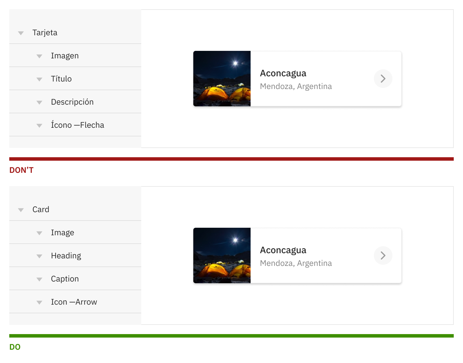
Groups and layers
Layers are to be named in the most simple and clean way to facilitate its reading. When the layer is a symbol or component instance, the name should be replaced for a simplified version.
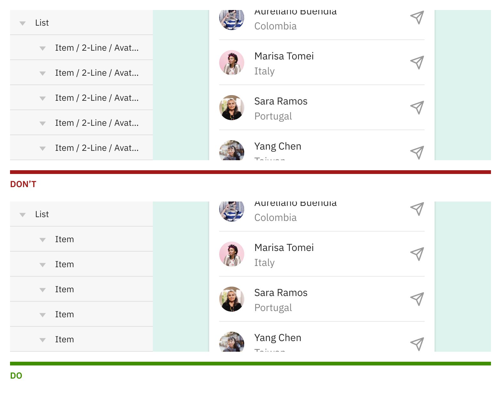
Inside a component or group, layers name should reflect the function they perform (something that will remain the same, independently from its content) —and won't be affected by the content itself.
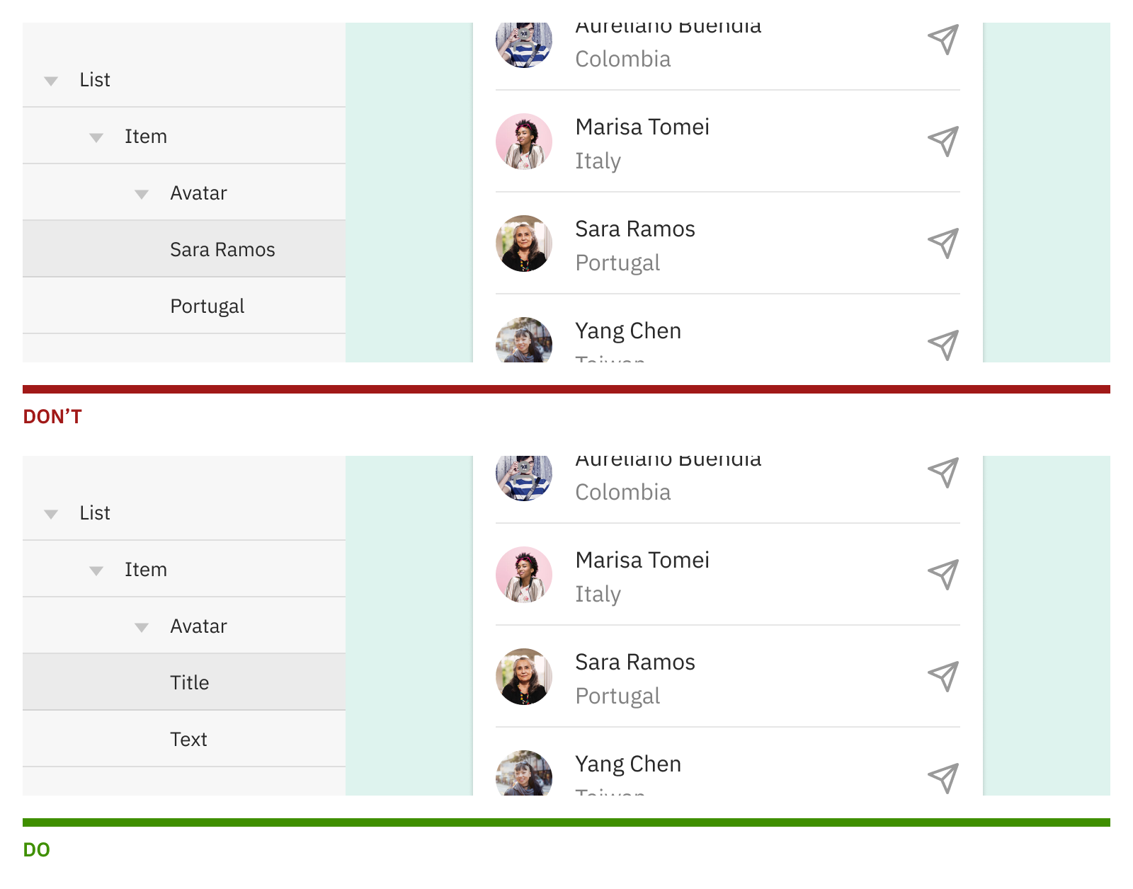
Layers must be easy to read, but also easy to identify. Therefore, in some cases a suffix could be necessary to separate one element from another, and easily understand what it's about by just taking a quick look at it. This is specially useful when we have two layers of the same type one next to each other.
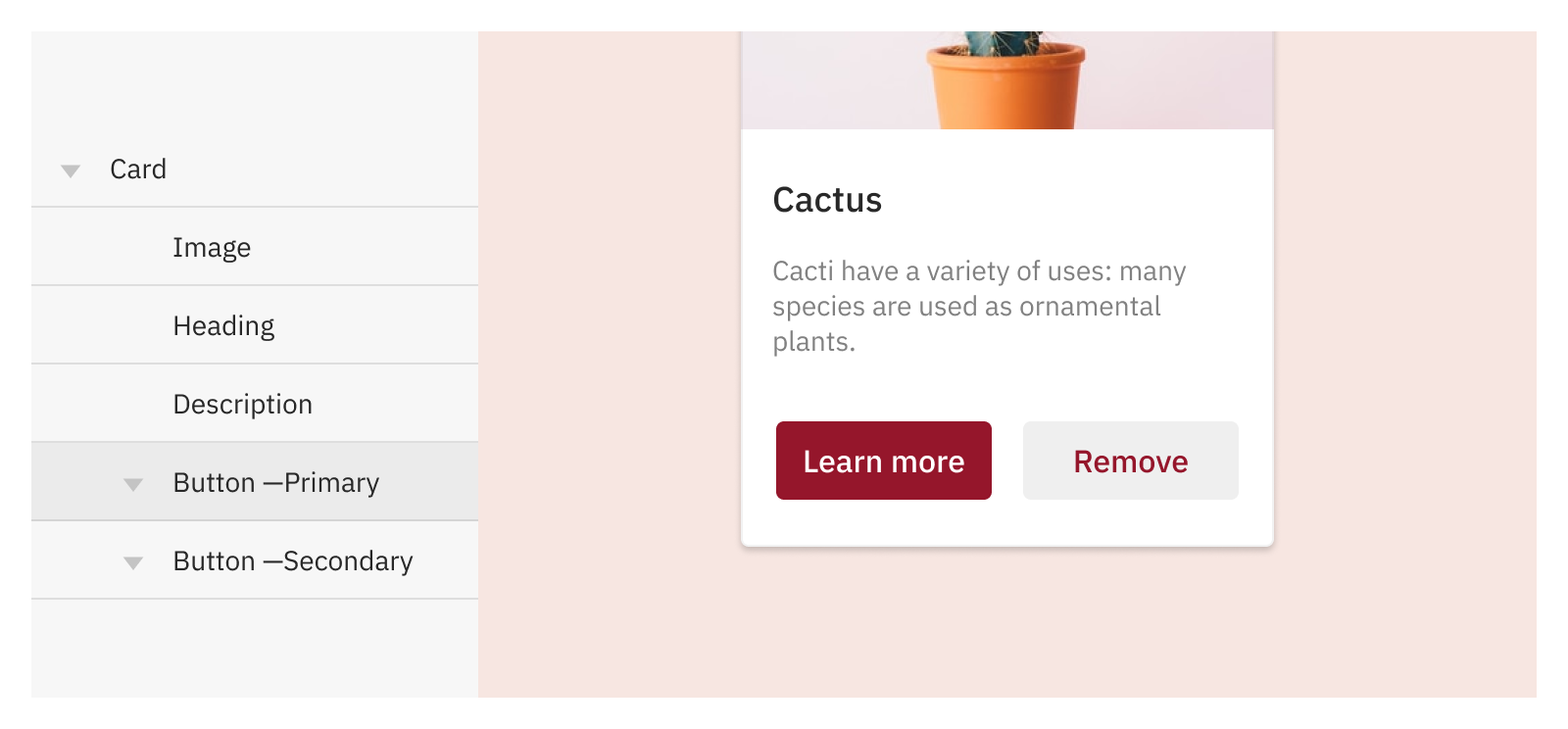
Components
Components names will go from the most general to the most specific, indicating first the content and function, and then its variants and states. One way of putting this into practice is:
Component / Function or hierarchy / Variant / StateIn a more graphical example, we could have something like:
Button / Secondary / Compact / EnabledThis could be extended in more complex components, that at the same time will include nested components inside. As rule of thumb, we prioritise function and context, over variants or behaviour particularities.