Auto Layout is one of the most important features in Figma, with a versatility that sets it apart from the ones in other design tools. In brief, it allows you to structure components and frames in a way that can automatically grow, making the container adapt to the size of its contents, or the other way around.
Being such a flexible feature, it also has its complexity and limitations. It can be a bit hard to understand how it works, specially at the beginning. It's also difficult, initially, to get predictable results without so many attempts, and trial and error.
On this article we will cover what you can achieve using Auto Layout. We'll go step by step starting with its most basic characteristics, to an idea of the potential it has to achieve more complex design layouts. Even if this is just an introduction, I hope this guide is complete enough for you to start using this feature with more confidence than ever before.
Getting the basics
Let's start with something simple. You can apply Auto Layout to either frames (even if empty) and componentes. But well, you'll start seeing how it works by having at least two layers.
The typical example is a button: A frame with a text, as simple as it gets. By just applying Auto Layout you can already see some things happening, that we'll see one by one to understand them, and adapt them to what we need.
When you apply Auto Layout to a component you will be able to override some of its values from the instance, but you won't be able to modify the general base structure.
Direction
To start, we have direction. This means how the component will grow once it has more, or less content. This could be vertically (arrow pointing downwards) or horizontally (arrow pointing to the right). In our first example, we have set it to be horizontal. This means that if the text is longer, then the component will stretch horizontally to make room for the content.
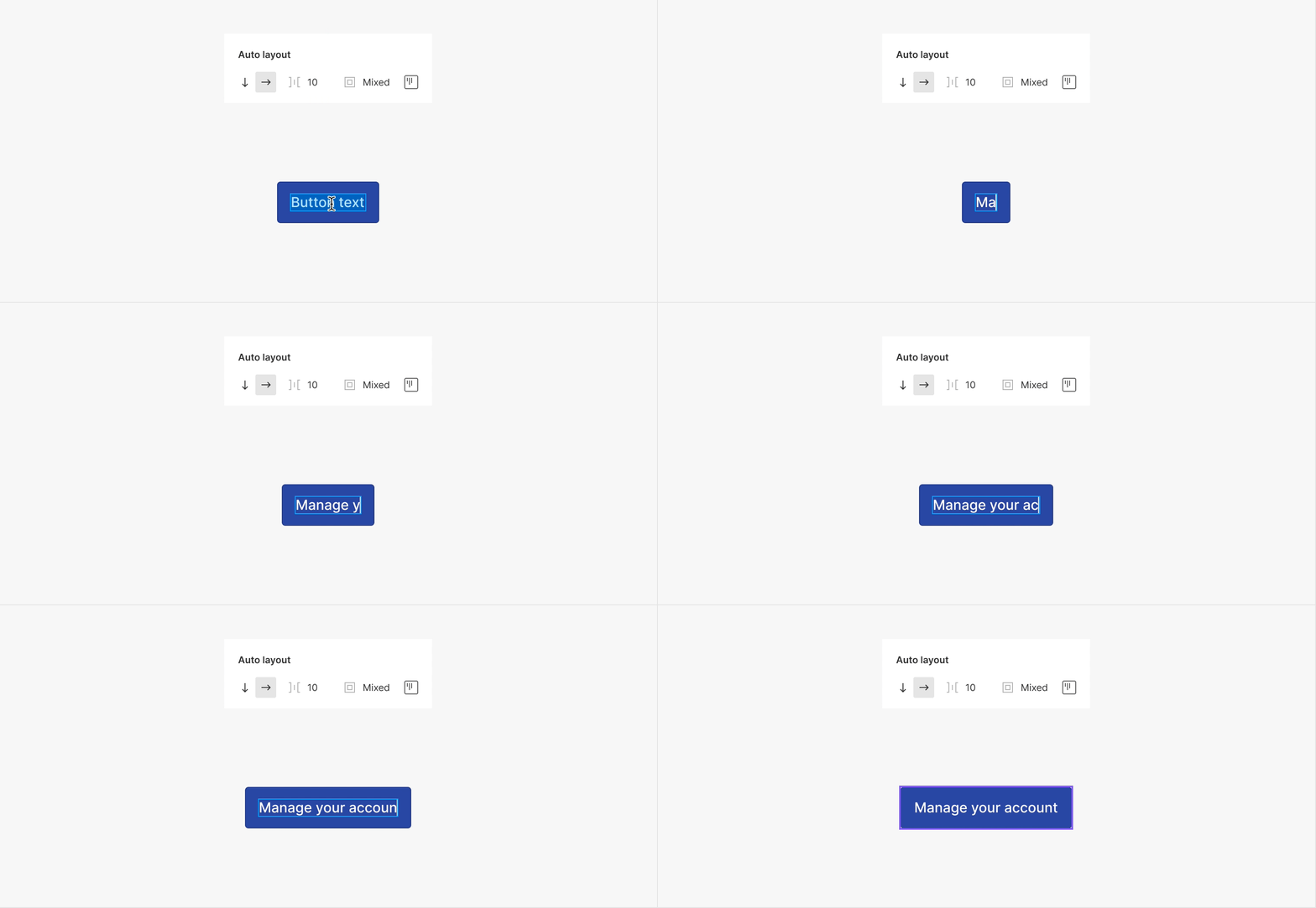
Direction can be vertical as well. Figma applies one or the other by default depending on the structure of the component, and from what it understands that makes more sense for each situation. In any case, this is something you can change anytime.
You can only set one direction at the time. To combine directions you will need to use nested layouts, something that we will cover later on.
Padding
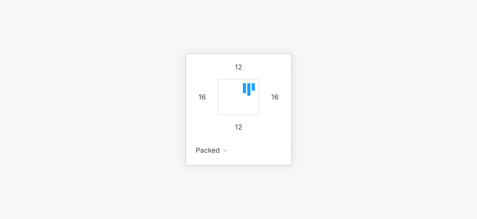
If you have worked with CSS before, this may sound familiar to you. And if you haven't, then you can understand padding as the internal margins of the component. When you apply Auto Layout, Figma will automatically add padding to each one of the sides, based on the separation to the container frame that the elements previously had. If you click on the padding options, you will be able to see the values applied: Figma has calculated them to be the same up and down, left and right. Even so, you can modify them, so all values are different from each other.
When all paddings aren't the same, you will see the text Mixed. If you'd rather prefer to apply the same value to all sides at the same time, you can just type the number you want, and the padding will be equally applied.
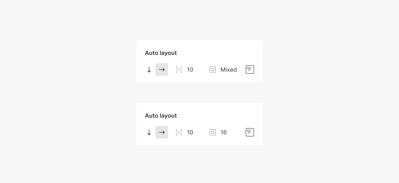
So, all this means that while the content changes the component will take those values into consideration to leave that area free, just as if they were blank margins.
Separation
So far we have had just a single layer inside the frame, but what would happen if we had another? By adding an additional element, let's say an icon, you will see there's a separation between icon and text. This distance has nothing to do with the padding we set before; it's a value that is configured independently. This distance will be the same between all elements. This means that if you add another element to the right, it will automatically keep the same distance: All layers inside the component are separated equally.
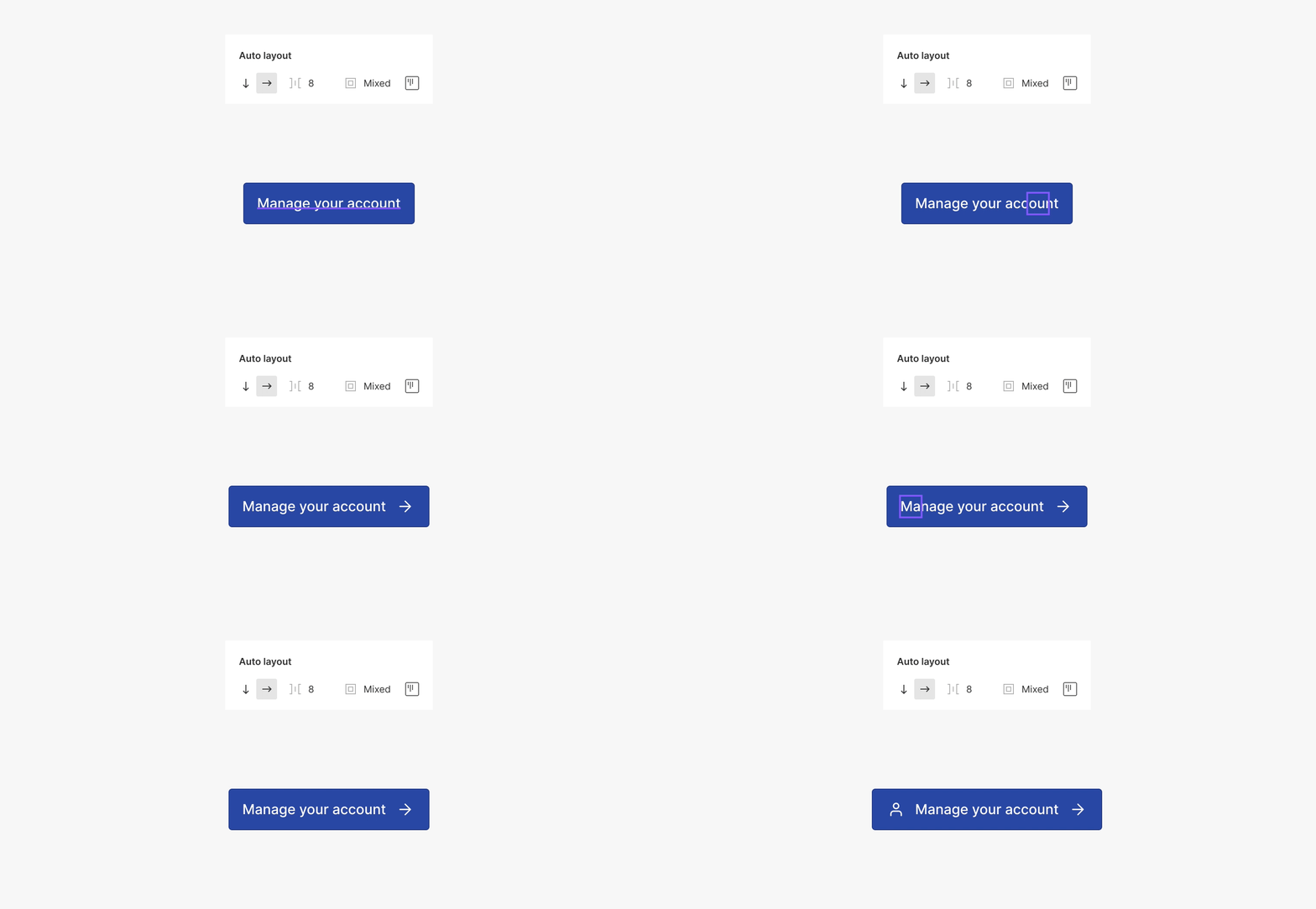
Separation is something very useful when we have a component that contains several layers that must keep the same distance to each other, so the layout won't break if you add or remove elements. A clear example would be items on a list. With this separation, no matter how many element we have, all of them will always be at the same distance from each other. When we add (or remove) a layer, it will respect these values.
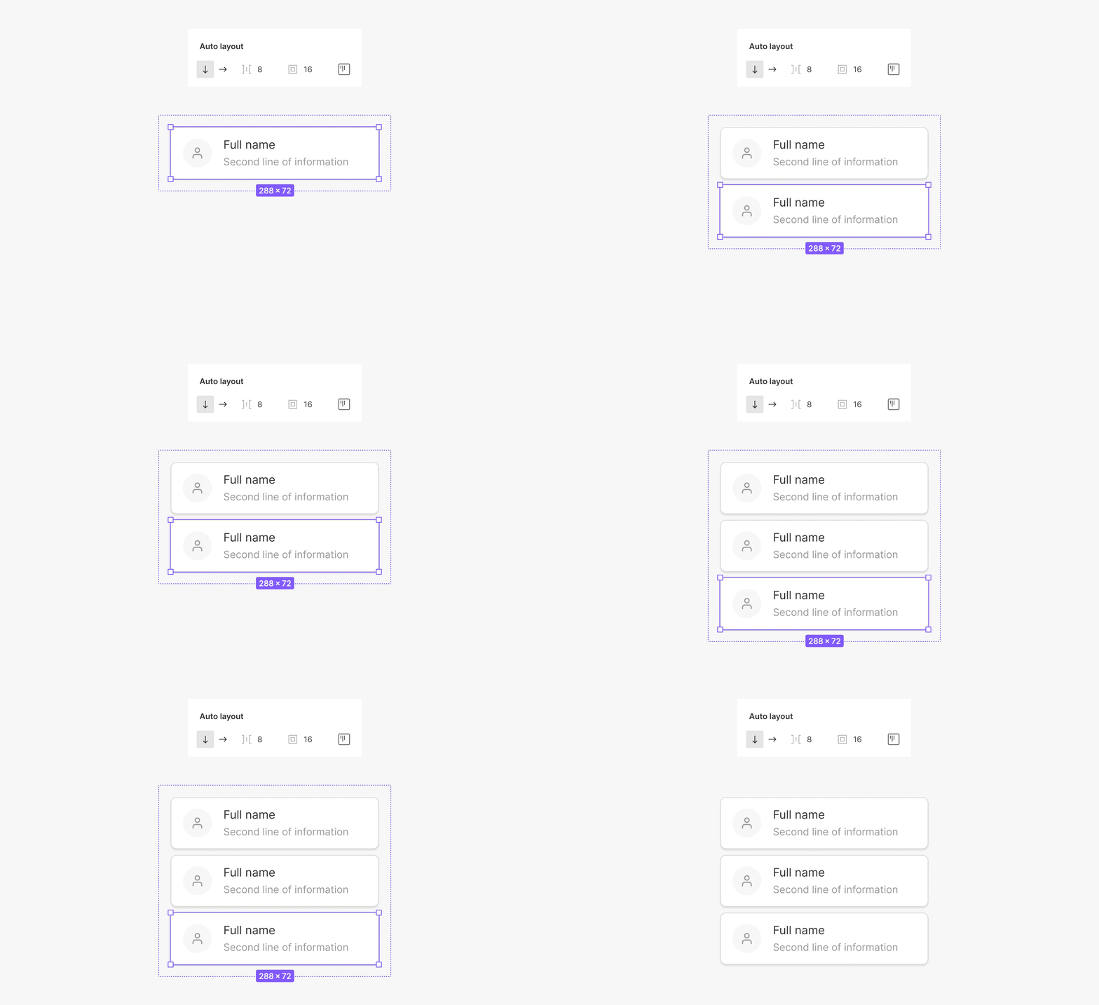
Now that we have more elements inside the component, we can already see what's going on in the layer's list. Figma uses by default an arrangement order inverse to what we see on screen. This means that the uppermost layer will be the element that is at the bottom on the canvas, and the other way around.
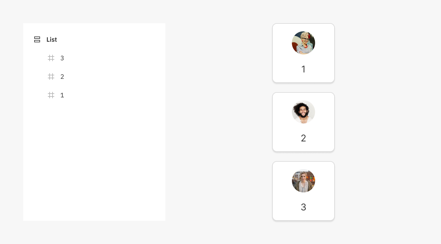
This is the opposite of my personal preference (yikes!). You have to keep in mind that if you change the order of the layers from the layer's list, this will also affect the elements on the canvas. Therefore, the layer's order is more crucial than ever, and something you have to be careful about when using Auto Layout.
You can also easily arrange elements dragging and dropping them directly on the canvas.
Distribution
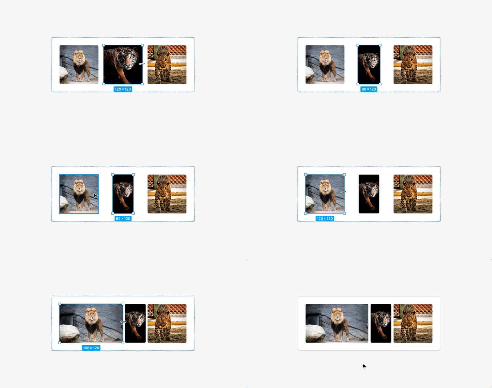
In the previous section, we saw how elements are separate following a predefined, constant value. Inside the padding options, this is shown as Packed. But this is not the only way to separate or distribute elements inside a frame with Auto Layout. Additionally, there's also the Space between setting.
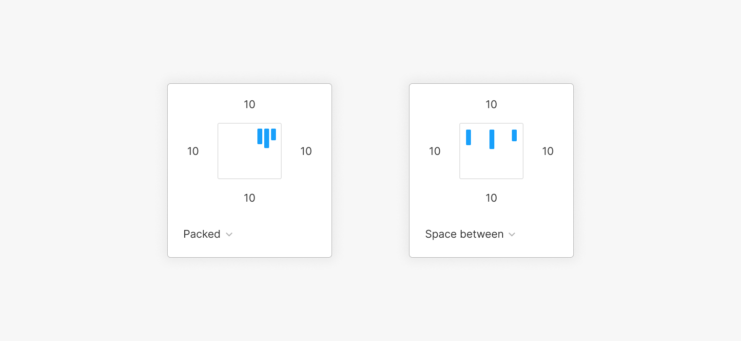
Applying this option will change the height or width of the container frame to a fixed value, and will use the space between each elements to divide it into equal parts. If the dimensions of any of those elements changed, they would still have the same separation nevertheless. This is a way of keeping a variable separation, but regular either way.
Alignment
When we work with Auto Layout, you have to forget everything you've learned so far. Well, not everything, but something in particular: Elements are not individually aligned, there's just one configuration affecting all of them at the same time. This is done from the same section where the padding options are.

In this same box, you'll find the possible alignments, that will determine how the elements will arrange themselves inside the component with Auto Layout. The alignment is represented by this… light blue? icon.
In our next example, we have applied a vertical Auto Layout. This means that we'll be able to center the elements horizontally only, because we have the Hug contents setting applied. This is something that we'll see later on, when we talk about Resizing, but it basically means that the main container will adjust to the size of its contents.
Because the longest elements are the two central items, those are the ones dictating the width, and don't seem to move. The others, since they are smaller, will be affected by alignment.
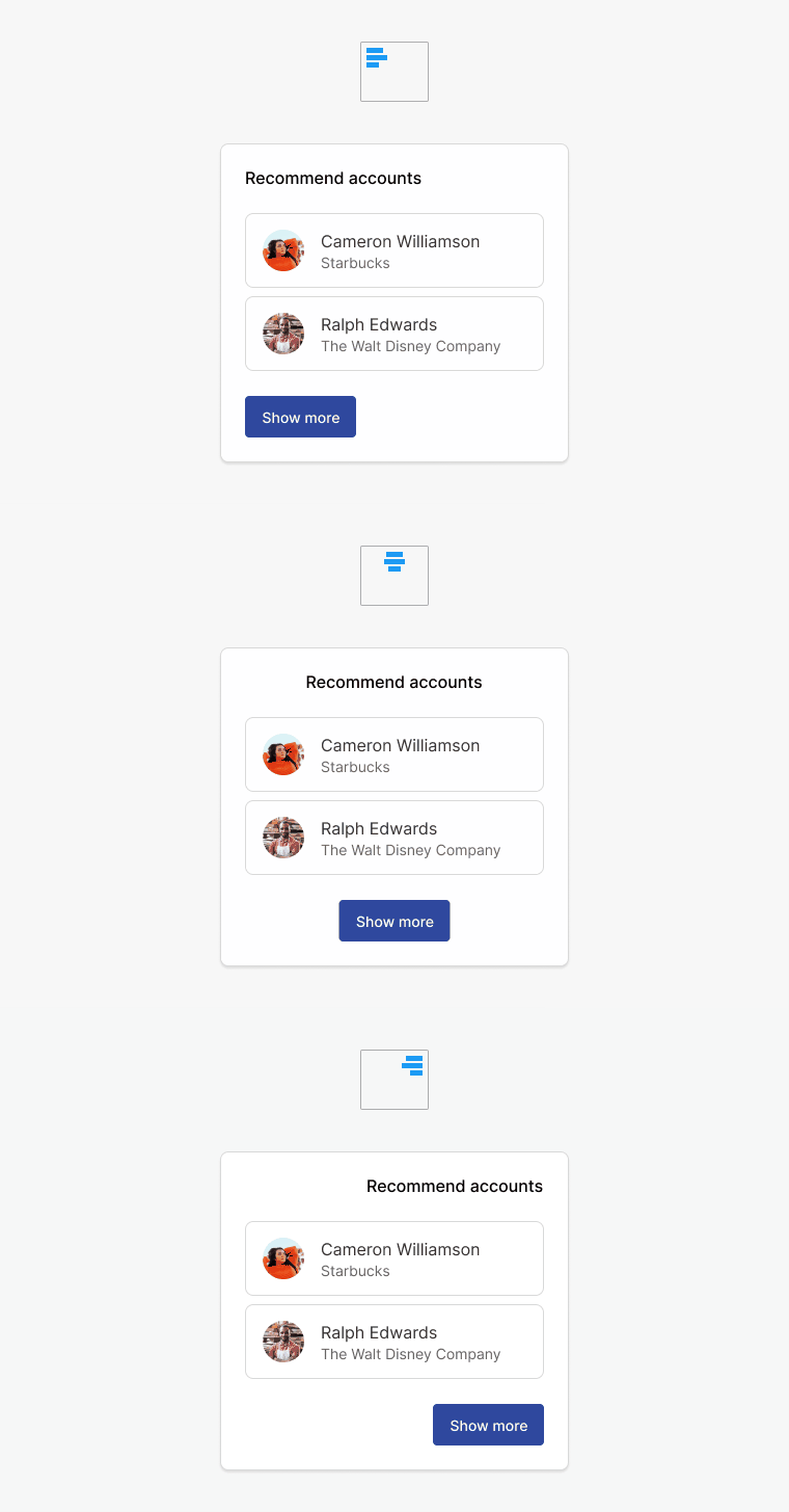
When we have a container which height and width has been manually modified to have a specific size (meaning fixed), then the internal elements will have more room and freedom to move around. Therefore, the alignment options will become more useful to arrange those elements in space, horizontally and vertically.
The outcome of the alignment options greatly depend on the seizing settings applied, and on the distribution on the container frame.
Resizing
So, now that we have all the basics under control, let's move to the Resizing options. This configuration will impact on how a container frame and its child layers will scale or stretch, when any of those change their width or height. These options are a bit complicated, because both the container frame and the internal ones can have each one its own resizing settings, and they are mutually affected.
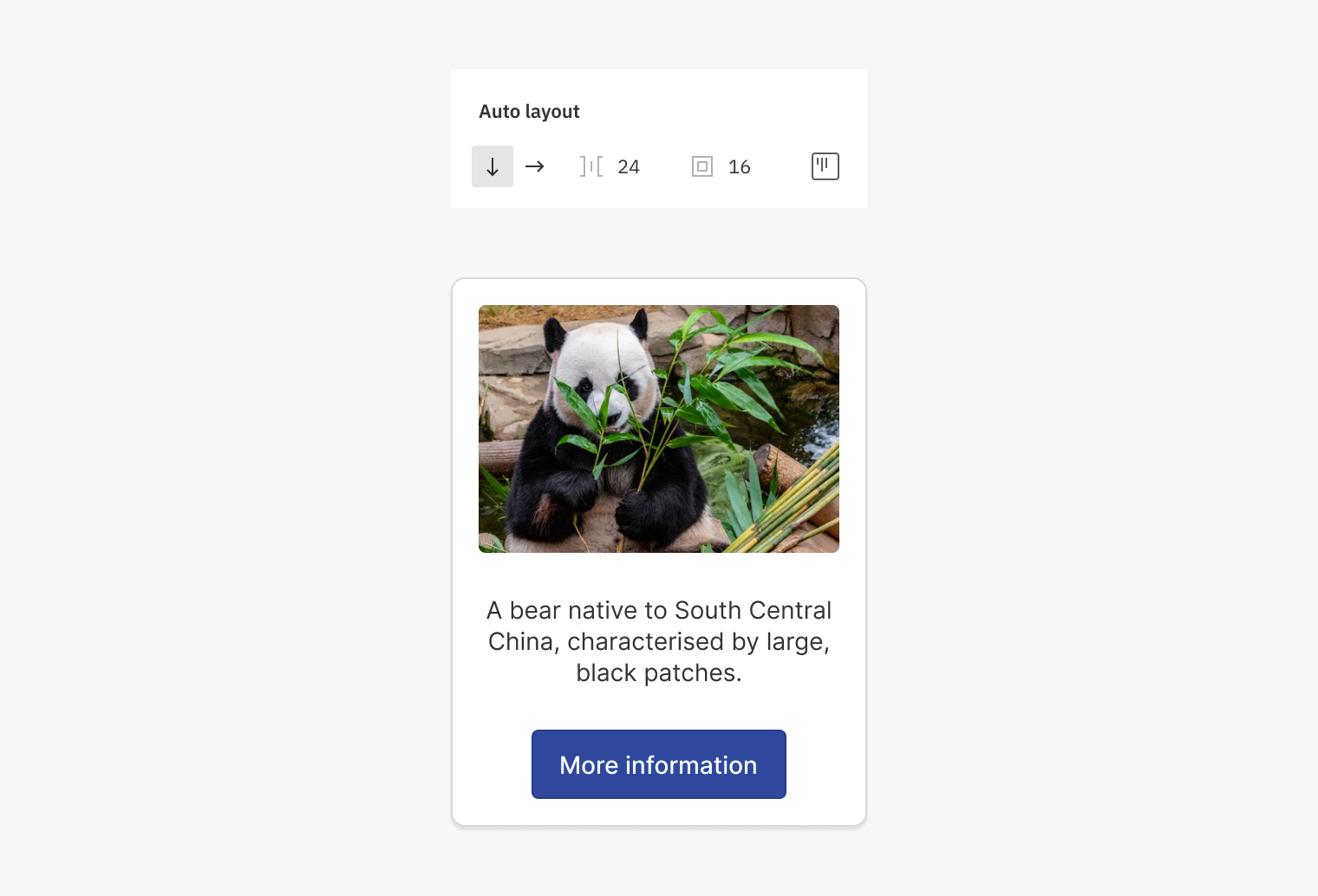
Let's see how this works step by step, using the following example: We have a Card that includes an image, a text and a button. There's a uniform padding of 24px, and the separation between elements is of 16px. As you can see on the image, not all elements have the same width, and they are horizontally centred.
Hug contents
The first option we'll talk about is Hug contents. This basically means that the container frame will adapt its size to its contents. This is something that can be applied to both width and height, and it's a bit what we have seen so far in the other examples.
If we added more text, then the container would still be the closest as possible (or hugging) its contents, keeping the same padding that was previously defined. This means that it will be the contents the ones deciding how big the container will be.

The same would happen if the image wasn't there. By hiding this layer, we can see how the container adapts, reducing its size to the one the visible elements need.

Fixed
Now, if we manually change the container's width and height, then it would stop being configured as Hug contents, and would be Fixed instead. Or in other words, with a fixed height decided by the designer in chief. So, now it will be the container itself the one deciding how tall will it be, and the child layers will need to arrange themselves depending on the resizing option each one of them has applied.
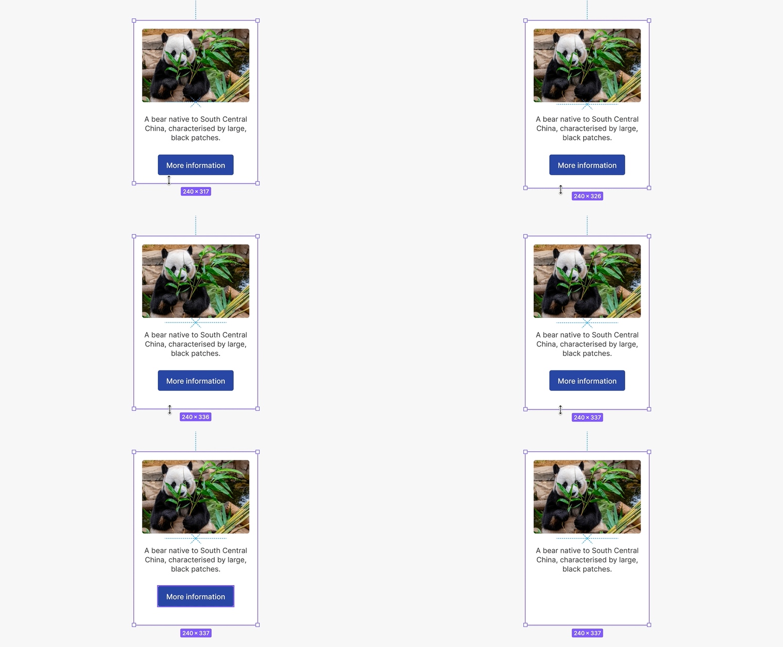
If besides all this we also hide the button, for example, then the whole container would remain unaffected, and would keep its fixed height. This could be easily changed by going to the previous Hug contents setting, so it would again adapt to its contents.
Fill container
The inner or child layers, inside the container, could have the Fill container option as well, which means something of the sorts of "please expand yourself to use all available space". In the previous examples the button had a width that wasn't the whole it could have had, but the minimum one required by its contents.

This is a configuration that could be applied layer by layer inside the same component. On the other hand, the image, text and button could have each different behaviours, depending on what we decide (summarising: We could have them use all the available space, or a fixed size.)
An example that could come in handy is when we have two containers with fixed heights, one next to each other. By making the text use all possible available space (this layer will have the Fill container setting), we could make the buttons align always at the bottom. The text layer is pushing the buttons (no pun intended), and using all the height it can.
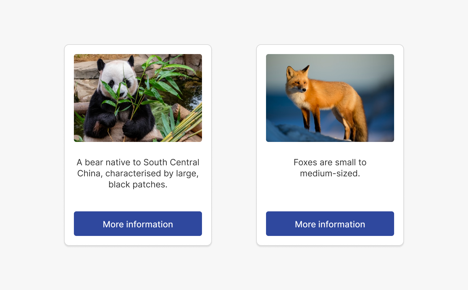
From here onwards, we could start playing with different combinations. Maybe the most important thing is to decide who's the boss when dictating the total component's width and height: The container, or its contents.
Bear in mind that applying Fill container will make the width or height of the main container automatically change to a fixed value.
Constraints
The Constraints options are generally used in Figma to determine the position that an object will have while the size of the container where it belongs, changes. So we could ask ourselves things such as: Should it remain centred, or always keep the same distance to one of its sides? In the context of Auto Layout, these options will also define in which way the component or frame will grow while its content changes.
Constraints options are available only if the frame or container is already inside another frame.
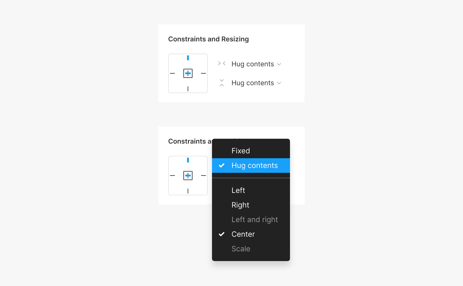
These options can be selected from the Constraints and Resizing section that we have seen before, selecting the lines in the way that you want. You can also pick them from the drop-down menu, that might be easier to understand. While using this menu, keep in mind that you have to choose the vertical and horizontal positioning separately, whereas in the line quadrant you could do all at once.
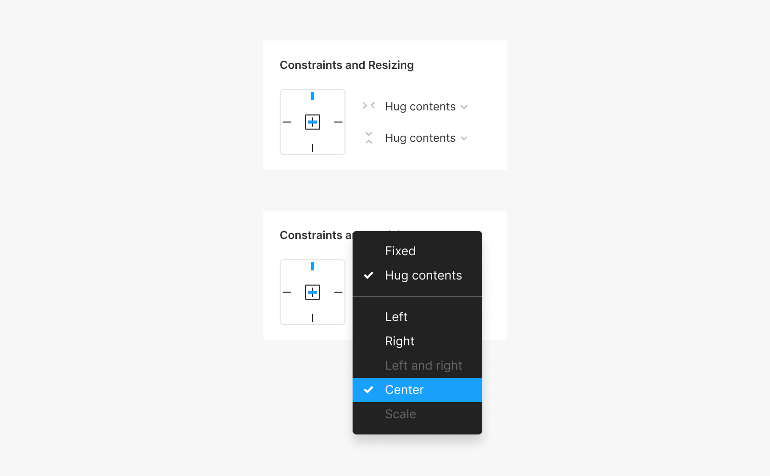
In some of the examples that we have already seen, there were some constraints options already applied. In the example below, we said that the component adapts when hiding one of the layers. What is also happening, is that it remains vertically centred in space, and that's because the vertical constraint is set to Center.

If we choose the Top option in the other hand, then the component will keep the same separation it has to the top margin while it increases, or decreases its size.

The same thing could happen with components or frames that have applied a horizontal Auto Layout. We could decide if we want them to be centred, or closer to the right to left while they change its width along the container.
Keep in mind that constraints options depend on the resizing settings applied, so some of them could appear as disabled.
Nested layouts
So far, we have applied Auto Layout to only one frame at the time, even when we have changed the settings for the child layers too. Things start to get complicated (or should I say fun?) when we also apply Auto Layout to the inner frames.
This is called a nested behaviour: When we apply Auto Layout to a frame, and it's then applied to its children too afterwards. This give us plenty more of possibilities to play with to get more complex arrangements, where each one of the elements will have some independence on the way it grows and adapts. Let's go by parts.

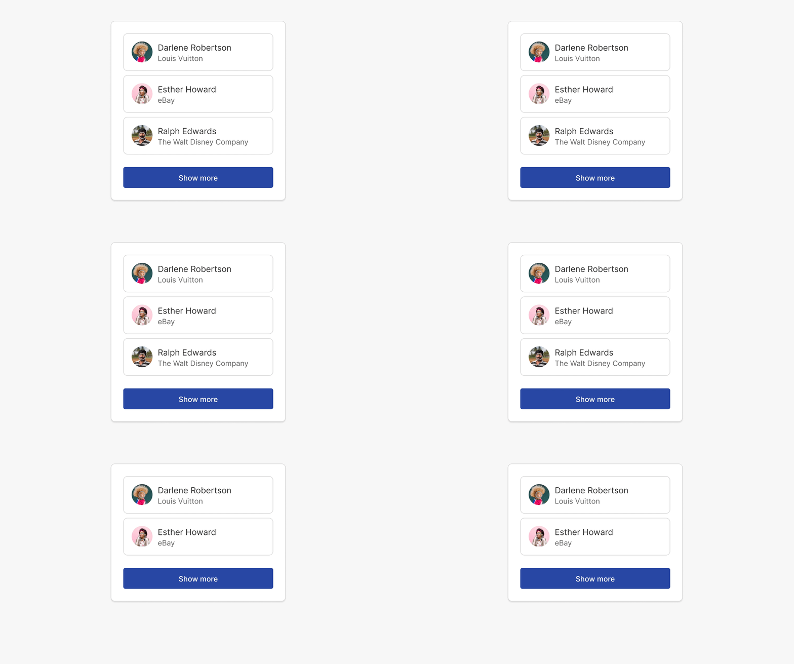
The first thing you will see in the upper image is that each one of the items has a vertical layout. When hiding one of the text layers the content automatically centres. But that's just in regards to the texts, that are grouped in the same frame, only them. Inside that same component, we could apply a horizontal Auto Layout to the whole Item component, in a way that if we wanted to hide all avatars, the text would use all possible width.
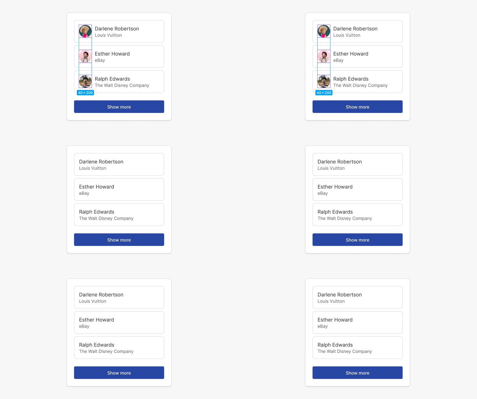
The main frame containing all of this also has a vertical Auto Layout applied, so we can hide and show some of the items, and the whole block will adapt itself vertically to the content it has on any given moment.

A quick recap on what we have so far: Texts are grouped with a vertical layout, and they are inside an item that has a horizontal layout setting. At the same time, all this is inside a big, big container that has a vertical layout applied to adapt to the amount of items it has. Anything else? Yes. In case you haven't noticed yet, the separation between items with avatars is smaller than the one with the rest of the elements on the main block.
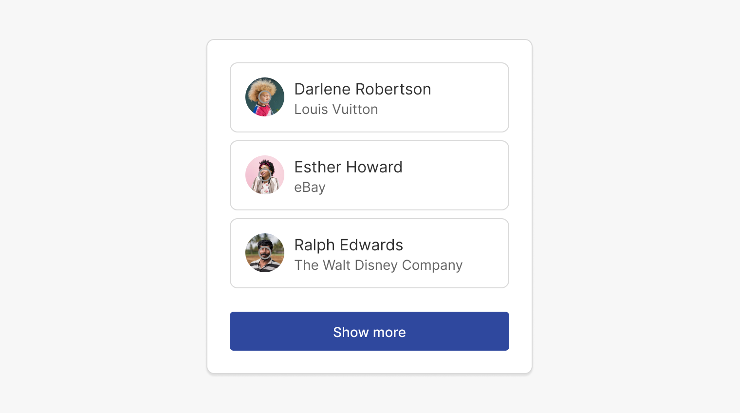
To achieve this, I have grouped (just the items) in an additional layout, in a way that it will have the same vertical layout the main container has -- with the difference that those elements will have a smaller separation. This is also a valid reason to use a nested Auto Layout: Keeping a main container, but grouping some of the inner items with different distances.
Keep learning
And that's all! I hope that after reading this, and seeing some examples, you have a better understating on how Auto Layout in Figma works. Like with everything, it requires a good deal of practice to start getting more predicable and controlled results. And even so, there's always a fair amount of trial and error before reaching the desired outcome.
The thing I recommend the most is to experiment, to try things until you feel more comfortable with the design decisions you are taking. If you want to keep learning, I will leave below a couple of links that may be helpful, too. Thanks for reading, and specially for making it until the end!

